Saturday I attended the opening of Escape From New York, curated by Olympia Lambert and held in Paterson, New Jersey (open weekends through June 19, 2010). When I heard of Oly's idea originally I was interested mainly because I live in New Jersey and thus am naturally interested in events involving New Jersey. Then I saw the list of artists, which turned out to contain the usual suspects from the Denise Bibro-Ed Winkleman-Schroeder Romero axis: Man Bartlett, Boyce Cummings, Jennifer Dalton, Thomas Lendvai, William Powhida. None of whose work I was all that excited about seeing. But then there were a whole pile of other artists in the list, too, most of them unknown to me, to give me some hope.
Not that Paterson needs this influx of New York artists to become an art neighborhood. Paterson, like Newark, has been the beneficiary of many, many years of government money and effort attempting to gentrify it and turn it into the next Greenwich Village or Williamsburg. There's plenty of government-subsidized artist housing and studio space in former industrial buildings renovated with public funds. These efforts have mostly failed to improve these cities, to the extent that recently on my way through Newark I saw a billboard from the new mayor essentially pleading with the citizenry to stop shooting each other.
It's actually somewhat heartening to know that, in a time when there are basically no bad neighborhoods left in Manhattan, there are still parts of the country left poor and unsafe. Although, really, Paterson is only relatively poor and unsafe: Compared to most of the planet across most of its history, Paterson is actually prosperous and comfortable. In fact it's a very energetic city of crowded sidewalks filled with busy people crossing the street at random, bicycles zipping by, blocks full of non-franchise small businesses with signage in English, Spanish, Arabic, Chinese, Polish, Turkish and many other less easily identified languages. It reminds me of nothing so much as Times Square in the 1970s and early '80s -- loud and scary but alive. Also a bitch to drive through.
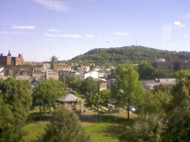
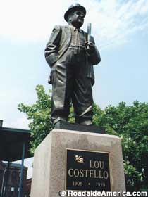
View from the fifth floor. In the foreground is Cianci Park where stands the statue of Lou Costello. Off in the distance is Garrett Mountain.
I personally have a soft spot for Paterson because, hey, you have to like a city with a memorial park and statue in honor of Lou Costello. This is the city of Alexander Hamilton and Allen Ginsberg, the city of "Howl" and Kerouac's On the Road. There is the Great Falls of the Passaic River, the largest waterfall east of Niagara. Being the second largest falls in the eastern U.S. doesn't mean it's really that big, though, and you can drive a hundred yards from the Falls and not even know it's there -- which is one of the things that makes it so amazing. In fact it took me two trips on as many days to find it when I went looking a few years back. But when you do find it it's lovely. Paterson also has its very own mountain -- really a very big basalt hill called Garret Mountain -- with a Victorian-era castle and watchtower (the current background image on my site is a photo taken from the cliff in front of the tower). Paterson's downtown was the cradle of the Industrial Revolution in America and is filled with late Victorian and early 20th century red brick factory buildings. There's something about that style I love, the way the brick matches the cast iron, the windows, the warmth and human scale of it all. Amid those red factories, if local legends are to be believed, the chili dog was invented.
And, as I said, Paterson already has its own artists. I personally know two of them -- in fact we met at an opening in Chelsea, long before I started writing this blog, when one of them overheard me disparaging New Jersey and leaped to its defense. That's the kind of artist bred out here in the rocky, tainted soil: The kind that will gleefully pounce on a stranger for uttering even one discouraging word. Upon finding out that I, too, was from Jersey, they both forgave me and we could make fun of our state together. I still bump into Gerald every now and then and keep in occasional touch with Cory. Since both of them have already escaped from New York, I guess, they're not in the show.
I know Oly knows there are plenty of Paterson artists, too, because that's how she found the venue for this show: At an art show last year. Why she'd feel a need to import so many artists from elsewhere is a bit beyond me. But I suppose I do understand it, really: You work with the people you know. Still, I have to wonder why she didn't reach out to the local artists. There's plenty of room in the building. There's room for some other New York artists: In addition to the Escape From New Yorkers taking up three out of five floors, one floor is filled with a show from Hunter College, although I didn't know this at the time, only found out when corresponding later with Oly, and can find no information about this part of the show at all. And there's space for some imported Jersey artists as well, as the ground floor is given over to Hob'art, a cooperative gallery from Hoboken, New Jersey. Hoboken, of course, is a long way from Paterson, not so much geographically but culturally, since Hoboken went through its long-awaited gentrification starting in the late 1980s and is now a de facto suburb of Manhattan with Brooklyn Heights-level real estate prices. The town of Frank Sinatra and On the Waterfront no longer exists -- in fact large portions of that waterfront fell into the Hudson River.
I had my friend Cory meet me at the show and as we walked around we met up with friends of his from the neighborhood. Cory lives in a loft one building away from the building housing Escape (with a 15-year-old chihuahua and the Six Million Dollar Man pinball machine he refurbished himself) and of course knows a lot about what's happening with different buildings in the area -- which ones have been renovated, which have been condemned, which need better parking. As we wandered we found Christine Conforti also making the rounds.
Christine is a true Paterson native. She grew up in the city and still lives there. Her mother worked sewing coats together in the very building in which we were standing. Back when I said Paterson had been on the receiving end of years of money and effort? Christine is one of the people who's been making that effort for the past couple of decades. And she is pissed. Not at Oly specifically but at the politics that led to a horde from way over in New York City invading Paterson and getting exhibit space, without inviting or even so much as contacting the local artists and arts organizations. Obviously I can't begin to understand or summarize what sounds like a complex situation after talking to a few people for ten minutes, but the gist of it seems to be that Paterson politicians are playing various arts organizations against each other while attempting to sell out to real estate developers. As I suspected there are people on the ground in Paterson who've been working and organizing and protesting and fighting to improve things -- to get space for artists to live and work, to keep them safe (from old factory chemical residues and from crime), to prevent the demolition of landmarks. Meanwhile a bunch of people from New York and Hoboken can swoop right in and set up shop without even asking any of those people to drop by for a visit.
Christine is the executive director of Ivanhoe Artists, an organization doing the hard work of getting sponsors, dealing with politicians, and generally fighting the good fight for artists. Ivanhoe organizes an annual art walk through downtown Paterson. In fact Cory had thought, when I invited him along, that this was going to be part of the art walk. As the three of us talked he got angrier and angrier that this huge art event had been put together without any local involvement. Parking lots being opened! Shuttle buses being run! All the things that never happen for actual residents suddenly happening for these carpetbaggers!
It all seems rather unfortunate but that's politics for you.
In the hopes of improving communcation in the future I introduced Christine to Oly. That's politics too, but the good kind.
Now let's drag the slider control back to the beginning, before the politics were more than just a glimmer, and enter the former Fabricolor factory. On the ground floor you can't see what you're in for: The front room's been modernized and renovated, and while it's still rough, it's relatively civilized with a dropped ceiling and real walls and windows. The room is large but not much bigger than many Chelsea galleries. The art here, as I mentioned earlier, is all from Hoboken-based cooperative Hob'art and therefore entirely different and unrelated to Escape upstairs.
(I'd like to mention here that I actually took notes as I went through the building. I almost never take any kind of notes but this was too much for my tiny brain to handle. I am absolutely, certainly going to skip artists and pieces: Anything that didn't catch my eye (for being good or bad) I'm going to ignore, skip right over, not even mention. If you want a complete listing of everything in the shows, I'm afraid you're going to have to rely on the shows' Websites themselves.)
The Hob'art show, as you might expect, is more traditional than the work upstairs, more of what regular non-Chelsea people would consider art. I actually liked it for that. Hob'art artists live in a world without installation and video, where Picasso and Pollock have only just been digested. It's a pleasant world to visit. The first piece that caught my eye, in fact, could almost be mistaken for a Van Gogh copy. And you really don't see anyone trying to copy Van Gogh in Chelsea. Ann Kinney's painting is wonderful in its naivete, her willingness to just go for broke and work in a Post-Impressionist style. And Louise Gale's swirly blue abstracts owe a large debt to old Vincent as well. Both of them bring energy and brightness to the room.
In a similar way Maria Castillo embraces color with Fauvist gusto. Her energetic all-over abstractions are quite good. Stan Lindwasser explores washy acrylics like a damp Abstract Expressionist -- and I mean that in a good way. His colors are sharp and vibrant. Meredeth Turshen is the most classic of them all: Her pastels (possibly over monoprints) have a very handmade 1930s look to them, with a classic earth pigment color scheme as old as cave painting.
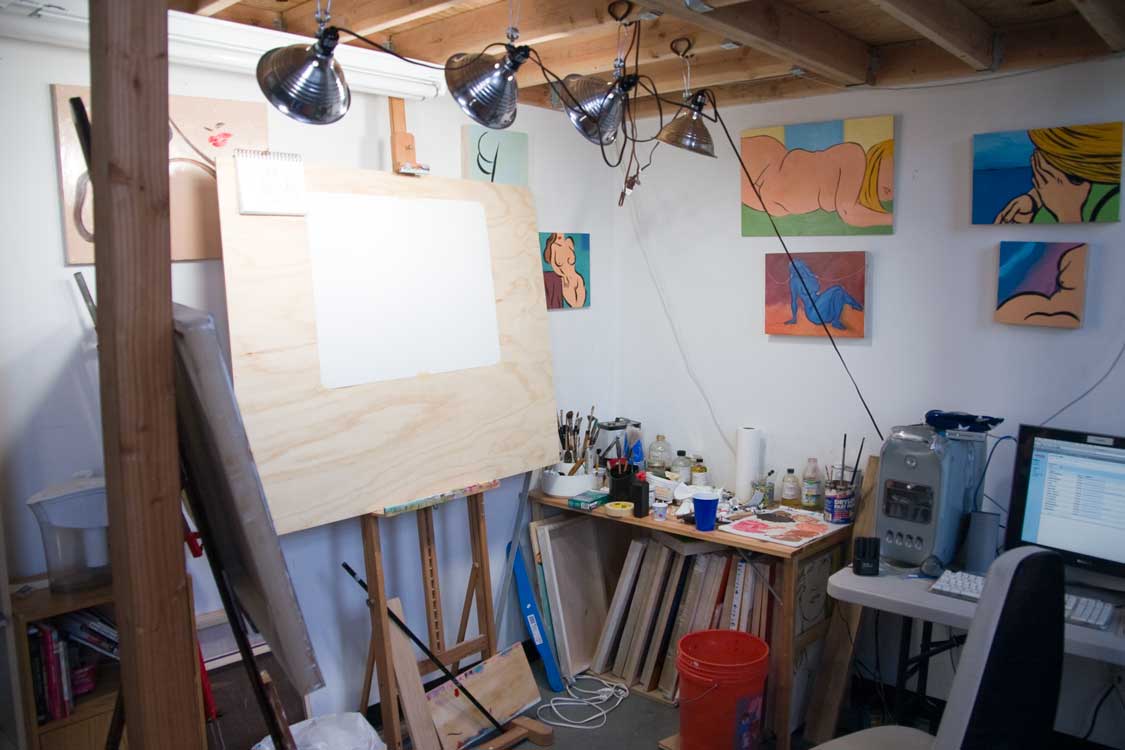
Escape From New York, second floor installation view, 2010 (photo courtesy Jason Varone)
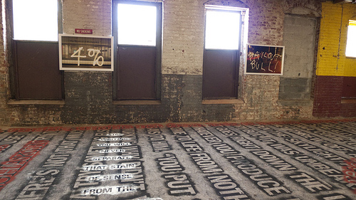
After going through the ground floor I made my way up the worn stairs to the second floor. On the open door from the landing -- itself a good-sized room which in earlier times doubled as the freight elevator platform -- was a sign reading "Walking directly on the text is STRONGLY ENCOURAGED". Peeking in I could see a large room but not the vastness I'd been led to expect from this building. Nevertheless painting the text all over the floor in shades of black and red must've been the work of days. I am told -- although I failed to make a note at the time, because I'm strictly amateur hour -- this was Nicholas Fraser's work. Already footprints were starting to collect from the few visitors since the show opened; on my way out an hour or so later the crowds had really done a number on the piece. Obviously intentional -- nay, encouraged. Since I'm prejudiced against the use of text in visual art I failed to enter into the spirit of the work and didn't read a word of it, but I did walk around the room to see the other art works in the space. Tamas Veszi had a series of paintings along one wall, all butted up against one another. The room was somewhat dim and the paintings dark and dingy: All I got from them was the feeling they were a kind of reverse Jasper Johns, like the backs of his flags, maybe. They were ugly, all sickly yellow and black, and didn't compel me to study them more closely.
The third floor -- as I mentioned earlier, this was Hunter College in some capacity, and I didn't know it at the time -- I won't even discuss it further because I didn't see a single thing there worth slowing down for. In fact going over my pad I got confused because I only had notes for four floors but Oly, on the Escape site, keeps talking about five. How can you lose a whole floor? Easy: Fill it with forgettable art! Moving on.
As I made my way up to the fourth floor I heard from above the sounds of a vigorous performance piece. Luckily there are two ways onto the fourth floor from the landing and I took the one opposite the grunting and banging. More on that in a moment.
It's here, going right into the rear wing of the building, that it becomes clear: The building is huge. Oly can write that one room is 200 feet long but you can't really see how big that is until you're standing at one end of it. It's shorter than a football field but football fields are usually outside. This is indoors and there isn't a column or pillar the entire distance, just a trussed roof a story and a half up. Windows run down both sides of the space making it seem even larger. They just don't make buildings like this any more.
I walked directly across the room and from there worked my way around counterclockwise. I'm a rebel like that.
First I found a series of paintings on window shades by Iliyan Ivanov. In other circumstances I might have found them poorly conceived and kind of ugly, but here, hung a short distance in front of windows with sun streaming in behind them, I thought they worked. The rear lighting gave the paintings a nice translucence which helped them feel less grungy. The paint, of course, couldn't be absorbed into the shade material, so it beaded on the surface, lightening what might otherwise have been heavy-handed, childish brushwork. Since the subject of the works was windows -- my memory is hazy on what exactly they depicted, if it was windows themselves or views from windows -- the whole worked together.
Not far from there, on the floor, was a small collection of works by Stephan Fowlkes. The two that really intrigued me were cube-shaped assemblages of wood of different thicknesses and stain colors. Parts were cut out from the cubes but the faces were smooth. Cory said he had a cutting board like that and I do too, made by a friend of mine. I'd hesitated to use it as a cutting board because I found the wood so beautifully arranged. These are like that, with the light and dark layers and the general loveliness of wood combining into a very nice whole. One of the cubes had been placed on a circle where the hardwood floor had been thoroughly cleaned and polished, which was a nice touch. It's hard to believe, but that entire vast floor was all hardwood lost under untold layers of factory grime. A floor like that today would cost a fortune.
Next my eye was caught by a free-standing piece almost as tall as I am. Three clear polycarbonate wings unfurl from the center of this sculpture by Jeremy Earhart. At least I think it was him; I couldn't find the attribution. I was charmed by this piece in spite of myself. It has a heavy metal simplicity to it, a basic elegance.
Unfortunately Stephan's lovely wood and the plastic wings were followed by Robert Appleton's grotty little paintings. They're total Feeblist crap, actually significantly worse than leaving the factory walls empty. They're bad enough to make a viewer actively angry at the artist for ruining perfectly good art supplies. Every time Robert buys paints or canvas, they should immediately be confiscated and mailed to some impoverished Third World village.
There were some dopey little installation bits after that -- a pile of sugar on the floor, a trucker's hat -- at least these bozos didn't waste expensive paints -- and then maybe some more things that didn't seem worth the time. Way at the end of the room An Xiao was setting up her...I don't know what to call it. Performance/installation/conceptual/new media thingamahoozie. I was exhorted to sit on the floor in a certain spot and send a text message to An using a given phone number. Then we were to swap messages or something until I felt enough of a connection with the artist had been made. I could start and stop at any time. I decided to make them both the same time by simply walking away. Later Cory wondered what would happen if we sent texts from anywhere in the building without sitting down. I told him he wasn't entering into the spirit of the piece.
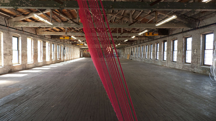
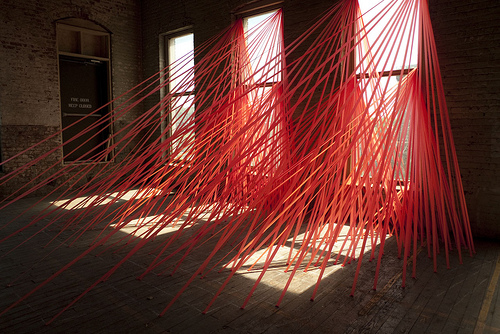
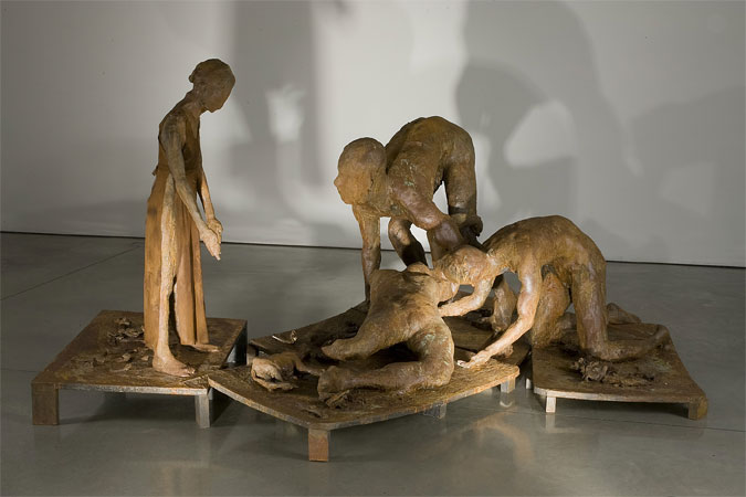
Thomas Lendvai, installation view, 2010 (photo courtesy Jason Varone)
Dominating the room as you walk down it, however, is a piece by Thomas Lendvai, a long ribbon of red bungee cord strung up and down from floor to ceiling at an angle approximately just off center of the room. My immediate thought was that Tom had been traumatized when as a child a Richard Serra fell on his head, because he clearly has a yen to control space. This time it's a rubbery net, last time I saw his work it was wooden planks, his Website shows similar work, and most of them are basically about slicing up empty space and making viewers walk around or under.
This piece definitely looks as if it took a lot of work. The ceiling is probably twenty feet up and the continuous bungee cord is stapled an even distance, twice on the floor, twice on the ceiling, stitching back and forth at least fifty feet. There was a lot of measuring and ladder-moving in installing it. And of course it references the building's former use as a silk factory and so forth. Sounds like it should be very successful, and I suppose it is, but it didn't raise my heart rate or anything. Cory really liked it. He twanged it as we walked by and I scolded him. Don't touch the art!
I came back around the room and I guess there must've been other stuff on the other side but I didn't note any of it. I think there was a video going. I came down a few short steps into the front part of the building which I'd avoided by coming in the other way. Oly and her minions had added some walls here to break up the space and hang more traditional work. I began in one corner where there was a very narrow alcove probably used as a bathroom when the building was operational. Now it contained a sculpture by Emil Silberman, white and lumpy and very Cubist, kind of Giacometti meets Picasso. I wish I could say it was bad enough to belong in the toilet but it wasn't. Quite. Another one, very similar, stood on a plinth outside the alcove behind a rough window frame. That one would've been good in the toilet.
Chris Saunders had a few paintings on one of the new walls. I've never seen his work in person although I've read his blog and seen his name around for a few years. I found that his skies -- his roiling clouds -- are really appealing and deep with a glowing sense of airy space. Then he grounds them with a minimal landscape very close to the bottom of the painting -- which is absolutely necessary to anchor the cloudscapes since they don't have enough form on their own -- but these landscapes are flat-looking, shallow, and thrown right up against the picture plane, such that they undermine, rather than support, the skies. Some artists make paint come alive and some just lay it on the surface, but I don't think I've seen any painters who manage both in the same painting. Chris does. I'd rather he kept the depth all the way through.
On the other side of the wall I saw Robert Schatz's exploration of the brushstroke. Robert paints his acrylics in a very thin and brushy manner over a light-colored panel such that you can see the swirls of the brush. I'm personally a big fan of brushstrokes -- I just love the way they look -- so I was captivated by these. I also appreciate Robert's use of negative space. One piece was almost entirely empty, in fact, with a tumbling wave of strokes across the bottom. I thought it was the strongest work on the wall.
At this point I noticed that Oly had taped up a number of sheets of paper around the room reading "Art? Not art?" Each one was next to some...thing, like a half-painted piece of plywood or a bent length of metal. This is a fantastic way of wholly destroying the credibility of your entire art endeavor, by implying that random construction debris could be confused with the actual artwork. It's funny in a smirky kind of way, but also sad.
Michelle Manley, Pushing Plastic 1, 2009, acrylic on board, 24x24 inches
Michelle Manley, meanwhile, held up the opposite end of the art spectrum with her meticulous paintings of swirly natural phenomena. The one I liked best looked like a closely cropped underwater photo of splashing and bubbles, as if someone zoomed in tightly on a detail of an Eric Zener painting. While I've been growing more and more restless regarding photo-based painting hers was probably some of the best work in the show.
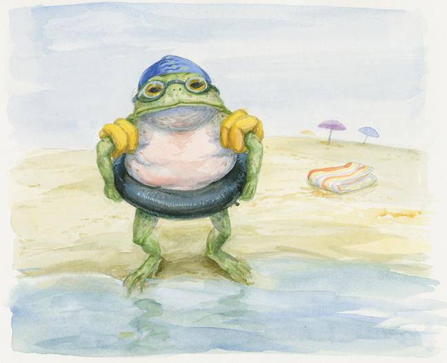
Rafael Perez, Toad prepares for the water.
Escape certainly runs the gamut from the most conceptual, ephemeral, participation-based art through to out-and-out illustration, as illustrated by Rafael Perez. Heck, his Website has the word "illustration" right in it! Rafael's contributions to the show are twee little watercolors of anthropomorphic amphibians at the beach. They reminded me instantly of one of my favorite books of all time, Frog and Toad Together by Arnold Lobel. Lobel, possibly restricted by printing technology, kept his watercolors in a narrow range of browns and greens; Rafael goes ahead in full, albeit washed out, color. Aside from that -- and Lobel's inimitable charm, of course -- these might as well be copies. But I suppose there are only so many ways to dress a frog. "Drat!" said Toad.
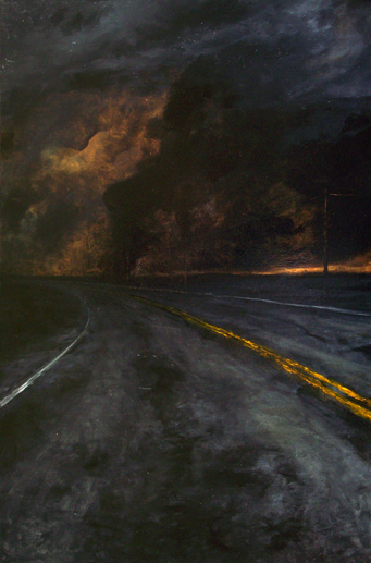
Michael Paul Miller, Are We There Yet, 2009, oil on canvas, 38x25 inches
Wait, did I say Michelle Manley had the best work in the show? I misspoke. Here is the absolute best, with Michelle close behind: Michael Paul Miller's "Are We There Yet". Michael has created a moody Goya highway going off to places unknown but probably not very pleasant. The surface of the painting is wonderfully lumpy, worked over like an old road itself, beneath angry dark skies as rough as old tar. A dim glow struggles over the horizon, and somehow it seems to be very definitely a sunset, not a sunrise. This is that one truly good work you hope to find whenever you go out to see art. If I haven't convinced you to see this show for any other reason, you should make the trip just for this.
Which is in strong contrast to the return of Jennifer Dalton's fucking bracelets. I saw these four years ago as part of her uniformly lame show Would You Rather Be a Loser or a Pig? and I guess they're going to keep coming back until she's managed to pawn off all of them. Cory took one -- one step closer to never having to see them again! -- and laughed with me about how they barely fit a normal-sized human, let alone anyone overweight, once again reminding me that discrimination against fat people is acceptable. I'd ask that everyone reading this go to the show and take one just to get rid of them, but then you'd have to see them and I wouldn't wish that on you. Because I care. If you do go to see Michael Paul Miller's painting, hold your nose and take a bracelet. You can throw it away when you get home.
As I made my way around the room I was getting closer and closer to that noisy performance art I avoided when I came in. I guess I knew I'd have to get near it sooner or later, so I edged over. This was, I believe, Jason Robert Bell's piece, apparently consisting of Unfrozen Caveman Performance Artist making a mess and grunting and bellowing while Unfrozen Cavewoman Assistant paced the area showing altogether more of her thighs and buttcheeks than necessary to communicate her cavewomanliness. I managed to get by without making eye contact and took the stairs to the fifth and final floor.
Sean Slemon, installation view, 2010 (photo courtesy Jason Varone)
This floor is broken into two parts, like the one below, but the second part isn't as long. That was all darkened while the front was kept open to the sunlight streaming in. Just inside the door the sunbeams had been taped off with bright red streamers by Sean Slemon. He followed the lines of light at some point of day from the windows down onto the floor to create a sort of web. The resulting installation was neat-o. I can't really express it better than that: It was just neat-o. That's what I wrote in my notes and I can't think of a better word.
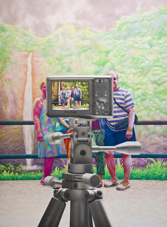
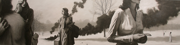
Micah Ganske, The Full Picture, 2010, acrylic on muslin, 103x80 inches
Michelle Manley has another painting up here, this one apparently on a canvas shower curtain. It's not as good as the one downstairs but still quite nice. Approximately opposite that is a downright enormous painting by Micah Ganske, a kind of photorealistic painting of a family being photographed by a camera on a tripod. The image in the camera's LCD screen shows the full family obscured by the camera itself; this is what most vacations look like from the dad's point of view these days, all camera. I suppose the painting's a statement on that (not to mention Magritte's famous The Human Condition) but I found it more of a statement of how acrylic paint behaves on muslin: Rather than lie on top as paint does on canvas, it soaks into the thin weave for a more watercolor look. The thinness of the paint couples with Micah's choice of nearly DayGlo colors to make this both very flat and very striking. This is probably, after Thomas Lendvai's installation, the most dramatic work in the show, and almost certainly the most likely to make a visitor off the street say "Wow!"
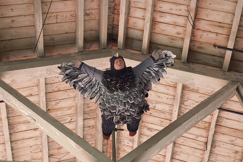
Dean Goelz, installation view, 2010 (photo courtesy Jason Varone)
I don't know when, during my time on this floor, I noticed Dean Goelz's creepy little boy in a bird suit hanging way up near the ceiling, but I wish I hadn't. Usually when I see Dean's work I appreciate the craft involved but wonder what he's getting at, why he bothers. At this distance, however, you can't see any craft, just ugliness and snark. Few things annoy me as much as when an artist appears to be looking down on his subjects, and in this case it's just nasty.
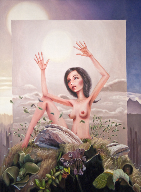
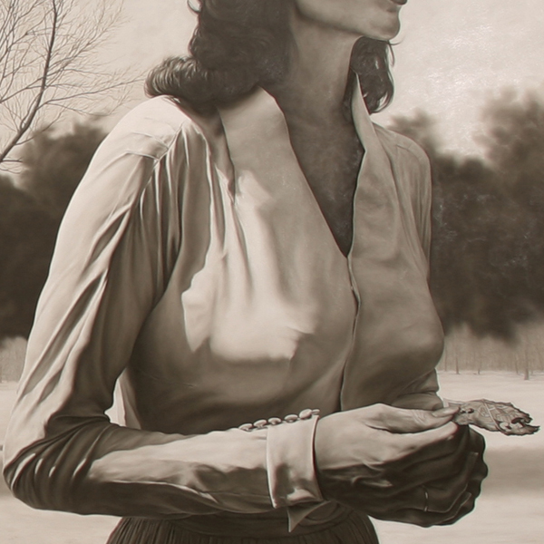
Alison Blickle, Sets Up, 2009, oil on canvas, 80x60 inches
Back by the entrance to the floor I caught sight of the painting by Alison Blickle. Her work, I discovered, is significantly better online, and it's not that good online. In person it's clear Alison has nothing going for her beyond topless self-portraits: She has no control of value and no sense of composition. She lacks the basic ability to put a painting together. She is simply bad, the poor woman's Lisa Yuskavage -- which is pretty crappy considering I thought Yuskavage was herself the poor woman's Yuskavage. Even Cory said, "This looked better from across the room."
Over in the darkened half of the floor, up a short stair, a few videos were playing or in the process of being installed. Against one wall, with ultraviolet bulbs shining down on them, are a few pieces from Jeremy Earhart again, all fluorescent paint on Mylar. They're sort of like the fancy-pants artist version of those blacklight posters metalheads used to put up in their bedrooms. Rock on, dude! Of course I didn't stay for the videos. You know how I feel about those.
I should note now that all the time I was strolling around the top floor, I could see good old Man Bartlett doing his piece, titled "#cleandream". He was stationed in the fifth floor's alcove congruent with the one downstairs I'd thought was a former toilet. I'd joke that putting Man in the toilet is appropriate but...here's the thing. I'm not going to make fun of Man Bartlett any more. I can't promise I won't ever make fun of him again but I'm going to stop for now. At this point I've made my feelings about his work more than clear and there's no reason to go over it again. As much as I don't like what he calls his art, I'd always gotten the impression that he was a decent person, a nice guy; and recently he sent me e-mail and we had a pleasant enough conversation which only reinforced that impression. And as much of a jerk as I may seem to be, I don't want to go out of my way to make fun of a nice guy. We disagree on what qualifies as art -- never mind what qualifies as good art -- but that doesn't mean we have to hate each other.
So all the time I was looking around the top floor, I could see Man in the alcove, talking to people who walked up to his space and sneaking out to pull a bottle of water from a hiding spot and take a swig. I felt I had to go over and say hello, maybe even engage in the performance in some fashion, but I was reluctant to do so because, let's face it, I'd been pretty mean to him. I'd already seen any number of other bloggers, artists, and curators who probably dislike me, including Oly herself -- I'm sure this review will improve things, too, ha ha -- and, again, as much of a jerk as I may seem to be, I don't enjoy being disliked. But that's what happens when you're honest in the world of art: You're going to tell someone that their work is bad, or the work they like is bad, and they're going to get mad at you. So I'd make a line for Man only to have someone else get to him first and then I'd circle around and look at something else for a bit, waiting for him to be free, and once he was free I'd start to amble his way again but then he'd be concentrating on something else so I'd veer off again, and so on.
Another visitor, who'd been friendly to me earlier, had gone up to Man and gotten spritzed with something. Then she stood there a moment before walking away. I asked her what he'd done. "He sprayed me with some floral perfume," she explained. Now I wanted to engage him even less because I hate perfumy things. They bug me.
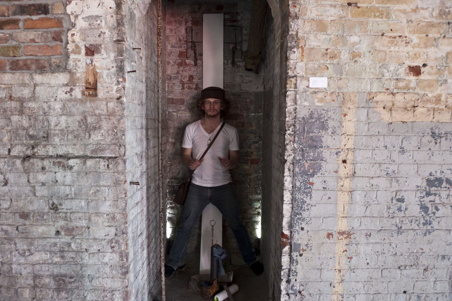
Man Bartlett in situ
Finally, though, I got it together and went right up to him. I expected I'd demur when asked to participate in the actual piece but at least I could talk to him. (All following dialogue approximate.)
"Hello, Man. What's today's performance about?"
He took a moment before he realized who I was, then he smiled and extended his hand. "Good to meet you!" Then he explained his piece: He had collected things left behind as the room had been cleaned and prepared for the show, little bits of metal from the factory days, some rusty pipes, a used paint roller from Oly's team's efforts, a few other bits and pieces one of which looked like a small seashell from where I was standing. (This assemblage is itself titled "cleandream, activated manifestation of objects performed.") He arranged them in the alcove and stood over them, hands in a benedictory pose, and was "activating" them. Visitors, he said, could come to him, think of something that was bothering them which they wanted to forget.
"Like maybe your experience of this performance," he added, smiling.
He'd spray the visitor with flower water and I guess relieve them of their emotional burden or something. "Would you like to try it?"
I admitted that I like looking through detritus like the stuff he'd gathered. When I was young I used to love, as young boys do, roaming through abandoned lots, deserted buildings, and construction sites picking up the stuff left behind and wondering about it. What did it do? What was it a part of? What happened to it? Why was it left here?
So in spite of myself I leaned into the alcove, closed my eyes, and allowed myself to be spritzed. Three pumps. The scent was faint and evaporated almost immediately, lavender and violets, maybe. I didn't think of anything in particular from which to be relieved; I wasn't hoping for redemption, exactly, but I would like to be redeemed.
I thanked Man and he said it was good to meet me and I went on my way.
I'm at a loss as to how to wrap this up. I went through the building twice, once on my own and a second time with Cory. Even with him we went through some areas more than twice. There's a lot to see. Can I recommend coming all the way out to Paterson from New York? Can I recommend you make the escape yourself? I'm not sure. I like the Falls, I like Lou Costello, I like Peruvian food, I like collecting trivia about Paterson. Do I like actually going there? Not really. I only live twenty minutes away and I rarely go there. Is it worth the trip? I'm not sure. If you have nothing else to do and feel up to the drive -- and despite Oly's detailed public transportation directions I do recommend that you drive (parking's only $1.35 an hour and no, I didn't misplace a decimal, it's seriously only one dollar and thirty-five cents per sixty minutes) -- come on out. If you're in New Jersey anyway -- perhaps because you live here, as I do -- come on out. Otherwise, you might rather stay in New York.
[I'd like to thank Jason Varone for letting me use his photos. I wasn't going to use more than one but then I realized I really wanted to illustrate the trip and these were the best photos I could find. Thanks, Jason! I'd also like to thank Cory for hanging out with me and giving me the Paterson-eye view of the show. And also giving me free games on his pinball machine.]
]]>


![Reblog this post [with Zemanta]](http://img.zemanta.com/reblog_e.png?x-id=47d97f49-1225-4c3e-acbf-a2823978e887)
![Reblog this post [with Zemanta]](http://img.zemanta.com/reblog_e.png?x-id=968dc0d5-839b-4090-8a1a-04be22459b14)


-by-Tracy-Helgeson.jpg)
-by-Tracy-Helgeson.jpg)


