I've gone back to ink and pencil lately. I can't explain it; some days I think in painting and some days I think in drawing. I go for stretches of one or the other. If I'm thinking in painting, when I pick up a pen I have no idea what to do with it. I look at a piece of paper and say, "I want a solid blue background with slashes of Van Dyke brown across the bottom," which of course doesn't work if you're holding a Bic ballpoint. And if I'm thinking in drawing, if I pick up a brush with paint on it I try painting strong lines and the paint skips across the surface and the brush leaves this texture and the colors muddy together and I get all angry and sometimes fling things across the room. (One of my earliest memories from school is of drawing a wolf on that incredibly pulpy public school paper. The wolf was perfect. Then I had to color it in using those incredibly nasty public school watercolors and the brush was too wide and I obliterated my beautifully outlined wolf foreleg and I threw a conniption, much to my teacher's chagrin.)
On an especially good day I can mix drawing and painting, but usually I'm working in one or the other system. And lately I've been thinking in drawing and I've been going back to ink, using brushes, pens, and a quill I found sitting, long abandoned, in my paintbrush holder. Which is why my centerfold painting has been sitting there on the easel staring at me reprovingly -- I haven't touched it in weeks.
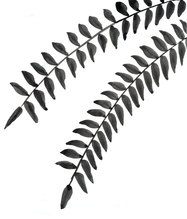 I've also been looking around me and thinking about capturing some of what passes people by. The kinds of things we see every day around here in northern New Jersey and don't pay much attention to. So I did this drawing of locust tree leaves -- there are a lot of locust trees around here -- using brush and ink.
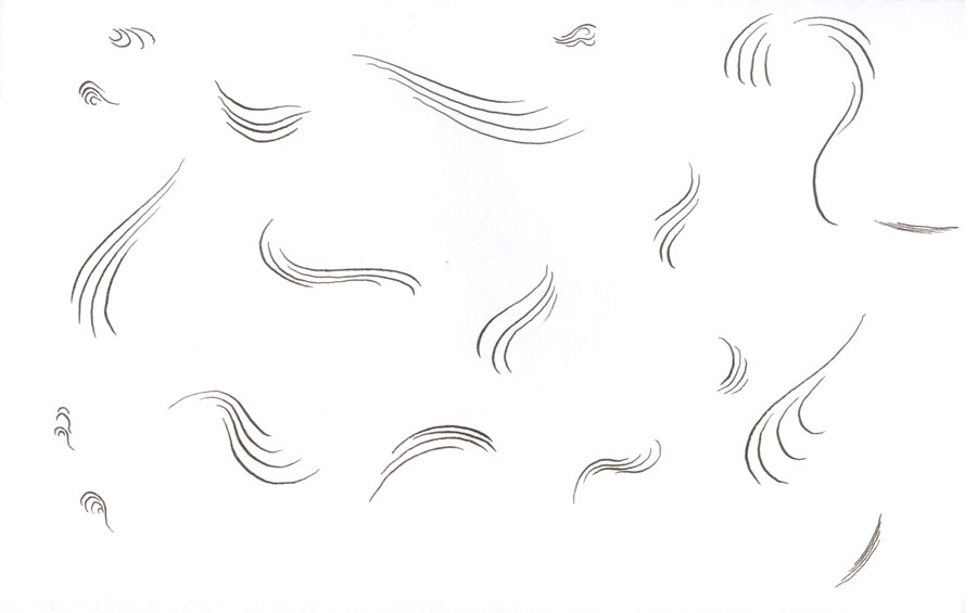
And since I found that quill, I decided to play with it a bit. Thinking of Steven LaRose, I sat down and just began noodling around all over the paper, following the (unfortunately) Sol LeWitt-like rule of lines, curving, grouped in clusters of four. I was just enjoying the way you can vary the line width using a quill, but only very narrowly. I also liked, when I scanned it, that if you look closely enough, the nice tight lines turn out to be scumbly and uncertain.
But quills and brushes aren't very portable. So when I'm out with my little sketchbook, I use felt tips. I hate ballpoints. It seems to be really hard to find good felt tips these days -- I like the older style felt tips which lose their shape a bit as you use them until they've sort of conformed to your stroke style. They can be really pleasant to doodle with, at least until they finally run out of ink. Since I can't find them easily, I instead have been using these very stiff Pilot Razorpoints, which give a good thin black line much like a Rapidograph. But as they run out of ink they get very scratchy, which annoys me. Still, they're okay.
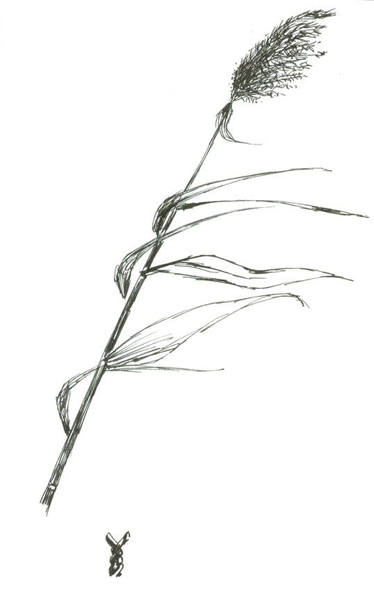 As I said, I've been looking at things we see but don't look at. One of the things northern New Jersey is positively awash in is reeds. They're what gives the Meadowlands its name, even though the acres of reeds don't make much of a meadow. It's more of a marsh. (Remember: Wet ground, short grass, bog; wet ground, tall grass, marsh; wet ground, trees, swamp.) I imagine early explorers from Europe landing on the northern New Jersey shoreline and seeing nothing but marsh and reeds stretching out as far as they can see and thinking, "Crap. How are we supposed to get across this?" Now, of course, we get across it extremely quickly on the New Jersey Turnpike, and we don't see the marsh at all. Or we get across it really, really slowly during rush hour, but then we're singing along with the car radio and not looking out the window anyway. Meanwhile people are draining the marsh and building stupid, ugly, worthless buildings on it as quickly as they can, and I'm thinking, we're going to miss the marsh when it's gone.
 Hardly anyone else seems to think this, though, because all the towns in the area can't hand out building permits fast enough. We won't be happy until we're all within one Phragmites australis of at least four Home Depots, three Stapleses, two T.G.I. Friday'ses, and a Bed Bath and Beyond. Then we can all ignore all the parking lot lights instead of ignoring the reeds.

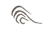
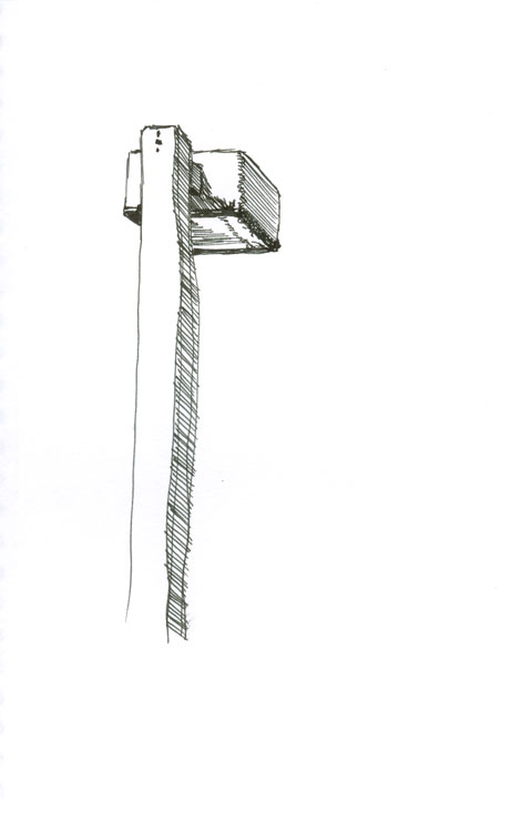
I always scroll down and look at pictures first. When I saw what you called your LeWitt-like rule of lines, I was amazed because I have been looking at marks like this by the illustrator Demi. In her book Buddha Stories she uses these golden lines on an indigo field to conjour water and clouds. Very pretty for a children's book. I'm sure she is quoting some ancient artform. Rather than research it, I plan to do some block prints on gold paint in the coming weeks. Hopefully spinning my own ancient artform. I like being able to see how the locust leaves were created. The transparent ink, although black, gets blacker in places. That is when I consider it painting. It becomes a glaze, one stroke doubling up making a spine to the leaf.I also like the street lamp. Especially how the soft corner of the light box folds from light to shade with a casual zigzag. I never got around to doing a series of fire hydrants like I wanted. They are little creatures that we all ignore. It was a series I wanted to do after returning from a long trip in the South Pacific where everyone seemed to ignore the overgrown tikis in their lives.More Drawing. More Drawing.
Steve, Blogger seems to have eaten your display named and made you Anonymous. But I know who you are.
Doing those curvy lines as gold on indigo sounds nice. I was actually planning (before I read your comment) on doing something similar on a dark color, which turned out to be black because I ran out of Van Dyke brown. Today I got the metallic paints from Gamblin, so I'll be putting up images soon.
The locust leaves were supposed to be solid black, but the ink I'm using isn't as black as I'd like. It's Higgins Eternal Black. It reminds me of a line from Scott McCloud's Making Comics: "Three respondents criticized the alleged watering down of the once-standard Higgins Black Magic ink (Steve Bissette called it "grey swill")...."
You're right that in this case it looks okay. I don't mind it. But I wanted a silhouette, not a painting.
The curious thing about those shades, though, was when I imported the scan into Adobe Illustrator CS2 and used the Auto Trace feature, the program traced it perfectly. I mean, every shade was reproduced as a small area which could be manipulated as a vector outline. It was really incredible.
Fire hydrants are very cool.
When you say "More Drawing," do you mean I should draw more, post more, or you should draw more? Or we should just champion the concept of drawing?
"Yep" to all the drawing questions.
I'm just posting a quicky to see if Blogger has something against me. Did you just switch to beta?
I did just switch to Beta. I'm thinking of switching to Movable Type, but my fooling with that has stalled. So I moved to Beta to see if I don't mind it as much.
Something about the beta switch has turned me "anon" on several blogs. Oh well.