When I went out on September 14, 2006, I was expecting it to be Comic Art Night. I had four artists on my list of shows and three of them were working in a style reminiscent -- possibly redolent -- of comic books. I'm not usually fond of fine artists wandering into comic book territory because, frankly, most fine artists don't have the technical ability to pull off proper comic book illustration. I find Roy Lichtenstein particularly irritating in this regard. But the artists on my list looked pretty good, so I was looking forward to the evening: Nicholas Di Genova, Lindsay Brant, Donald Baechler, and Hope Gangloff.
And what a difference a week makes! I wrote about how crowded and awful it was on Super Thursday, and here only a week later and there was no one at all to be found. Chelsea was nearly deserted. Of course, it's relative: Nearly deserted in Manhattan means there was a jazz trio playing soothing music outside one gallery and only a few hundred people on the sidewalks.
I began at Fredericks Freiser. Actually, I began having to go to the bathroom. Mr. Freiser, alas, does not have a bathroom for the public, so I was forced to leave in search of somewhere more friendly. Freddy: I'll never forget this.
It turned out to be lucky, though. I scurried over to my favorite building, 511 West 25th, and to its list of ample charms I can add that it has easily accessible public restrooms. On my way upstairs I said hello to Valerie McKenzie, which always makes my evening, and then stopped outside of Lyons Wier • Ortt. Fortunately for me a couple was gallery hopping ahead of me and, finding the door locked, knocked on it. I say this is lucky because I never would've knocked. The door was graciously answered by Anna Ortt.
So, happy me, I was able to finally see Mary Henderson's show. And it is fantastic. Mary works from photos she finds online to put together series of paintings linked by theme. This particular show is called Right Clique, which is a painful pun, only forgivable in light of how great the paintings themselves are.
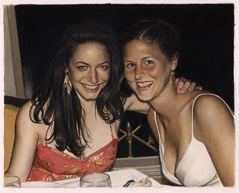 Mary Henderson is a hyperrealist similar to Denis Peterson. But where Denis uses an airbrush, Mary uses traditional brushes with oil paint or gouache. This makes a big difference: The oils fairly glow. I don't want to compare the two painters any further, because I feel that might unfairly hurt both of them, so I won't say any more about Denis.
Because of the color range and density of oil pigments, what might otherwise seem photographic -- especially in online reproductions -- instead becomes luminous, lending these quotidian scenes a bright beauty and timelessness that raises them well above the plane of digital snapshots. When Mary uses gouache her results are more closely photographic due to gouache's matte colors and lack of saturation. These are much more impressive technically than they are purely visually: Gouache is a touchy medium, difficult to work with, and for her to get photorealistic effects using it is an accomplishment indeed.
Which is not to take away from her mastery of oils. Her paintings are small -- the largest one in this show is 14 by 11 inches -- and stunning in their detail. Most paintings dissolve into a morass of lumpy paint when you get closer to them; Mary's paintings just get more and more complex, like she painted each molecule individually.
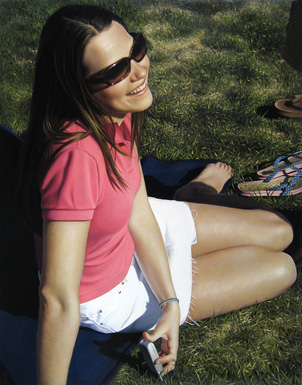 Sometimes the only thing worthwhile about a painting is its technique. Sometimes a painting is good in spite of its technique. In Mary's case, her paintings use technique to convert something which would be boring and pointless -- personal photos of people you don't know doing things you don't care about in places you've never been -- into something almost holy and magical. This is not just a pretty girl sitting in the grass holding her cell phone, which image would be irretrievably uninteresting as a photo unless the girl was my high school sweetheart. This is a young woman suffused in the glow of a beautiful day, captured in a moment of happiness and beauty which belongs to an unreachable past. Somehow, through her intense concentration on the subject, through bringing all of her talent and experience to bear on the execution, Mary has imbued this simple scene with more emotive strength than a thousand photos.
Part of me can't help but wish Mary would tackle some subject more weighty than this pun-worthy show; but when I really think about it, I find I feel she tackled a very weighty subject. More, she took a potentially lightweight subject and gave it weight. Which is really quite incredible, when you think about it: It's something only the very best artists can do.
After thanking Anna for opening the gallery and letting her get back to work, I went upstairs in search of Hope Gangloff at Susan Inglett Gallery. For some reason I couldn't find it, though. Either the gallery was closed or I couldn't even find the front door, I forget which. Whatever happened, I didn't get to see Hope's work.
On my way over to see Donald Baechler I passed Stux where a large opening was, as usual, spilling out into the street. There's a soft spot in my heart for Stefan's gallery; I saw my first Kostabi show there, when Stux was a smaller space on an upper floor. Now it's got a large area on the ground floor, and Stefan hasn't shown anything I was particularly fond of. Still, when I see an opening there I stop in, just in case.
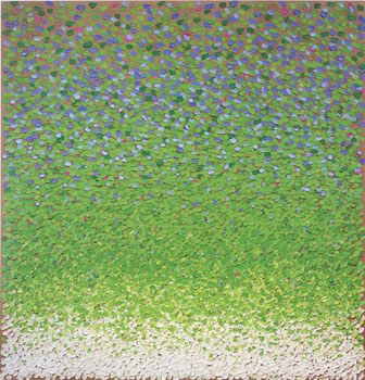 The main area was taken up this time by Kuno Gonschior and his latest, largish paintings. Kuno has painted Seurat dreaming of water. Each painting is just about square, over six feet on a side, and painted with a dashlike series of thick strokes in varying colors. The result is mildly hypnotic, like staring too closely at a Monet. I ended up a little cross-eyed. I got the impression -- if you'll forgive my use of the word -- that Kuno had taken turn of the century French painting and distilled it down to some essence.
Unfortunately, this distilled essence of Impressionism is form without content, color without referent. And if there's anything the Impressionists were about, it was specificity: This place, this color, this atmosphere. Without that specificity, what's left is purely retinal, with no real connection to anything. Kuno's paintings remind me of Seurat, but they also remind me of those cards optometrists use to test colorblindness.
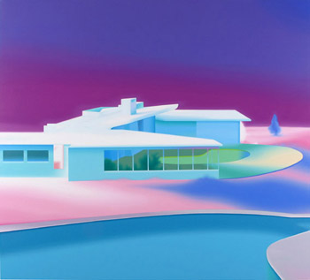 Lurking in the back of Stux I found the works of Darren Wardle. Darren appears to be an old-fashioned airbrush artist, working in hilariously bright acrylics to create a world of architecture straight out of 1985. Those people you see illustrated in large chrome-framed posters in unisex hair salons would look perfectly at home in front of Darren's flamingo-puke buildings.
Okay, so Stefan Stux strikes out with me again. I'll still go back.
 Next I stopped in Cheim & Read to see Donald Baechler's show. Donald has a pleasant enough cartoony thing happening, and he works nice and big so you know that, even though these are cartoons, they're Serious Works of Art. You could definitely drop ten grand on one of these, slap it up behind your leather chair at the head of the boardroom table, and feel like you're so hip you've got a titanium pelvis. You can rest assured you're hip because Donald's paintings are large, expensive, on a ground-floor gallery in Chelsea, and not particularly good. Your underlings will glance at the Baechler on the wall, shake their heads, and stop wondering why they didn't get bonuses this year.
Donald also has a sculpture in this show. It is indescribably worthless. It looks like someone took a Giacometti and force-fed it like a duck at D'Artagnan. Duck -- Donald! Ha! Sorry, that was unintentional. Really.
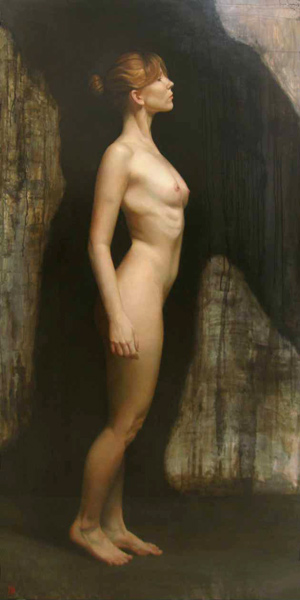 Since I was over at that end of the block and its doors were opened, I went in to Gallery Henoch to see what was happening. The gallery had a group show up with all of their heavy-hitting realists; the ones that really struck me on this visit were David Kassan and Sharon Sprung. I'll have more to say on Sharon later, in the next couple of weeks. David has done something really interesting to me: He's married academic figure painting of a very high level with nearly Abstract Expressionistic backgrounds. The contrast between the two approaches makes his paintings vibrate and gives them a poignant air.
Now, before I go on to the next gallery -- before I start talking about yet another painter with technique to spare -- I have something I want to share with you. I want you to know I'm only telling you this because I respect you and I think you deserve to know. You and I have a special connection, and so I'm willing to tell you things I wouldn't tell anyone else. I want you to keep this to yourself; fold it up and put it in your hip pocket until you get home. Take it out when you get undressed for bed and put it on top of your dresser and leave it there. Only look at it on special occasions when you think of me.
Okay. Are you ready? Come closer. Right there. Let me whisper it in your ear.
I'm a sucker.
There you go. That's it. I'm a sucker. Show me a Dalí-esque academy technique surrealist painting, and I'll fall for it. Throw in oblique -- or, hell, even overt -- references to Lewis Carroll (like Jett Jackson) or Mary Shelley and I'm yours. I know I shouldn't fall for this. But I do. Although I'm striving to be a fine artist, deep down in my breast there beats the unrepentant heart of an illustrator. I can't help it; it's how I'm wired, who I grew up with. I grew up looking at Boris Vallejo, Frank Frazetta, Den Beauvais' covers for Dragon Magazine, D.A. Trampier, H.R. Giger, Rowena Morrill, and Patrick Nagel. I love N.C. Wyeth to pieces and if I could grow up to be either one of the D'Aulaires or the Brothers Hildebrandt, I'd count myself happy.
On one of my earliest trips to Chelsea -- long before I started writing this blog -- I accidentally stumbled upon Interart Gallery on Tenth Avenue between 23rd and 24th Streets. I really liked the artist who was opening that night. Since then I've had to walk past Interart a number of times and every time I've gazed wistfully through its closed door at what was showing. But somehow I just hadn't gone by during an opening. That was until this Thursday, when I happened to find that the gallery was, in fact, having an opening; and, even more amazing, it was for Michael Cheval, the same painter I'd seen on my first visit.
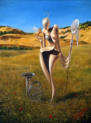 Should I like Michael Cheval? Probably not. Do I like Michael Cheval? Hell yes I do. Michael is the painter I wish I was. No: Michael is twice the painter I wish I was. If I could be half of Michael Cheval, I'd take it home and tell everyone I won the gameshow. Is he really that good? No. He's not. Technically he's superb -- technically he's incredible, almost as good as Dalí at his peak. He's not quite as flawlessly smooth, not quite the total master of his media. But he's better than almost everyone else who's ever picked up a brush. Still, his paintings lack a certain something, the same way Dalí's do. They're brilliant, they're beautiful, they're stunning -- and they're embalmed. Chilly. A little stiff. Not in terms of composition or rendering -- oh no, those would be technical weaknesses, and this work has almost none of those. No -- in terms of pure emotion. Van Gogh was sloppy, a mess, his canvases are little and crowded and sometimes even sort of muddy. But they radiate emotion, they're practically vibrating with feeling. Everything that made Van Gogh who he was is encased in every single brushstroke of his paintings. Not so Dalí and not so Cheval: Their brushstrokes have been drained of passion. Michael is an instrument of exquisite subtlety and grandeur, but he's playing an elementary melody. He's a Father Willis Organ playing Chopsticks .
I have no idea how to resolve this problem. It sometimes seems that the painters with the most rigorous technique are also the most emotionally distant. Look at Goya: It's pretty clear that he wasn't cut out to be a court painter. His portraits are pretty unpleasant. But when he got hold of a powerful idea, he painted the hell out of it. Van Gogh, too, got better the farther away from classical painting he moved. Now consider Lucian Freud. His paintings are devastatingly full of emotional power. But have you gotten up close to one? If you do, you'll see he makes Derain look like Bouguereau.
Speaking of Bouguereau, I love his paintings to some degree; when I look at them, or Rossetti's work, or Cot's The Storm, I'm uplifted the way I might be from looking at a cathedral: I think it's amazing that humans are capable of such feats, especially since most of the time they barely manage to be hairless monkeys. Every time I'm in Florida I make a pilgrimage to the Salvador Dalí Museum to sit in front of some great paintings. But these paintings don't reach down inside me and grab anything. They're amazing, but, like cathedrals, they don't move me.
And, ultimately, I want more out of art.
So I don't know what to tell a painter like Michael Cheval. His paintings are beautiful and they're clearly what he wants to paint but, in the end, I'm a sucker for liking them. They don't tell me anything I don't already know. I'd be thrilled to own one and if I were still in college I'd plaster my dorm room with his posters. Is it wrong of me to ask for more? To ask for more even while I love them?
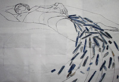 Let's move on to easier things. Like Lindsay Brant at HaswellEdiger. I expected Lindsay to be a kindred spirit: Her art seemed to be about freeing drawings from paper, which is something I've been thinking about lately; and there's an element of sensuality to her work. Unfortunately I was slightly disappointed. Lindsay's art seems half-formed. Most of the pieces appear unfinished. Further, it might seem like she's trying to release her drawings into new media, like free-floating sculptures; but at bottom she's actually making stained glass, and thus really just drawing in an old medium. I like stained glass -- I think it has a lot of potential for fine art and I enjoy it in churches -- but there's a whole side to stained glass that's very plebeian arts-and-crafts. My feeling is stained glass used to be so difficult and expensive that, like carpets and landscape paintings in the living room, when they became cheap and easy the middle class ran out and began buying and making as much as they could. So Lindsay's work gives off, for me, a real A.C. Moore vibe. The fact that the gallery is displaying studies for pieces which are also included in the show, and which don't look like Lindsay is done with them, doesn't help.
Also, there's a feeling that this show is carefully calculated to be transgressive. A woman depicting naked women with Klimt-like fluids pouring from her vagina! Stained glass, traditionally the medium of uptight Catholics, being used to display boobies! Little fails to move me as weakly as when someone tries to be offensive.
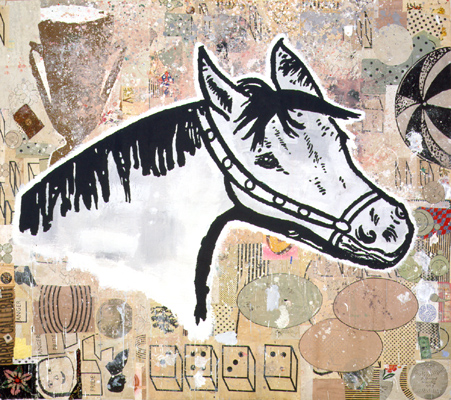
I soon found myself back where I started, at Fredericks Freiser, examining the drawings of Nicholas Di Genova. In fact I got to examine them at a much greater length than I wanted, since New York's Finest, apparently having run out of terrorist plots against the subway, had decided to start handing out tickets for open containers of booze and to this end they set up a temporary command post next to my car. So I couldn't get out without annoying the police, and if there's anything I know from living in New York City, it's don't annoy the police.
You know me by now: I love drawers. I really like pen and ink and if the artist goes to town on detail, so much the better. And in this case Nicholas adds an extra twist by doing these drawings animation style, on the rear of translucent Mylar, along with nice, flat colors and mounted over backgrounds. All in all, this is the kind of show almost guaranteed to please me.
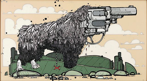 Only I'm not pleased. Part of the problem is Nicholas' subjects, which are these manga/graffiti-inspired mergings of animal and weapons machinery. What are we supposed to make of these? Bionic penguins? Cyber-chickens? Is there some way to give a crap about them? The other part of the problem is sheer scale: Two or three animal-handgun combos might be mildly amusing and intriguing, but the walls of the gallery are fairly plastered with the damned things. After a few minutes of this repetition, I'm ready to dislike anything Nicholas draws just on principle.
And then finally, the trouble is Nicholas Di Genova's drawings remind me of nothing so much as the work of Ed Stastny, who's been putting his drawings online since at least 1993. Ed was one of the pioneers of the Web, running an artists' Website long before almost anyone in the art world -- or the world in general -- had heard of the World Wide Web. To give you an idea of what Ed did, maybe a short history is in order.
Back before there was a World Wide Web, the Internet was almost entirely text-based. Images -- still or moving -- and sound were not entwined in the online experience. Back in those days, everything was done through text-only systems like FTP. To give you an idea of what it was like: Let's say you wanted to do a pastiche of Michelangelo's Birth of Man. You'd have to hope that someone somewhere had scanned in a photo of the fresco from a book -- which would be difficult, since digital color scanners were virtually unknown outside of professional print shops. Then you'd have to go to an FTP site you knew about personally, maybe because someone had sent you the address in an e-mail message or someone had told you about it. On that FTP site you'd have to rummage through directory after directory, guided by the filenames, looking for words like "art" and "sistine_chapel". If you found a file that looked promising, you'd have to download it to your PC -- which could take a couple of hours -- and then view it. It'd probably be the wrong image, and then you'd have to go back to rummaging.
In other words, looking for anything in particular on the Internet back then was like looking for an out-of-print book by going from bookstore to bookstore. It was tedious and unreliable.
All that changed in 1993 when Marc Andreesen and Eric Bina, building on work by Joseph Hardin, Dave Thompson, and of course Tim Berners-Lee, wrote and released NCSA Mosaic, one of the earliest Web browsers. The World Wide Web, and the Hyper-Text Markup Language it supported, suddenly made it possible to include images and text, to connect one page to another, to easily and quickly lay out large quantities of text -- in short, suddenly anyone on the Internet could publish something of nearly the quality of a printed book.
By late 1993, a lot of computer people had jumped into the World Wide Web with both feet. People were putting up all kinds of things depending on what interested them most. My interests were Discordianism and Buckminster Fuller. Philip Greenspun was into writing and photographing a travelogue. Jerry Yang was into categorizing all the Web pages he could find.
And Ed Stastny was into art, artists' communities, and collaboration.
Ed founded the site originally called OTIS (Operative Term Is Stimulate) but then called SITO after the Otis elevator people got mad. SITO's been on the Web since 1993, which is about as old as you can get on the Web, and Ed's work has been part of SITO for that entire time. SITO was a place for people to put up their art -- whatever it might be -- and view other people's art. It was a visual place in the World Wide Web, where anyone could join in and add to the site. It may seem obvious and commonplace these days, but back then, SITO was a great leap forward. SITO really is the forerunner of today's community sites like Flickr and YouTube. It was a burst of originality and vision in a world of text.
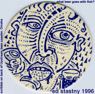 And it all really started with Ed and his drawings. Ed's drawings inspired me to doodle a great deal during staff meetings back then and I still love his style, with its strong lines and tribal-tattoo inflection. What Beer Goes with Fish? is an excellent example of Ed's loose, open, doodly, stream-of-consciousness drawing.
Ed definitely deserves more notice than he's gotten. He's continued to experiment, too, and I find his latest series of work utterly amazing, the kind of idea that seems so obvious when you see it but which you never could have invented on your own. He calls them Composites, which is a deeply unfortunate term, because it's so dry and non-descriptive. I'm not sure what would be better -- time passages? interweavings? tesserisms? -- but look at this and tell me it's not beautiful.
But the pioneers of the Web have been largely relegated to a geeky little niche in the back of the computer museum, if that much. Book publishers, music labels, film studios, the art world, they all arrived on the Web dragging their offline material with them. Pretty soon the artists of SITO -- and Ed -- were overwhelmed by "real" artists with their own Flashy Websites. Ed would probably disagree -- he seems so relentlessly inventive and energetic, I can't imagine him considering anything he's done to be less than a perfect success -- but I can't help but feel we've been cheated because we cheated Ed.
Because now we have this show by Nicholas Di Genova instead of a show by Ed Stastny. Honestly I'd really rather see Ed.
So it wasn't Comic Art Night after all. Which is kind of a shame. Well, I have until January for that.


Nice one. I'm supposed to be cleaning the gutters before the rain hits, so I could only scan these two posts (this one and "Why nude. . ." above). I hope to some day do go on a gallery walk with you.
Nancy Baker told me: "Cut out the self-flagellation schtick." So I'll give it a try right now.Steven, going to galleries with me is just as awesome as you think it'd be.
Ha, you hold a grudge against the gallerist cause he doesn't have a public washroom? Ed Stastky fucking sucks and his work is nothing like that of Degenova's... um, if you are going to make comparisons, at least fucking try... c'mon now.
Hey man, my studio mate just turned me onto this post... Heh, that was him being mad, he's cute like that. Fair play on hating my work of course, but Ed Stastny? I like his work, but I do not understand the comparison.Our work isn't even remotely similiar... Its cool to despise, but the comparison is like eating an orange and being pissed off that its not a bagel with cream cheese.Anyway, just wanted to put in my two cents, but good call on bringing people's attention to Stansky, lots to love there.
Hey, Nick, I didn't say I hated your work. I didn't like your subjects or your repetition in this one show. I think you could be doing some really good things. You've got good technique (you don't need me to tell you that). If you found a more -- I don't want to say serious, exactly -- if you found a better subject and had a show put together by a more discerning gallerist, I think it'd be really excellent.But that's just my opinion, which is worth exactly what you paid for it.And take it from someone who is looking at your work and Ed's from outside: Your work is similar. Not identical, not exact, not the same. Similar. Related. For one thing, I think you're both pulling from the same inspiration, which is animation, anime, manga, graffiti. If you look at a drawing like The Attic you can see the similarities.Of course, Ed's got a lot of wacky stuff up there now, so maybe you're seeing his newer things. I remember when he just had a few line drawings up, and they were a lot more like your work. That's why I said your show reminded me of Ed.There's room for a lot of people in the art world -- it's not an either/or, as in either we get Nicholas Di Genova or Ed Stastny. I'd like to see both of you with shows. But mainly I wanted to draw attention (pun not intended, but I'll leave it in anyway) to Ed, because I really like his stuff.