I've been thinking visually lately. That's not a bad thing; it's great, really. I have a couple of projects I'm working on which may one day see the light of day which seem very exciting to me, and they're occupying my brain. Great!
What that means, though, is I've been putting off writing any reviews. Because the idea of sitting down and cranking out verbiage just isn't enticing to me at the moment. But I've got a couple of things I need to write up before they get stale, and I really did enjoy them a lot, so they deserve their write-ups.
Over there on the left there's a list of links. Some of them point to parts of this little blog bubble I'm sort of part of, where we comment back and forth at each other. Some of them point to resources a lot of people use. And some of them might seem a little out of place, a little random. Those are the links to people who really interest me. It's not enough to be a good artist to get on there; you have to be a good artist I find intriguing for some reason.
One of the names over there is Timothy Mutzel. I found his work online by accident one day, visiting galleries and looking at their upcoming shows. I wrote him e-mail telling him his work looked great and I wanted to be on his mailing list. Tim's also living in Staten Island right now, and since I grew up there, I feel a fondness for its inhabitants, much the way a parolee might feel about his friends from the old cellblock. Tim remembered to let me know when he was opening at CVB Space.
I'm glad he did because his show is worth a visit. Now, I don't know anything about galleries or how they're run, so I wouldn't know a vanity gallery from an artists' co-operative from a public toilet with art hung by the WPA. So I have no idea what CVB Space is in the scheme of things. I do know two things: It's at the downtown edge of the neighborhood which qualifies as Chelsea and it's HUGE. Comparatively. It's very roomy. And Tim has hung his paintings up (or had them hung, or whatever) on every available wall. He's just short of having stuff on the outside walls looking down on 13th Street. So if you see his show, you will get a lot of Tim Mutzel. He even has a couple of paintings hung up behind the gallery counter, which is usually reserved for, at most, one tiny work no one really wants to see that badly.
If you're looking for bang for your gallery-going buck, then, Tim's show at CVB should definitely be on your list. Also, this was the first opening at which honest to goodness cheese was served. Wine and water are standard; if you're lucky, you'll get champagne and cola, maybe some cheap lite beer. I saw mini-pretzels once. And Inka Essenhigh's opening apparently gave away Newcastle, which is amazingly fantastic if you're a beer snob like I am. My non-art-world friends like to ask how my latest wine-and-cheese trip was (and ask me where my black turtleneck and beret are), but I had not seen cheese until Tim's opening. You should support them just for that. Buy a painting when you're there.
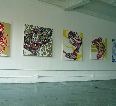 But you're not here for the cheese, are you? No, you want to know about the art. Well, you wouldn't be disappointed. Tim's work is excellent. The big surprise to me was how lumpy his paintings are: The online reproductions look like perfectly flat acrylics, like Tim plans them carefully, tapes them off, and colors in the lines. And he wouldn't be doing anything different from a number of artists if he were. But he's not, and that's the surprise. Tim's paintings are not planned, and in fact are built up from many, many layers of paint, so each area of color develops its own texture, like old plaster walls. His abstract designs are so sharp and dynamic, and the paint layering so organic and soft, that a really intriguing tension spans each painting.
I talked with Tim for a few minutes. Not as long as I wanted because I still had another show to attend after, but a fair bit. He strove valiantly to explain his process. He explained that he might start with something representative, like a skull. Then he pushes it, and pulls it, and thinks about it, and...and then his words get all tangled up, and I can't figure out what he's saying. But that's okay, because he's describing something in words which is best seen as a painting. If the words could explain it, then he'd be a writer. They can't, so he's a painter.
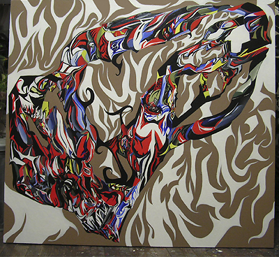 I'm not sure what his paintings are getting at, exactly, but that too is okay. They definitely have an underground, tattoo, hot rod, Big Daddy Roth vibe. "Kicked in the Skull" here reminded me of Robt. Williams, which is bit odd considering there's no really recognizable shape in it. But Tim told me I had the right idea: He'd started with a skull and was thinking of Williams' work when he painted it. So there's a feeling that somewhere, under these paintings, there's a world of evil robots and freakish racers and grinning devils. There's a feeling that all of that's been filtered through an art school and reduced to some kind of abstract essence.
Tim takes a long time with his paintings, too. They take their own time. He builds up layer upon layer, and with no clear plan at the start, he can't tell he's finished until it feels finished. In a way, the paintings tell him when they're done. They take months until they reach that stage. It's kind of funny, because superficially, his paintings are like James Wolanin's, and James works incredibly quickly. I told Tim about James, particularly how James had said, "I need this painting done in a week," and then did it. Tim said he wished he could paint that fast. But he can't: Part of the paintings is simply how long they take.
I had to part with Tim far more quickly than I would have liked, because he was interesting to talk to, and also because I wanted the story of the ancient white-haired guy who followed us around while staring at us the whole time I was there. But I didn't have time; I needed to make it to the School of Visual Arts for their final Open Studios show for the 2006 Summer Residency. I wanted to see Jim Wolanin, of course, and also follow up on the other artists I'd met last time.
I found Jim squirreled away along with the other painters who'd been summer residents for the first session but not for the second. Anyone who was in the second session (or both sessions) was still in their studio space; everyone else had to come back in and hang their work off in some distant corner past the photography people. I skulked past the photography people in the narrow hallway, unsure of whether they'd be jealous or contemptuous of the Canon 300D I'd brought with me. Either way I didn't want to get involved. I would've been willing to look over and perhaps review the photography, but I only had an hour or so and I wanted to make sure I saw everyone I'd seen at the previous open studios.
 I aimed for Jim first. I still think he was the best painter at SVA this summer. Jim had up the two paintings he'd completed while he had the studio space and the last one he finished in time for the show. I'd been watching his steady work on his blog, so I wasn't surprised by the final painting.
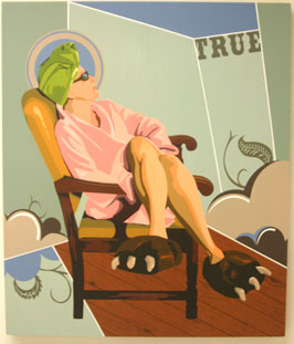
I'm curious about his direction, though. Jim's style makes sense with the war imagery he used to use: His paintings are very flat, very Pop, and Pop of course appropriates the tactics of advertising. Something like a Curtiss Tomahawk in Flying Tiger colors is well suited to this style, because the military and its actions are often sold to civilians using the same tools Madison Avenue uses to sell us cars or soap. The juxtaposition makes intuitive sense.
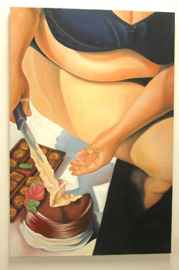
These latest paintings, though, make me ask questions. In "Bear Claws," for example, it seems clear this is a woman on a vacation, even if it's only for a moment. She's just gotten out of the pool, maybe, or the shower. She's got slippers on -- and sunglasses. Who wears sunglasses fresh from the shower? But who wears slippers right out of the pool? Maybe she's trying to enjoy her relaxation in the way she thinks she should. Maybe by making this pedestrian scene into something like a glossy ad, Jim is saying we find ourselves, even in repose, imitating the ways of people in commercials.
Then again, there's an element here of elevation. Relaxing in a chair elevated to the status of a stained glass window. There's a sort of sacred space around the woman; she's got a halo and everything. Heaven is in the quotidian?
I don't have any answers of course. The ambiguity is interesting, actually. It's less gratifying in the short term -- who doesn't like planes and naked women? -- but it may very well be more satisfying to think about.
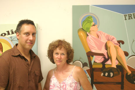 And here's Jim himself along with a woman who should look familiar. Jim has the same trouble I do, which is he keeps using the same model over and over again. But it's not such a bad thing.
Back around the bend I'd passed Apryl McAnerney, so after hanging out with Jim for a bit I went back to see what she had up. I found Apryl nursing a beer in front of a drawing on red paper and said hello. It took us a bit before she worked out who I was and when she finally did she said, "I know you! You pissed me off!" Which is exactly the kind of reaction I love to get. I suppose I pissed her off with my suggestion, the last time I reviewed her work, that she needed to challenge herself more, find more focus. I still think that, although I must admit I liked her drawings a lot better seeing them again than I did the first time.
Let me say, though, that I write the things I do out of love. Sure, there are painters who I can't stand, who I wish would stop painting. But almost as bad are the painters I just don't have an opinion about. They're hard to write up. What can I say if the work isn't bad, but just doesn't seem good to me? I can't say anything.
But if the work has potential, if I think there's a chance for the artist to be really good, if they've got technique, if I like what I see but think there's room for improvement -- well, that's a good thing. I offer my comments as constructive criticism. Not that I think I've got some great insights on how to be a successful artist; all I have are my opinions, and they're not worth a whole lot, really. But they're what I have. So I put down my comments and you can do what you want with them. But keep in mind, if I'm critical, it's because I love art, and I love the art world, and I want to see everyone be as good as they can be. It's not because I don't like you.
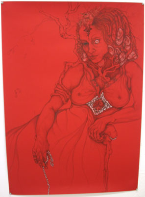 That said, let's look again at Apryl's work. I still love her attention to detail and her willingness to follow a drawing into whatever weird territory it wanders. I really think this piece on red paper is very good. The contrast of the paper and the pencil is excellent, and the addition of the white gives it a real life. Also, I think the subject is better; as much as I joke about drawings and paintings of topless chicks, they're not really always the best subjects. And while this woman is on the topless side, the drawing doesn't feel sexy to me. It just feels human. I wish I'd gotten a better photo of this drawing so you could really see the texture and shading, which is wonderful.
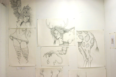 Meanwhile this drawing, Apryl claims, is unchanged from when I saw it last; still I don't remember that woman having giraffe hindquarters. How did I miss it? I really like getting the chance to see a given artwork more than once; I always see more on later viewings. Too often my reviews are hit-and-run. So she's got a giraffe butt. The delicacy of the pencil work is again totally lost in my lousy photo, but it's really amazing.
Apryl and I did talk some more after she realized who I was. She spent most of the time, actually, telling me how great the artist on the wall opposite her was. She was an artist from Europe -- Turkey, I think, maybe -- who came to New York for the SVA and spent almost no time in her studio. Apryl said she hardly ever saw her, and she was always out collecting random knick-knacks and tchotchkes from around the city. Then, out of nowhere, for the open studios she put up photos of these items, arranged on patterned scarves, with notes in marker labeling each item as some member of her family ("husband," "mother-in-law," "uncle"). Apryl was very emphatic that if I was going to write about anyone, I should be writing about this woman. Sadly, her work didn't excite me as much as it excited Apryl, so I didn't note her name or take any photos or anything. You can just see the tiny photo on the right side of the image of Apryl's drawing.
I actually think Apryl has the capacity to be a much better artist than that arranger/photographer. I think Apryl can be an artist with a much more engaged audience, an artist who can really grab people and tell them something. She's got a style which can appeal strongly to a particular segment of the population. She can have a niche. What I would like to see is Apryl expanding beyond that niche by focusing herself more, maybe engaging a little more of her left brain. She needs to be challenged, that's what I think. She's already shown she can do what she does. She needs to get herself some goals that are beyond what she can do.
Nearby I found Rachel Dalnekoff's work again, but I couldn't get a photo of her two paintings. Once more I missed her, too. Which is a shame. Well, I was late and the studios were beastly hot -- you know it's hot when it's a hundred degrees outside and an open window lets in a breeze that feels cool. I mean, I saw a woman who had sweated through her dress. You see men sweating through their shirts all the time, because men sweat -- especially me, I sweat unbelievably, I'm a big fat hairy sweaty guy and I sometimes worry I smell funny, too -- but to see a woman sweat through her dress, it's got to be beastly hot. So if Rachel wasn't around I can't blame her at all. Anyway, because I feel bad I missed her, go look at this painting and tell me I should have hired her to work on my painting for me.
On my way downstairs I found a small table with soda and one clean plastic cup along with several used ones. The ice, a helpful woman told me, was going fast, and she dipped her hand in the half-melted bowl to pull out a few remaining shards. I rehydrated myself with some Coke and took the stairs down two flights to the equally sweltering fourth floor, where the studios were still set up.
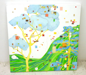 The first person I encountered on this floor was Leigh Ann Davis, who seemed thrilled to see me and eager to explain what she was doing and why. I was immediately drawn to the first painting I'm showing here, but she sort of steered the conversation away from it, saying it was unfinished and old and anyway not what she was doing now. I like it, though. It's like some landscape out of Yellow Submarine. I like how Leigh Ann's oils look like watercolors.
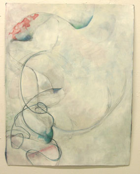 But her more recent work looks like the second image here. She had a fair number of similar paintings hanging. It's hard to tell from my photo -- the lighting is just terrible for photography in SVA -- but she's painted on fabric. Leigh Ann told me how she'd gesso over fabric like canvas or whatever she had handy to paint on top of it, but she'd decided maybe she wanted to fabric to show through more, so, being a short distance from New York City's garment district, she went out and bought a bunch of pieces of patterned fabric and began to paint on those. There's a very subtle effect of the pattern showing through Leigh Ann's paints; in places she's reinforced the patterns, in others obscured them. For the purposes of this show she left kind of ragged edges of the original fabric hanging out -- you can see a bit on the lower left of this photo. She seemed unsure of whether she was going to straighten those out or leave them as is.
I think what Leigh Ann is doing is mildly interesting, but honestly, I think her colors are kind of depressed. All of her latest paintings use this greyish palette, with subdued reds and blues here and there. The lack of vibrancy feels draining. Leigh Ann didn't seem depressed or down when we spoke; in fact, she seemed really excited by this new direction of hers. But -- and maybe this is because I'm a philistine -- I prefer her bright colors. This series is too quiet, brooding. A little dull. I think I like it better when Leigh Ann is playing Georgia O'Keeffe as Abstract Expressionist or psychedelic animation background artist.
 Next door to Leigh Ann, right where she was last time, I found Samantha Hahn. This is now the finished painting I photographed in June. I still think it's the best painting showing in her studio; in terms of technique and composition it's really much better than anything else I saw from her. If this is an idea of the direction in which Samantha's going, we should be seeing some really good work from her in the future.
While wandering around I saw some work from the second residency I hadn't seen back in June. As I was quickly moving down one aisle up the next I was suddenly struck by a big studio installation. The whole thing was so striking I had to get a decent photo of it and find the artist.
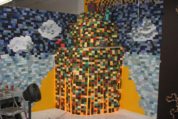 Cathleen Cueto helpfully had written her name and contact information on a pile of paint chips, which is another wonderful use for the things. But what made me stop was this installation -- I must admit I forgot to write down the title -- which is made up of little rectangles of colored fabric. A curtain of them hung down around a small lamp and it swayed in the slight breeze of a fan moving the heavy air around. The whole installation seemed quietly alive, brightly colored, and simply arresting in its simplicity. You can just make out Cathleen's second installation in the lower right hand corner of the photo; she glued hundreds of wine corks into a path winding around the walls and floor. It was whimsical but not nearly as interesting as the fabric swatches, which just stopped me dead in my tracks.
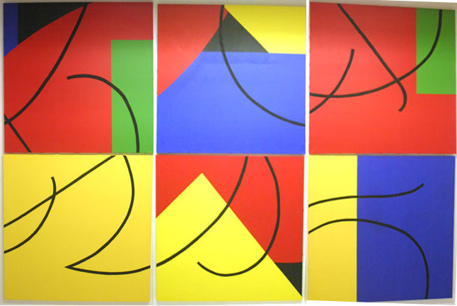 Finally near the door and the elevators, I found Jennifer Kincaid and her work, titled 6!46. Jennifer and her husband were there, just about to leave, and they quickly explained that Jennifer has her own gallery in California and is apparently quite successful. The SVA residency was her way of getting a start in New York City, and she had a great time gallery-hopping and meeting the other artists at SVA.
As for her work here, the mathematical among you will already know what she's doing from the title, while for those of you who missed the classes on probability & statistics, I'll explain. 6! (pronounced "six factorial") is the number of ways of arranging 6 items in a line, and it's defined as 6 times 5 times 4 times...down to one. You see, you can choose any one of six items for the first spot, then one of five for the second, and then -- well, if you don't get it by now you're not going to and probably don't care. 46 is four to the sixth power, meaning 4 times 4 times 4...until you have six fours. That's because each painting can be rotated (they're square) four ways. And there are six paintings. So 46. Multiply 6! and 46 and you get the total number of possible arrangements of Jennifer's paintings, which is 2949120. Jennifer's idea is to present a different arrangement each time the paintings are set up, and keep photos of each arrangement, and put them up next to the paintings. So in theory each time you see the work it's different, but the same.
And now that I've burned out the brains of most of the art people reading this, the rest of us can talk about the actual paintings. They're good. Bright and bold. Not the most captivating paintings of all time, but they're big and comfortable. Without the conceit of the permutations, I'm not sure they'd be all that exciting; with the permutations, they're neat. And I like feeling smart for knowing enough math to understand the title, so it's sort of a little pat on the back.
And that was the SVA Open Studios. I missed Karina Contreras; by the time I got to her space, the lights were out and everything. What a shame. It looked like she expanded the previous installation and it would have been great to see her and discuss it, not to mention photograph it for posterity.
In case you were wondering, the Gay Porn Painter had toned his studio down for this show; his paintings weren't any better than last time, but he gave it a shot. I hope he does well. Everyone deserves to be successful, right?
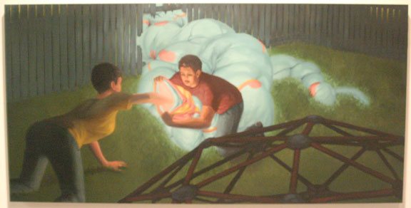
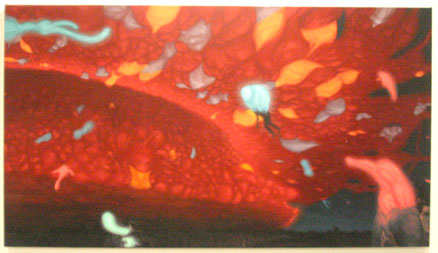 One final note. I have to apologize for being a lousy journalist and reviewer. I took photos of two really excellent, albeit weird, paintings, and I neglected to get the artist's name, the titles of the paintings, or any other useful information. I'm a bad person. I'm going to put the photos I took here and if anyone can tell me who they're from, I'd really appreciate it. But, check it out, they're really good. My photos are terrible, but let me tell you, the colors are fantastic, the compositions are dynamic. And there's a geodesic in one, and you can't go wrong with that. What strange energy beast has invaded suburbia and why are the kids messing with it? What bizarre manifestation is pulsating over the forest at night and sucking up people? Who can tell? It's such a great nightmare, though.
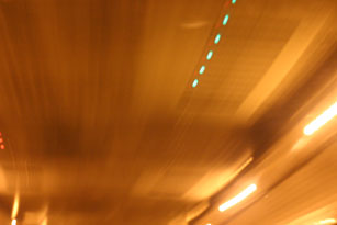
 Finally, from the I'm a Loner Dottie a Rebel Department: You know those signs reading CAMERA USE PROHIBITED posted up in front of major New York City traffic funnels like the Holland Tunnel and the George Washington Bridge? Well, to show you I'm no fascist-loving bootlicker, that I have the backbone of an artist and a wild man, here are my photos taken inside the Lincoln Tunnel. Take that, pigs! Okay, I was driving at the time, so I didn't exactly get anything in focus. But it's the thought that counts.

