Julie Evans, that fantastic artist -- I think she's my current favorite, but you know me, I change all the time -- Julie wrote to me (and everyone else on her mailing list) to let me know she had a couple of pieces in the group summer show at McKenzie Fine Art (until, good lord, August 7, 2009). I therefore made it a point to be in Chelsea for the opening on June 18.
22 artists on the walls and a good crowd: That's Valerie's place. As I went around I saw a few artists I've reviewed in the past -- Eric Heist, Ken Weaver, Julie Allen. There were a number of artists I didn't know, too. Rather than run down the list of everyone in the show, I'm going to note the works that struck me as especially interesting.
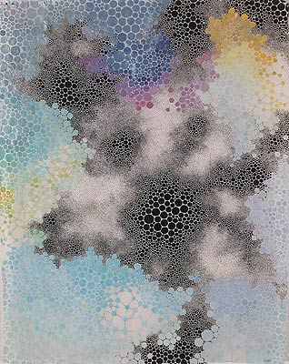
Julie Evans, Umbilcumdom, 2008, acrylic and gouache on paper, 11.5x10 inches
Julie Evans' work is, of course, the standout. I find, doing my usual research for writing this up, that I've seen one of the pieces before, but this one I've pictured here is new to me, I think. Hard to say with abstracts, and anyway Julie's been working in this sort of series, all similar, for a couple of years. What I liked especially about this one is the sinuous olive green line snaking its way around the spreading watercolor. She has such a sure touch that it looks as if it went down in one stroke, with edges ever so slightly sfumato, merging perfectly with the surface. Nothing she does looks painted on; it all looks organically related, whether carefully planned or allowed to run its own random course. This is the level of abstract mastery that can only come from many years of practice and experimentation, and yet it all floats so lightly there, as if it just happened.
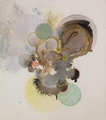
Karen Margolis, Dvitva, 2009, watercolor, gouache and graphite on abaca paper, 14x11 inches
More organic and less controlled -- more loose -- is the work of Karen Margolis. Her two small paintings (or drawings, whichever -- they straddle that line) are lovely little cloudbursts of subtle pastel color and fiddly detail, working up from tiny circles to larger ones in a cellular kaleidoscope. Smoky, cloudy, evocative, over fibrous, translucent abaca paper, altogether each painting flowers into a pleasant space.
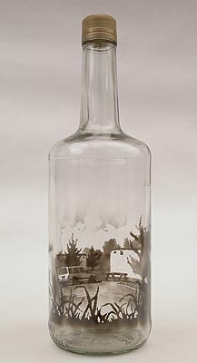
Jim Dingilian, The Pines, 2009, smoke in empty glass bottle, 11.5x4 inches
It wouldn't be a trip to McKenzie Fine Art without some unclassifiable object presenting itself. This time there are two from Jim Dingilian. It looks like he burns a candle inside a bottle, coating the sides with soot. Then he somehow scratches into the soot to create a drawing around the inside of the glass. The result is intriguing. I can't tell how I feel about it as art. Certainly it makes a conversation piece and a curiosity, and maybe that's good enough.
The rest of the show didn't strike me as strongly as the three artists I mentioned here, but I do think the show as a whole is worth seeing.
Across the street from there is Lennon, Weinberg showing Cindy Workman's the women. (yes, the period is part of the title). Beware of shows with their own punctuation, especially if they have their own ideas about capitalization. Instead of being titled that way, they should just be called "Pretentious" and left at that. Truth in advertising, don't you know. (An aside: It says something, to me anyway, when a gallery can come up with a highfalutin title for a show like "the women." but doesn't have an employee smart enough to know how to spell Plexiglas in the work descriptions. To say nothing of including the damned frame in the media.)
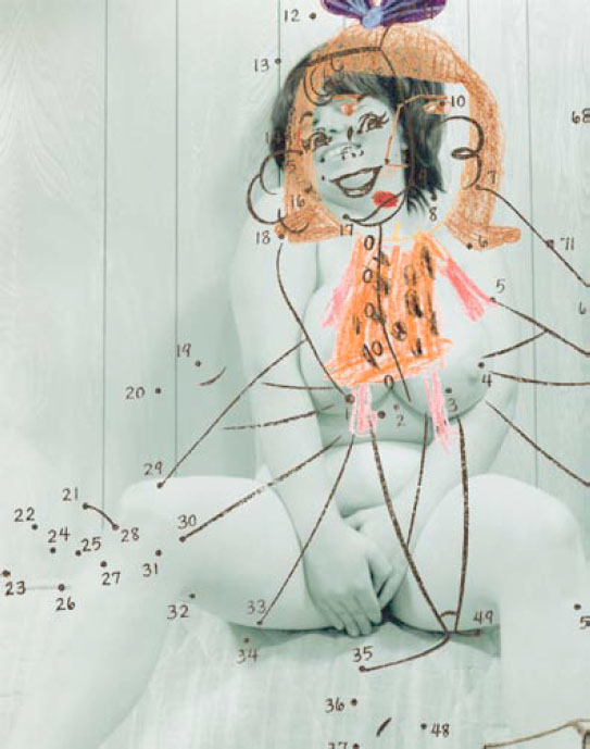
Cindy Workman, Pebbles, 2003, unique digital print, Plexiglas and frame, 51x40.25 inches
And, oh, is Cindy Workman's show pretentious. Here are Cindy's own words from the gallery verbiage: "These composite images invite the viewer to perceive many roles at once. While addressing the complexity of today’s female self they invite the observer to process and examine this new model, continuing art's long tradition of shifting universal perceptions and prevailing standards." Inviting, addressing, continuing, shifting, prevailing. How wonderfully droll, considering her paintings all consist of heavy-handed juxtapositions of portrayals of women: Big boobs plus Pebbles Flintstone! Porn plus '50s-style commercial illustration! Young girl plus naked woman plus mathematical diagrams! A blowjob superimposed with a child's drawing! Lipstick lesbians and, um, the Lone Ranger!
Strip out the verbiage, ignore the ham-fisted social commentary and approach the paintings as visual objects: They're okay. They're mildly interesting to the eye. Cindy combines bold, simple compositions with solid color schemes; they're not boring. It's just unoriginal Pop, basically harmless fooling around coupled to good decorative sense. Hip wallpaper for the new bourgeoisie; thought-provoking transgression for those whose intellection involves deciding from which local cafe to buy overpriced coffee and whose idea of revolution is crossing when the sign says DONT WALK.
But maybe this summer is the time for yawnprop, propaganda that puts viewers to sleep with the laziness of its oft-repeated slogans. That would explain why Cindy's lamely obvious feminism slipped into a ground-floor gallery at the same time that Cedric Smith's lamely obvious explorations of blacks in early 20th century America showed up at Dillon Gallery.
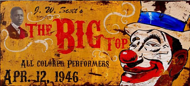
Cedric Smith, The Big Top, 2008, mixed media on canvas, 36x80 inches
Like Cindy, Cedric has a thing for Pop, but unlike her, he's not interested in creating a shiny, plastic, antiseptic surface; instead, like a painter of stage flats, he'd rather throw up some faux finishes to fashion trompe l'oeil antique signs. This gives the gallery the feel of an upscale Houlihan's or T.G.I. Friday's with its vintage advertising hanging around. Only the necessary art world twist differentiates these: Cedric has interposed old photos of black people into signage where they would not have been welcome originally. So we have an ad for the New York Times with a black newsboy, farm produce come-ons with cherubic black babies, and even part of an ad for Coca-Cola with a black child dressed as a jockey on a rocking horse.
Certainly Cedric is skilled in the technique department: I had to get up close to the work to see it was not, in fact, weathered, painted wood. He sure can turn canvas into old planking with the best of them. But the illusion aside, these just aren't very interesting in any way. Their only reason for existing is the conceptual underpinning, and frankly, it's so obvious and weak I can't imagine caring. Yes, black people drank Coke but weren't shown in ads. Yes, there were circuses with all-colored troupes. And? I don't believe it's a worthwhile goal for art to make viewers think, but if that's going to be your goal, you ought to at least make them really think. Or save everyone some trouble and just make one sign reading, "YOU KNOW WHAT'S BAD? RACISM!"
Anyway, I was only joking about the summer; it's not the season for yawnprop, it's the season for group shows. Although some group shows are more coherent than others. Sometimes a group show really just looks like a dealer emptying their closets. Such is the case with Low Blow: And Other Species of Confusion at Stux Gallery. Even the title lets you know there's no real connection between these works, aside from Stefan Stux still having them cluttering up his back room.
Which is not necessarily meant to insult to the art on display. Even the most doggedly random show can consist of good art. But, sadly, not this one. Most of the art in the show is dopey (Tom Sanford), weird (Benji Whalen), or both (Don Porcella). The front of the gallery is taken up by an installation that qualifies as dopey, weird, ugly, and incompetent all at once: Kristen Schiele's Burn for My Love, a pile of poorly made dollhouse-sized junk -- decorated with bits cut from magazines or photos or something -- and a wall-sized abomination possessed of not a single redeeming quality.
I usually respect Stefan's choices even if I don't actually like them; usually I can see how someone might like the art he shows, even if that someone isn't me. Not this time.
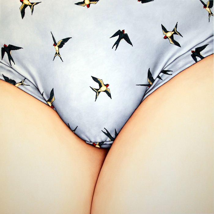
Ashley Hope, The Downes Effect: Swallows, 2008, gouache on paper, 48x48 inches
Two pieces did catch my eye in a good way, though. First was Ashley Hope, whose work I had yet to see. I'd been hoping to find some one day since seeing her work online in Jack Tilton's "School Days" show. This particular work shows her sure hand with gouache: It's not an easy medium to work in, and yet somehow she manages to work up a really large piece and keep the tones perfectly smooth across a relatively vast expanse of paper. It's remarkable. Her pigments glow, her composition is excellent, and, well, as a whole it's just mildly disturbing. Very nice.
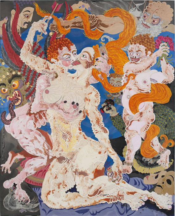
Aaron Johnson, The Exposure of Luxury, 2009, acrylic on polyester knit mesh, 75x60.5 inches
I also liked -- but didn't totally love -- Aaron Johnson's work. It's ridiculously energetic, practically vibrating off the...whatever it's made out of. The media description says "polyester knit mesh" but that doesn't really communicate how alien the material of this piece is: Some of it looks like animation cels laid over canvas, some of it looks like acrylic paint, some of it looks like plastic. The layers don't all lay quite flat, or they don't seem to. Even up close I was kind of baffled by the whole thing. And the content, as you can see, combines Chinese and maybe some southeast Asian and Indian motifs into a phantasmagorical scene of sex and violence with a dash of Dalí. The beast doesn't quite hang together -- something just doesn't click overall -- but there are things about it I like, and certainly I've never seen anything similar.
I should probably also mention Barnaby Whitfield's pastel which is technically magnificent but which is otherwise so horrendously hideous, wacky, and nauseating I can't even bear to think about it for too long. On the plus side, it contains penises.
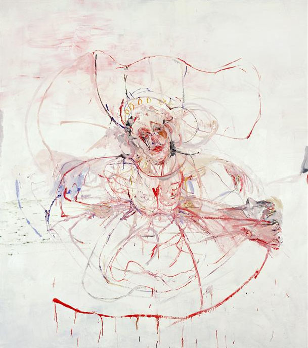
Judy Glantzman, ANGEL, 2000, oil on canvas, 90x80 inches
Finally, on my way home I saw an open door and went in. I was rewarded for my efforts with some of the most unappealing paintings I've seen in a long time, all under the name Judy Glantzman. Betty Cuningham, alas, is showing three years of Judy's work in The White Paintings, 1999-2001. Imagine for a moment that Willem de Kooning and Francis Bacon's love child suffered from epilepsy and some evil nurse stuck a paintbrush in their hand at the start of each seizure. Those paintings would be about half as vile as the ones I accidentally saw.
Also, Judy has drawings up. They're bad, too.
Interestingly, while performing my usual due diligence on this review, I found I unfavorably reviewed Judy's work almost exactly three years ago. What I saw then -- which was newer than the work in this show -- was so completely different I didn't even realize it was from the same painter. Those paintings were significantly less terrible. Still very bad, though. At this rate Judy will become only the world's third worst artist in approximately 3.5 eons. Watch your back, Marlene Dumas!