Things have been pretty quiet around here, not because there are no openings to attend or because the art world's shut down. No, things have been quiet because I've been lying around the house doing absolutely nothing. Because I'm a bad person.
But this week I got up and got out. Saturday 24 June I had an appointment in Manhattan for which I was early, so I squeezed in a couple of quick gallery visits to kill time. Then the following Tuesday and Wednesday some friends from Florida were in the area so my family and I spent some time pretending to be tourists along with them. I don't know which I found more depressingly ironic: the fact that you now have to go through two metal detectors and a gas detector (and god help you if you bring along a pocketknife) to visit the Statue of Liberty; or that the current Bergdorf Goodman window displays are homages to/rip-offs/pastiches of the Dada show at MoMA.
Then on Thursday my sister brought my mother and nephew into town from Virginia Beach just as I was heading out to the SVA Open Studios for the summer residency occupied by, among others, Jim Wolanin. So I dragged her along for the ride.
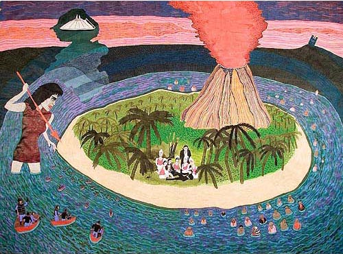 Back to Saturday: It was pouring rain and I had at least thirty minutes before my meeting, so I ducked into some galleries along 27th Street to keep dry and see if there was anything interesting going on. I started in Derek Eller where I found a strange fantasy world in which 1980s recording artist Adam Ant and actor Bela Lugosi are menaced by zombies, giant spear-wielding women, and the gorillas from the Planet of the Apes.
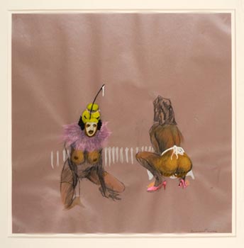
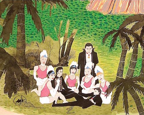 I had found myself in the bizarre world of Beatriz Monteavaro's drawings. Sometimes I enter a show and immediately feel I'm in the presence of an artist. Sometimes I enter a show and immediately feel I'm in the presence of a person who is in dire need of psychiatric help. This was one of those latter times. Beatriz's drawings are not technically proficient enough to make me think they're intentionally insane -- like the drawings of Henry Darger, they simply appear to be the graphic ravings of a lunatic. That doesn't make them bad, per se, just unsettling to the degree that I think Beatriz doesn't need gallery representation, she needs prescription medicine.
Well, maybe not. She's not quite that far gone, perhaps. But Adam Ant? He figures prominently in many of the drawings. Also zombies. I must admit -- despite my general ambivalence regarding drawing and my strong position on both zombies and Adam Ant -- the large works are quite striking. They made me a little dizzy, although possibly just because of their enormousness.
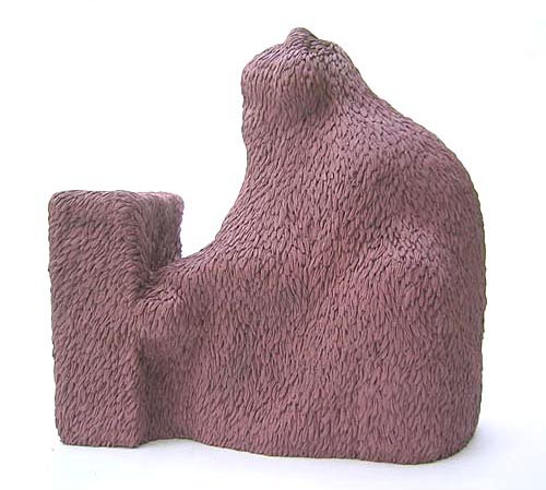 In the room behind the drawings are some smallish sculptures by Carl D'Alvia. These were kind of neat: Little things which look like they've been covered with fur. The objects underneath are hinted at, although not entirely explained, by the titles of each. This one pictured here is called "The Piano" and it looks like someone playing a small piano under a hairy throw rug. Obtuse doesn't even begin to describe these sculptures, but they are wonderfully tactile -- I was the closest I've ever been to touching a work of art when I saw these.
After chatting up the gallerina I went next door to Clementine Gallery which is showing James Franklin and Zoë Charlton.
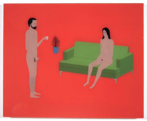 James Benjamin Franklin's small paintings are inviting and distancing at the same time. They remind me of gouache paintings with how flat the colors are, and no wonder: When I got home and looked it up, I found James' medium isn't flashe but Flashe©, which is an acrylic paint apparently designed to be a drop-in replacement for gouache. Over very blunt, detailed, affectless, staid paintings, James layers a shiny coat of plastic resin, which makes each one look like a piece of candy you just want to lick.
The level of detail of each figure is fantastic: Arm hair and pubic hair is made up of nearly microscopic brushstrokes. But there isn't a shadow to be seen on any of these lifeless cut-outs. Perspective is minimal. People are naked but not sexual -- even the man grasping his erect penis is casually holding a cup of coffee in his other hand. A lack of passion rules in these little worlds. A man appears ready to fuck a woman from behind, but his cock is flaccid and they both have blank looks. A couple floats aimlessly in a sterile pool while their undergarments lie listlessly near them. A man in his underwear is nearly submerged in the water, completely inert.
Altogether the show exudes calm, but it's not a comfortable calm. This is the calm of deadness, of being overly medicated, of somnolence. It's numb: Cool and deadly, like a bathtub full of ice on a winter's eve.
 Meanwhile Zoë Charlton can't hold her own in this show. Where James' paintings are artful and subtle, Zoë's drawings are obvious and scratchy. Her work reminds me of what I've seen from Kara Walker, and it has the same propensity for setting my teeth on edge. Black women in Klansman hoods! Gold leaf afros! Negro twat! I assume I'm supposed to be offended by the imagery, or the juxtapositions, or something like that, but instead I feel talked down to, like I'm supposed to be a naughty white child who should apologize for being racist. Only I'm not, and I won't. If the draftsmanship were impressive I could at least feel I'm being treated as an equal; instead, it's like being lectured on grammar by someone using run-on sentences.
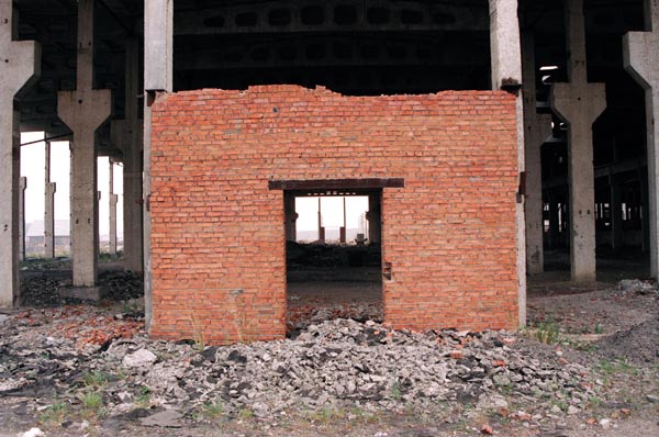 Finally I visited Plus Ultra Gallery to see the latest work from Gulnara Kasmalieva and Muratbek Djumaliev. Ed Winkleman and his small army of assistants (it wouldn't surprise me to hear he did all the work with his partner Murat) have rebuilt Plus Ultra's space into a small gallery of photos and large video room painted black where Kasmalieva & Djumaliev have a short film, Into the Future, looping over and over. Ed has a knack for finding things that leave me wondering "But is it art?" Usually, where video is concerned, my answer is "No fucking way." I often do wish we could all just get together and admit that video isn't art.
That said, I'm not going to say that what's on display at Plus Ultra really isn't art, because I'm not sure. It is certainly interesting. I found it especially intriguing because Kasmalieva & Djumaliev are documenting the vast industrial wastelands of Siberia and they look shockingly like the vast industrial wastelands of northern New Jersey. So I appreciate their video and its accompanying photos as a meditation on destruction, desolation, heedlessness, greed, and hubris. The video splits its screen between slowly panning across, up, and down a deserted landscape of wreckage and footage of people embarking on a rusty old ferry boat. At times the two motions of the separate cameras create a queasy feeling neither shot evokes individually, and that's as disquieting as it is neat.
As usual I'm unsure of whether the feelings evoked by this show qualify it as art or just, you know, documentary. I'm not fully comfortable with leaving the question open, but I also can't answer it, so I guess I have to accept that it simply is what it is, it evokes what it evokes, and it's worth going to see. I often find myself asking "But is it art?" Really, I rarely need to know.
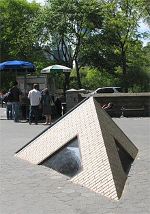 Sometimes it's obviously art and just plain fun. So it is with Sarah Sze's public sculpture, which I bumped into while touristing at 60th Street and Fifth Avenue. I happen to love that neighborhood; I know people who get hives just thinking of travelling that far uptown, but when I worked in an office nearby my affection grew hugely for the area. You've got to feel something for a place where the lunch counters, instead of having signed photos of celebrities on the wall, have signed photos of Ford models reading "Thanks for ruining my diet!"
I also love public art. New Yorkers are supposedly jaded, but I think they're as curious as anyone else, and anything which makes them pause in the middle of their day and think about something different for a change is a great thing, if you ask me. From Arturo Di Modica's bronze bull with the gigantic testicles to de Creeft's Alice, and back down to J. Seward Johnson's Double Check guy, who never once even glanced over his shoulder on September 11, 2001, I love public art.
Sarah Sze's Corner Plot continues in this tradition, engaging the public in a way most artists can only dream of. It's unfortunate that this piece is temporary; I can only hope it finds a good home somewhere out where people can see it. Passersby stop and stare at it as they walk by, trying to figure out if it's a building sinking into the street or erupting out of those hexagonal NYC park pavers. They peer in the windows trying to make sense of the jumble of objects inside. They touch it to make sure it's real. Most of all, they smile at it, or just shake their heads: Those crazy artists. And how great is that?
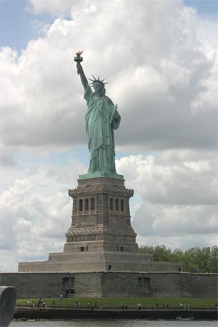 Being a tourist doesn't usually mean seeing a lot of good art, but I'm going to include a photo of the Statue of Liberty here, because the old girl is great art. I never get tired of looking at her, even after going past her twice every school day for three years. So few artists of any age think as grand as Bartholdi and Eiffel did, and of those that do, even fewer ever complete anything. Who's doing anything like this today?
Alas, you can no longer go up inside the statue. It might be worth getting a job with the Parks Department just so you can visit the now-closed areas when no one's looking.
This brings us to Thursday, 29 June, when my sister found me about to drive out to Manhattan for the School of Visual Arts Summer Residency Informal Open Studio Tour and So Forth Starring James Wolanin and Some Other People. Before we got there, though, we made a quick stop at Ricco Maresca to see their new opening, Dreamland: Coney Island 1905-1925. I was hoping to bump into Gerald Slota, who is, I think, represented by the gallery, but I didn't see him there.
I was expecting this show to be one of those ironic twists on Coney Island, you know, the now-clichéd view of carnivals as places of dark, unconscious desires filled with demonic avatars of unspoken perversion and so forth and so on. You're familiar: Dimly lit fantasies informed by too much Ray Bradbury and Twilight Zone, involving far more tattoos and fishnet than anyone really should get involved with. Blah blah blah, I'm fed up with that crap.
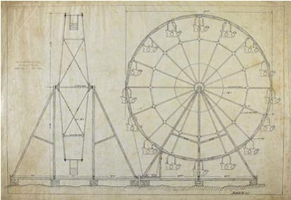 So I was surprised to find that Dreamland is, in fact, a straight ahead no nonsense display of engineering drawings and photos of Coney Island in its heyday, before we got all cynical Rob Zombie about it. In fact I spent a little too much time looking for the subtext, the entirety of which was embodied by a couple of tattooed people with wild hair smoking home-rolled cigarettes in front of the building. Instead of them, the items in the show evoke images of serious, small, older men, rolling up their shirtsleeves and getting down to work at drafting tables, carefully designing and specifying things like ferris wheels and carousels.
It's really a pleasant show, even if I still find myself asking "But is it art?" I enjoyed it as much as possible, I suppose, going from drawing to drawing and remembering the drafting classes I took in high school. Unexpected and mildly interesting.
Next door is another show which left me wondering about the art question. Hasted Hunt is showing Martin Schoeller's Close Up, a series of portrait photographs, mostly of famous people, enlarged to the unbelievably gargantuan size of nearly five feet tall.
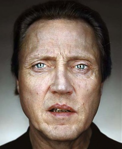 It's clear that Martin has got his style down to a science: People's faces, neck up, focused on the eyes, depth of field so narrow some noses go out of focus, using film stock of such fine grain that you can count, for example, Brad Pitt's nostril hairs. I find the photos really entertaining from a documentary perspective -- there I go again with the documentary! -- because I'm always interested in people's faces. And famous people are, of course, famous. So there's an element of mild, safe voyeurism here: Jack Nicholson's eyebrows are getting out of hand! Is that Andre Agassi or Colin Farrell? How does Valentino get his hair like that?
"Angelina Jolie is almost exactly my age," my sister noted.
"I can honestly say," I replied, "you do not look any older than Angelina Jolie. Beyond that, I've got nothing."
I can't say for sure if this is art or not either; I can say it's certainly not as worthwile as Kasmalieva & Djumaliev's work.
The galleries were closing, but the SVA Open Studios had another hour, so my sister and I drove crosstown to make our stop at the School of Visual Arts.
I can't claim to be overly fond of SVA -- my experience with the institution has mostly involved staring at the weirdo students when I had my suit jobs near 23rd Street. I had my brush with being a New York City art student back when I applied for the High School of Art & Design; I was accepted but decided instead to go to my local school and try for Stuyvesant the next year. Taking the ferry to Stuy when I made it in, I'd see the Art & Design kids -- I even knew a couple of them -- and that just confirmed that my instincts were right: I couldn't stand art students.
I've since changed my mind, mostly. Art students are still by and large people I don't get involved with, but I've found that they're more diverse than I thought, and there are some normal, serious, hard-working artists interspersed with the wackos.
The first thing I noticed on leaving the elevator on the fourth floor was that I was wrong about what the SVA studios would look like. I expected separate rooms, but what I found was one really big room broken up into aisles. Each studio is actually three walls, maybe 15 feet square, opening out onto the aisles in pairs, facing each other. At the ends of the building the last studio walls form a corridor down which you can go from aisle to aisle.
The next thing I noticed was that music was playing. Classical music. It took me a bit to place the piece and then I got it: Beethoven's Moonlight Sonata. How arty.
The music was coming from a studio down the way. In between the studios were almost deserted, abandoned. I found myself thinking, "I title this one, 'Procrastination.'" And, in a ridiculous accent, "Fuck you and your bourgeois open studio tour! I say pfah to you!"
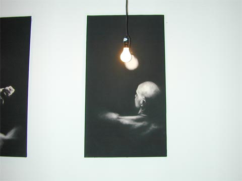 After a bit we came upon the studio from which the music was emanating. A sheet had been hung up and a video was projected on it. In black and white, a bald man carefully shaves a young woman's head. To the tune of the Moonlight Sonata. This is so over-the-top arty, so hopelessly stereotypical, I found it amusing. Across from the sheet, on the studio walls, hung four or five drawings. These drawings are really excellent. Charcoal has been laid down so carefully it almost looks like velvet. A figure is exposed to the light. Actual lightbulbs were hung so if you stood in just the right place, they'd match the light source in each drawing. This little bit of artifice was unnecessary, I think: The drawings stood well on their own, and in fact are fantastic.
It was on the way out, later, that we met the artist and the subject of the drawings, Karina Contreras and her... I'm going to call him paramour because I'm not sure if he's boyfriend or husband or what. Karina was the woman getting her head shaved in the video; by the time we met, it had grown back in to an adorable pixie cut. Karina seemed a little vague about whether the whole installation constituted an entire piece or should be considered separately. I'd recommend (and my recommendations are worth what you pay for them) letting the drawings be themselves and dropping the rest. But that's just me.
We found Jim Wolanin around the way a bit. His latest paintings are excellent, of course, just like his older ones. In a month of residency he polished off two paintings and nearly finished a third, which strikes me as making pretty good time. Jim has jettisoned the war imagery you can find on his site for a more personal visual vocabulary; I didn't take any photos, but you can see his progress on his blog.
I'll let you in on something I didn't figure out until I'd seen some more of the studios: Jim is the best artist there. He's really something.
Around the next corner I could see, way at the end of the aisle, something I knew would be trouble. Even at that great distance I could tell the style and subject of the painting and I feared I was going to have to see more. Sure enough, when we got down there, it was what I'd expected: Gay porn. Not that gay porn is anything bad. It's okay for what it is. And naked men, even naked sexualized men, are not necessarily pornographic, even if we as a culture seem to have a problem with penis imagery.
Two European looking men were lounging around near the opening of the studio. I tried to slip past but one of them spoke to me. "Come on in," he said in an accented voice. "I know it is... pornographic, a bit, but..."
I looked around for my sister but she'd vanished somehow. I ended up edging into the studio while the guy pointed out who was a porn star and who worked in porn and which ones were portraits of him. I felt bad not liking the art as I stepped past the pile of gay porno magazines, but I really didn't like it. It wasn't the subject matter, or the style, exactly; it was some combination of the subject and style which altogether made the paintings seem amateurish and prurient.
I believe it's possible to depict the male form, nude, in a sexual and exciting way. I believe that this was not it. I escaped as quickly as I could without seeming rude, without taking a single photo, and without noting the painter's name.
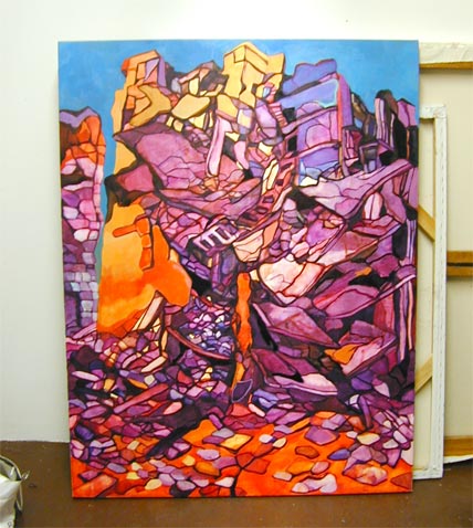 Down another aisle we passed the studio of one Rachel Dalnekoff. She wasn't around, and in fact her studio was guarded over by nothing but her paintings. I took this shot of one leaning against the wall: I really like it. The color scheme appeals to me and the hints it gives of a collapsed apartment building are engaging. If this site is the same Rachel, then her style is really evolving. And she's got great taste in quotes, since she leads off her site with a Picasso quote I use here.
Not far from that studio we rambled into a small party going on at the intersection of three studio spaces. I toured the artwork, first, then joined the conversation briefly. That's how I met Gregory Coates, who has been mentioned on Jim's blog, along with SVA residents Samantha Hahn, Leigh Ann Davis, and Apryl D. McAnerney.
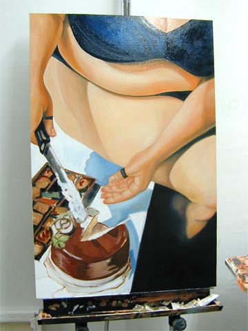 Samantha's work caught my eye first, because her studio was closest. She's apparently exploring the relationship of women to food; she's got a painting of a nude woman eating some dessert and spilling it on her thigh, for example. This image here is unfinished, she made sure to tell me, but it was, to me, the most striking of the group. For one thing, it's got a fat chick in it, and I'm a big fan of fat chicks. More importantly, though, it's got a better composition and far better technique than anything else Samantha had there. Her technique, overall, could use some improvement, I think; she's at that odd point where it's not so bad you can call it a style, but not so good it's really good. She needs to get better or worse. That's a quibble, though; as it is, she's nearly good enough to show at Gallery Henoch.
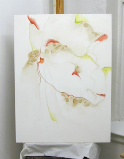 In the studio next door, Leigh Ann is doing some nice work, too, in an entirely different style. It struck me as a curious mix of Joan Miró and Georgia O'Keeffe: Take the watercolor-like use of oil paints from O'Keeffe and apply it to Miró's amorphous shapes, and you've got an idea of what Leigh Ann is going for.
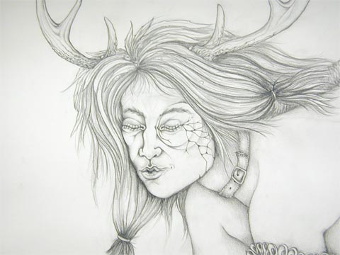 I felt more strongly about Apryl's work than I felt about either Samantha's or Leigh Ann's. Whether or not that's a good thing I'm unsure. Apryl was displaying a number of pencil drawings, either one big piece spread out over a number of pages or maybe multiple separate pieces, I couldn't tell. On the positive side, I like drawings; and I like detailed drawings even more; and I like topless women, which figure strongly in many of the works; and I like an artist who just follows her muse through the entire drawing, no matter how strange or surreal the muse gets. On the negative side, Apryl's drawing style has an untutored edge to it that reminds me of 1970s prog rock album covers or the illustrations you find in books on the New Age shelves. Her random disregard for anatomy, gravity, or sense could be a stylistic decision but strikes me more as a bad habit.
 I therefore liked Apryl's work immediately but my emotional response was mixed, and I may have mistaken that for depth the work itself doesn't possess. Apryl is good but I think she needs something; maybe the tighter strictures of oil painting would do her good. Maybe she needs to be channeled more. On her Website she writes, "I like the immediacy of the pencil on paper -- I have an idea, sketch it out on the paper and -- bingo -- automatically I have something I can get lost in and be proud of, usually a face or hand -- and I am HAPPY." This might be the root of her problem, that she's looking for relatively quick results. Again, my advice is worth what you pay for it.
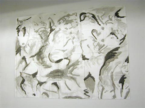 While my sister and I were talking with the group -- I wanted to make sure it was okay I took photos and posted them on my site -- another SVA resident wandered up. Marc Freeman admitted to being the perpetrator of a work my sister had liked, although she claimed it may have been because she, as a teacher, is used to seeing the art of first graders. Marc's work, he said, was the big inky stuff around the way. Big is a good description: This photo shows a drawing which is probably four or five feet wide. I like it fair bit, especially what looks to me like a wolf over on the upper right. That may be a Rorshach thing happening, or maybe it's intentional; either way, it's pretty cool. Atmospheric and evocative, minimal and spare.
Overall I came away from the SVA feeling pretty good about what they're doing there. From what Jim has told me, the program has some interesting lectures, and certainly some of the artists have true talent. I'm not sure about the worth of the actual studio space -- it seems a bit cluttered and crowded to me -- but it's a good way to meet people, I guess. I hear they're going to be having a more formal show in August, although the exact date is unclear. If you've seen anything here you like, I heartily suggest keeping an eye out for that.
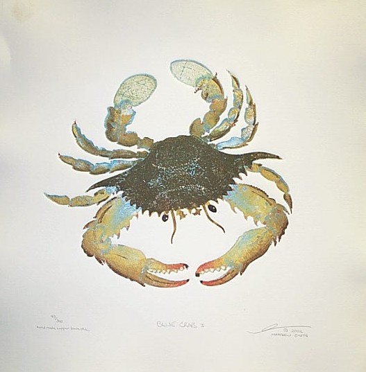 I almost don't want you to go to Matthew Smith's Website, though, because if you do you'll think, "Lame ocean-themed stuff from local artist." Matthew's site is so hopelessly unprofessional you're likely to be turned off by the front page, and the reproductions of his prints are absolutely dreadful. So let me say that they are, in fact, subtle and beautiful, colorful and lively, and really, really neat. And, yes, okay, they're lame and ocean-themed, to some degree. But the method -- this copper block etching printing technique -- is capable of some really astonishing effects. Look at this blue crab right here.
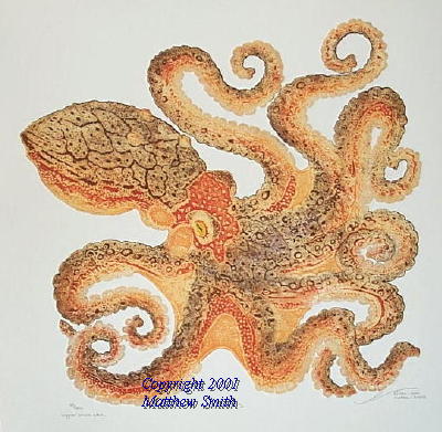 I still have no clue. It sounds like a royal pain in the ass, but the results are really excellent. The final prints have a great Japanese flavor, with the expressiveness of line and the flair of color, and the texture is just fantastic. I'm not sure I have the patience for any kind of etching; judging by
 I ended up spending much more time than I expected getting to know Dan, who goes by Danonymous when he comments on blogs; Oriane Stender, who coincidentally has a piece at
 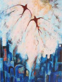 I also had some time, sitting in the comfy chair, to admire Stephanie's work. If you visit her
