If you stretched a rubber band all the way to where Denis Peterson was the last time I saw him and then let it snap, today you'd find him off where the rubber band ends up. Last time he was painting refugees and inmates of prison camps and victims of genocide. Today he's painting New York City street scenes.
I have to try really hard not to judge him. As he told me at his opening, he couldn't paint those people any more: He was crying while he painted. It's a difficult thing he was doing, and, really, was it his responsibility? Was what he was doing important in any sense? I can't answer those questions. That alone is enough to make me think I shouldn't judge him. So I won't make any more excuses for Denis; I'm going to stick to my general philosophy of art and concentrate on how the paintings look, despite my initial discomfort over their wholehearted embrace of Pop, with their meticulous recreations of billboards, magazine covers, neon signage, corporate logos, and other urban visual clutter.
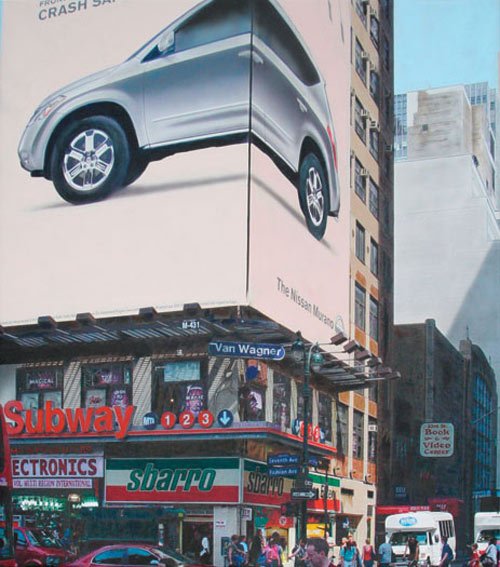
Denis Peterson, Fashion Avenue, 2008, acrylic on canvas, 36x32 inches
I say vertical because these are certainly not a pedestrian's eye view of the city. The people are there doing their business, caught in startling yet somehow breezy clarity, studiously -- like good New Yorkers -- ignoring the photographer/painter and the bustling signs and windows above and around them. But the humans are just one part of the scene; most of the canvases are taken up by minutely observed advertising, building facades, streetlights, traffic signs, signals, and, off near the top, maybe a patch of blue sky.
I raved a lot about Denis' technique last time and all I can say now is, it wasn't enough raving. His latest series is a showcase for how far he can take his abilities: He is, really, an Olympic-level athlete of painting. I've seen a lot of fantastic painters in my time, academically trained and otherwise, but Denis -- Denis is in a class by himself. He is the Michael Phelps of painting, the Usain Bolt of airbrush and paintbrush. He makes Vermeer look like Jackson Pollock.
Keep in mind I'm just talking about technique. But the comparison to Vermeer is good in more ways than one: although good old Johannes was known for interiors, he painted regular people doing regular things, and Denis is doing the same with his street scenes. And they're both clearly photographically based; there are some holdouts who refuse to believe Vermeer used a camera obscura but I think the case is pretty well settled. Since Denis is alive and kicking, thankfully, we can ask him how he does it, and he can tell us that his compositions start with multiple photographs which he assembles. Then he adjusts details, makes changes, moves this here and that there, with the final result a scene that never really existed but which is a distillation of a real place. He transfers the composition in different ways -- projecting, tracing, and so on -- and then he begins to paint.
And there, frankly, is where the magic happens. The last series of his I saw was stunning in its evocation of a photo: If I hadn't been told otherwise, I probably would have assumed his paintings were digital prints on canvas. His current series is beyond that, beyond photography, beyond photorealism; Denis calls it hyperreality, but even that's too crude because it still has the word "reality" in it. Photos possess within them a paradox: The closer you look at them, the less you actually see. The same is true of most paintings. Get close enough and you start to see photo grains or blobs of paint or pixels. But not with these; the closer you get the smoother the paintings become. Even when Denis is using a brush and not his usual airbrush, when you get your nose right up against the painting, it's still smooth, perfectly formed, exactly rendered. Denis is using the paintbrush more, too, and it shows, but really only if you look very closely and carefully. I actually prefer his brushwork slightly since it's a little more lively, even though he's still many miles from impasto.
The results of all this technique and choice of subject are technical marvels and entertaining documentaries. Even though the precise moment of each painting never exists, it's nevertheless true in the sense that it's a minor drama enacted every day. The signs and buildings of New York City are fluid, ever-changing, and no snapshot could possibly capture more than a momentary portrait of any given vista; but Denis, through his art, manages to snare a true, timeless sense of how the city feels.
But it's a funny thing: Under the slickness of these works, the Pop-ness of it all, the sheer advertising campaign shininess of the paintings, I think what comes through most of all is Denis' sensitivity. It was less obvious in Don't Shed No Tears because all I had for comparison was that series; now that I've seen more, it's clear that underlying all of Denis' work is an acute sensitivity, a deftness and lightness of touch, an infusion of caring, not just for the technical aspects of painting, but also for the subjects he chooses. He spends about 200 hours on each painting and during that time he truly comes to understand what he's painting and, more, he transmits that understanding, transmutes it somehow into his art.
It's also worth noting that, in this latest series, Denis carefully hides his signature. I'm a sucker for a puzzle like that. I always used to love studying Hirschfeld caricatures to find his daughter's name. I live for that stuff. Also it gave me something to do at the opening.
Denis' show opened at the Mark Gallery in Englewood, New Jersey, a very fancy neighborhood with a downtown mostly made up of Talbots, sushi restaurants, and Audi and Mercedes dealerships. Being a close personal friend of Denis' -- he immediately and warmly greeted me as "Emmanuel" -- I got to meet the gallery owner, Arielle Mark; her wonderful husband, who was also the official photographer; and David Kapp, one of the other artists in the show. Because I've made it sound like it was all about Denis, but in fact he was just one of three. There was also Ben Aronson, who I didn't meet, even though I really liked his work.
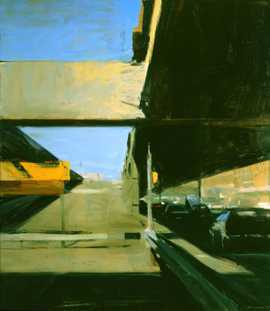
Ben Aronson, Closed Ramp, West Side Highway, 1997, oil on panel, 52x46 inches
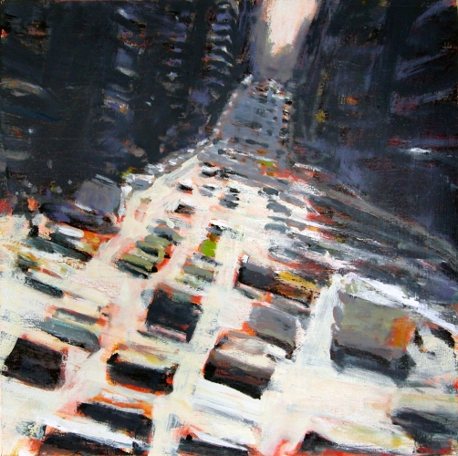
David Kapp, Go, 2008, oil on linen, 28x28 inches
Arielle certainly put out a fine spread of food and drink, including -- a first at any opening I've attended -- a roving drinks server. There was some really incredible hummus and some sushi that had been out a little longer than it should, but that's what I get for arriving late. I hate being the fat guy at the buffet, though, so after sneaking a few bits I commenced the gallery ramble, which is what you do after you've already looked at everything once but still feel you have to hang around a few more minutes.
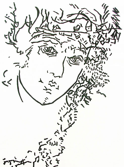
Daniella Sheinman, Venus No. 2, graphite on canvas, 78x54 inches
Then I noticed another piece leaning on the wall. "Anna Druzcz!" I said. "I know her work from Williamsburg!" (Before you ask: Yes, I do talk in hyperlinks.)
Arielle's son then told me how he'd seen Anna's work at an art fair -- some kind of small works affordable art fair or other the name of which I didn't catch -- and he liked it, so his mother looked at it, and decided she liked it also. "I have one in my bedroom," he said. "Mom got it for me for my bar mitzvah." Lucky kid! And good for Anna, too: A sale and a gallery all in one go.
Gerry Andrea, The Piano Scene of Dave McKenna
Englewood might not be the center of the art world, and it may not look anything like Denis' paintings, or Ben's or David's, for that matter, but it does have this going for it: After I said my good-byes to everyone, it was a short drive home.