I hadn't planned on going out for a gallery slog. I planned to go to one or two shows, maybe, then pick up some art supplies and head for my Brooklyn studio. Instead, because of my wandering eye and my inability to find my way around Manhattan south of 14th Street, I ended up walking across half of the island like a stunad and never making it to Brooklyn. It was a great day for a walking tour of downtown New York City, a lovely, wet, gray fall day. At one point the water came down in a dense mist moving sideways. Did you know New York gets more rain than Seattle, London, or Glasgow? It does.
I knew things were going badly when I'd carefully typed up all the addresses I wanted to hit in a nice Word document which I promptly forgot open on my PC without printing as I left the house. Luckily I had an earlier printout of a list of shows I wanted to see in my bag so I was able to find my first stop -- first because it was easiest -- and see Jason Bryant's show at Raandesk Gallery of Art.
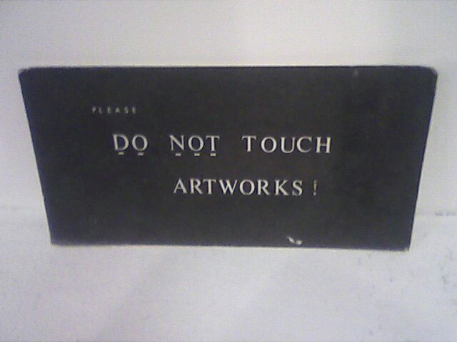
First things first: Raandesk isn't a gallery. It's some walls around a group of interconnected spaces which are being used for other things, including desks rented out to people who, I suppose, need desks and a room to put them in. This makes it a little hard to see the work because you have to lean over desks, or squeeze between them and the wall, or surreptitiously glance around the people sitting at them, in order to see the paintings.
Jason Bryant, In Passing, West 52nd Street, 2008, oil on canvas, 40x60 inches
But this only underscores the most important question raised by Jason's work: Is this trip really necessary? That is, do we really need another artist painstakingly copying advertising images using the techniques of advertising to tell us...what? That there is advertising? That advertising images are really nice? That cropping ads strategically gives us different ads? The better Jason's technique gets the more I find myself asking why bother -- why should he bother painting these, and why should we bother looking.
For myself, I didn't bother long. One sweep around the room, wiggle my eyebrows at the receptionist, and I'm off. Off to call my wife to get me the address of my next stop, which was so far away, I figured I might as well make a few other stops as I went.
New York City's subway system is truly second to none; it's huge, easy to use, and very convenient -- unless you're trying to go certain ways. Trying to get diagonally across Manhattan, for example, is an exercise in frustration, unless you want to follow Broadway. And trying to get anywhere in Chelsea is impossible because the trains don't go over that far.
Since my next stop, then, was on 20th Street between Tenth and Eleventh Avenues, I figured I might as well trudge crosstown from Raandesk to the far end of 27th Street, to where the mighty Hudson nearly laps at your toes, to see what was happening at my old favorites Winkleman and Schroeder Romero.
Ed wasn't in but Murat was so, rather than actually look at the installation of Yevgeniy Fiks' Adopt Lenin I chatted with him. Murat is far more interesting than any old work of art anyhow. We discussed everyday things -- the way to a man's heart is through his stomach, and that's true for women, too -- and Murat made excuses for why Ed's too busy to respond to my e-mail messages.
So I narrowly dodged Lenin and crept into Schroeder Romero just to see what was happening. There was a group of students there whose teacher was talking to Lisa and Sara Jo so I thought I had a chance to get out before I was noticed, but Lisa called out to me before I could get to the door. Not that I don't like talking to her -- far from it, I love her -- but I feel bad that I don't like what they show in their gallery.
"Another show right up your alley, eh?" Lisa chuckled at me.
"I've been thinking," I said, "of just never mentioning Winkleman or your gallery ever again, just because I feel so bad always saying terrible things about you guys."
"Come on, Chris, we like you because you're honest."
Marsha Pels, Dead Mother, Dead Cowboy, 2008, installation view
On my way out I very coolly tripped over the motorcycle sculpture and almost broke my neck. That'd be why they put the guardrail around it, because otherwise I'd have stomped through Marsha's blue neon tubing like a postmodern Godzilla.
I said my good-byes and exited, aimed southward. Then on the corner of 23rd Street I bumped into Ed Winkleman himself, hurrying to his gallery to be busy some more. It wasn't a good day for running into people on the street -- did I mention it was raining? -- but Ed paused long enough to have a short conversation. I told him I'd just come from his gallery and Schroeder Romero.
"Another show right up your alley, eh?"
Indeed. We parted as friends and I continued south down Eleventh Avenue until I passed something that made me draw up short. It takes a fair bit to get noticed in Chelsea below 23rd Street; apparently the ghosts of Haring and Basquiat together don't possess enough presence to impress on everyone that graffiti art is dead, the 1980s are long gone, and no one's going to get discovered by scribbling on the walls any more. So to stand out amidst all the clamoring sunbursts, peeling wheatpaste doodles, slap-on stickers, and exhortations of awesomeness and street cred requires something truly special.
In this case it was a perfectly flat, blank, white wall -- like you'd find inside any gallery -- with a doorway.
I backpedaled and stood in front. Inside the door was another expanse of white wall with the legend "Midori Harima" below the word NEGATIVESCAPE. I walked inside and around into the room....
...and I'd hate to ruin it for you. Go for yourself. But if you can't, or don't mind having the surprise drained out of it -- well, it's not that great or anything, but -- okay. After the sunlight on the white walls inside you can't see anything except, floating a few feet in front of you, a ghostly merry-go-round. It hangs there, vaguely alive, pale. Unmoving but somehow waiting. Waiting for you. Waiting for you to unwisely move towards it....
It's profoundly creepy.
Tentatively I tried to walk around it, keeping my distance, only to bump into a heavy black curtain. After a little bit my eyes adjusted and I could see the space was just a medium-sized room with a high, New York industrial ceiling and black curtains covering the walls. The merry-go-round is a forced-perspective sculpture in white plaster, or something similar, with a shadowed, negative version of itself being projected on it from just inside the door. Basically it's not much different from the Haunted Mansion ride at Disney World, where they project singing faces onto blank sculpted heads, making what looks like living statues. But in this case, of course, you're on Eleventh Avenue -- at a place called Honey Space -- and not in an amusement park. And you're expecting an art exhibit, not a haunted house ride. The net result is it's a lot more freaky.
Bumping into random crap like that is one of the things I love most in life.
Of course it's easy to bump into random crap when you get lost going around the corner like I do. There's a reason my family lived on an island for over twenty years -- as long as you don't go over a bridge, through a tunnel, or on a boat, you can be sure you're not too far lost. So it shouldn't be too surprising that I turned down 21st Street instead of 20th and ended up pacing back and forth in front of Manhattan Mini-Storage wondering where my next destination had gotten to. Are you sure, darling wife, it's 529? Because I can't find that building number.... Let me get a Coke from the Mini-Storage vending machine for sustenance as I pace a few more times....
But then my eye was drawn to Casey Kaplan where someone named Nathan Carter was showing something called "RADIO TRANSMISSION CONTRAPTIONS." In I went to find a collection of works put together by someone who'd spent altogether too much time in the Joan Miró and Alexander Calder wing of the nearest museum.
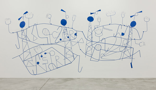
Nathan Carter, CALLING FOUR TOWERS SIGNAL DRIFTING WITH NO FIXED PURPOSE, 2008, steel, acrylic paint, 240x31x112 inches
In fact I was so enamored of this that I wanted very much to talk with the director in charge of this exhibition. I approached one of the two gallerinas and asked if I could talk to the gallerist in charge.
"You mean Casey Kaplan?" she asked.
There are actually people with the gallery name in the gallery? Weird! "I guess so," I allowed.
"What do you want to talk about? The art?"
"Well, yes."
"Is there anything I can help you with? Any questions I can answer?"
"No, I mean, I just want to talk to whoever put the show together. You know, about the art." I mean, I wanted to say, Casey is most likely through the door right behind you, listening to everything we're saying, and couldn't I just say hello or something?
"Let me see."
Curiously, the other gallerina then got off the phone and went back into the office. She came back out followed by a small dark-haired woman. I got the impression that Casey Kaplan was male, but one never knows.
"Can I help you?" the woman asked.
"I'm Chris Rywalt," I said. Nothing happened. This is the part, I wanted to say, where you tell me your name. Leaving me no choice but to say the kind of clichéd thing I hate saying. "And you are...?"
"I'm Chana," she said, pronouncing it like "Shawna," which is the same name as Reilly's lady friend whose name I didn't want to write out because I didn't know how to spell it. Small world!
"Yes, okay, well, I wanted to talk about the art here."
"Do you have any questions?"
"Well, no, not...you know, I just wanted to...I mean, this show is just so unabashedly retro, so old-fashioned, and you don't see this kind of thing in Chelsea that often, and I...just wondered...you know...how...why someone would put on a show like this. Because. I mean, I like it, it's just...."
It's just that I sound like a mental case.
"Well, Nathan Carter has worked closely with our gallery for many years," she said as if she were reading it off a nearby card. "And this was a direction he chose to take."
"Right. Okay. Well, I just...it's good. That's good. I...."
The conversation wandered off, entirely out of my control, petered out in a few small gasps, then died on the floor. Why Casey didn't want to talk to me him/herself I don't know.
Feeling thoroughly stupid by now I managed to find my way out of the gallery and around the corner. As I did so I passed Yvon Lambert. I paused. Should I turn around and go in? Do I need to? Is it worth the effort? Unsure, uncertain, I wobbly backtracked and stood in awe before the majesty that is
ANDRES SERRANO'S SHIT
Andres Serrano, SHIT (BULL SHIT), 2007, c-print, silicone, acrylic, wood frame, 88x72 inches
So I have nothing against Andres. And I knew what to expect from these images because I'd seen some of them online. I hadn't meant to see the show, but of course one keeps on top of these things anyway, and so here it was.
What I wasn't prepared for, though, was the sheer size of the photos. Each one has been enlarged to slightly over seven feet high. Considering the subject of each photo is maybe a few inches high, this is a factor of at least twelve we're looking at. This is some HUGE SHIT.
And shit it is. Surely Andres is courting all manner of easy reviews of his work, and given the titles of his photos he must know it, because each one is named after a standard use of the word "shit" in English: Holy Shit, Bull Shit, Dog Shit, Heroic Shit, Good Shit, Bad Shit. And so on. It's sophomoric, if junior high has a sophomore year; the whole exercise reminds me of something I'd have done in seventh grade, some kind of dictionary of shit. Speaking of which, there's a long-winded (but very funny) online joke listing the basic tenets of the world's religions as applied to shit ("Confucianism: Confucius say, 'Shit happens'").
I must admit some of the photos made me queasy. I wonder if I'd have felt that way if I didn't know what the subject was; I think so. Sometimes you can just tell shit. Also, the gallery kind of had this odor vaguely reminiscent of poop, as if some of the photos, being so gigantuan, actually gave off an aroma of the subject. Then again maybe someone just changed a diaper in the room. Who knows?
In any case, the photos themselves are intensely uninteresting. Doodie has different textures. Wow. Flies sometimes land on it. Really. Andres likes bright lights behind his subjects. Exciting.
Piss Christ is off in a smaller room, by the way. In person it looks, well, exactly like it does online, only with so much glare from the gallery windows it's hard to see. Way to go, blue chip gallery!
I exited past the goofy knot of students ogling the turds and bravely refrained from asking the gallerina if I could the bathroom. I didn't have to go number two anyhow. Just outside, on the wall of Yvon Lambert, a sign prominently declares: NO DUMPING. And now I need a blood transfusion; I think I overdosed on irony.
But guess what? I finally made it around the corner and onto 20th Street whereon one can find 529 West 20th Street, specifically the fourth floor, specifically Denise Bibro Fine Art, which is what we all came here for! For the woodpeckershrooms, as my wife so delicately called them when she texted me the address? No, for Nancy Baker's Duck and Cover Drill!
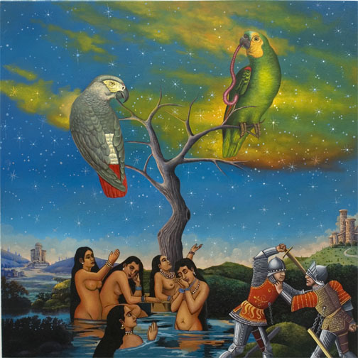
Nancy Baker, No Man's Land, 2008, oil on wood panel, 20x20 inches

Nancy Baker, No Man's Land (detail), 2008, oil on wood panel, 20x20 inches
Can you hear the "but" coming?
But I'm a little disappointed in these paintings. Not a lot. Just a little. They have many very good points: Nancy's sense of color is fantastic. Her compositions are excellent. Her subjects and her juxtapositions are weird. Her choice of source material is impeccable.
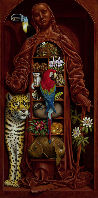
Here it comes again: But. But her inscrutable hermeticism makes it hard for me to love these paintings. In her earlier show her work was full of things going on, and somehow that helped carry them along; these paintings are more focused, with fewer figures and situations, and in a way that makes them more confusing, because when there are only four or five subjects in a painting, you expect them to make some kind of sense together. But here we have a parrot eating a worm being worshiped by some south Asian beauties who are ignoring the medieval knights fighting -- over them? -- on the shore. The ladies are lovely and the parrots are lively and the knights are knightly and they go together how?
Also I get the feeling these works were either rushed or Nancy's at the limit of her abilities as a painter. There are altogether too many passages that aren't quite right, aren't a hundred percent. That may be intentional or it may be she's hurrying too much. Or maybe she's just loosening up. Which could eventually be really good. But here in these works, it doesn't seem fitting.
With those criticisms laid out, then, I should say that Nancy still puts on a good show. I love the way her smoothly smoky cloudscapes surround the hard-edged figures in front of them, the way she moves between a flavor of academic realism, medieval Boschism, and paint-by-numbers. Her high-contrast patterns laid over painterly backgrounds are beautiful. She's not using quite as much kitsch as she was -- which I consider a good thing -- although Casper the Friendly Ghost and the Poky Little Puppy put in appearances. Gotta love the Poky Little Puppy!
I spent a goodly amount of time alone with Nancy's paintings, going back and forth between them. They're really lovely. After a while, though, I had to move on. For the sake of completeness I went into Denise Bibro's main gallery where I found the work of Boyce Cummings, Christopher Reiger, and Amy Ross. I've been meaning to see Chris' work, and to get him to come gallery-hopping with me, and somehow have failed at either. Until now, when I sort of accidentally wandered into his show -- I'd forgotten about it in my rush to get to Nancy. Boyce I'd reviewed before although I honestly couldn't remember a thing about his work. And Amy Ross I knew nothing about.
Christopher Reiger, A Cruel and Beautiful Faraway Place, 2007, watercolor, gouache, sumi ink and marker on Arches paper, 32x27 inches
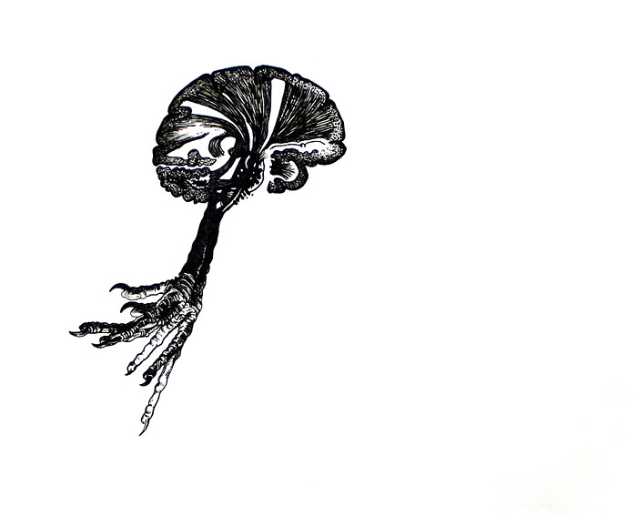
Christopher Reiger, Ri Hokkai, 2007, pen and ink on Arches paper, 9.75x11.75 inches
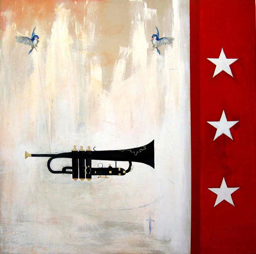
Boyce Cummings, Black Trumpet, 2008, mixed media on canvas, 42x42 inches
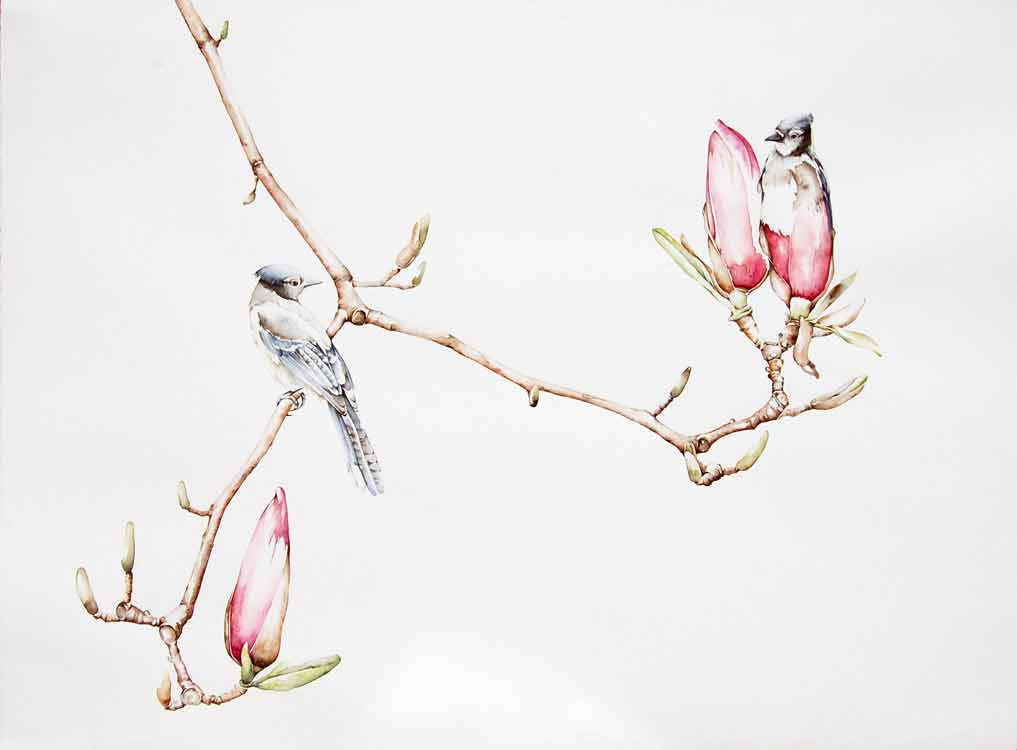
Amy Ross, Bluejay Magnolia, 2008, watercolor on paper, 26.5x34 inches
As I was picking up my postcard to go, someone called out to me, asking if I was Chris Rywalt. No use denying it -- I am. It turns out Oly Lambert, an online acquaintance, works at Denise Bibro. We talked a bit and she introduced me to Denise Bibro herself. Take that, Casey Kaplan!
Downstairs from Denise is Hasted Hunt and they're showing the very big (although not Serrano-sized) photos of Michael Thompson. Well, not of Michael himself -- he took the photos, I mean. Apparently he took them in the service of several ad campaigns because that's exactly what they look like, up to and including Kate Moss topless. Because what the world really needs is another photo of Kate Moss' tits. Note I have not included any images for your delectation.
Having thus exhausted Chelsea for the day, I turned my weary feet cross-downtown. Because I wanted to get to -- well, by then I was so tired I wasn't sure where I was going. Lower east side kind of thing, like that. In my plans earlier I'd thought of going to Soho Art Materials, and also to see a show David Gibson invited me to, but somehow I got them all mixed up and wasn't sure which one I was going to first. And then I wanted to go to my studio. All of which meant finding a downtown train, which meant walking crosstown from Tenth Avenue or so about a hundred miles to...some other Avenue. Seventh or Sixth or something. I was getting slightly delirious. I'd promised myself I wouldn't walk much because I wasn't feeling really well, and here I'd already walked about fifty-two miles, in the rain, uphill, both ways....
I wandered cross- and downtown until I found the F train at 14th and Sixth. I hadn't been in that area in a while. I caught the downtown F and, blearily consulting the map, figured I'd get off at -- Delancey? Then I saw East Broadway and a little bell rang: That's where David's show was. Why did I want to go to Grand Street? Oh, right, to go to Soho Art Materials. So I should get off -- HERE!
And I jumped off the train at Second Avenue. Which is, incidentally, about ninety-seven miles from where Soho Art Materials actually is, especially if you, like I did, start out going downtown, then head crosstown, then turn back uptown and end up where you started again.
Eventually I found Grand Street and began working my way over. Building numbers down there are decidedly fractal. You see you're at 167 and you want 121 or something like that, and you think it can't be far, but then you see the next building is 165+1e-72, and so on, and pretty soon, if you're like me, you're thinking you should've brought the sherpas and some dried yak meat.
Also, I know what you're thinking: You're thinking Soho! Artsy groovy people! Must be cool! Wrong. More like Soho! Chinese and Italian people! I was walking through the part of town where Chinatown and Little Italy are battling it out corner by corner to decide if the shops should sell dried moldy milk curds or dried split fish stomachs. Cannoli or Peking duck? Espresso or GOOD GOD WHAT IS THAT STUFF?!
As an aside -- I know that we're supposed to be enlightened now, and say that all human cultures are equally nuanced and worthwhile, and that people everywhere are pretty much the same. But I'd like to point out that I don't understand places like Chinatown or Little Italy or other mini-countries. It seems to me you left your country for a reason, right? So why do you want to recreate it in your new home? I understand that your homeland might have some good qualities, but if an argument could be made that you can't import what's good about a culture -- food, calligraphy, frescoes -- without also getting what's bad about it -- shameless disregard for intellectual property, big stinky cigars, sidewalks that smell funny when it rains -- Soho is it.
Also, my feet hurt.
In any case, I found Soho Art Materials and bought myself some paints. Then I realized I needed somehow to find my way to East Broadway while knowing very, very little about how to get there from where I was. I knew Canal Street was down the way a bit. I figured I'd go there and head east and see what happened. Eventually -- did you know Canal Street goes uphill? -- at least it'd stopped raining -- I turned south on the Bowery and, by heading doggedly downtown, bumped into East Broadway at last. The English language signs had by this time disappeared as had most of the white people. The shops carried merchandise that made the stuff on Canal Street look like Neiman Marcus. I trudged along East Broadway, counting off the addresses, hoping I'd find David's show before I collapsed.
I did finally find it, thankfully just across from another F train stop for a quick escape. The show is at the Ernest Rubenstein Gallery of The Educational Alliance and is titled Beauty's Burden. David is the co-curator along with Jennifer Junkermeier. I have to admit to being a little leery of this show just because of David's verbiage; what is one to make of a phrase like "...beauty operates in collusion with the specific dictates of image and form, occurring randomly across mediums, flowing through the cracks in our understanding of each artist's process"? Flowing through the cracks? Operates in collusion? Huh? Nevertheless I went because David invited me and I like David (for what little time we've had to talk).
In defense of David, I should note that after all the walking I'd done, if I arrived to find Jesus Christ Himself beaming at me and holding out on his right hand a 22-year-old Cindy Crawford slathered in baby oil and crying my name in ecstasy, I'd have been mildy irritated.
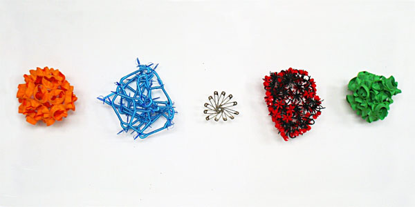
Five separate pieces by Meridith Pingree
Junk or art?
You decide!
"Ceci n'est pas une peinture"
My day was nearly over. Drained of all will to live I crept out of Ernie's gallery and slumped dejectedly towards the subway station. But what's this? Another gallery? In this far-flung place? Why, it's LaViolaBank Gallery with a small group show! And what have we here? Some reasonably neat things by Joey Archuleta, Eske Kath, and Casey Jex Smith!
But the critic is tired. He's going home now -- F train to A train to bus to bed. Thank you, and good night.