October 2006 Archives

Last night I attended the opening of Why the Nude? at the Art Students League of New York. The Art Students League is one of those New York institutions I should probably know more about, since I grew up in New York, after all, but which I'm almost totally ignorant of. When you live here, you take a lot of things for granted. One of those things is that you'll hear venerable institutions mentioned in literature and films, and even walk by them on the street, and never once find out what they really are or why they're there.

It turns out the Art Students League is one of those classic New York piles of rock in midtown, with the giant wooden railings and worn steps and floors tiled in tiny squares by craftsmen a hundred years ago. The stairwells have officious letter-sized printouts warning that writing -- "or tagging" -- in the hallways is against policy and anyone caught doing so will be summarily thrown out. So much for the "students" in "Art Students League" -- I've never seen an art school (or any area where artists congregate) that wasn't covered in a gleeful array of scribbles, splotches, and general crap. Even in Paramus, New Jersey, that bastion of middle-class conformity, even there the stop sign nearest to the local Pearl Paint is papered with an incomprehensible melange of weathered stickers. Apparently whatever notions I had of the Art Students League being some outlaw organization forming a safe haven away from the iron gaze and steely fist of the Art Establishment are inaccurate; apparently the Art Students League had, at some point, calcified into its own establishment.

That said, let's talk about the show. I want to get this out of the way early: If you have an even passing interest in the representation of naked humans in art, you should go see this show. The curator -- whose name I cannot ascertain at the moment -- has collected a large assortment of paintings and a few sculptures (and, alas, one video) all related to the subject of the nude. The art here ranges from the mid-1960s all the way to the present and encompasses various approaches; although paintings of the realistic nude predominate, there is one lone quasi-Cubist painting, some drawings, a few photos, and a couple of other unclassifiable things.

Now I'd like to complain a bit. This is so I can end the review on a positive note, not because my complaints are major. It may be that I'm getting jaded, or maybe just crotchety in my old age, but a couple of things bothered me about the show.

The first problem was no one knew who the artists were. I went to the opening hoping to meet artists, in particular Sharon Sprung. No one who worked in the gallery -- not the young women handing out wine, not the person at the information desk -- could tell me if the artists were present, let alone who they were. Granted that a show of this size -- I'm not sure how many artists were represented, but I'm willing to guess about forty -- makes it hard to tell who is who. Still, if you're going to have gallery staff, you could at least introduce them to the artists so they know them.

So I didn't meet even one of the artists, which is a shame. Figuring I was there to meet artists, I decided just to start talking to people. One woman arrived wearing a smock with paint all over the front -- I guess she came in from her studio somewhere else in the building -- and I tried to talk to her, but she brushed me off. Maybe she's tired of weird guys trying to pick her up at galleries. I did speak to one young man taking classes at the Art Students League; he was able to tell me that Costa Vavagiakis, who I desperately wanted to meet after seeing his painting, wasn't around, because this young man is in Costa's drawing class. Costa, he said, is a demanding teacher, but good. Then the young man moved away, possibly because he's shy, but maybe because he, too, is tired of weird guys trying to pick him up at galleries.

Sharon Sprung, R Undressing, 2006, oil on panel, 44x36 inches The other problem is the handout at the door is hopelessly limited and the Website similarly devoid of useful material. The brochure clearly tilts towards realism, with the signature piece being Sharon Sprung's R Undressing, and moreover it lists only seven artists out of the more than forty participating. This oversight forced me to actually take notes, something I have not done in the entire time I've been writing reviews. On the positive side, the free Art Students League catalog has reproductions of a few of the good paintings in the show along with a decent sample of what the school has to offer.

There. The complaining is now mostly over with. On to the art.

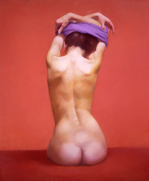
R Undressing is the signature piece of the show, gaining pride of place both on the cover of the show brochure and as the first image illustrating the show online. It's also likely to be one of the first paintings you see walking in to the show. And of course it's why I was there, or anyway Sharon Sprung was. I've seen R Undressing several times now down at Gallery Henoch and it's very striking. I think the feelings of heft and volume are its main attraction, but the contrasting color choices -- the figure tends to the yellow side, with the background being a vibrant warm pink tone -- are also appealing. When I saw it with Stephanie Jackson, I mentioned I liked it although it reminded me strongly of a Boris Vallejo painting, both because of the model's musculature and the colors; Stephanie said, "Who?"

I'd hazard to say there were better paintings in the show, but certainly Sharon's work is one of the best. Some paintings jump out at you from across the room; some sneak up on you. R Undressing is one of the ones that jumps out. Anywhere in the room and it would've had a small crowd around it.

By way of contrast, and illustrating my point, right next to it hung Pink Cushion by Joan Semmel. I didn't even notice it until I'd gone around the room once, but when I did notice it, I nearly wept. It's not that the painting is beautiful and it's not that it's so well painted in a technical sense; it's that, when you really look at it, it shows a warmth and love for its subject (it's a self-portrait, by the way) that is deeply moving. So many of the paintings in this show are perfect examples of academic nudes at their highest expression of the perfectability of man; though it's clear the curator tried to mix in some intentionally warts-and-all depictions. Joan Semmel has found, not a middle ground, but a higher plane, where she's depicted an imperfect body in an imperfect way but with such sympathy and care that the true meaning of what it is to be human comes through. At first glance Joan's subject is just a nude woman; if you stand in front of it, though, it slowly unfolds that her subject is older, with her skin beginning to sag, her breasts droop, her veins show. And yet she's still beautiful. We don't get to be young forever, but there's a certain joy to be found in accepting that.

Bouncing around to the other end of the painting spectrum, turn the corner to find a giant Will Cotton painting, Cotton Candy Cloud (from 2006, not one of the earlier ones). Will's painting seduces you entirely whether you want it to or not. It's enormous -- the reclining woman is almost life size -- and pink and soft. The cloud of, yes, cotton candy is luxurious and inviting, and the nude woman sitting in it equally so. She looks out at you with partly-closed eyes, clearly pre- or post-coital, and she's rendered in such numinous, glowing tones as to be irresistable. She's like something out of Vargas, dropped into the early 21st century, less innocent, more knowing. She's the sweet candy of sex: No sweat, no smell, just an explosion of fantasy flavor, and then she's gone.

I can imagine that a painting like this automatically turns some people off. The forthright temptation of the painting, its obvious desire to be loved -- Cotton Candy Cloud fairly slinks across the room and sits in your lap purring -- might immediately irritate some viewers. But I fell for it the same way I'd fall for a pretty girl hawking a crappy cell phone plan.

Sometimes you have to wonder about placement in these big shows. Right up next to Cotton Candy Cloud is a big charcoal drawing, Reclining Nude by Eric Alberts. I'm not sure this drawing would look good in any context -- this is one of those times where I think, "Damn, why aren't my drawings in a show already?" -- but next to Will Cotton's work, Eric's drawing looks like the largest restaurant placemat doodle of all time. I imagine a curator wants to establish some kind of rhythm for visitors as they walk around, but just so you know: Good/Bad is not the kind of rhythm to aim for.

But you can scan past the drawing quickly and get to the painting which is pulling viewers from around the room, Ephraim Rubenstein's Sarah Pregnant. The most striking thing about this painting is that it's round. But a round painting in a rectilinear show is like a woman wearing a low-cut dress to the theater: Once they catch your eye, you may still find they're ugly. Not in this case, though. Sarah Pregnant is a pretty painting, a wonderful love letter from an artist smitten with his model. It is also, as the note next to the painting explains, the first of many paintings of the artist's son.

What struck me most about the painting was Ephraim's style. Most realistic painters choose one of two styles: Either they try to efface their brushstrokes leaving only smooth tones; or they glorify their brushstrokes in quasi-Impressionistic fervor. Ephraim paints the road less traveled: You can see his strokes, they're part of what gives his subject its texture, but they're subtle with almost no impasto. His tones aren't completely blended, but mix on the canvas; and yet the style is more finished than you'd see in, say, Manet. And the paint is laid on lightly -- you can see the translucent edges of his brushstrokes, sometimes down to the canvas primer. Ephraim's light touch makes the painting seem effortless, like an upbeat gospel song compared to the heavy organ works of most realists.

Speaking of impasto, you can go down the line -- don't worry, we'll back up in a minute -- and see the other extreme, of a painter so in love with paint and its texture that he can barely contain himself. Or he's insane, I'm not sure which. Philip Lawrence Sherrod's JOANN'S*..-(RED*NAILS!)"?,_ -- yes, that's the title, as closely as I could copy it -- is a riotous mass of snaky brushstrokes in wildly mottled colors, all swirling around, with sticky-looking peaks and deep runnels, all energetically focused on Joann's quivering twat being held open by the eponymous red-painted fingernails. I would be amazed if Philip did not immediately fuck Joann silly upon finishing this painting; in fact, I'm guessing he stopped several times before the thing was done just to give her a quick jump. There's an element of ugliness to this painting which just makes it better -- sometimes, you want your sex nasty.

All right, now that you're ogling the other gallery goers with more than passing interest, let's back up to that painting we passed. It's easy to walk by, because when you've got Will Cotton on one wall and Philip Lawrence Sherrod on another, one academic nude starts to look like another. But this one -- ah, this one is different.

Costa Vavagiakis, Miranda XI (in progress), oil on panel, 50x42 inches 
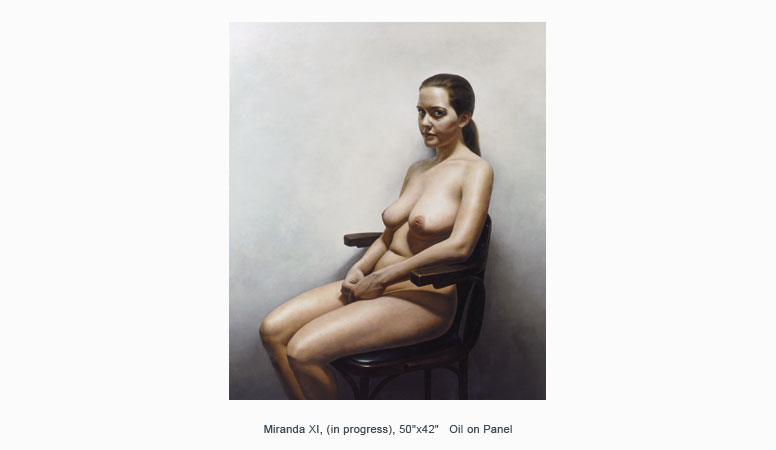
This one is Miranda XI by Costa Vavagiakis, he who I mentioned earlier as being a demanding instructor of drawing. I could have told you he'd be demanding because you can see it in his painting, which shows an absolute mastery of painting technique only achievable through countless hours of practice. As my beloved Professor William F. Ondrick used to say, "There's no substitute for the work. Not even genius." If Costa doesn't have that on a plaque over his door, he has it engraved on his heart.

This reproduction does the painting no justice at all. For one thing, this image (which is from Costa's site) is of the painting in progress. For another thing, the intense detail is entirely invisible at this resolution. What you cannot see is that Costa has not just painted a portrait of a person, he's painted a portrait of that person's skin. Just about every realist painter I've seen, faced with the difficulty of depicting human skin, throws up their hands and just paints. The texture of the paint ends up substituting for the true texture of skin. Because, look at your skin: It's really difficult to render. It's not one color. It's not even two colors. It's a million different colors, with spots, bumps, shades, hairs, wiggles, creases, veins showing through, folds, ripples -- it's staggeringly complex. Faced with that, even the most obsessive of painters is forced to give up and become something of an Impressionist. Rembrandt -- he whose name is synonymous with absolute mastery of painting -- even Rembrandt just slapped a few pinkish and bluish paints on the canvas and said, "Flesh!" I have often looked at my arm (the most easily examined patch of skin I tend to have around) and despaired at ever depicting human skin in anything approaching a realistic manner. I might even have said it was truly impossible.

Costa Vavagiakis has showed me, however, that it is not. Miranda XI is a perfect rendering of the human body, better than any photograph could ever hope to be. All of Miranda's earthly vessel is here reborn. The subtle blue of veins running beneath her skin. The small nodes around her areolae. The folding of the skin around her knuckles. The curve of her ear. Each pore, each hair, each freckle, everything, it's all here.

And more: Miranda stares out of the painting at us. Most nude sitters are coy -- they avert their eyes, or close them, or are seen from the back. They turn their heads demurely to the side or hide them under locks of hair. Not here. Miranda looks the viewer right in the eye with a defiant air. I want to examine the painting closely, but I feel like I'm inches from Miranda's gaze. She knows I want to look, and she's letting me look, but she's also letting me know that maybe, just maybe, she's not too happy about it.

Miranda XI is the kind of painting that may help a viewer understand why Leonardo's Mona Lisa is the most famous painting in the world. In today's culture it's probably impossible to see La Gioconda with fresh eyes; you've seen the painting reproduced so many times, you know her smile better than you know your own mother's. What made the painting so special is lost in its endless repetition. But I think Miranda XI approaches the same level of art and can give modern audiences a taste of what's so great about a great painting.

Moving on. Not everything at this show is flat. There are a few sculptures scattered here and there. One of the most enticing is Krishna, by Judy Fox, who is lounging near the middle of the room.

Jody Fox, Krishna, 2001, bonded marble with casein paint, 30x68x20 inches 
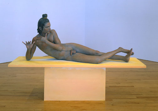
I'd like to be able to say my first homosexual experience was at the Art Students League. But that would be lying. My first homosexual experience was at Boy Scout camp, like everybody else's. However, I came close to having another homosexual experience upon viewing Krishna, because, damn, he's so beautiful. He's lying there unconcerned, calmly posing in some symbolic form, his penis draped casually over one thigh. Oh yes, Krishna is well-hung. I know he's supposed to be pretty, as he's an important Hindu god, but I didn't realize he was so impressively endowed. If more men actually looked like this, I'd consider switching teams. Or anyway switch-hitting.

Back on the wall, there is Anthony Palumbo's wild Cheese and Crackers. Anthony cheerfully jettisons any attempt at natural coloration or proper drawing to bring forth this wacky painting. I appreciate artists who can use color with imagination; matching colors you can see is difficult, but using colors straight out of your imagination and still making things look right isn't easy, either. Anthony's purples and greens combine to make a recognizable nude in spite of themselves and the result is simply exuberant.

Much more traditional but still vibrant is Standing Nude by Leonid Gervitz. After seeing some of the other work, Leonid hardly looks like the obviously talented painter he is, but what's most arresting about this painting is his Caravaggio-like use of chiaroscuro. That and the cat rubbing against the model's legs.

Finally, on your way out, you might notice a painting you missed coming in. It's right next to the door facing into the room -- facing Sharon's and Joan's paintings, in fact. It is New York Harbor by Robert Neffson. Robert mostly works on city scenes, but in this case he's put someone in front of a vast and detailed buildingscape. His paint handling is in a very different style from many of the more academic artists in this show; he invests more in vivid and sprightly colors. The nude woman strides across the painting in the foreground, pouring water from a bowl into her mouth. There's an air of unforced intimacy in this painting, almost like a snapshot; the woman hides her nudity from outside eyes by holding a cloth draped over her shoulder, but we're on her other side. It's morning in New York and the air feels fresh and clean against her skin, some spilled water drops drying on her arm.

You might leave this show still asking yourself, why the nude? Why indeed? Most of the artists give an answer to this question in the little note cards next to each painting. The best answer may have been given by William Scharf -- whose painting, ironically, isn't even recognizable as a nude -- who wrote, "Why the nude? Why not?"

When I went out on September 14, 2006, I was expecting it to be Comic Art Night. I had four artists on my list of shows and three of them were working in a style reminiscent -- possibly redolent -- of comic books. I'm not usually fond of fine artists wandering into comic book territory because, frankly, most fine artists don't have the technical ability to pull off proper comic book illustration. I find Roy Lichtenstein particularly irritating in this regard. But the artists on my list looked pretty good, so I was looking forward to the evening: Nicholas Di Genova, Lindsay Brant, Donald Baechler, and Hope Gangloff.

And what a difference a week makes! I wrote about how crowded and awful it was on Super Thursday, and here only a week later and there was no one at all to be found. Chelsea was nearly deserted. Of course, it's relative: Nearly deserted in Manhattan means there was a jazz trio playing soothing music outside one gallery and only a few hundred people on the sidewalks.

I began at Fredericks Freiser. Actually, I began having to go to the bathroom. Mr. Freiser, alas, does not have a bathroom for the public, so I was forced to leave in search of somewhere more friendly. Freddy: I'll never forget this.

It turned out to be lucky, though. I scurried over to my favorite building, 511 West 25th, and to its list of ample charms I can add that it has easily accessible public restrooms. On my way upstairs I said hello to Valerie McKenzie, which always makes my evening, and then stopped outside of Lyons Wier • Ortt. Fortunately for me a couple was gallery hopping ahead of me and, finding the door locked, knocked on it. I say this is lucky because I never would've knocked. The door was graciously answered by Anna Ortt.

So, happy me, I was able to finally see Mary Henderson's show. And it is fantastic. Mary works from photos she finds online to put together series of paintings linked by theme. This particular show is called Right Clique, which is a painful pun, only forgivable in light of how great the paintings themselves are.

Mary Henderson, Dinner Table, 2006, gouache on paper, 8x6.5 inches Mary Henderson is a hyperrealist similar to Denis Peterson. But where Denis uses an airbrush, Mary uses traditional brushes with oil paint or gouache. This makes a big difference: The oils fairly glow. I don't want to compare the two painters any further, because I feel that might unfairly hurt both of them, so I won't say any more about Denis.

Because of the color range and density of oil pigments, what might otherwise seem photographic -- especially in online reproductions -- instead becomes luminous, lending these quotidian scenes a bright beauty and timelessness that raises them well above the plane of digital snapshots. When Mary uses gouache her results are more closely photographic due to gouache's matte colors and lack of saturation. These are much more impressive technically than they are purely visually: Gouache is a touchy medium, difficult to work with, and for her to get photorealistic effects using it is an accomplishment indeed.

Which is not to take away from her mastery of oils. Her paintings are small -- the largest one in this show is 14 by 11 inches -- and stunning in their detail. Most paintings dissolve into a morass of lumpy paint when you get closer to them; Mary's paintings just get more and more complex, like she painted each molecule individually.

Mary Henderson, End of the Year, 2006, oil on panel, 14x11 inches 
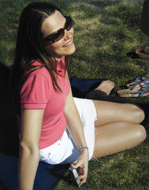
Sometimes the only thing worthwhile about a painting is its technique. Sometimes a painting is good in spite of its technique. In Mary's case, her paintings use technique to convert something which would be boring and pointless -- personal photos of people you don't know doing things you don't care about in places you've never been -- into something almost holy and magical. This is not just a pretty girl sitting in the grass holding her cell phone, which image would be irretrievably uninteresting as a photo unless the girl was my high school sweetheart. This is a young woman suffused in the glow of a beautiful day, captured in a moment of happiness and beauty which belongs to an unreachable past. Somehow, through her intense concentration on the subject, through bringing all of her talent and experience to bear on the execution, Mary has imbued this simple scene with more emotive strength than a thousand photos.

Part of me can't help but wish Mary would tackle some subject more weighty than this pun-worthy show; but when I really think about it, I find I feel she tackled a very weighty subject. More, she took a potentially lightweight subject and gave it weight. Which is really quite incredible, when you think about it: It's something only the very best artists can do.

After thanking Anna for opening the gallery and letting her get back to work, I went upstairs in search of Hope Gangloff at Susan Inglett Gallery. For some reason I couldn't find it, though. Either the gallery was closed or I couldn't even find the front door, I forget which. Whatever happened, I didn't get to see Hope's work.

On my way over to see Donald Baechler I passed Stux where a large opening was, as usual, spilling out into the street. There's a soft spot in my heart for Stefan's gallery; I saw my first Kostabi show there, when Stux was a smaller space on an upper floor. Now it's got a large area on the ground floor, and Stefan hasn't shown anything I was particularly fond of. Still, when I see an opening there I stop in, just in case.

Kuno Gonschior, Landscapes X, 2000-2001, acrylic on linen, 75x79 inches The main area was taken up this time by Kuno Gonschior and his latest, largish paintings. Kuno has painted Seurat dreaming of water. Each painting is just about square, over six feet on a side, and painted with a dashlike series of thick strokes in varying colors. The result is mildly hypnotic, like staring too closely at a Monet. I ended up a little cross-eyed. I got the impression -- if you'll forgive my use of the word -- that Kuno had taken turn of the century French painting and distilled it down to some essence.

Unfortunately, this distilled essence of Impressionism is form without content, color without referent. And if there's anything the Impressionists were about, it was specificity: This place, this color, this atmosphere. Without that specificity, what's left is purely retinal, with no real connection to anything. Kuno's paintings remind me of Seurat, but they also remind me of those cards optometrists use to test colorblindness.

Darren Wardle, Paprazzi, 2004, oil and acrylic on canvas, 48x48 inches Lurking in the back of Stux I found the works of Darren Wardle. Darren appears to be an old-fashioned airbrush artist, working in hilariously bright acrylics to create a world of architecture straight out of 1985. Those people you see illustrated in large chrome-framed posters in unisex hair salons would look perfectly at home in front of Darren's flamingo-puke buildings.

Okay, so Stefan Stux strikes out with me again. I'll still go back.

Donald Baechler, Autonomy or Anarchy #1, 2003, acrylic, paper and fabric collage on paper, 102x118 inches Next I stopped in Cheim & Read to see Donald Baechler's show. Donald has a pleasant enough cartoony thing happening, and he works nice and big so you know that, even though these are cartoons, they're Serious Works of Art. You could definitely drop ten grand on one of these, slap it up behind your leather chair at the head of the boardroom table, and feel like you're so hip you've got a titanium pelvis. You can rest assured you're hip because Donald's paintings are large, expensive, on a ground-floor gallery in Chelsea, and not particularly good. Your underlings will glance at the Baechler on the wall, shake their heads, and stop wondering why they didn't get bonuses this year.

Donald also has a sculpture in this show. It is indescribably worthless. It looks like someone took a Giacometti and force-fed it like a duck at D'Artagnan. Duck -- Donald! Ha! Sorry, that was unintentional. Really.

David Kassan, Alley, oil on panel, 72x36 inches 
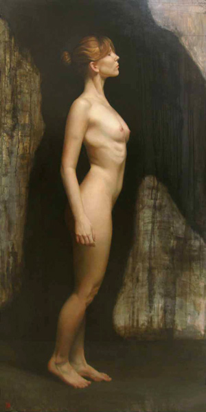
Since I was over at that end of the block and its doors were opened, I went in to Gallery Henoch to see what was happening. The gallery had a group show up with all of their heavy-hitting realists; the ones that really struck me on this visit were David Kassan and Sharon Sprung. I'll have more to say on Sharon later, in the next couple of weeks. David has done something really interesting to me: He's married academic figure painting of a very high level with nearly Abstract Expressionistic backgrounds. The contrast between the two approaches makes his paintings vibrate and gives them a poignant air.

Now, before I go on to the next gallery -- before I start talking about yet another painter with technique to spare -- I have something I want to share with you. I want you to know I'm only telling you this because I respect you and I think you deserve to know. You and I have a special connection, and so I'm willing to tell you things I wouldn't tell anyone else. I want you to keep this to yourself; fold it up and put it in your hip pocket until you get home. Take it out when you get undressed for bed and put it on top of your dresser and leave it there. Only look at it on special occasions when you think of me.

Okay. Are you ready? Come closer. Right there. Let me whisper it in your ear.

I'm a sucker.

There you go. That's it. I'm a sucker. Show me a Dalí-esque academy technique surrealist painting, and I'll fall for it. Throw in oblique -- or, hell, even overt -- references to Lewis Carroll (like Jett Jackson) or Mary Shelley and I'm yours. I know I shouldn't fall for this. But I do. Although I'm striving to be a fine artist, deep down in my breast there beats the unrepentant heart of an illustrator. I can't help it; it's how I'm wired, who I grew up with. I grew up looking at Boris Vallejo, Frank Frazetta, Den Beauvais' covers for Dragon Magazine, D.A. Trampier, H.R. Giger, Rowena Morrill, and Patrick Nagel. I love N.C. Wyeth to pieces and if I could grow up to be either one of the D'Aulaires or the Brothers Hildebrandt, I'd count myself happy.

On one of my earliest trips to Chelsea -- long before I started writing this blog -- I accidentally stumbled upon Interart Gallery on Tenth Avenue between 23rd and 24th Streets. I really liked the artist who was opening that night. Since then I've had to walk past Interart a number of times and every time I've gazed wistfully through its closed door at what was showing. But somehow I just hadn't gone by during an opening. That was until this Thursday, when I happened to find that the gallery was, in fact, having an opening; and, even more amazing, it was for Michael Cheval, the same painter I'd seen on my first visit.

Michael Cheval, LEA OF INSPIRATION, oil on canvas, 24x18 inches Should I like Michael Cheval? Probably not. Do I like Michael Cheval? Hell yes I do. Michael is the painter I wish I was. No: Michael is twice the painter I wish I was. If I could be half of Michael Cheval, I'd take it home and tell everyone I won the gameshow. Is he really that good? No. He's not. Technically he's superb -- technically he's incredible, almost as good as Dalí at his peak. He's not quite as flawlessly smooth, not quite the total master of his media. But he's better than almost everyone else who's ever picked up a brush. Still, his paintings lack a certain something, the same way Dalí's do. They're brilliant, they're beautiful, they're stunning -- and they're embalmed. Chilly. A little stiff. Not in terms of composition or rendering -- oh no, those would be technical weaknesses, and this work has almost none of those. No -- in terms of pure emotion. Van Gogh was sloppy, a mess, his canvases are little and crowded and sometimes even sort of muddy. But they radiate emotion, they're practically vibrating with feeling. Everything that made Van Gogh who he was is encased in every single brushstroke of his paintings. Not so Dalí and not so Cheval: Their brushstrokes have been drained of passion. Michael is an instrument of exquisite subtlety and grandeur, but he's playing an elementary melody. He's a Father Willis Organ playing Chopsticks .

I have no idea how to resolve this problem. It sometimes seems that the painters with the most rigorous technique are also the most emotionally distant. Look at Goya: It's pretty clear that he wasn't cut out to be a court painter. His portraits are pretty unpleasant. But when he got hold of a powerful idea, he painted the hell out of it. Van Gogh, too, got better the farther away from classical painting he moved. Now consider Lucian Freud. His paintings are devastatingly full of emotional power. But have you gotten up close to one? If you do, you'll see he makes Derain look like Bouguereau.

Speaking of Bouguereau, I love his paintings to some degree; when I look at them, or Rossetti's work, or Cot's The Storm, I'm uplifted the way I might be from looking at a cathedral: I think it's amazing that humans are capable of such feats, especially since most of the time they barely manage to be hairless monkeys. Every time I'm in Florida I make a pilgrimage to the Salvador Dalí Museum to sit in front of some great paintings. But these paintings don't reach down inside me and grab anything. They're amazing, but, like cathedrals, they don't move me.

And, ultimately, I want more out of art.

So I don't know what to tell a painter like Michael Cheval. His paintings are beautiful and they're clearly what he wants to paint but, in the end, I'm a sucker for liking them. They don't tell me anything I don't already know. I'd be thrilled to own one and if I were still in college I'd plaster my dorm room with his posters. Is it wrong of me to ask for more? To ask for more even while I love them?

Lindsay Brant, study for stained glass, 2005 Let's move on to easier things. Like Lindsay Brant at HaswellEdiger. I expected Lindsay to be a kindred spirit: Her art seemed to be about freeing drawings from paper, which is something I've been thinking about lately; and there's an element of sensuality to her work. Unfortunately I was slightly disappointed. Lindsay's art seems half-formed. Most of the pieces appear unfinished. Further, it might seem like she's trying to release her drawings into new media, like free-floating sculptures; but at bottom she's actually making stained glass, and thus really just drawing in an old medium. I like stained glass -- I think it has a lot of potential for fine art and I enjoy it in churches -- but there's a whole side to stained glass that's very plebeian arts-and-crafts. My feeling is stained glass used to be so difficult and expensive that, like carpets and landscape paintings in the living room, when they became cheap and easy the middle class ran out and began buying and making as much as they could. So Lindsay's work gives off, for me, a real A.C. Moore vibe. The fact that the gallery is displaying studies for pieces which are also included in the show, and which don't look like Lindsay is done with them, doesn't help.

Also, there's a feeling that this show is carefully calculated to be transgressive. A woman depicting naked women with Klimt-like fluids pouring from her vagina! Stained glass, traditionally the medium of uptight Catholics, being used to display boobies! Little fails to move me as weakly as when someone tries to be offensive.

I soon found myself back where I started, at Fredericks Freiser, examining the drawings of Nicholas Di Genova. In fact I got to examine them at a much greater length than I wanted, since New York's Finest, apparently having run out of terrorist plots against the subway, had decided to start handing out tickets for open containers of booze and to this end they set up a temporary command post next to my car. So I couldn't get out without annoying the police, and if there's anything I know from living in New York City, it's don't annoy the police.

You know me by now: I love drawers. I really like pen and ink and if the artist goes to town on detail, so much the better. And in this case Nicholas adds an extra twist by doing these drawings animation style, on the rear of translucent Mylar, along with nice, flat colors and mounted over backgrounds. All in all, this is the kind of show almost guaranteed to please me.

Nicholas Di Genova, Feathered Six-Shooter Commodore (Second Daughter), 2006, ink and acrylic on mylar, 20x36 inches Only I'm not pleased. Part of the problem is Nicholas' subjects, which are these manga/graffiti-inspired mergings of animal and weapons machinery. What are we supposed to make of these? Bionic penguins? Cyber-chickens? Is there some way to give a crap about them? The other part of the problem is sheer scale: Two or three animal-handgun combos might be mildly amusing and intriguing, but the walls of the gallery are fairly plastered with the damned things. After a few minutes of this repetition, I'm ready to dislike anything Nicholas draws just on principle.

And then finally, the trouble is Nicholas Di Genova's drawings remind me of nothing so much as the work of Ed Stastny, who's been putting his drawings online since at least 1993. Ed was one of the pioneers of the Web, running an artists' Website long before almost anyone in the art world -- or the world in general -- had heard of the World Wide Web. To give you an idea of what Ed did, maybe a short history is in order.

Back before there was a World Wide Web, the Internet was almost entirely text-based. Images -- still or moving -- and sound were not entwined in the online experience. Back in those days, everything was done through text-only systems like FTP. To give you an idea of what it was like: Let's say you wanted to do a pastiche of Michelangelo's Birth of Man. You'd have to hope that someone somewhere had scanned in a photo of the fresco from a book -- which would be difficult, since digital color scanners were virtually unknown outside of professional print shops. Then you'd have to go to an FTP site you knew about personally, maybe because someone had sent you the address in an e-mail message or someone had told you about it. On that FTP site you'd have to rummage through directory after directory, guided by the filenames, looking for words like "art" and "sistine_chapel". If you found a file that looked promising, you'd have to download it to your PC -- which could take a couple of hours -- and then view it. It'd probably be the wrong image, and then you'd have to go back to rummaging.

In other words, looking for anything in particular on the Internet back then was like looking for an out-of-print book by going from bookstore to bookstore. It was tedious and unreliable.

All that changed in 1993 when Marc Andreesen and Eric Bina, building on work by Joseph Hardin, Dave Thompson, and of course Tim Berners-Lee, wrote and released NCSA Mosaic, one of the earliest Web browsers. The World Wide Web, and the Hyper-Text Markup Language it supported, suddenly made it possible to include images and text, to connect one page to another, to easily and quickly lay out large quantities of text -- in short, suddenly anyone on the Internet could publish something of nearly the quality of a printed book.

By late 1993, a lot of computer people had jumped into the World Wide Web with both feet. People were putting up all kinds of things depending on what interested them most. My interests were Discordianism and Buckminster Fuller. Philip Greenspun was into writing and photographing a travelogue. Jerry Yang was into categorizing all the Web pages he could find.

And Ed Stastny was into art, artists' communities, and collaboration.

Ed founded the site originally called OTIS (Operative Term Is Stimulate) but then called SITO after the Otis elevator people got mad. SITO's been on the Web since 1993, which is about as old as you can get on the Web, and Ed's work has been part of SITO for that entire time. SITO was a place for people to put up their art -- whatever it might be -- and view other people's art. It was a visual place in the World Wide Web, where anyone could join in and add to the site. It may seem obvious and commonplace these days, but back then, SITO was a great leap forward. SITO really is the forerunner of today's community sites like Flickr and YouTube. It was a burst of originality and vision in a world of text.

Ed Stastny, What Beer Goes with Fish?, 1996, ink on beer coaster 
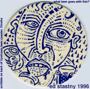
And it all really started with Ed and his drawings. Ed's drawings inspired me to doodle a great deal during staff meetings back then and I still love his style, with its strong lines and tribal-tattoo inflection. What Beer Goes with Fish? is an excellent example of Ed's loose, open, doodly, stream-of-consciousness drawing.

Ed definitely deserves more notice than he's gotten. He's continued to experiment, too, and I find his latest series of work utterly amazing, the kind of idea that seems so obvious when you see it but which you never could have invented on your own. He calls them Composites, which is a deeply unfortunate term, because it's so dry and non-descriptive. I'm not sure what would be better -- time passages? interweavings? tesserisms? -- but look at this and tell me it's not beautiful.

But the pioneers of the Web have been largely relegated to a geeky little niche in the back of the computer museum, if that much. Book publishers, music labels, film studios, the art world, they all arrived on the Web dragging their offline material with them. Pretty soon the artists of SITO -- and Ed -- were overwhelmed by "real" artists with their own Flashy Websites. Ed would probably disagree -- he seems so relentlessly inventive and energetic, I can't imagine him considering anything he's done to be less than a perfect success -- but I can't help but feel we've been cheated because we cheated Ed.

Because now we have this show by Nicholas Di Genova instead of a show by Ed Stastny. Honestly I'd really rather see Ed.

So it wasn't Comic Art Night after all. Which is kind of a shame. Well, I have until January for that.

Matisse: The Cut-Outs

| 3 Comments

There may be reasons why I have an affinity for Rousseau; there are better reasons for me to have an affinity for Henri Matisse. More than one person has told me that my drawings remind them of Matisse; I find this flattering (as I should) but also mildly perplexing, because I knew virtually nothing about Matisse's work when I started the series of drawings you can see on my Website. Of course I was familiar with his most famous pieces, like his Blue Nudes, Dance, and Icarus. But not any more than that, really.

I came to my Matisse-like drawings by something of a back route; I was inspired to change my drawing style -- to attempt drawings in a totally different way than I used to -- by seeing The Mystery of Picasso at the Film Forum. Before that anything I tackled in terms of art was very serious: I approached it seriously, took my time, and only worked when absolutely sure I could do what I wanted to do. I planned. I thought over my plans, examining them from every angle. I considered. I weighed. When I saw Picasso on film, what I saw was that good old Pablo, he scribbled. He didn't think anything through. He just started in and followed wherever his drawing went. And when he painted, he re-painted, and re-painted, and wiped out, and started over -- he painted an entire painting for the film and, when any of us would have stopped, he went on and obliterated it with an entirely different painting on top of it.

Granted that Picasso created no masterpieces for that film. The results were beside the point, as far as I was concerned; sitting there, hypnotized by the flickering frames in the dark, blasted by the music, as Picasso's drawings and paintings came to life before me -- that was the point. The drawings Picasso created stand with the film, part of its fabric, and don't really stand on their own. Picasso and Henri-Georges Clouzot took me on a hallucinatory trip that day.

What I took from that was the value of scribbling, of drawing without planning, of taking what comes. Maybe I could start with a vague idea of where I was going, what I was trying to capture; but plans would be incidental. There are no mistakes, just happy accidents, I said to myself, as Bob Ross used to say on his TV show.

Determined to scribble more, then, I looked around at my life, which was a total train wreck at the time. I felt like I was standing in the middle of a vast field of rubble, surrounded by twisted metal and smoking concrete. It was just past September 11, 2001; and, too, I'd effectively destroyed my own life at almost the same time.

So I turned to the only thing I felt could mean something to me: The animal comfort of another warm body, of sex and love. It was a comfort I couldn't properly feel at the time because my marriage was part of what I'd destroyed, but somewhere from the tangled mess I felt I could pull out the pieces that meant something. I was determined to capture the small moments that make up the intimate times which stitch together a life with someone.

That's where my drawings came from. From somewhere very deep and personal, at the confluence of how I felt and where I wanted to go, artistically and in a larger sense as a person.

So it was quite a shock to go to the huge Matisse Picasso show at the Museum of Modern Art and find that when Matisse drew, his drawings looked like mine. Or mine looked like his. Whichever. Somehow I'd absorbed something of Matisse through his friend Picasso, long after they were both dead, and put it out on paper. As Brent Hallard commented on Ed Winkleman's blog, my images are "a mark making historically indebted." But they are so, oddly, without my knowing the history.

Also strangely, I don't find myself enjoying Matisse's work very much. It's okay. I find myself concentrating on the flaws I perceive more than the works as a whole: I'm critical of Matisse's ability as a draftsman. He seems hesitant and unsure in his lines. He doesn't trust his eye -- and I wouldn't if I were him, either, because I feel an inelegance in his drawing which itches and can't be scratched. I keep wanting his drawings to be tighter, more secure, better. More, I feel Matisse wanted this as well. Picasso's drawings are similar in quality and style but at no point do I feel Picasso wishes his drawings were anything other than what they are. Gauguin's paintings look like he meant them to be the way they are, flawed and ungainly. But Matisse, in his work I feel a yearning.

Maybe that's just me, though. Maybe I feel a yearning. Maybe I feel like Picasso and Gauguin were hopeless causes -- they could never be nudged to be excellent draftsmen. (Picasso, in particular, could be an excellent draftsman when he wanted to be.) But maybe I see in Matisse something closer to what I want. Which is silly: Who cares what I want? Obviously Matisse is sufficient unto himself, or he wouldn't be in the museums. Right?

Well: Some days I feel like a lot of what's in museums is there because at some point someone thought it should be, and now people think, you know, maybe this stuff shouldn't be in the museum, but, well, it's been here so long now, I guess we'll just leave it. The inertia of art: It's on the wall because it's been on the wall for a hundred years, which time makes it of historical interest even if, in and of itself, the object isn't all that interesting.

But then my cynical nature can be overwhelmed. And it was when I found, tucked away in a distant corner of the National Gallery of Art in Washington, DC, the permanent installation Matisse: The Cut-Outs.

Henri Matisse, The Cut-Outs at the National Gallery of Art, installation view 
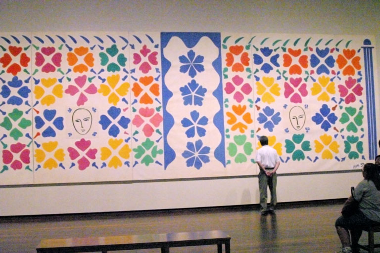
What blew me away was not so much the works themselves, although they're pretty impressive. What really got to me was the realization that draftsmen before me -- that Matisse himself -- had been working on liberating the drawing from the paper. I knew this before, of course -- in the National Gallery there are several examples of Alexander Calder's drawing with wire -- but the scale of the cut-outs are astonishing. Especially considering Matisse was in a wheelchair when these were made; he must have had a small army of assistants. But unlike Sol LeWitt's Wall Drawing #65 also at the National Gallery (and which should be retitled Yet Another Wall Drawing Attributed to Sol LeWitt for No Reason We Can Fathom Since He Never Touched It), Matisse's hand is evident everywhere.

The hand of the artist: So denigrated in our time, here elevated until it's nearly all that's left. These cut-outs are as direct as can be from Matisse's eye to his hand, from his hand to our eye. When I stand in front of a painting I remind myself, sometimes, that I'm standing exactly where the artist stood when they were working on it. I'm seeing the painting nearly exactly the way they saw it while they were painting. I find this version of time travel exciting. And Matisse's cut-outs are even more viscerally of him than any painting: Each piece of paper records a precise turn of his wrist. Standing in front of them, as they take up an entire wall before you, you can feel as if the paper is still warm from the artist's touch, as if he's actually in the room with you.

And to think, too, that we're working on a project together -- this project of releasing drawings into the wild, pulling them off the paper and sending them galloping -- that's pretty exciting. No, I'm no Henri Matisse. I count myself lucky that I can even see his work. But if I can, in some small way, contribute to the enterprise he dedicated himself to -- then I'd feel pretty good.

(In the installation photo, by the way, that is not me standing in front of the piece. I'm manning the camera. However, that is my wife Dawn sitting in the lower right corner.)

Henri Rousseau: Jungles in Paris

| 3 Comments

At long last I made it to see Henri Rousseau: Jungles in Paris, the travelling exhibition of Rousseau's paintings at the National Gallery of Art in Washington, DC. Way back in February, I think it was, I read about the show and printed out a page on it so I'd remember to go after it opened in July. It was only six months away; still, at the time it might as well have been opening in 2050. The summer was as far off as the next flyby of Halley's Comet. But somehow the six months got behind me and then another couple of months slipped in there and my wife, bless her heart, realized if we didn't get down to DC this weekend we'd never see the show. And she knows, of course, that Rousseau is my favoritest painter, so she put it together and we drove down Sunday morning.

There are a number of rational reasons why I might feel an affinity for Henri Rousseau. He was a "weekend painter" until he retired from his day job at the age of 49. He was completely untrained and taught himself everything he knew about art. Before becoming a full-time artist, Henri had worked at quite possibly the most boring job in the history of bureaucracy, as a customs clerk, checking people's baggage at the border of France to make sure they paid taxes on anything they brought in to the country. He never travelled anywhere. His work would probably be unknown today but for the championship of Pablo Picasso, who told everyone he could about Rousseau's paintings and held parties in his honor. Looking back, it seems like maybe Picasso considered his support of Rousseau to be one of his jokes on the art establishment. If so, it's likely that Rousseau didn't get it. He was too busy -- along with paintings he also composed music and wrote stage plays which were never performed.

So from his biography alone, I love poor Henri. He gives me hope, since I'm a latecoming, self-taught artist, working as a computer programmer, quite possibly the most boring job in the history of the modern corporation.

Then there are a number of rational reasons why I might not like Henri Rousseau's work. I'll admit this: Rousseau's a terrible painter. Technically speaking, his work is a disaster. He has no grasp of perspective, no clear concept of human anatomy, no sense of composition. His coloring is childlike. He makes so many elementary mistakes in drawing it'd give an academic the willies. His paintings cry out for some professional guidance. One copy of Drawing on the Right Side of the Brain would've worked wonders for the guy.

But my love for the paintings of Henri Rousseau isn't rational at all. My love is based entirely on standing in front of the paintings and feeling. I was working at yet another thankless, pointless computer job in midtown Manhattan. My life had beaten me down. I could barely walk. And one day during lunch I stopped in the Museum of Modern Art. I wandered aimlessly past any number of paintings barely even registering them. And then there was Rousseau. I stood in front of it, then sat. My whole world fell into that painting. Everything dropped away.

I can't explain my love for Henri Rousseau because it can't be explained. It's beyond analysis. I knew nothing of Rousseau's biography that day in MoMA; I didn't examine the painting closely enough to note its flaws. The painting, in some way, bypassed the thinking parts of my brain -- it reached through my eyes and down into some deeper place and found something past thought and language, past where I make decisions and debate ideas. I can't explain my love, or defend it, or even place bounds on it. The more I try to put my hands around it, the more it slips away.

I'm not even sure which Rousseau it was that affected me this way. Was it The Dream? The Sleeping Gypsy? When I went back years later, The Sleeping Gypsy was in the place where I'd had my epiphany, but I strongly recall leaves. It was probably The Dream. I was honestly so affected I almost fainted, so forgive me for forgetting exactly which painting it was.

The only thing disappointing about Henri Rousseau: Jungles in Paris is that The Sleeping Gypsy isn't in it. Every other major painting you might want from Henri is there, in addition to a lot of his lesser paintings. In fact one of the things that's really fantastic about this retrospective is you can see Henri start out attempting to be a real academic painter and failing miserably. He just has no idea what he's doing. Then, over time, you can watch as he tries harder and harder to reach his goal, until ultimately it appears he just gives up. Then he wanders off in his own direction, giving free rein to his inutition, and the farther he gets from academic painting the better he gets. Eventually his paintings have almost no connection to reality: Rousseau has no clue what a lion looks like. He's got monkeys using fishing poles. He's got an American Indian fighting a gorilla in a jungle. Jungle cats have six claws on each foot. And throughout all of it, Rousseau is lavishing his attention on the flora which is ostensibly the background. I can't tell if he loved painting plants or if he found himself in the middle of painting the plants thinking, "Damn! One more leaf and I'm going to kill someone!" But it's clear the leaves are what the paintings are about, whether he knew it or not.

The exhibition text talks about Rousseau's "unsettling" juxtapositions and "jarring" changes in scale and perspective. Maybe if you stretch you can see those things, if you feel you need to. I see a painter with no observational skills and no technique whatsoever. He's not trying to make that kid on the rocks look like a petulant giant. He's just incompetent.

The amazing thing is, his technical competence doesn't matter. When he lets loose on some totally fantastic subject, his enthusiasm, his spirit, his amazement at being alive all come through. Rousseau's cartoon moon shines down on all of us while we sleep and dream of life.

There really isn't anything else in the modern wing of the National Gallery to compare with Rousseau. An entire room full of Barnett Newman's Stations of the Cross has less energy, less life, than one square inch of any given Rousseau. As Kurt Vonnegut wrote of Rabo Karabekian in Bluebeard, if you took any given painter's works and displayed them so they'd all focus their energy on a single point, and then you stood at that point, for most painters you'd feel nothing. But Henri Rousseau -- well, he might just knock you over.

Pages

OpenID accepted here Learn more about OpenID
Powered by Movable Type 5.2.7