WARNING: The following review contains hemming and hawing. Also equivocation.
I've written before, more than once, that I'll go to any art event if someone invites me. This has never been really entirely true. I always consider going if someone invites me, but there are other considerations, such as how terrible the art looks, how cranky I am that evening, whether or not there's a family event at the same time, and so forth. Over the summer, too, this blog became somewhat inexplicably more popular, such that I've been getting a lot more invitations to things than I used to. So while my invitation policy used to be nearly true, it's gotten much more fictional over the past couple of months.
I feel unnaccountably bad about this. I don't owe anyone free publicity, but on the other hand, I do like to be invited to things and I hate letting people down. I'm a people pleaser. You can tell that, can't you?
So I got this invitation via e-mail to this opening. I checked out the work and I'm going to be honest: It didn't look great. It didn't look bad, either. It looked, really, like the kind of work that really can't be judged by JPEGs. I figured the work could go either way. In person it could be very good or it could be totally lousy. Impossible to tell. My first impression, then, was to skip the opening.
Then I looked up who was inviting me. The message was from a woman who was, judging by the photos online, attractive and upscale enough to get in photos at fundraisers attended by what, from my lowly perspective, appear to be the New York fashion elite. Well, the invitation was almost certainly not personal, but I was flattered nonetheless, because I'm easy like that. A pretty girl who knows rich people wants me to go? Then maybe I should!
A later message was from a guy, which brought me down a bit. But he was inviting me to the pre-opening, which, he said, was for press and VIPs. VIP! I've never been a VIP before, except once when I was someone's guest. I'm special!
Then I saw the address of the opening. It was in the middle of nowhere, Brooklyn. I mean, the middle of Brooklyn can't possibly be the middle of nowhere, not really, but in terms of my existence, it was: Not near any other art openings, not near subways I usually take, not near where I get off the bus, not near my studio. Also, not near a good neighborhood. This was in one of those neighborhoods I only hear about on the evening news because there's a fire or a hit-and-run.
Have I hemmed and hawed enough for you? More warning: There's further ahead. But anyway. I had my reservations about going and I had my reasons for going and none of them were really related to the art, and what I'm getting at is there are lots of things swirling around in my head that have nothing whatsoever to do with art which go into whether I see something or not. This is not very high-minded of me, I know, and part of me feels bad about it, but it is what it is.
In the end, that Thursday night, I went. I found myself getting off the L train in Bushwick. I immediately thought, compared to this, my studio's neighborhood in Gowanus is Park Avenue. Flushing Avenue in Bushwick is an area that can best be described as up and coming because it can't go much further down and away. But that's where the great art is, where those outside the art world are, right? Because it's cheap. It's not like Williamsburg or DUMBO or Chelsea or the Lower East Side, even, neighborhoods which have been so thoroughly gentrified you can't afford to live there. Those places are still trying to pretend they're down and out, but they're the very haute kind of down and out that takes a large amount of cash to practice. Not Bushwick: I passed an open pool hall with signage in Spanish. I didn't even know Spanish people played pool.
There on the corner of Vandevoort and Flushing Avenue I found Factory Fresh, and if you get there before October 11, 2009, you'll see Tim Kent's All That is Solid Melts into the Air.
Let's get the last of the hemming and hawing out of the way: I'm not sure, if I'd been walking from gallery to gallery in Chelsea, that I would've stopped for very long at Tim's show. I would've skimmed right over it, probably, without really giving the work any time at all to sink in. But I wasn't in Chelsea, I was in Bushwick, and I'd come over two hours by bus and train -- the bus getting stuck in the Lincoln Tunnel for 45 minutes due to some kind of accident ahead of us -- and when I got there, I was one of the only visitors in the gallery, and I was greeted warmly by my e-mail correspondents and introduced to the artist. All of which conspired to keep me in the gallery and paying attention.
As soon as I arrived I was met by Wade Groom and Katja Douedari, the husband and wife team of Studio Douedari, the publicity firm getting the word out on Tim's show. Both of them are really lovely people, new parents of twins, and we had a good little talk before they introduced me to Ali Ha, co-owner of the gallery, and at last Tim Kent himself.
I was completely charmed by everyone in the gallery, not least Tim. He's an excellent conversationalist, made me feel welcome, had interesting things to say, struck me as intelligent, intense, and serious. I really liked him. We talked for a few minutes before he left me alone with his paintings and the few drawings he had up. One thing he confided in me was that the show had been intended as a small show of drawings; somehow it had ballooned into a rather large show of nearly 20 paintings and a handful of graphite works. As I began to look around a good crowd of people began to fill up the space so that by the third or fourth time I'd walked around I was having to dodge viewers to get around.
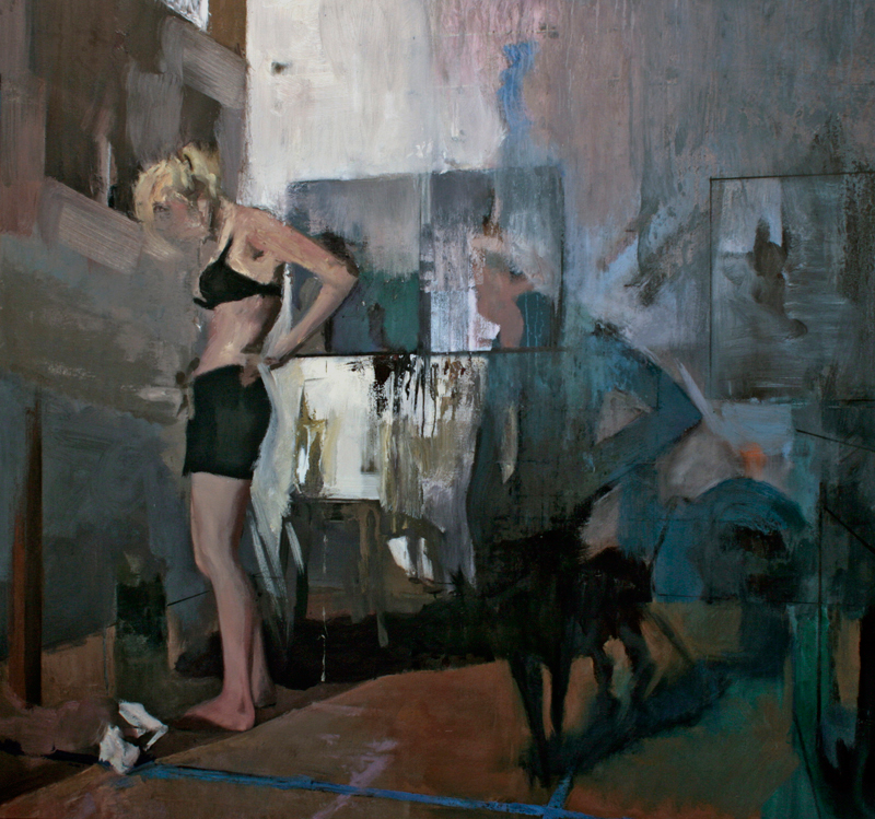
Tim Kent, No Love Lost, 2009, oil on linen, 72x68 inches
Which brings us finally, at long last, to the work itself. Sorry it took me so long, but I warned you.
I definitely think Tim is a real artist. I think there's something to his work. I'm not certain I'm capable of reviewing it properly, which accounts for all my equivocation; I'm not sure it's near enough to something I have a feel for. That said, a couple of the paintings strike me as real standouts, very solid, excellent work. I've reproduced two of them here, and I think they're the best in the show.
My instincts were right, however: You can't appreciate Tim's work in JPEG form. The JPEGs lend them a clarity and obvious concrete aspect almost totally missing in person. Standing in front of his work, what strikes me most about it as a whole is ambiguity. At few points is it clear exactly what he's rendering. Even the few small paintings which are clearly portraits are blurred, messy, nearly abstract; you'd never pick their subjects out of a line-up. One portrait, titled E.C., is so abstracted I'm not sure it's intended as a portrait at all.
In his figurative work he tends to attenuate parts of the figure. Legs wander off in a smear of paint and blend into the bedsheets. Faces are blended into the wall. It's difficult to ascertain what's shadow. In The Room, It Breathes a crisply rendered staircase and fairly tightly painted chair set off the other end of the room where someone is splayed on the bed. It took me several minutes of looking (some over Tim's shoulder as we talked) to realize there is, in the foreground, a nightstand with pill bottles and a wine glass. To say that an air of menace hangs over these paintings is to understate the case. Likewise in No Love Lost it was a little while before I noticed there was a dog in the painting.
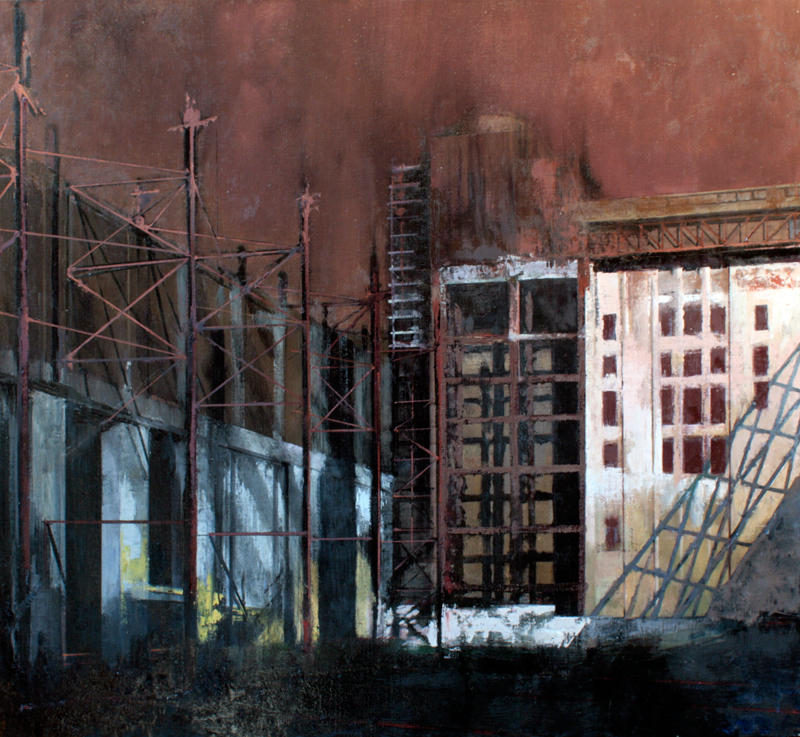
Tim Kent, Childhood's End, 2009, oil on linen, 46x50 inches
Although I'm naturally drawn to the human figure -- I tend to think every painting needs a person in it -- my favorite in the show turned out to be, after several trips around and looking very hard, Childhood's End. It's a pure cityscape, with passages of impressionism, but instead of seeing sunlight and bright colors, this is one of those dingy, dirty back ends of the city. Scaffolding and trusses dominate the buildings, the air is hazy and claustrophobic, the sun wanly laps down from the right. It evokes an urban landscape even Hopper might find too depressing.
Some of the other works struck me as less sturdy. Tim's abiguity can take him too far from anything concrete, but he doesn't really make the full leap into abstraction; his palette reminds me of Clyfford Still but he doesn't activate the surface, doesn't drive up the pressure the way he needs to be truly abstract. Instead his paint just dissolves into a muddle. And Tim's use of stags strikes me as inorganic and unfelt. An artist like Christopher Reiger uses wildlife because he has to -- it feels as if he lives with his deer and foxes and bears. With Tim, I get the feeling he somewhat arbitrarily chose the stags as some kind of symbol; they didn't choose him.
So with all my hemming and hawing my conclusion is that Tim Kent is a real and serious artist. I don't feel my critique really does him justice; I don't feel qualified to judge him. All I can say is, go out to Bushwick and see for yourself.