When last I left you I was standing at the locked doors of Cheim & Read contemplating the words of the Batman as quoted to me by comic artist Mike Cavallaro. I didn't just stop there at the doors; I did what I usually do when in Chelsea, which is go from opening to opening, seeing what I can see. You may recall from that essay of mine that I listed the ways in which I end up seeing bad art; you may further recall that the most common way is for me to wander from show to show. And you might wonder, then, that I'd ever wander through Chelsea, since that's when I see most of the worst art I'll ever see.
The answer is simple: I believe firmly in serendipity. More on that later.
The first opening I attended was one I aimed for. I'd seen the show listed on Chelsea Art Galleries and the itty bitty JPEG caught my eye. Here was an artist fooling around with the superhero comic book idiom. I asked a bunch of the actual real live comic artists in my studio's building if they wanted to come, but they all had paying work to do. Funny thing about comic artists: They work. Really hard. Fine artists just fuck around all day but comic artists, man, they put in the hours.
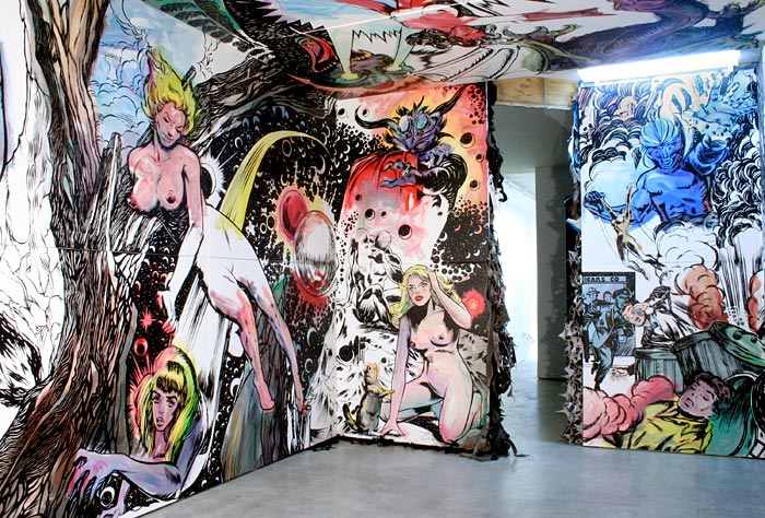
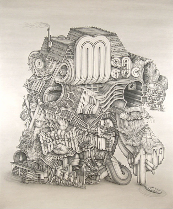
Gosha Ostretsov, Coolville installation detail, 2009
Which is why it's somewhat galling to see a fine artist borrow so shamelessly from comics and manage so little with it. All right, maybe I'm being overly obstreporous here. Certainly Gosha Ostretsov is no Roy Lichtenstein, and I mean that as a compliment. I ran images from his show, Coolville at Claire Oliver (through June 27, 2009), past my comic artist friends and none of them could pick out specific images he'd copied; the general agreement was Gosha had, at least, spent plenty of time looking at John Buscema and John Romita's work. I still couldn't shake the feeling that Gosha's figures were directly stolen, and that wherever he modified them he screwed them up; and yet I have no proof, the way we have with Lichtenstein. As Mike said to me, though, "There's so much work out there by Romita and his contemporaries that it's almost impossible to keep every Spider-Man cityscape in your head." The same could've been said, in spades, about Lichtenstein and the originals from which he stole; but someone worked it out.
I'll say this for Gosha: His room-filling installation looks fun. Although he stole from comics, and clearly expected viewers to make the connection to comics, he failed to put together a coherent sequential story; instead he's made more of a collage of comic book moments, with villains and damsels in distress (usually nude), along with quintessential 1960s cityscapes and crowd scenes. Filling the walls and ceiling it all makes for a vivid and vibrant pop culture experience. You can tell it's fine art, though, because nothing really makes sense, and Gosha is clearly using some set of personal hermetic symbols it's up to us to puzzle out. If we care, which we don't.
One thing that made me think he'd copied his figures was the handling of the nipples, of all things. Buscema and Romita and other artists working at the same time weren't big on showing nipples -- as a rule nudity wasn't allowed, although they bent the rules plenty on Roy Thomas and Buscema's Savage Sword of Conan -- and when Gosha draws nipples, each one looks as solid and chewy as a big old gumdrop. My suspicion is this is because Gosha had to fall back on his own inferior draftsmanship. Although I suppose he could be attempting a statement on the objectification of women in the comics medium.
But probably not.
Gosha further artifies the show by standing a bunch of funny-headed mannequins around the place, some with cans of spray paint. My guess is they're supposed to be the bad guys in his personal universe, and since they're wearing suits, I'd have to say they're representative of the agents of conformity or something equally profound. I imagine Gosha thinks he defeated them by finally getting a show in a ground-floor Chelsea gallery (to say nothing of a spot in the Venice Biennale). But the joke's on him: He's more of an agent of conformity in the art world than any guy in a suit and tie.
I'm not sure where I went after that; I was more aimless than usual this Thursday, and I'm pretty sure I went back and forth over the same area more than once. It was a lovely late afternoon for walking in circles. The sun doesn't set until after eight this time of year, so there was plenty of light and time to enjoy New York City's short springtime.
In fact my travels took me past what is probably the strangest activity I've seen on the streets of New York in all my 38 years in the city. I think I've seen some weird shit but it's probably not a patch on the weirdness that most people see; somehow New York stays resolutely normal when I'm around. But that Thursday I walked by a very short, nearly dwarfish woman, wearing only a g-string, painted green, climbing on some construction scaffolding. I cannot recall ever seeing anyone actively naked on the street in the city; of course I don't go to the parades in the Village or Coney Island. This wasn't a parade, however, or even a performance. From what I could gather, some photographer was doing a shoot. A weird shoot.
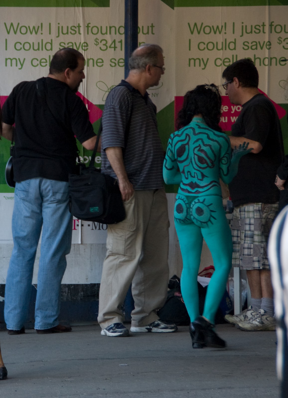
On the street in Chelsea, 2009.
In addition to the green woman there was a woman painted gold and, later, a completely hot pink one. As I walked by I could smell the airbrush paint. It reminded me of summers doing t-shirts. I took some photos just so I could prove this really happened; I couldn't take too many because I honestly felt bad enough for the models. I figure, to take the kind of job where you're nude on a city street, you're either very brave or very desperate; and since I couldn't tell which, I didn't want to make them feel worse if it was the latter. Also, I thought the professional photographer who was paying for their time might be unhappy to find me to essentially stealing his work over his shoulder.
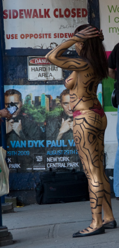
On the street in Chelsea, 2009.
But I had my camera with me, you see, and the urge to pretend to be a photojournalist was too much.
From here I'd ordinarily continue in the order I walked, except I can't piece my trip together. I'll just go through the pile of postcards and hand-outs in the order I like them, starting with the worst. How's that?
Actually, let's start with the one I can't remember at all. I specifically remember stopping at an opening at John Connelly Presents. I clearly remember looking for a postcard or something and not finding one, and finally settling for a JCP business card. "I'll take this," I told myself, "to remember I was here, and then I'll remember the artwork." Plan failed. I remember taking the card, I have the card here, and I have no idea what I saw there. Nothing on the gallery Website rings a bell. Everything on there had closed by last Thursday; nothing new is listed until June 5. Did they rent the gallery out for something else? Playing vanity gallery to make ends meet? I have no idea.
So much for my not taking notes. I guess I should've taken a picture. Oh well. To make up for it, I'll show you a photo of this guy. I hadn't noticed him before. His cousin lives around the corner on Eleventh Avenue and is much more obvious. This guy's kind of hidden. (Some searching leads me to believe these are the work of French street artist Space Invader, though I can't find these invaders on his site.)
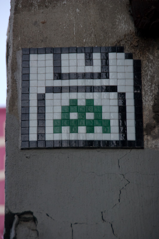
On the street in Chelsea, 2009.
Back to actual art shows. The worst of the bunch -- although it's hard to nail just one down for the honor -- was Mark Flood's Chelsea Whores at Zach Feuer (until July 10, 2009). I mentioned Zach in a previous essay here, picking on him for firing a whole bunch of his artists. All I can say now, my mouth agape: Zach fired painters in favor of this crap?
Mark Flood, Self Portal, 2009, collage on coroplas mounted on wood support, dimensions variable, 50x36 inches
Mark's actual show is hard describe because it's one of those where the artist can claim to have intended anything you might say about it. Just look at the title: It's clearly a criticism of the very world it inhabits. Since I myself was in that world when viewing it, I am part of that it criticizes. Therefore I've been effectively neutralized!
Only not really. Because the show is part of the world it's criticizing and no amount of posing on Mark's part lets him wriggle off the barbed hook that easily. You want to criticize? Then let's see some actual criticism. But no, what we get here is a threadbare variation on the anti-pose pose -- maybe it's self-consciously posing anti-pose posing as an anti-pose? Whatever it is, it's dumb as all hell. Is it funny when the gallery hand-out calls Mark "the least important German artist of the post-Word War II period"? No. Does the self-deprecating note of phrases like "conventionally provocative and predictably controversial" help? No. The fact you know it's lousy art, Mark, is not itself a critique of anything except your poor self-judgment. Your mangled photos and spray-painted signs bear witness to nothing so much as your witlessness and your complete lack of talent or originality, and saying as much in your press release isn't part of the joke, it's just pathetic and stupid.
Zach, Mark: Please stop wasting everyone's time and just burn your gallery and everything in it to the ground. Take the insurance money and move to Boca Raton, sit on the beach, smirk to yourselves, and leave us out of it.
So much for junk from the Painting Is Still Dead school. Alas, the Painting Is Still Alive school doesn't always throw up a decent alternative: Witness Kim Dorland's Super! Natural! at Freight + Volume (until June 25, 2009).
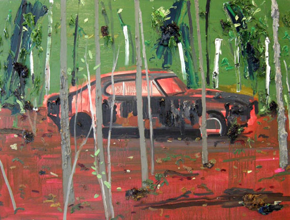
Kim Dorland, Fixer Upper, 2008, oil and acrylic on wood, 35.5x48 inches
It's almost impossible for me to imagine worse painting than Kim's gloppy, disordered, inept messes. It would actually be an insult to Feeblism to call her a Feeble painter; most Feeblists, at least, don't appear to have tried all that hard. Kim's thrown down so many colors in such profusion, amidst such graceless compositions, with no quality of touch -- it simply boggles the eye. And no getting away with "that's what I intended" here: It's clear there's zero intention behind these beyond getting the paint from here to there. The entire show lacks a single redeeming moment. If I found that Kim is a blind quadriplegic who paints with a brush stuck in her ear, I'd still be surprised she could turn out such terrible paintings.
Now the worst is behind us. What's next isn't great, either, but at least it wouldn't make one weep for humanity.
I've ended up in Brenda Taylor's gallery the last couple of times I was in 511 West 25th; I'm not sure why I didn't write about what I saw there. Maybe because the gallery Website isn't current. I don't know. I remember liking what I've seen there in the past.

Jamie Clyde, from Paid in Plastic, 2009
I found myself there again this time for Jamie Clyde's Bloodletting and Paid in Plastic -- "Two bodies of work, one night only" crowed the postcard I took with me. One night only, meaning you can't see it. Just as well, really. Jamie's got some "sexy" photos of mannequins, which I suppose is some kind of statement on the standard black & white nude photos with which our world is surfeited; and then he's got some photos of people in suits with added surrealist touches which I guess says something about the business world. Feel free to visit Jamie's Website to see the photos, but if you fall asleep and smack your head into the keyboard, well, I warned you.
Equally yawneriffic but completely different, we have Violet Hopkins' Afraid He Might Be Mistaken for a Centaur at Foxy Production (until July 24, 2009). The title is the most interesting thing about the show; the rest I experienced as the visual equivalent of "blah blah blah". It wasn't until I read the gallery verbiage -- at home -- that I learned the main thrust of the show is ignorant contempt for one's intellectual superiors.
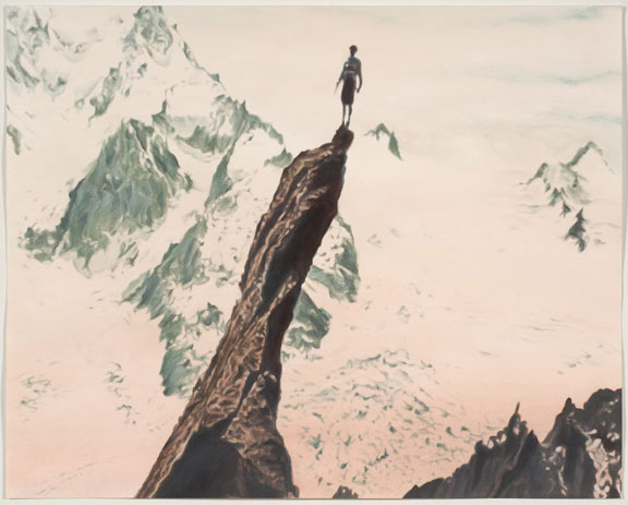
Violet Hopkins, THEY MAY GUESS IT WAS BOTH DIFFICULT AND POINTLESS TO SCALE THIS NEEDLE, 2009, ink and pencil on Arches watercolor paper, 16x20 inches
My impressions on the walk through the show: Here we have a bunch of watery, faded-looking watercolors clearly based on photos. It's cheap photorealism, the subjects are uninteresting, and altogether no connection between the images can be discerned. Maybe it's some kind of time capsule or something, with images chosen by the artist with no real point. A couple walking, someone holding a toad, a seashell, a guy measuring an alligator's tail. One quick circuit around the room and I had no interest in going back a second time -- there's nothing visually interesting here, nothing remotely absorbing, nothing worth the paper it's painted on.
However, reading the gallery verbiage explains it all. Violet has taken images from the 1977 Voyager spacecrafts' Golden Records. I urge you to go and read NASA's page on the Voyager missons: It's a fascinating account of one of mankind's greatest accomplishments, truly one of our most amazing achievements. I am humbled to think of what humans are capable of when we really put our minds to it. If there's anything that gives me hope for humanity, that makes me think we have a chance of ever overcoming our darker impulses and finally making life wonderful for every person on this planet of ours, it's a project like the Voyager mission.
Think about it: Human beings designed, built, and deployed a spacecraft. We sent it out on a course to pass by Jupiter and Saturn, 500 million miles away and more, collect data and send it back. And not only did both Voyager probes complete their initial mission, they both turned out to be so well-designed that they've continued to operate, continued to send back data, and had their missions extended from five years to thirty years. The enormous difficulties involved in this enterprise, the mathematics and engineering, the decisions to be made, the sheer knowledge of the working universe required -- I can't even begin to comprehend the magnitude of this undertaking. It makes the most ambitious dreams of science fiction look like Lincoln Logs. Because the Voyager mission actually happened. Hell, it's still happening.
Knowing that the spacecraft would continue on their journey long after their mission was done -- that's Newton's first law of motion for ya -- the scientists and engineers at NASA thought it'd be a good idea to freight the crafts with some information, just in case some life form exists beyond our solar system and happens to find them. Not a bad idea. A rather hopeful one, I think. You might even say idealistic. So they hired Carl Sagan to head a committee to put together a collection of information from Earth: sounds, pictures, and so on. And they put it all together in a way that's as universal as they could make it, so that whatever kind of life form found the information, they could decode it and make some kind of sense of it. So they could get an idea of what we were like.
That compendium of information is called the Golden Record. Because, of course, gold is one of the most stable of all elements and thus well-suited for a permanent record.
The idea that human beings are capable of completing a project as awe-inspiringly large as this -- I don't have to hide my feelings. It almost brings me to tears.
So along comes Violet Hopkins, a know-nothing emptyhead with a flimsy little MFA from California, who probably couldn't tell Isaac Newton from Fig Newton, to point her finger and laugh at this effort. The press release effuses, "she explores the limitation of possibilities inherent in fixing an image to a concept." It's a shame Violet wasn't on the committee at NASA so she could point out this brilliant postmodern observation to them. They were clearly all so ignorant, thinking an image could represent what it actually shows. I hope, if the Record ever is found by an extraterrestrial, that they take into account "the complex layers of appropriation and change that the images have undergone over time". Layers of appropriation? What does that even mean?
The press release even goes so far as to drop this gem: "The purpose of the inscriptions is illusive: only the original producers would be able to read its symbols; an alien would certainly be stumped." Of course, it took a naif to notice what the greatest minds humanity has ever produced couldn't possibly have grasped, that their carefully designed and thoroughly researched graphics could never hope to be understood by an alien. Or, at least, by a 35-year-old nitwit transplanted from Texas. Just a brief note for Ms. Hopkins: Just because it doesn't make any sense to you doesn't mean it doesn't make sense. This is especially true if you're an ignoramus, which, apparently, you are.
My bile rises just reading the title of the piece I've reproduced here. Violet, darling, why don't you try doing something actually challenging for once, instead of incompetently copying the work of your betters, before you go casting aspersions on the evidence of their efforts? Difficult and pointless to scale this needle indeed. Better difficult and pointless than easy, brain-dead, and pointless, like your show. Give me a mountain climber any day over a worthless so-called artist proferring her stupidity as fine art. Do the world a favor, honey: Go back to Texas, find a hole with a gila monster, crawl on in, and never come out again.
All right, okay, enough with the negativity. Let's talk about some good shows.
I haven't been down West 27th Street in a long time; I haven't felt the need. I'm glad I made the trip, though, because I found Frank Magnotta's Grand Optimist at Derek Eller (until June 27, 2009).
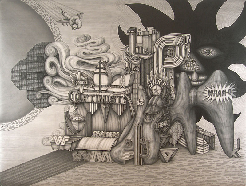
Frank Magnotta, Grand Optimist, 2009, graphite on paper, 80x104 inches
Frank's work crept up on me. The first drawing in the show, Life Drawing, struck me as too twee by half, and not particularly well-drafted. I therefore cast an eye with slight jaundice over the rest of the show. But as I walked around once, twice, then a third time, I realized that Frank's drawings are in fact fantastic. I was pulled in by his obvious obsessive technique -- each piece is huge for a pencil drawing, some four feet wide, and carefully and subtly shaded -- but then I was captivated by Frank's playful invention and profusion of detail. In terms of subject matter, the work lives where Pop and Surrealism rub up against each other; yet somehow Frank's approach elevates each piece above both categories. In lesser hands this could devolve into kitsch or cheap collage, but Frank's insane pencilling holds it all together.
Frank Magnotta, Century 21, 2009, graphite on paper, 95x80 inches
What are we to make of a piece like Century 21 where an infinite recession of Virgin Marys marches down into nothingness in front of a phantasmagoric profusion of corporate logos, dripping, festooned with moss, bristling with gun barrels and tendrils -- is that dollar sign electrified or growing a root network? -- and finally oozing a belly-up whale out of a giant digital digit?
The only question I have is, does Frank plan these drawings or just start at one corner and work his way to the other? Either way, he's a madman genius.
One last show. Remember earlier in the essay I said I firmly believe in serendipity? This is why. Following my feet I wound up walking along West 23rd thinking only to head back to the subway. I don't usually take 23rd because it's crowded and noisy and not, usually, especially interesting. But this time as I walked something on a building across the way caught my eye.
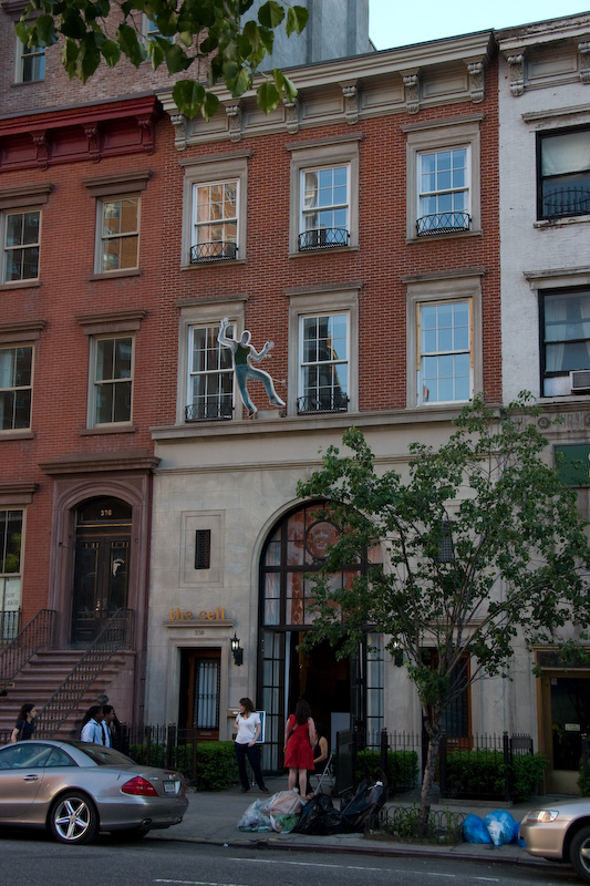
On the street in Chelsea, 2009 (338 West 23rd Street).
It was a sculpture of a man leaping out of a window. It's one of those reverse sculpts -- where the shape is concave instead of convex, curving inward and away from the viewer instead of outward and toward. You might have learned at a science museum that this creates a neat optical illusion such that the object appears to track your eyes as you move around it. It's very groovy. I was fascinated enough to take a couple of pictures. There I go, pretending to be a photojournalist again.
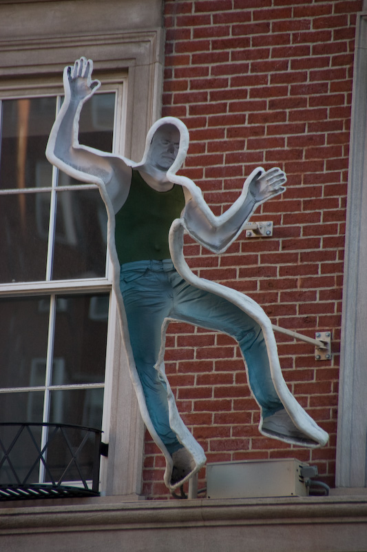
Craig Kraft Studio, Falling Man, 1995.
It turns out this is Falling Man by Craig Kraft Studio. But I didn't know that. All I knew is I wanted to know what the heck it was and why it was there. So I crossed the street and found the Cell Theatre which, it just so happened, was hosting an art opening in the lobby. It was Trio showing work by Alison Ives, Abby Rieser, and Shelley Rotner (until June 2, 2009).
Shelley's photos are the most noticeable things in the lobby; but on further inspection they're just photos, and you know how I feel about photos. Nothing very exciting. Alison's work likewise didn't inspire me; I think she had some photos up, also.
But Abby's work....
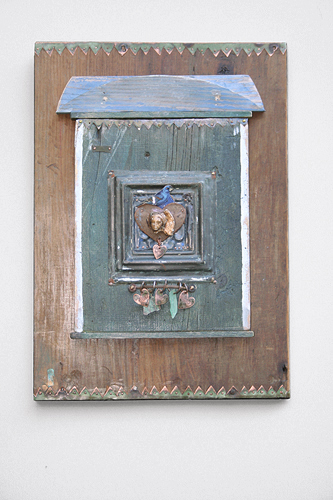
Abby Rieser, Love Song, wood, metal, leather, 19x13.75 inches
At first glance Abby's sculptures may look like a thousand other found art assemblages you've seen. But they're not. In person, they immediately reach out to your heart. They are soaked in wistful nostalgia, the sense of life's passing, the brief moments of love and happiness with which we're all blessed from time to time. They have an ache and an inner smile, a wisdom and a beauty. Completely devoid of irony or detachment they touch something deep inside you.
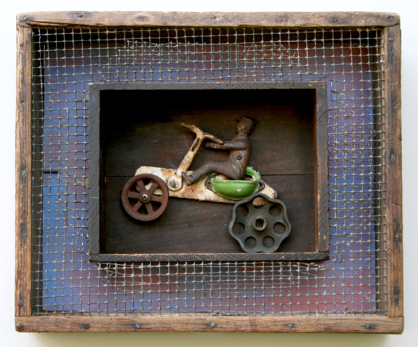
Abby Rieser, On the Road, wood, metal, 12.5x15 inches
Abby Rieser's works are absolutely lovely.
I really wanted to tell her so while I was there. I paced around looking for anyone who looked authoritative enough to tell me who she was, but I couldn't find anyone. There were enough people around -- even in the theater's lovely little urban back yard -- but no one who seemed like an owner or person in charge or otherwise botherable with dopey questions like the one I had. I left without finding Abby.
What I wanted to say to her was this: You're doing something very special here. It looks easy but it's not. Hundreds of artists attempt this kind of thing, taking old bits and pieces, flotsam and jetsam of people's lives, and putting them together in supposedly evocative ways. Almost all of them fail. Almost all of them somehow manage to make objects less than the sum of their parts; what I'm saying is, if you found, say, a piece of wood or a spigot knob on the curb or in the gutter all by itself, it would likely be a more interesting and entertaining object just like that than after being incorporated into one of those found art sculptures. But you, Abby: You have a gift. You've done something magical and, like all great artists, you've made it look easy. But it's not easy, not at all.
Abby, please keep making these.
And that, friends in art, is why I wander. I suffer through the fools and knaves, agonize through the Mark Floods and the Kim Dorlands, fall unconscious at the Jamie Clydes, froth at the mouth over the Violet Hopkins; I go through all of that because out there, sometimes, when I'm very lucky, I find Abby Rieser.
And then it's all okay.


