
Venus of Willendorf, 24,000 BC
It's extremely difficult now to imagine a world in which popular culture is ephemeral. The blossoming of the Internet and its overlay, the World Wide Web, has effectively granted most people access to almost the entirety of human history and culture. Some kind of record of almost every artifact, from 160,000-year-old stone tools right up to Takashi Murakami's latest plastic ejaculatory sculpture, is available in moments.

Takashi Murakami, My Lonesome Cowboy, 1998, oil, acrylic, fiberglass, and tired, tired irony
In this culture of cultures, where anything and everything is equally accessible from anywhere, it's hard to imagine that a great deal of this culture, certainly the last hundred or so years of it, was intended to evaporate, never to be recalled. My favorite example, my favorite thought experiment, involves film.
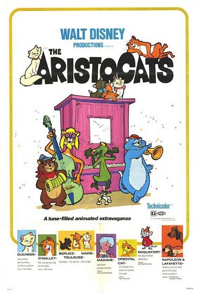
The Aristocats, released December 1970
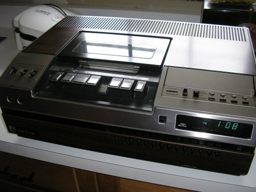
Quasar VCR, 1976
I was born in 1970 and that puts me at the tail end of the last generation to remember -- only just barely -- what movies were like when they were simply movies. I clearly remember when my aunt and uncle, who were always at the forefront of home gadgetry, got the first VCR I'd ever seen. It eventually changed how our culture related to the moving picture. Before VCRs arrived in homes in the late 1970s, movies and TV shows were strictly disposable entertainment. Movies came into the local theater, played for a while, and vanished, never to be seen again.
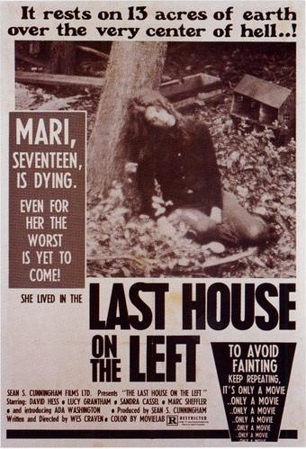
Last House on the Left, released August 1972
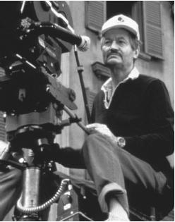
Roger Corman
In fact this is what the whole genre of exploitation cinema was based on. It takes some thinking to realize what was being exploited in these movies wasn't the actors, or the topic at hand; what was being exploited was the audience. The idea behind exploitation film was, you got a great idea for something audiences would want to see -- sex, violence, death -- you put together a poster to draw them in, and then you had something, anything, on celluloid you could throw on the screen in front of them. It didn't have to be good or even okay. It didn't have to be remotely entertaining. Because the movie wasn't the point: The point was getting people to buy tickets just once. After you'd shown the movie everywhere you were able, you could just throw the damned thing away because you didn't need it any more. And no one cared (except, perhaps, disappointed moviegoers).
We've changed how we look at exploitation cinema. We think of Ed Wood and Roger Corman as auteurs whose artistic drive pushed them to work despite lacking basic resources (often including simple talent). They weren't. They were opportunists out to make a quick buck. We've forgotten that because we've lost the ability to imagine the relationship people had to culture in the time before mass video reproduction.
Mainstream movies weren't much above exploitation circles, either. If a studio was very, very lucky, it'd make a movie that could be re-released every few years. Disney movies were good for that. And I remember seeing E.T. the Extra-Terrestrial and Raiders of the Lost Ark in re-release. Star Wars came around more than once. But they were a dying breed by the early 1980s. And before that no one made a movie expecting it to be that kind of movie; you made a movie to come out once and disappear. Maybe it'd show on TV. Hitting the jackpot with a movie people wanted to see over and over was pure chance -- chance at times helped by lapsing copyrights (cf. It's a Wonderful Life and Night of the Living Dead).
One of my favorite places for reading about movies is Glenn Erickson's DVD Savant column, because not only is he an entertaining writer, he's been around long enough to be able to evoke what it was like for a film buff in the days before the VCR. These days being a film buff is easy. In the 1960s and early '70s, it took a lot of effort. Glenn writes about reading about classic science fiction movies and only managing to catch up with them on late-night TV in heavily edited scratchy copies. Film students would rustle up old 16mm prints of films they'd hoped to see. Film stills circulated like samizdat.
Cult films really were cult films in those days: Movies seen by a small group of people, discussed in reverent tones, displayed in ratty little temples by fervent disciples. To have seen a film like Un Chien Andalou or Metropolis put you in an elite clique.
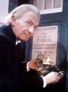
William Hartnell as the Doctor
Things were much the same in the world of TV. TV shows were meant to be aired once and then never again. TV series creators hoped to reach the magic number of episodes after which their show would be eligible for syndication; even then, not every episode was bought and re-aired. A select few series went on to become staples in syndication -- The Brady Bunch, MASH -- but by and large TV shows were all expected to evaporate as soon as they'd gone over the air. I still remember my surprise when, in high school, I met a Doctor Who fan from England who informed me over there, everyone's favourite Doctor was whoever was on when they started watching the show; the BBC never showed reruns so no one in the audience had ever seen any shows earlier than that. A couple of years later I learned that the BBC had lost a number of the earliest episodes of Doctor Who, if you can stretch "lost" to include "demagnetizing and reusing the tapes to save storage space". (NASA did the same thing with the Apollo 11 Moon landing, which is admittedly more egregious.)
Movies and TV only highlight the most obvious changes in our way of looking at culture. In fact the changes had been happening across different media at different rates, but they'd been happening: Newspapers became available on microfiche, magazine stock and printing processes improved, audio recordings got better and more varied with magnetic tape and then CDs, and so on.
So let's think about that: Let's use our imaginations to reconstruct a world in which popular culture is evanescent, and while we hold that in our heads let's go back to the mid-1950s and consider the birth of Pop Art.
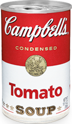
It's well known that Pop Art's major innovation was to elevate the look of the quotidian, the appearance of the every day object, to the status of fine art. This is a bit of a twist on the readymade of Marcel Duchamp, which of course is supposed to be a regular object which an artist has decided to call a work of art. And anyway readymades really didn't come into their own until after Pop. So we'll set them aside for a moment. Pop Art isn't about the object itself, it's about the appearance of that object: A painting of a Campbell's soup can or a mock-up of a box of Brillo, the sine qua non of Pop.
Or Pop is about the appearance of representations of those objects: It's about the tropes of advertising, of copying the look of newspaper photos or magazine ad photos. Or even taking those actual items and re-using them in a collage or silkscreen.
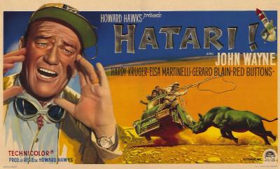
Hatari!, released June 1962
But let's place Pop back into the context of an impermanent popular culture. Remember we're holding in our heads a world where, when Hatari! finishes its run at the Orpheum, you'll never see it again. A world where, when Campbell's changes its soup can designs, you'll never see that design again unless you happen to be some kind of deranged soup can label collector. (Remember as late as the early 1970s, a sure sign of Howard Hughes' madness was that he sat in his hotel room all the time watching old movies.)
Now what are Pop artists doing?
They're taking the temporary and making it permanent. They're taking the every day, which passes under our notice as it goes, destined only for the trash heap, and they're rendering it in long-lasting materials. And they're putting it in places where objects are preserved as carefully and perfectly as human technology will allow: Art galleries and museums.
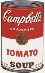
Andy Warhol's Campbell's Soup Can, 1962
Campbell's Campbell's Soup Can, 2009
Go ahead. Take a look at Warhol's soup can or his Brillo box. You've probably seen these images a lot. You probably already have a pre-programmed reaction to them. You probably think, "appropriation of the methods of mass manufacturing in a fine art context" or maybe you think, "my kid could do that" or "what a marketing genius Andy was". Those are valid reactions. But what I want you to do now is really look at those objects. Visually. Look at them.

Brillo box, 2009
Did you notice what I noticed? Campbell's soup cans don't look like that any more. Neither do Brillo boxes. Campbell's soup cans are still very similar (although an argument could be made that they kept the design much the same due to Andy), but they've still changed. And Brillo, wow, it's a totally different critter!
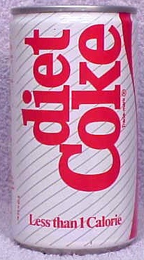
Diet Coke can, 1982
If it's hard for you to really see this with Warhol, then just find yourself a movie from, say, 1982. Go ahead, download one. It's easy. Now find a scene where someone's drinking a can of Coke. Do cans look anything like that any more? No, they do not.
And that, my friends, was the genius of Pop Art. Taking the fleeting (yes, my thesaurus is working overtime) and making it fast. Taking the transient and nailing it down. Turning the too-mortal into the eternal immortal.
Now let's bounce back a bit to where I told you to download a movie from 1982. You probably didn't, but you could have. Well, maybe you personally couldn't have -- maybe you're not the pirating type, maybe you don't know how this downloading thing works; but I could have. Because I've had a fair amount of practice and I can figure things out, I'm at the point now where I can find and download virtually anything with a few minutes' worth of work. Almost no piece of pop culture ephemera is so elusive that some evidence of it -- a photo, a news item, a video, a TV show -- cannot be downloaded.
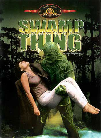
Swamp Thing, released 1982
Are you reading Patrick O'Brian's wonderful but woefully under-illustrated biography of Pablo Picasso? You can follow along with the images at the On-line Picasso Project. Curious about the extended European version of the original Swamp Thing movie starring Adrienne Barbeau? I can get that. Joss Whedon's entire run on Astonishing X-Men? It's out there. Wonder what Coke can designs have looked like through the years? Holy cow is there a page for you.
The Internet and the World Wide Web, then, have finally drawn together all the diverse developmental strands preserving and making available past artifacts of culture -- from paper and movable type all the way up to the compact disc -- and put them in one place: at the very end of your fingertips.
So at long last, and by a somewhat circuitous route, we arrive at my thesis, which I will here phrase in the form of a Socratic question: If pop culture is no longer ephemeral, what's the point of Pop Art?
This might be a simple academic question if not for the fact that so much of contemporary art is still stubbornly based on Pop. But it is. A great deal of Pop continues to be made under various guises, including the school of "pile together a whole bunch of crap and call it art". I used to call this Dumpster Diving Art, but the plain fact is you no longer have to jump into trash bins to make this sort of work any more; you can do it from Starbucks using your laptop.
Pop was becoming obsolete as it was being invented. By the 1980s it was almost pointless and now, well, whatever worth it might have had has certainly proved more evanescent than the artifacts it intended to preserve. You can most likely buy your very own 1962 Campbell's soup can on eBay, and if there isn't one for sale now, just wait a bit. It'll turn up.
I always say, if you wish to become wise, don't do what the wise man did. Seek what he sought. So where should art go? The Pop artists were seeking to do something that couldn't be done any other way. Now there's another way. Let's ask ourselves, then: What can't be done today? What can't the Internet do?
What can't be reproduced?
That's easy. The irreproducible. That which cannot be reproduced is that which cannot be reproduced. Obviously. The Internet can't project the experience of a real oil painting, of carved marble, of standing in the room or park with the actual art object. That's what can't be reproduced: Real live in person experience.
And that, friends and neighbors, is what I'm driving at here. Pop is over. Time to get back to art.


