Just a quick trip into Chelsea, a surgical strike, as it were, zipping in and out as quickly as possible while still, one hopes, giving the art its due. I probably would've skipped it if not for my new Facebook friend Gary Petersen, who happened to have a couple of paintings in a new show at McKenzie Fine Art, which is pretty much irresistible to me.
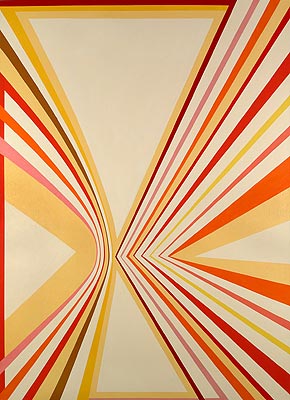
Gary Petersen, Departure, 2008, oil on canvas, 50x36 inches
So the paintings won't blow your hair back but they are good, solid works. Jazzy enough to keep from being wallpaper. And I like Gary's color choices. I asked him how he works out his color schemes and he confided in me -- I hope it wasn't too confidential -- that he makes it up as he goes along. He said one of his teachers once told him his color sense was dreadful and he needed a course in color theory, but Gary managed to avoid it, and I like the results.
I wish there were more of his paintings in the show so I could have more to write about them, but there are just the two; and they're the best things there. I can't even be critical of the other work because it slid right past my consciousness like an overcooked egg off a plate.
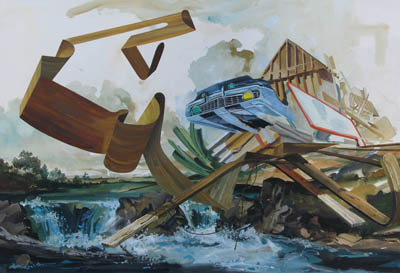
Next door at the usually uninteresting Jeff Bailey Gallery things weren't much better: A few interesting things sprinkled between some deeply boring things, with a set of paintings kind of in the middle.
Zohar Lazar, Slow Peel, 2008, gouache on paper, 15x22 inches
Chris Gentile, End Times/Amend Times #2, 2008, C-print, ed. 5, 114x11 inches
Joshua Marsh, Pitcher (square), 2008, oil on panel, 16x16 inches
Finally I stopped in Lennon, Weinberg because I saw some more hard-edge paintings and thought I'd see what it was. It turned out to be Off the Wall, a show mainly interesting for the large number of French people at the opening, there to see, I guess, the five French artists in the show.
The show's gimmick is a lot less fun than that, though. "Off the Wall" -- this one guy, he painted right on the wall! Far out! And this other guy, his sculpture grows, like, out of the wall! Sort of! And this other artist, they piled a whole bunch of boxes!
Maybe Mr. Lennon's dad or Mr. Weinberg's father-in-law is in the housepaint business or something and the gallery's just a showplace for painting over different types of stains -- acrylics! graphite! oil pastel! -- since Stephen Westfall had just painted the back wall of the room which now hosts the pointless scribblings of Gilgian Gelzer.
Off the Wall, installation view (Pierre Mabile, Philippe Richard), 2009
Altogether deeply shallow. Time to go home!