One of the art blogs I read regularly is J.T. Kirkland's Thinking About Art. The two of us have similar ideas about art in general and I find his blog very accessible and interesting, so of the many art blogs out there I've looked at, I like his best. Thus it was when I heard J.T. was going to be coming up to New York City accompanying his drawing of Matthew Barney I asked if we could get together and maybe explore Chelsea. We set the date for Friday morning; and we met at Paul Kasmin and worked our way downtown. I'm in nowhere good enough shape for the hike we proceeded to undertake: Across 27th Street, down Eleventh Avenue one block, across 26th Street, down Tenth Avenue one block, repeat until my wife calls at 22nd Street asking where the hell I am and when I'll be dragging my sorry ass home. Between Tenth and Eleventh each block is about eight miles long, so I think in total, including some stairs, we walked far enough to reach Omaha.
Chelsea is home to about 300 art galleries and we must have visited somewhere between twenty and thirty of those. We probably looked in at another ten or so. Ultimately, I think we got a fairly good overview of the whole area, this slice of the art market so many people spill so much ink on.
There's no way I can remember everything we looked at. Some galleries had postcards, and I took one if I thought the work was interesting enough. J.T. and I determined that the hotter you are as an artist, the bigger your postcard is; one guy had actual posters, which we figured was the pinnacle of art world respectability. Actually, the pinnacle is probably being able to sell posters at your gallery show, but being able to give them away is almost as good. Some artists didn't even rate postcards. J.T. and I also checked pricelists; apparently he finds this activity endlessly amusing. Typically for me, I found it both hilarious and very, very sad.
Herewith, then, in order of however I feel like writing about them, are the openings and topics on which we touched.
Overview
On the way in I picked up the latest copy of New York magazine which had an article on whether or not the art market is going to collapse. Author Marc Spiegler's opinion: Of course it will.
And I for one can only say: It can't happen fast enough.
The art market in Chelsea is a bloated corpse filled with noxious, fetid excrement, kept afloat on a sea of moron money. The sooner market forces can lance this putresecent vessel and let it sink the better off we'll all be.
Hyperbole? Perhaps. And maybe I'm an idiot to argue against a big, stupid art market, because maybe there's no hope for me to be a successful painter without it. Maybe in a shrinking, frightened art world, my own work would go nowhere. So maybe I should be rooting for an expansion-crazed market where almost anyone can sell almost anything.
But you know what? I may be wracked with self-doubt, but I have more respect for my own work than that -- I have enough faith in myself to think that, while I may not be a great painter or even a really mediocre one, I'm talented enough to manage without being buoyed up by other people's crap.
In fact I really feel that the crap brings us all down. It makes anyone involved in the art world, no matter how tangentially, look like an idiot. It scares off people we could really use, people with valid opinions, good eyes, great taste. It makes it easy for people to dismiss true art while Thomas Kinkade hangs in their living room. Wouldn't it be a better world if everyone who bought a Thomas McKnight poster instead bought an actual painting by an actual living artist? (Not that I don't like McKnight. I just think we've all seen enough of him for one lifetime.) Granted that original art costs more than a poster -- but isn't that at least part of the problem?
That's my feeling after my time immersing myself in Chelsea openings and then going from gallery to gallery for a day: There's a whole lot of crap. And I don't mean crap like "just not my thing" crap. I mean crap crap. It's bad enough that it makes me paranoid, because I can't believe anyone would sincerely put this crap out there thinking it's either good or saleable. I start to think that there's a conspiracy on, some kind of plot at the distant, upper reaches of the wealthy, that they've worked out a way to keep the proles from revolting by making themselves appear foolish and risible. As long as the poor people think the spectacularly rich are stupid, shallow, Paris Hilton, addlepates -- as long as the destitute working class can feel superior in some intangible way to their masters -- they'll keep slaving away and never rise up. This theory of mine perfectly explains reality TV, George W. Bush, and the Chelsea art market. The only problem with it is IT'S COMPLETELY INSANE.
Sadly, this is the best theory I have. The only two competing theories I have are a) Nearly Everyone Else Is an Idiot (which I reject as being overly cynical) and b) I Am an Idiot (which I reject because, okay, I'm biased).
But then I find myself being paranoid or cynical (or both) more often than not, especially when presented by monumentally brain-damaged art, which brings us to
Tara Donovan
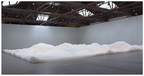
In case you've been living under a select, art-world ignorant rock for the past couple of months, you already know about Tara Donovan's installation at PaceWildenstein's gallery on 22nd Street. It's the kind of installation spoken about in its specifications: It consists of about three million plastic cups glued to the floor and it's about fifty feet wide and sixty feet long. Everyone is writing and talking about it and I've yet to read a single negative word.
PaceWildenstein was actually one of our last stops. Shortly after J.T. and I met up he mentioned that he wanted to see Tara Donovan's show; her name floated around in my head, knocking stuff over without actually connecting with anything. "I don't think you'll like it," J.T. allowed, which made me think he had a very shallow idea of who I am from reading my so-far-short-lived blog. A couple more times as our journey continued he mentioned Tara Donovan again and each time all I got back from my mental rolodex was that I must not have been in a hurry to see her work because I couldn't remember anything else at all about her.
 As soon as we got in the gallery, though, I remembered exactly who Tara Donovan was and why I couldn't remember anything about this show. J.T. made noises to the effect of how he totally loved the piece. I just stood there.
I can say, by way of being nice, that I liked the work more than I expected. Since I expected to think that Untitled (Plastic Cups) was the most worthless piece of garbage I'd ever seen, perhaps liking it more than I expected is not much, but it is something.
I know this is the kind of question one is not supposed to ask in the world of art, but I'm going to go ahead and ask it anyway, because it's all I could think of. What's the point? Three million cups glued to the floor, in stacks of varying height, like a big rolling field of petroleum product. Hell, not even like: That's what it is. What for?
The easy answer is publicity! Lots of people were there to see it, everyone oohing and ahhing and taking photos with their credit-card-sized digital cameras. J.T. pointed out that something like this adds to a gallery's and artist's reputation and increases demand for other works by the artist. That's the easy answer. The High Art answer is only a little more difficult: The artist has recontextualized a common household object causing cognitive dissonance within the viewer as they consider the implications of the vastness of the art work and its place in consumer society and I could go on like this all day but you get the idea. Basically it's all bullshit and I don't have enough MFA credits to get all the jargon precisely right anyway. The press release says, basically, it's all about process: In other words, I'm supposed to stand there and think about Tara Donovan and her small army of unpaid interns spending days and nights carefully gluing cup after cup after cup onto the concrete floor. Hmm. Did they wear kneepads? Where'd they buy their coffee? Did the interns think they were doing something really cool or do they hate themselves? Okay, I'm done. Now what? All right, I'll think a bit more. I'll imagine Tara didn't use any interns and did it all herself. Now I'll imagine that she hired some Mexicans from a Home Depot parking lot in Queens and paid them in pistachios. Well, I'm out of ideas. How about you?
The only real purpose I can see for an installation like this is so everyone can go see it and say they did. Like I'm doing now. Something like this generates a lot of ink because everyone wants to get in on the act. I find myself wondering what other reason a gallery could possibly have for mounting a show like this one. Can they sell something? Maybe a sleeve of plastic cups for a thousand dollars? Maybe charge five hundred bucks for each individual cup with a Certificate of Authenticity noting its position in the arrangement [96, 100, 7]?
Part of me does feel that PaceWildentstein has done something great. The director just went to an artist and said, hey, do something. Whatever. It doesn't have to make money or mean anything or do anything or have anything to do with anything at all on planet Earth. It can be whatever you want. Knock yourself out! I think that's great, that's a great attitude to have towards art. Sometimes you get something truly wonderful that way.
Alas, sometimes you get plastic cups.
If galleries can be placed in a spectrum, PaceWildenstein is a gallery at one end, off at the incredibly rich, huge, you'll-never-work-in-this-town-again-after-that-bitchy-review end of the rainbow. At the other end are the tiny, so far west they're almost floating, duck-your-head-as-you-come-in places, galleries run by people who love art -- or anyway the art business -- where the director is also the art handler, phone operator, publicist, carpenter, janitor, and coffee wrangler. One of the first galleries J.T. and I stopped in was one such, and J.T. wanted to come by because it's run by Ed Winkleman. And I was glad because, in addition to meeting Ed, I also got to see that Plus Ultra Gallery was showing
Nancy Baker
 First, the art. I don't think this was exactly up J.T.'s alley but it certainly was mine. I'll admit to being overly enthusiastic about technique; show me some decent drawing ability and capable paint handling and I'm all atwitter. To me, a painting that's well-executed but not especially interesting is better than a painting which may well be exciting in some strict art theory sense but looks like it was done by a monkey. I'm a sucker. I admit it.
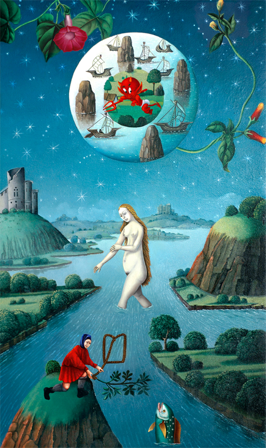
So Nancy Baker's art got me because she's got technique. She's working in the style of old illuminated manuscripts -- similar to Madeline von Foerster but earlier in art history's timeline, closer to Bosch than Breugel, maybe even further back -- but she mixes in what Ed called "the kitsch factor." I'm not one for kitsch, as a rule, no matter how well executed, but as Ed noted while we were talking, Nancy's work is just at that edge of kitsch without going too far over. Superficially her paintings look like medieval panels but then you notice there are rockets and Harvey character Hot Stuff and UFOs.
So I liked the work on display. Nancy's no virtuoso but she's very good. Her subjects bear close scrutiny; there's a lot of little stuff going on most of the time. It's not always clear exactly what to think about: A soldier's killed a baby and here comes a flying saucer! But then it's not like old illuminated parchment makes a whole lot of sense most of the time, either.
Second, meeting Ed Winkleman. When I started my blog I did some quick searching and it didn't seem like many people were doing what I was planning, but I've since found that my search was very, very shallow. A bazillion people are blogging (and how I hate that word) about art, and about a zillion of them are here in New York. But the one blog I've found which seems to be the sanest, most pleasant, most intelligent, most well-written, and most well-liked is Ed Winkleman's. And why not? In person Ed is all of those things, too. The three of us had a nice chat, including speculating about who Edna, the Anonymous Female Militant Art Bitch, could be and whether we could, ahem, winkle her out of her shell.
Ed eventually pointed out he had work to do -- minefields to sweep, no doubt! -- so J.T. and I left him and went very nearly next door to Clementine Gallery to find
Daniel Johnston
 Daniel Johnston is perhaps unreviewable; apparently he's some kind of weird cult phenomenon person, one of those people who have enough of a crazed following that whatever they do, whether it's a recording, concert, documentary film, or art show, gets some buyers. Therefore it's probably wrong for me to even try to think about this show of drawings in terms of its value as pure art because I don't know or care about Daniel Johnston or anything he does. But here goes:
If Daniel Johnston deserves a show in Chelsea, then my calculus notes belong in the Louvre.
That's okay, though, because just a few doors down at Derek Eller was
Dan Fischer
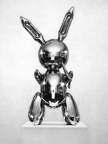 J.T. and I were a little concerned for Ed's mental state since he'd recommended we check out the drawing show next door which we thought was Daniel Johnston's; but it turned out Ed meant Dan Fischer's, which was much, much better, although so is the Christmas display of gingerbread houses at the old age home. Dan's exhibition consisted entirely of what looked like photographs but which turned out to be, on closer inspection, really precise pencil drawings of photographs. Of course I was blown away by the sheer craft of being able to draw so well in graphite as to be nearly indistinguishable from a photo. That's pretty amazing. Beyond that, though, I failed to see why I should actually want to look at the drawings any more than the original photos. The photos themselves, by the way, were all of artists or their work: Piet Modrian, Ed Ruscha, Jeff Koons; I think I saw Picasso but my memory might be playing tricks with me.
I'm not sure where we went next; I remember J.T. was looking for a gallery on Eleventh but I can't figure out which one it was. We did swing by Stephen Haller Gallery to see Ron Ehrlich, who doesn't get a heading because I have exactly zero to say about his work. If I didn't have the postcard here I wouldn't even have remembered I saw it. My wife likes the postcard. That's all I've got.
At some point we ended up at White Box, where the only work I found even remotely interesting was
Ilkka Halso
 Ilkka Halso appears to be another one of those Photoshop nuts falling out of the Chelsea trees these days. Virtually every gallery has an iMac; you'd think they'd be less impressed by some simple Photoshoppery and a C-print, but there you go. You can just tell I love Photoshop art almost as much as I love video installations, can't you? But I liked Ilkka's work because it wasn't badly done and the theme was kind of interesting: The idea that nature might one day only exist in preserves and museums. Sort of your anti-Disney activist nightmare. It's not the most original idea in the world, but I thought it was neatly embodied in Ilkka's compositions, anyway, which were like National Geographic photos from some Brave New World of the future.
Everything else at the White Box, incidentally, was like installations from some Brave New Art World of the future, where everyone's brains have been sucked out by aliens and Ryan Seacrest.
Tom Wesselmann
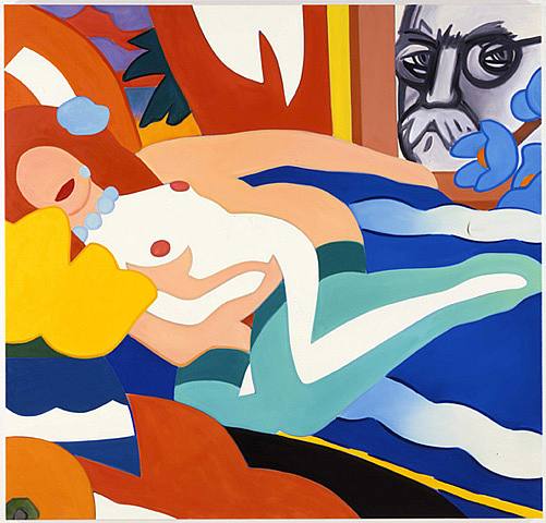 I was thrilled to pieces to finally hit the Tom Wesselmann show at Robert Miller Gallery. I had thought of going to the opening, but didn't; no hurry since it's not like I could talk to the artist, Tom being rather unfortunately dead. I liked the look of Tom's work online but was otherwise unfamiliar with his paintings. I've been enlightened. I really love them. They're so big and bold and bright and just wonderful. Not challenging, true. Not earthshattering. I'm not going to revise my whole approach to art because of them. But, damn, they sure look pretty. And they're all of naked women, which is always one of my favorite subjects. That probably makes me a bad person. Well, I also like the way Tom sneaks in Matisse and references to other painters. It makes me chuckle.
J.T. did not like Tom Wesselmann. I believe J.T. has no emotions whatsoever.
After that we wound our way down to 25th Street which, I've decided, is my favorite street in Chelsea. There was a lot of good stuff there, some of it even in the same building. Let's start with Margaret Thatcher Projects and
Adam Fowler
![[Adam Fowler]](/blog/images/20060331/adam_fowler.jpg) Adam Fowler is a Washington, D.C. artist and J.T. knows him or has swapped e-mail with him or sees his work in D.C. or something along those lines. What Adam does is different, at least, not to mention obsessive: He draws curving lines on pieces of paper, cuts out the blank space between them, and then layers the lacey remains on top of each other. The result is kind of Pollockish, kind of like staring at acoustic ceiling tiles too long, and kind of frightening. Talk about process: Adam goes through enough X-Acto blades to keep the company in the black for the next decade. Looking at his work I can only think that this guy is seriously crazy. At least you won't wear out your eyes gluing plastic cups to the floor. Adam's work is good, though, so maybe it's worth the sacrifice. It interestingly straddles the divide between drawing and sculpting, and I didn't even know there was such a divide, or anyway that anyone could find where they came so close.
Adam Fowler is a Washington, D.C. artist and J.T. knows him or has swapped e-mail with him or sees his work in D.C. or something along those lines. What Adam does is different, at least, not to mention obsessive: He draws curving lines on pieces of paper, cuts out the blank space between them, and then layers the lacey remains on top of each other. The result is kind of Pollockish, kind of like staring at acoustic ceiling tiles too long, and kind of frightening. Talk about process: Adam goes through enough X-Acto blades to keep the company in the black for the next decade. Looking at his work I can only think that this guy is seriously crazy. At least you won't wear out your eyes gluing plastic cups to the floor. Adam's work is good, though, so maybe it's worth the sacrifice. It interestingly straddles the divide between drawing and sculpting, and I didn't even know there was such a divide, or anyway that anyone could find where they came so close.
Meanwhile scattered around the room along with Adam's work were the sculptures of
Julia Venske & Gregor Spänle
 (Apparently they go together). Unlike Adam's interesting work, Vanske & Spänle's work sits there boringly, looking like poured blobs of shiny white plastic. It turns out they're not plastic -- the duo spends a lot of effort carving and polishing marble so it looks like poured plastic. Next up, I'm going to take a Maserati and make it look like a Yugo. Now that's art!
On the same floor in the same building we found Museum Works Galleries showing
Peter Stanick
 Peter Stanick is sort of a low-rent Tom Wesselmann. I might have been impressed somewhat by Peter's work if I hadn't just seen Tom's; instead I found the work derivative and -- let's just say it -- easy. It's pretty clear Peter works from photos; his final designs remove the details leaving that flat Pop Art look but without any real flair. Where Tom evinces a sense of fun, Peter feels a little seamy, a little Playboy Advisor illustrationish. There's some Patrick Nagel in there but none of Nagel's skill with line. This is not to say I thought Peter's paintings were bad. I liked them. They just didn't excite me much. If he moved away from the photos, maybe, and added something of himself, then I might have really enjoyed his work.
Downstairs from those two galleries J.T. and I dropped by two shows I'd already seen and reviewed, namely Lyons Wier showing Lynn Jadamec and McKenzie Fine Art showing James Lecce. J.T. had swapped e-mail with Valerie McKenzie so we stopped to talk to her. He unwittingly asked if the gallery had been in any of the art fairs recently, which set Valerie off on an extended self-contained rant about how art fairs (in particular the Armory Show) are bad for artists, collectors, dealers, galleries, the planet, and the universe in general.
Let me pause for a moment and note that I am a talker. I talk. I talk a lot. I have this need -- it's a compulsion, really -- to fill empty space with words. Often I'll fill a pause with something really, really wrong, like "Where'd you get that stupid hat?" or "You're very tall," or "What an ugly painting -- oh, I'm sorry, is it one of yours?" It's a fault. Sometimes I talk so much it's hard for other people to get a word in.
Valerie makes me sound like Helen Keller. Before the Miracle Worker. Not only could I not get a word in edgewise, she didn't need me to. She'd say something and I'd formulate a thought on it and before I could even get it to my mouth she'd be on to the next topic. I don't think she even paused for breath. Not that I minded: Valerie not only talks non-stop, what she says is worth listening to. She has interesting things to say.
Eventually the conversation wound around to speculating about who Edna, the Anonymous Female Militant Art Bitch, could be. Again. If I'd known being anonymous would get so many people talking, I wouldn't have told anyone who I was.
After a while J.T. and I took our leave and went next door where some gay porn was playing along with videos of people making breakfast. Neither J.T. nor I had much use for the gay porn so we left quickly and ducked into Lyons Wier Gallery down the hall. I stopped in to say hello to Michael Lyons Wier only to find out he had no idea who I was because he'd never gotten any of the e-mail I'd sent him. Damned spam filters! Damned spam!
On the way out of the building we found the George Billis Gallery which was showing paintings by Thomas Connolly, Tom Gregg, and James Oliver. I didn't spend much time on Connolly or Oliver; Connolly's detailed, realistic New York City street scenes were technically fantastic but J.T. wasn't all that interested so we moved by pretty quickly. But I was struck by
Tom Gregg
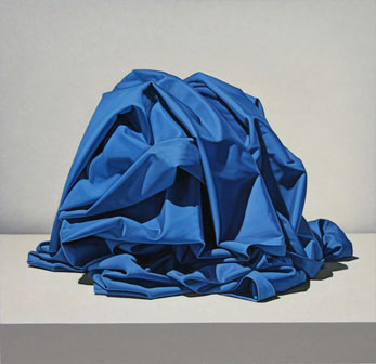 Tom Gregg's latest series is of swaths of fabric wrapped around objects the identity of which is not even hinted at. Mysterious! Actually, I didn't care. The fabric isn't wrapped around anything because it's not fabric, it's paint. So it's not as if the object is anything unknown -- it simply doesn't exist. It's notional. And I don't need to think about it. But Tom's mastery of painting drapery is certain. As usual, I was blown away by the technique -- especially since I've been thinking of some drapery I might put in my own painting. Beyond that, though, I was with J.T. Time to move on.
Across the street we went in to Bortolami Dayan, an enormous gallery simply reeking of money. Showing there is the latest work by one
Hope Atherton
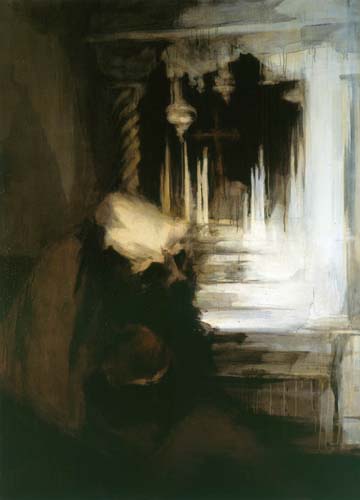 The gallery had, by the door, a copy of some art magazine which had on the cover, not Hope Atherton's paintings, but Hope herself. And she shure is purty. Depressingly so, actually, because the more artists I see the more I think that there's no room for old, fat, ugly guys in the art world. Which means there's no hope for me. Now, I know I've written about the physical appearance of artists before, but I hope I mentioned their art first. Not so Art Rag International or whatever, which seemed to think the babe comes first. Which is stupid and unfortunate because Hope's paintings are actually very good.
To start with, they're very large. They look like out of focus photos, taken with a slow shutter speed. Actually, there's a resemblance between Hope's work and the work I saw from Alex Pacula, but Hope takes her subjects further from life and into a realm of abstraction and vague uneasiness. She loses more detail from the photo (or the idea of a photo). There's something here of Goya and something here of Gustave Moreau. There's a lot more missing as well: Goya's emotion -- anger, fear, horror -- and purpose are lacking, as is Moreau's strange symbolism. Hope seems to paint as if the world is full of darkness and despair, but it seems less sincere and more like Goth posturing than it could be.
Nevertheless I liked Hope's paintings. They had a nice texture. They worked for me. Less so for J.T., I think.
We had more fun analyzing the paintings across the street at Kashya Hildebrand Gallery where we saw
Robert Schaberl
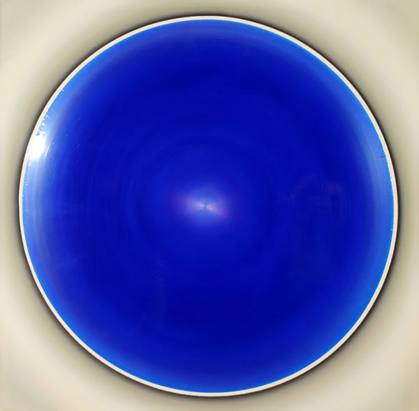 Robert Schaberl's paintings are like some strange reincarnation of Peter Sedgley only without the airbrush. Just about all of Robert's paintings are the exact same size, and square, with a circle of shiny color. Rather than painting targets, though, Robert's painted swirls. Well, nothing so gauche as an actual swirl. Sort of squeegs, like a swirl without the swirliness.
They're hard to describe and about as hard to give a damn about. J.T. and I amused ourselves by trying to figure out how they were made -- does he use a squeegee? A roller? How does he get it so perfectly round? -- and wondering if he ever fucks up royally and if so, what happens to the resulting painting. Like, four hours into his careful twirl of paint around the canvas and -- Fuck! I sneezed! Now I have to start over!
So much for the triumphant return of 1966 and Op Art. Speaking of which, Valerie had recommended that we see this one show and eventually we did find Danese on 24th Street where they were showing
Susie Rosmarin
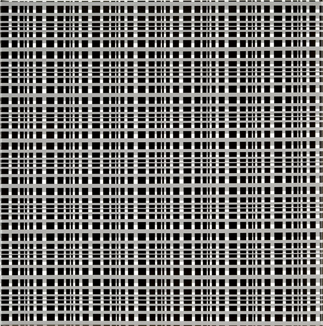 Susie Rosmarin is another Op artist -- Valerie actually called her "a taper," almost as if it was a bad thing -- but Susie really puts the Op in Op Art. Knock me over Op. I seriously almost fell down when I saw her first paintings, not because they were so beautiful or masterful, but because my eyes almost fell out of my head trying to make sense of them. Susie is indeed a taper; she obviously tapes up her canvas like mad, into all these tiny strips, and then paints carefully modulated tones in between (all before the canvas is mounted -- you can tell if you check the folding) for really wild optical effects. Some of her paintings are large enough to make the whole room feel like some experimental Twilight Zone camerman is filming you. They will make your eyes bug out. They may give you a headache. They're very cool. I'm not sure who would buy these and hang them -- potheads and acid droppers, maybe. Maybe eye doctors. But, wow, they are something else.
J.T. would have walked out with one -- he has a day job, and therefore discretionary income of which I cannot even dream -- but found the prices a bit too steep for him. We instead had to content ourselves with the damn fine oversized fold-out postcard the gallery was giving away, even if at that reduced size the paintings lose all their impact.
And now here we are: This is where I came in. J.T. and I shambled through Tara Donovan, wandered through a couple more galleries rather dispiritedly, and finally ran out of steam. J.T. needed food badly, and I needed to go home and do parent-type stuff. I left J.T. at the diner on the corner as I staggered off to the subway. It was a day well spent, mocking crappy art with a friend. Try it sometime, before the art market crashes.
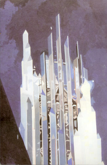 As for the paintings, they look as if Eric has taken low-resolution video stills of churches, inside and out, and traced them. They look like paint-by-numbers.
 But I did not know what was in store, so presently I found myself at
  I will give Jocelyn some credit, though; at least she tries. Not so
 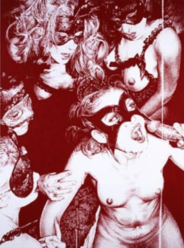 I also got a look at an exhibition I had sort of kind of meant to see but hadn't, which was what they had up, which was Ken Weaver's "ROYALLY FUCKED!" Now I'm going to ask you to look at the reproduction here and use your imagination a bit, because the JPEG just isn't enough. Imagine this image here only five feet tall. It looks almost like something from an offset printing press, all benday dots, but if you look a little closer you see it's actually pastel on rough paper. Bright red pastel, not the sort of burgundy here. And these are drawings. Absolutely meticulous drawings. The technique on display is impressive. It's not as obsessive as Dan Fischer's, but it's still very well done.

