I'm a sucker for several things. As I've written, I'm a sucker for painting technique. I'm also a sucker for a pretty girl and an invitation. And if a pretty girl invites me somewhere, well then I'm a double sucker. (Quick definition so you don't think I'm some kind of patriarchal throwback: I define "pretty girl" as "female person about my age or younger who I like and is nice to me." It actually has almost nothing to do with physical attractiveness and is mostly about my inability to admit that, at 36 years old, I am a grown-up.)
In this case, Lisa Schroeder invited me to her gallery's latest opening, which is how I ended up in New York on a Friday instead of Thursday. "You'll like it," she promised, because, as I admitted in print, our tastes in art are usually wildly incompatible. Alas, Schroeder Romero's show of Reuben Lorch-Miller turned out to be, as usual, a head-scratcher for me.
 I wrote once about the three categories of art as being Wow!, Yuck!, and Huh?. I realize now there's a fourth category: What Were They Thinking? All three original categories assume that we can all agree the works in question are probably art works, although we might disagree about their merits. The fourth category asks, "What made anyone think this was actually art?"
It's clear that Reuben has made things. These are certainly man-made items. It's clear Reuben has some intention with these items. What's unclear is whether his intention was to create items which are so lacking in any outstanding qualities of any kind -- including badness -- that they just have no effect at all. I'd seen art that was aggressively awful. I'd seen art that was uninteresting. I'd seen art that was incompetent. But I don't think I'd yet seen art which was essentially nonexistent until now. This show is like a perfume which evaporates the instant you open the bottle leaving no scent behind, so you can never tell if it's the most wonderful perfume of all time or simply a broccoli fart.
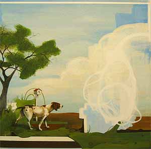
What's in the show? A few C-prints of very lossy JPEGs enlarged far beyond their limits. A few banners, like collegiate team flags, with cryptic phrases stitched on them ("SURRENDER", "WATCH OUT"). Some wooden plaques with cryptic phrases painted on them ("Bless the night." "Just the other side of nowhere."). A box with leaves painted on the inside. And a video showing a river and its bank, helpfully shown on a thirteen-inch TV at floor level.
At the opening I found myself next to the video and Lisa.
"If I watch this long enough," I asked, "does something happen?"
"Oh, Chris," she said, playfully exasperated.
"I mean, does some naked person run across the screen or something?"
She leaned in close to me. "It's conceptual."
"Uh huh."
Then she tried to explain how, if you watch it long enough, you do start to see things. Like, the river is always moving. And so on.
I had no doubt if I watched it long enough I'd start to see things. I felt this process would be greatly aided by ingestion of alcohol, or perhaps cannabis.
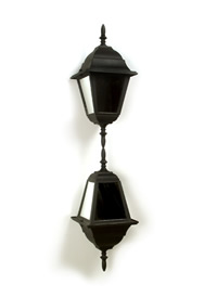
There was one piece I thought was rather neat. Off in the gallery's side room, usually where they keep a few extra pieces from other artists, Reuben had hung untitled (lanterns). Two lanterns, one upside down, joined at their bottom point, hang from the ceiling and slowly rotate. The glass in the lanterns has been replaced with mirrors. In the small white room, at the right angle, the mirrors appear to be reflecting nothing at all, while the joined lanterns give the appearance of one lantern with a mirror underneath it. The piece has an immediate "Hey, cool" effect.
That was the one piece where, as the artist says in his statement, experience superseded understanding. Well, almost.
Next door Ed Winkleman was hosting an opening of his own. I was surprised to see it -- I'd come in just for Schroeder Romero. Ed has up some photos from Victor Skrebneski. A little later -- I'm jumping ahead in time here -- I was returning to the gallery for a second look when, outside, I was stopped by a tall beautiful woman with a Slavic accent.
"Are you here to see Victor Skrebneski?"
"Yes I am."
"Have you seen his work before?"
"No. I mean, I was here earlier, so, yes, but not before tonight."
"You'll like it. He's a legend."
"Really?"
Turns out he is a legend -- a PDN and Kodak Legend.
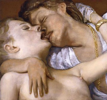
I've gone on record multiple times as saying I'm uneasy about considering photography as art. I love photography, especially of people, especially of nude people, and I find it engrossing and fascinating, and I enjoy taking photos myself. But I've yet to find a photograph that moved me the way truly great art does -- the way, say, a great symphony or song or painting might. I've never seen a photograph that really got inside me. I won't say that photography cannot be art -- I think anything can be art -- I'm just saying I haven't seen it yet. And I've seen a lot of photography.
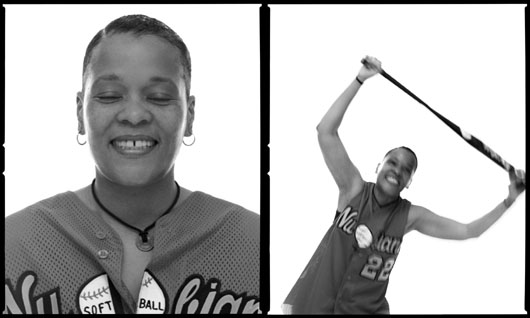 I did like Victor's show. He has some lovely photos of athletes. Each photo is actually a pair of photos, printed out very large, of different aspects of the athlete. I was most taken by an image of a swimmer's legs, actually a composite image of three photos of the same swimmer's legs from different angles. His legs are quite beautiful.
On the way into New York, a little bit outside the Lincoln Tunnel, there's a billboard which has, for a while now, anyway, been taken up by Abercrombie & Fitch ads. Each ad features some impossibly sculptured guy in a state of undress -- with his pants undone, his shirt off, being naked in a field, whatever. I always find myself captivated by this billboard. I can't believe the model in the photo is even the same species as me, let alone the same gender. I mean, I've never seen any part of my body remotely resemble the parts of their bodies. I might as well compare myself to a helicopter.
Driving in and looking at the billboard, I thought to myself that I needed to ask Ed a question when I saw him. And then finding that my favorite photo in the show was of some man's legs, I felt I had to ask even more urgently. So I told Ed about my preference in photos, and the billboard, and then I sprung it on him.
"Am I gay?"
Of course I'm not. He did say that he thought I'd appreciate that particular photo, though, because in my art I clearly appreciate the human form. Which is certainly true. Another thing I liked about Victor's photos was how they communicated the strength, both physical and mental, of the subjects. Each athlete looked like someone who had found their limits and sought to extend them as much as possible. They each looked like people of passion and purpose. And like people who really enjoyed their sport.
After my first pass through Victor's show I saw that the corridor behind Ed's gallery was open and lit. I'd never seen it that way, but now it was possible to cross the corridor and go into the gallery on the other side. So I wandered over to Black & White Gallery which was showing Jackie Saccoccio's In Transparency.
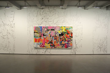 I was immediately taken with the first thing I saw, which was an enormous drawing on a huge sheet of paper tacked to the wall. The drawing was entirely in black ink and none of the lines intersected -- it reminded me, in fact, of the drawings I've been doing, only much larger. Further into the gallery, I saw that Jackie had drawn all over the walls of the gallery in the same style. I barely noticed her paintings, honestly.
While getting a postcard I was accosted by the gallery director, Tatyana Okshteyn, who introduced herself to me and began telling me about her upcoming show. It turns out that Eric White is going to be in that show. I have a couple of lithographs from him, and met him at an opening of his a few years back. He's terrible at responding to e-mail so I haven't had much contact with him, but I'm looking forward to seeing him at that opening. In the meantime I asked Tatyana to introduce me to Jackie, which she did, and Jackie and I spoke for a while.
I'm afraid I barely mentioned her paintings, which, in retrospect, might have been a little rude of me. But we got to talking about her drawings, and how her drawings served a similar purpose to mine, which is that we were both trying to break out of established routines to create something without putting too much conscious thought into it. I was thrilled to see that someone had gotten to fulfill my dream of drawing on the gallery walls -- an urge I often have to fight down -- and she said it was, in fact, a liberating amount of fun. It was also interesting that her lines on the wall were reactions to the space; if you stood in the right spot, the drawings on the faces of two columns fit in with the drawings on the opposite wall, merging them into one space. Too many so-called art installations could be set up anywhere under any conditions. Jackie's installation was very site-specific, and was due to be painted over in a few short days.
I bid good bye to the evanescent drawings and went out to the only other opening I found that looked good. Nicole Klagsbrun was showing the work of the late artist known as Cameron (Marjorie Cameron Parsons Kimmel). According to the online gallery verbiage Cameron was a mystic, a follower of Aleister Crowley, and maybe a member of the OTO. Well, sign me up -- I'm a huge fan of Robert Anton Wilson (who died only recently, alas) and through him something of a fan of Crowley, so I could hardly miss this show.
 Not that it was great. Turns out I could have missed it and gone on with my life just as happily. The curators of the show apparently just took apart a bunch of Cameron's sketchbooks and pinned the pages to the walls. There were a few striking images, a large number of apparently idle doodles, and a few ink and/or watercolor paintings which were somewhat muddled. All the images seemed very dated to me, like something out of a 1960s Walter Foster book on How to Paint Psychedelia.
On the way back to my second run through Winkleman and Schroeder Romero -- just a little while before my fated run-in with the Russian lady -- I wobbled in to Derek Eller Gallery. From the street the show didn't look like much -- in fact none of the other openings on 27th Street near Winkleman looked like much -- but I'm glad I went in. I found the show Whirl and Magnet by Lorenzo De Los Angeles, whose wild name, if it isn't a pseudonym, should be.
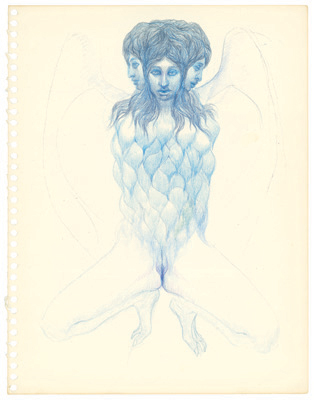
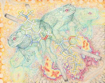 Lorenzo's work in this show consists of colored pencil drawings of deep subtlety of shading and detail. His content is less subtle but more incomprehensible: Strange molecular figures, seemingly infinite regressions, vaguely sexual sphincters, the occasional toad, these all figure in his compositions. Each drawing is beautiful, meticulous, and weird all at once, but it's a weirdness all Lorenzo's own; far too much weirdness in the art world these days is the cookie-cutter Juxtapoz weirdness, which isn't weird at all but is instead its own sort of counterculture culture. Instead of simply being odd and shallow, or twisted and sick, Lorenzo's art is approachable enough that it demands you explain it in some way. Like, this here's about how toads are leaving our planet because of excess nicotine. I wish there was more of the work from his show online; this wasn't my favorite drawing by half, but it's the only one I could find.
To sum up, then, I'm glad I came in on what was, for me, an off night. I'm sorry that once again I couldn't love what Schroeder Romero had up for me. Maybe one day we'll overlap and then I'll write a glowing, fantastic review. But until then, sigh.
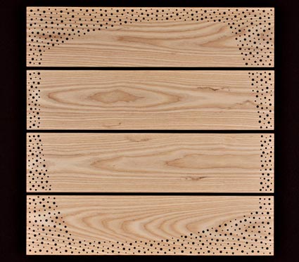 I arrived to find that J.T. had managed to convert his small hotel room into a mini-gallery. His work -- mostly wood, with one framed drawing -- hung on the walls, and the bed was covered with his drawings and prints. The room's table became the gallery's front desk, along with postcards, verbiage, price lists, a laptop and a sign-in book. Altogether this was clearly the work of some kind of insane details freak -- just the kind of guy you might expect to spend his spare time drilling hundreds of tiny holes into planks of wood.
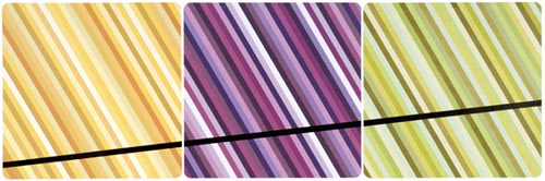 His drawings are oddly different and yet similar to his wood work. They all share a common sense of some obsessive compulsive working out his energy at the end of the day. His drawings are mostly circles, each carefully -- not to say laboriously -- inked in the style of a turn of the (last) century draftsman. J.T. has taken to using scrapbook paper, which is archival and comes in a wild array of patterns and colors, as the background for his intense scribing. The clash of arts-n-crafts and art makes beautiful music, even when J.T.'s only addition is a dark line slashing arrow straight across the graded stripes of the paper.
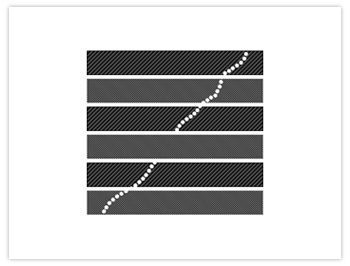 Because I was one of the lucky few to visit, J.T. gave me a free print. I chose this one here. Not for any good reason beyond I liked it best out of the ones he had available. J.T. told me it was his favorite. I wonder if he says that to everyone who gets a print.
 The night wasn't just slow, it was also disappointing. I started at
 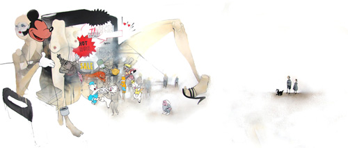 The show's signature image was the only decent painting, and that might have been okay only because it was so big, and I find big paintings tend to look better than small ones, if only because the large size lends more gravity. As usual, Anthony fell into the fine artist trap of being unable to competently reproduce cartoon characters like Mickey Mouse and SpongeBob, and ultimately his message was hopelessly shallow: Corporations use the same techniques to sell porn that they use to sell movies for kids! Sex sells! Won't someone think of the children?
 After that we were at something of loose ends; I didn't know of any other openings. J.T. only had one more he thought might be worth the walk, so we found our way to the
  In the next room,
  J.T. and I wandered a bit after that. I'm not sure what else we saw. I know we stopped in at
