I'm behind on some reviews -- I haven't written about the Bridge Fair yet, and I have a few other things here I haven't gotten to, some of which I really liked -- but in the interests of getting this down while it's still fresh, I'm going to skip ahead and write about the most recent opening I went to.
Of course that only opens up more problems. How do you review someone like Joanne Mattera, when she invites you to the opening, has always been nice to you, and greets you with a kiss on the cheek, even if you already wrote a somewhat less than kind review of her curating abilities? It's tough. I'm feeling like I might be thinking more positively to make up for the last couple of reviews I've written. I don't know. It's so hard to be really honest and open. A friend recently wrote to me saying, "People will not love you for your honest opinion, especially if you are not Holland Cotter. And what is an honest opinion anyway? Most people have a hidden agenda. Honest opinions are always mitigated by intention. We have our personal agenda, be it political, economic, or whatever."
I sincerely don't think I have a hidden agenda. I'm just doing for others what I'd like done for me.
Anyway, maundering aside, it helps when you really do like a show, and I really do like GeoMetrics II, at gallery onetwentyeight until April 19, 2009. Don't let the title of the show turn you off; I know, it sounds kind of lame, like some junior high school math textbook from 1977. Frankly the title is the worst thing about the show, which, in the scheme of things, is really good, because it's the least important thing about any art show.
There are some really excellent paintings in this show, which is loosely based, as you might have guessed, around the theme of geometric abstraction. The curator, Gloria Klein, is a longtime hard-edge abstractionist herself, and she has one of her own paintings up, which I didn't even realize at the opening. Somehow I failed to put together the name on the wall next to the work and the person Joanne introduced me to.
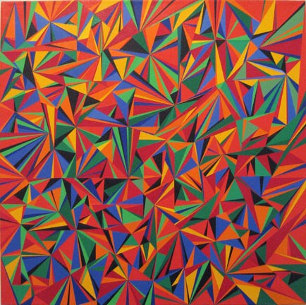
Gloria Klein, Beach Umbrellas, 2007, acrylic on canvas, 30x30 inches
Gloria's work immediately reminded me strongly of
Tim Mutzel's, which is kind of backwards, since she's been painting for around forty years, and Tim's a child in comparison. Gloria's work is a colorful multifaceted shattering of the picture plane, resolutely flat and yet suggesting multiple depths, like a kaleidoscope. She's a fan of red -- this particular canvas is red all the way around the stretchers -- and blue comes across strongly too; although when you really look at it you can see just as much green and yellow bouncing around. Gloria paints all over, like the Abstract Expressionists and Color Field painters the hard-edge style descended from, and her painting shares that expansiveness you find in their works, that space-filling you can feel in your ears, as it were.
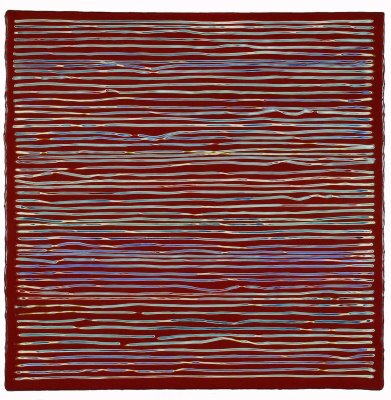
Joanne Mattera, Vicolo 35, 2008, carved encaustic on panel, 18x18 inches
Joanne Mattera, Vicolo 36, 2008, carved encaustic on panel, 18x18 inches
Joanne's two paintings are next to each other near the front of the gallery. I was surprised by them, because I'd seen the JPEGs, and these don't reproduce properly at all. At a smaller size, it looks like maybe she's strung string across a canvas; somewhat larger and it looks like image compression has caused color fringe artifacts across the surface. But no, not at all: In each of these, what Joanne has done is lay down encaustic in layers, over and over, and then gone back in with a carving tool and scraped out lines. So each line reveals, through the layers, a varying sampling of the colors she's laid down. The carving is, of course, imprecise and in places stuttering and halting, so you can see the effort and manual nature of the carving, which both brings out and is brought out by the different colors. The effect is far too subtle, in terms of resolution, to look correct in reproduction. In fact these paintings are closer to sculptures; what you also can't get until you see them in person is the very tactile nature of the encaustic, the way its waxy sheen communicates, with the carving, how it feels, like candle drippings or crayons; with Joanne allowing the encaustic to lap over the edges of her panels like the rind on good cheese. Elegant, simple, precise in their imprecision -- very wabi sabi, as the Japanese might say.
Steven Alexander, Calypso Rose, 2009, acrylic on canvas, 30x30 inches
Not far from Joanne's encaustics is one of Steven Alexander's encaustic-like acrylics.
I wrote about his work before and his work here didn't change my mind; he still manages to take something potentially cold, a very uniform kind of abstraction, and make it good and heartfelt, basically by messing it up. His distressed canvases are the result, I learned from talking to Steven, of a lot of layering and not, as I jokingly suggested, from leaving Stephen Westfall out in the rain for six months. I also learned that I guessed rightly about how he gets that encaustic-like surface: He mixes his own paints from raw pigments and an acrylic base, which is naturally matte and milky. By varying the concentration of pigment -- mainly by using less than you'd find in a commercially prepared acrylic paint -- he keeps that encaustic-like surface. His control of his medium and his layering result in paintings that look battered but are essentially bulletproof; Steven confided in me that he ships his work to galleries rolled up and lets them re-stretch the canvases when they get them. This is in contrast to encaustic, which is comparatively delicate. Joanne said she always has to watch for people poking her work with a fingernail to see if it is, in fact, wax.
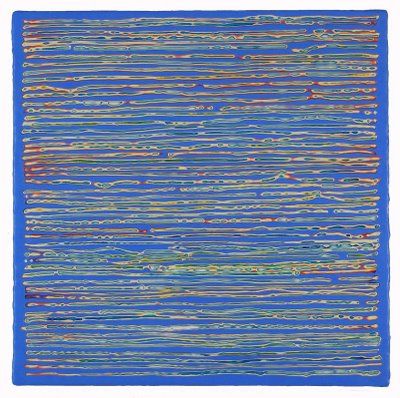
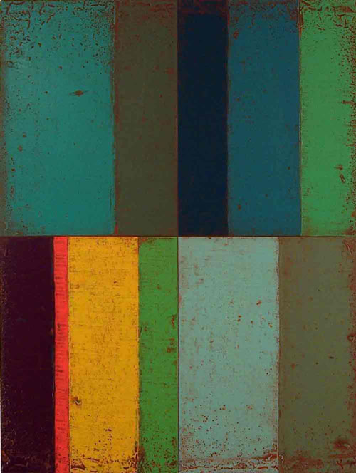
Lynda Ray, Float Copper (top) and Driftway (installation view), 2008, encaustic on panel, 14x18 inches each
Just along from Steven's work is some more actual encaustic, two paintings by
Lynda Ray. (I'm showing the installation view of the paintings here because the colors are closer, to my eye, than the images Lynda has on her own site.) Her work is what you expect from the medium, with its thick oozy and puddled colors looking less brushed and more poured. Lynda's abstraction, like Steven's, tends towards the handmade. Her hard edges aren't that hard at all; instead they waver into each other, lap over in spots, and even drip and sag a little. Steven's paintings look weathered; Lynda's look handmade, homely, like a needlepoint sampler. In a way -- and I don't mean this as an insult -- they're like hard-edge for the home, like cozy Frank Stella. Human-scale abstraction, without the cold intellectual distance so common in the style.
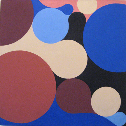
Lorien Suarez, Wheel Within a Wheel 28, 2004, acrylic on canvas, 24x20 inches
Moving around to the back from there we find
Lorien Suarez's contribution. (Interesting note: Lorien has this painting on her site long side up; in the show, it was hung short side up. Further, the
image on the show's site is kind of duller than the real thing; but the image I put here, taken from the artist's site, is, to my eye, significantly brighter and peppier than the real one. I'm not sure, then, what orientation is correct -- or even if there is a correct orientation -- and I'm not sure which image is the best to illustrate the work.) This was the painting I was most looking forward to after seeing the show online; I have to admit to being disappointed in it in person. It's good, but I really wanted it to be better. I think the basic trouble with it is, well, it's acrylic. If it were in oil I think that alone would improve it. Instead it comes off as kind of flat, lacking presence; and the blending is not quite right, which could be a problem with the medium (I've had my troubles with getting acrylics to blend properly). Also, the colors are so basic, so clearly straight from the tube. I feel the whole thing needs some modulation. Judging by Lorien's site, this whole series is a lot more interesting than this representative; maybe any of the other ones would've been better. It's hard to say.
Facing each other across the space in front of Lynda's painting are two works by Larry Spaid and one by Laura Battle. For some reason none of them are on the show's site; it may be a coincidence, but neither did any of these low-key works make much of an impression on me. They all seemed competent, quiet, sort of suitable for tasteful corporate decorating. I do remember that Larry's works were framed behind glass and this made the already subtle works difficult to see well.
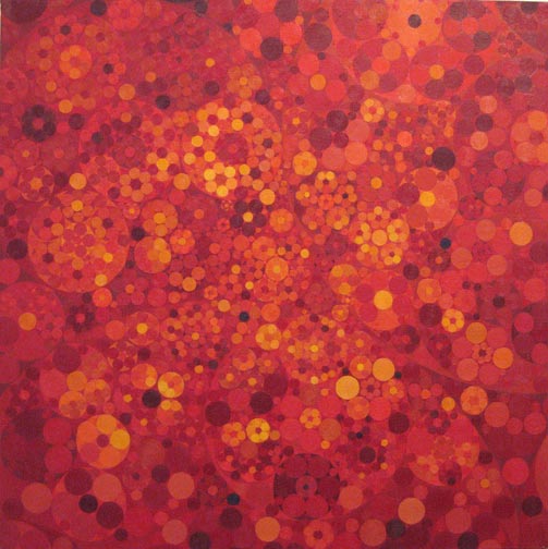
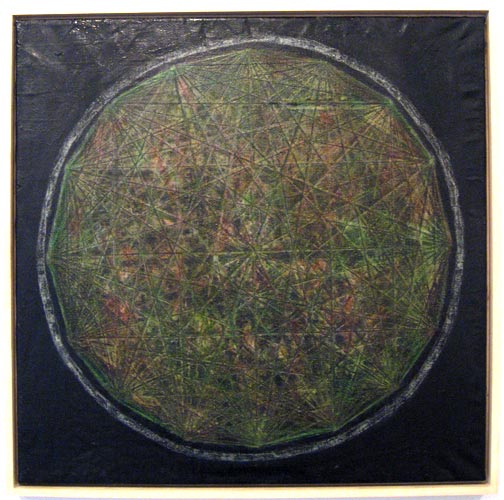
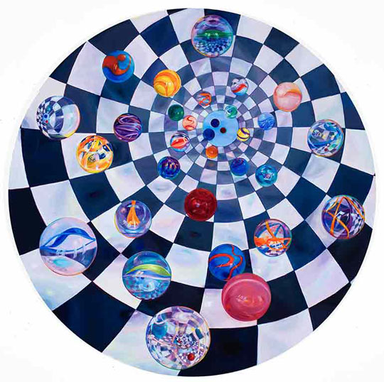
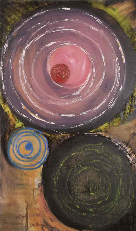
Bruce Pollock, Red Square Cluster, 2009, oil on canvas, 24x24 inches
Next I want to award the Best in Show ribbon to
Bruce Pollock for his vibrant painting
Red Square Cluster. Maybe it's just a demonstration of Audrey Flack's dictum -- "If you can't make it big, make it red" -- or maybe I just tend to like that red-to-yellow spread, but this painting really caught my eye and held it. Initially it reminded me of
the old Koch curve fractal, only of course using circles within circles. On closer inspection the resemblance breaks down, however: The painting is too hand-made for a fractal, too irregular. The circles aren't all precise, and there's evidence still of the lines Bruce used to lay out the composition. The JPEG here smooths out the edges and also compresses the color range too much; the original is sharper and more energetic, with a visual vibration coming off the surface from the imperfect glazing of paint.
Michael Knutson, Crossing Oval Coils XII, 2009, oil on canvas, 30x30 inches
The Koch curve comparison continues with the next work by
Michael Knutson. His isn't fractal at all but it does use the hoary old Star of David motif, which tiles nicely with hexagons. The trouble with this painting is two-fold: First the color scheme is far too basic; combined with the regularity of the pattern, which although warped is basically the same across the entire canvas, the whole painting just kind of slaps you once and then hangs limply, too busy and yet too staid all at the same time. And second the texture of the oil paint clashes with the style: A pattern as dense as this one really needs to be painted as flatly as possible to avoid the brushwork from heading off in directions at odds with the pattern itself. The result of the wobbly paint application is that the already-overwrought pattern loses whatever coherence it might have held across the picture plane, and the whole composition collapses into a nervous wiggly noise of contrasting primaries. It kind of hurts your eyeballs without giving anything back.
Mark Dagley, Distressed Orb, 2009, oil on linen, 30x30 inches
Following along we reach
Mark Dagley's work, which is something of an opposite to Michael's painting, being amazingly unbusy, to say nothing of nearly lazy. This work completely failed to catch my eye or interest me in any way. All I saw was muddy, and further inspection didn't improve on that, so I moved on.
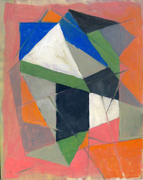
Julie Gross, Mirro-B', 2008, oil on linen, 23x24 inches
Curiously, at first glance
Julie Gross' painting made me think of Mondrian. I say this is curious because she doesn't have a straight line in her work while Mondrian, of course, has nothing but straight lines in his best-known work. I should be thinking of him when looking at Julie Karabenick's paintings -- about which more in a bit -- but not Julie Gross'. And yet it seems to me she's doing for circles sort of what he did for rectangles, letting them flow into and out of each other while arranging them in space. Her colors are nothing like Piet's, either, but I can't shake the feeling that she's approaching her work similarly. I do sort of wish her colors here were a little bolder; judging by this work and her Website she's going for a subdued kind of early 1970s palette, with smoky blues and avocado greens and muted earth tones. I'd like to see her come to a middle ground along with Lorien. Still, this painting certainly is a good one, with a solid composition and a positive feeling of flow.
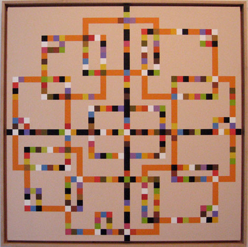
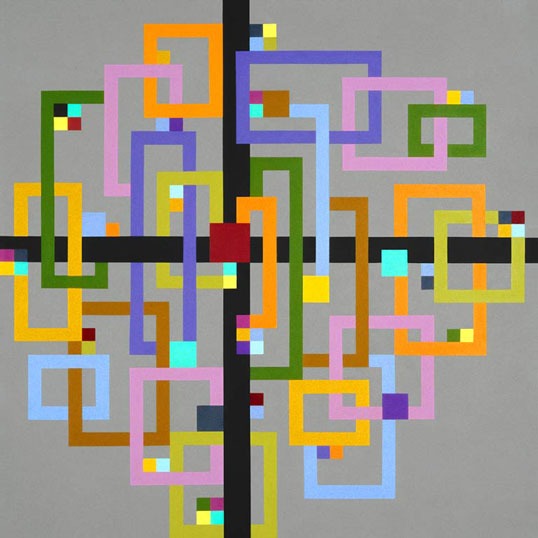
Julie Karabenick, Composition 78, 2008, acrylic on canvas, 30x30 inches
Finally, back by the door, we find
Julie Karabenick.
I also wrote about her work before, and again I don't have much to add. She still has that Atari 2600 thing going, both in terms of color and the low-resolution pixel feeling of her lines; that's not intended as an insult or to take away from the work at all, but just shows my personal associations. I still feel I'd like some more texture in her work -- texture that works with her designs, not to distract from them. Again I'll use the word jazzy: her paintings are jazzy.
Overall I liked this show a good deal. It's one of the few shows I've been to where I'd even like to compliment the hanging; the flow of the show from one work to the next enhances the experience. I think Joanne even brought that to my attention but she didn't need to. I felt it as soon as I walked in. It's definitely worth a trip over to the Lower East Side. In fact it's easier to get to since it's closer to a subway stop than anywhere in Chelsea. Back when we were hanging the Blogger Show, James Kalm suggested that the Lower East Side (some people have taken to typing that LES but I'm resisting) is the next up-and-coming art neighborhood, and maybe he's right.

