It took me long enough but I finally recovered from seeing the worst art show of all time and thus was able to get off my ample ass and into another traditional gallery slog. One benefit of waiting so long between trips into Manhattan is I was able to put together a list of really interesting shows to see. I even felt energetic enough to start at midtown, hit SoHo, saunter through Chelsea, and fetch up at the School of Visual Arts MFA Open Studios. The following morning my fasting blood sugar was the best it'd been in months, too. Not a bad couple of days.
I began my trek on 57th Street at Marian Goodman where I saw
(until January 9, 2010)
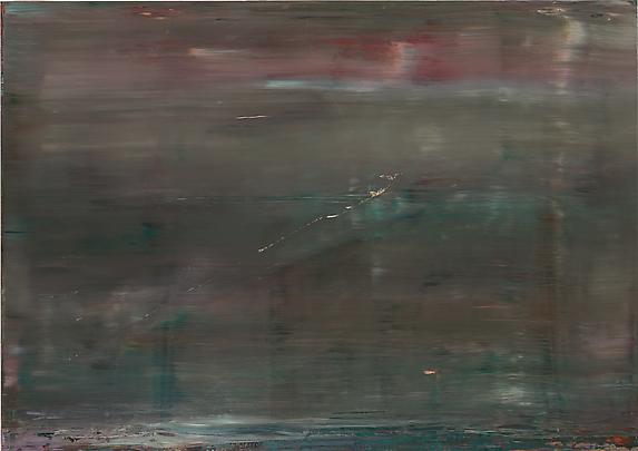
Gerhard Richter, Abstract Painting (909-5), 2009, oil on something or other, 58 5/8x82 5/8 inches
I might not have put Gerhard on my list of shows to see except that over at Franklin's Artblog.net a number of us started discussing his work across two separate threads, one nominally about Bunny Smedley and the other George Bethea. He came up largely because Artblog's commenting pool mostly consists of Modernists, Abstract Expressionists, Color Field painters, and Greenberg readers. The discussion tends towards a very high level since some involved knew Greenberg personally and were involved in the New York City art world back when all these topics were new and at the top of the field. Since then, of course, painting's been declared dead a bunch of times, it's been declared undead, it's been decided that it was never dead, and abstraction -- which didn't really go anywhere -- is regularly hailed as returning, reconquering, reemerging, or whatever. And of course one of the few really big art stars of the past twenty years or so working in a kind of Abstract Expressionist sort of way is Gerhard Richter.
I personally don't care about abstraction per se one way or the other, and honestly neither did Greenberg or anyone else properly calling themselves Modernist; for me (and for the others for whom I'm presuming to speak) the main thing is that the work of art be good regardless of style. So I wasn't going to see Richter to see how well he fit under the label of Abstract Expressionism or any other label for that matter; I went to see for myself, after all our discussion of his work, if his paintings were any good.
And they aren't. People talk about Gerhard's work being chilly or emotionless. Well, distancing yourself from emotion is, in its own way, an expression. It's communicating something. I get nothing of the kind from Gerhard's work at all. What I do get is the feeling of an assembly line, and not a very good one.
Most of the work in this show consists of Gerhard putting down paint of a few different colors and smearing it from one end of the surface to the other. Then perhaps he'll put down another layer, possibly of different colors, and smear that, possibly perpendicular to the previous smear. At times there's a hint that there may have been a more traditional painting at the very bottom which he's also smeared.
Then, aside from the assembly line pieces, there are a few works that, in context, appear to be one-time experiments on which he never followed up. Here's one where he sponged the paint on, here's one with solid squares of color arranged in a grid, here's a batch of paint-squished-between-glass. Just to break the monotony of putting the canvas flat and dragging a two-by-four across it, I guess.
He also varies his supports, which doesn't sound very exciting and isn't. One's on canvas, another's on wood, yet another is on something called aludibond. Altogether, what comes across from this entire show -- and it's a huge show -- go ahead, click through the whole thing at the gallery Website, I guarantee your clicker finger will fall off -- is Gerhard being willing to make choices so long as they don't figure very strongly into the final result. He picks the colors, he picks the grounds, he does the same things to them, and he's done.
Worse still, he doesn't seem to care about the final result. Clumps of pigment get dragged across the surface leaving gashes in the paint? No problem. Big boogery lumps on the end alligator up and threaten to fall off? That's great! (Come back in a hundred years and see how great it looks, Gerry.) The latest layer pulls the skin off the only partially cured underlayer? Just push it back into place, no one will notice. No one says you have be anal retentive -- AbExers aren't exactly neat freaks -- but these flaws don't say "I'm pushing for the best art, I can't be bothered with details!" They say "I just don't give a crap, where's the next one?" Would the slightest nod towards professionalism and craft have killed him?
All of this carping would be beside the point if visually these paintings were great. But they're not. While I was there a couple of tour groups were milling around and I overheard some of the guide's spiel and felt embarrassed to be an artist. The blathering was wide and deep and the poor souls roped into the tour were glumly nodding and accepting it. "Yes, these are important paintings full of feeling. Yes, they are passionate and intense. Und so weiter und so weiter." Anything but what was obvious, which is that even Gerhard was bored with them.
On my way out, waiting for the elevator, I scanned the various books for sale by the front desk. Gerhard Richter is apparently so important he merits not merely one book for this show but at least five, one of which is entirely about just one painting. September by Robert Storr is a book-length essay (or an essay-length book, hard to say which) dedicated to "A History Painting by Gerhard Richter". It says something about Gerhard's show and this painting in particular that it could be intended by the artist to engage with the September 11, 2001 terrorist attacks in America -- a topic about which I personally feel pretty strongly as a lifelong New Yorker who spent several years commuting daily through the World Trade Center -- and yet I didn't even notice until I was leaving, and then a book had to tell me. In fact upon seeing the book I remembered that Jerry Saltz had waxed rhapsodic about this very show and its connecton to September 11. That's how emotionally powerful this show is: I didn't even remember or notice while I was actually looking at the work and neither, most likely, will anyone else, unless they bone up directly beforehand.
And that, ladies and gentlemen, is just sad.
The great thing about the address of the Marian Goodman Gallery, however, is that it's all very serious high art premium-priced galleries upstairs while the street-level part of the building is taken up by
(open forever)

Ana Tzarev, Starvation, 1996, oil on linen, 51 1/8x38 1/4 inches
and her personal vanity gallery. I'm probably going to take a bit out of my already-tiny credibility even by saying I went through Ana's. One dealer I spoke to -- and dealers very, very rarely say anything negative about anyone else -- said to me, "Isn't that a...commercial gallery?" as if I'd admitted to picking up Thai ladyboys on the weekends. But I've been curious about Ana since her space opened up a couple of years ago -- she had these great billboards around town -- and here it was. So I went in.
I'll say this: Her gallery -- oh, hell, I might as well call it what it is, a store -- her store is a fantastic space. I can't imagine how she affords it but it's just wonderful. Any artist would wrestle Charlie Finch in hot oil to get a place like this. It's huge and has none of the anonymous echoing white cube so beloved of real galleries. It's warm and inviting, like a giant glowing womb. With its own glass elevator.
As for Ana's paintings...well, they're certainly kitschy. I can't deny that. And she wears her love of Van Gogh not only on her sleeve but all over her smock -- she's even got the chutzpah to have painted a vase of sunflowers and a patch of irises, and further she's engaged in her own version of Japonisme (about a hundred years too late). She falls far short in the comparison, but that's no shame, failing to match up to one of the greatest painters of all time. Despite not being up to Van Gogh's level, though, her paintings are nevertheless big and colorful and energetic and honest and....
Okay, I can't really and truly love them. I can't say my little dried-up art elite Grinch heart grew three sizes that day. But it did thaw a bit, for just a moment. Ana's got life and, in her paintings of people suffering from famine and disease in Africa, she's got some darkness, too. She loves slathering on the paint, she's in love with paint itself; by the time you get to her most recent paintings she's squeezing it out like icing on a wedding cake. And she's certainly got a thousand times more heart, courage, and brains than Gerhard Richter upstairs. In a way Gerhard's work is just as kitschy in its refusal to be interesting or good as Ana's is in its puppylike need to be loved. Ana sincerely wants to put something big and bright up on your wall; Gerhard sincerely doesn't give a shit. I know which sincerity I'd choose.
I imagine someone might argue that other cultures and their problems aren't properly addressed by a touring European taking inspiration from their quaint suffering and marketing them for huge sums back in Whitey's capital city. That turning flowers and starving people and women with baskets on their heads and onion domes and all that into big saleable commodities is crass and wrong. And I don't really have much of an argument against that except I don't get that feeling from these paintings. I've been in a Thomas Kinkade store, for example, and it's nothing like this. Maybe it's naive of me, but I feel that Ana is really trying, in her own way, to connect with the people, places and cultures she depicts.
Maybe not. Maybe she's just cashing in. What do I know?
Anyway, I'd had no intention of stopping in Ana's store. It just happened. Where I really meant to go was Tibor de Nagy to see
(until January 23, 2010)
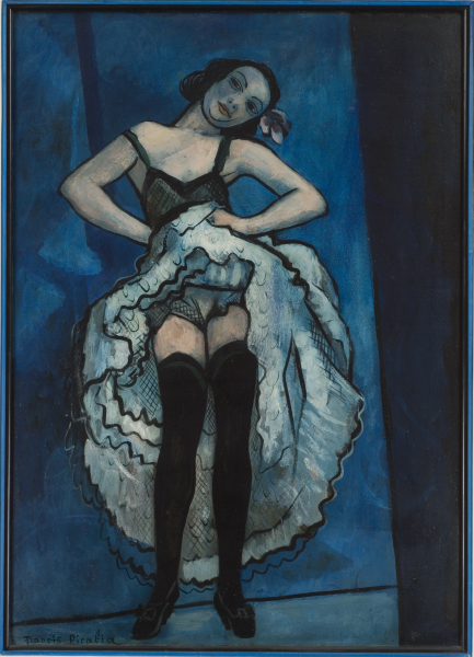
Francis Picabia, French Can-Can, c. 1941-1943, oil on board, 41 3/4x30 inches
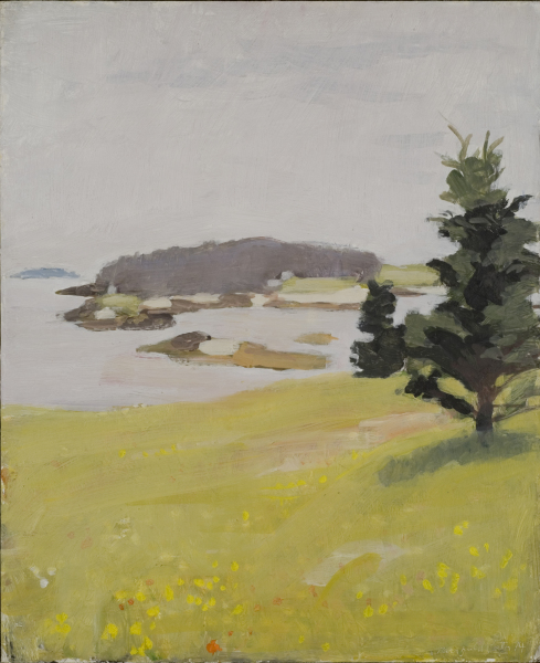
Fairfield Porter, Bear Island with Spruces, oil on board, 22x18 inches
These two shows are very, very small, in what, after the last two shows I saw, felt like very cramped quarters. Nevertheless I wanted to go back to Marian Goodman and drag all those tour groups over with me, because there's more real human emotion in one small canvas from either Porter or Picabia than there is in two whole warehouse floors of Richter.
I can't go on for too long about either artist because I don't feel I'm qualified and the sample of work here is so small. But I'll try to give you an idea of what I thought.
There are no masterpieces from Picabia here, although French Can-Can (pictured here) comes close. It's the signature image of the show and with good reason: Either it's the reason there's a show at all or it's the piece expected to draw buyers in. It's an excellent painting, forceful, lovely, forthright. It looks like a cross between Picasso's Blue Period and a Degas dancer, with overtones of Toulouse-Lautrec (which is probably unavoidable when the subject is a French stage dancer around the turn of the 20th century). And if it's a little off-kilter -- in composition, in rendering -- that just gives it a touch of interest. Who'd want to hang out with an even-keeled dancer? Where's the fun in that?
There's another painting of a standing female figure, too, a nude, in a much different style: This time she's almost faceless, shadowed, in an ambiguous rocky place, and the modeling is much more realist, less cloisonné. It's luminescent in its own way, not really as dark as it first appears, and in its idealized form perfectly contemporary.
Also included are a few smaller paintings, some more abstract than others, mostly dark, and some lovely sketches, one a caricature of Man Ray on the cover of a menu, which exactly captures the essence of Parisian cafe culture, or anyway my imagining of it. None of them are fantastic, especially compared to the dancer; the other paintings are mostly dark, clotted affairs, and some of them have so many overlapping elements it's hard to see them at all. Still, they radiate a strength and a probing kind of exploration of the medium of paint.
Porter's part of the show -- I suppose they're really separate shows -- is even smaller than Picabia's and the work is less impressive. I wish I could find a good reproduction of Katie and Jacob in the Yard, which I thought was probably the best piece there; in it two figures and the side of a house are dwarfed by a strand of trees and, most importantly, a lawn flooded with shadows and sunlight which almost appears to be coming alive like some enchanted fluid.
Aside from that painting, the work reminds me of Alex Katz, although much better. What makes Porter work when Katz falls flat is hard to pin down: Is it the colors? The blending of edges Katz always seems reluctant to do? Pure composition? Painterly touch? I'm not sure but it's clearly the case that Porter paints rings around Katz. I'd like, in fact, to see them side by side, just to see if the comparison would reveal any clues.
As in the Picabia show, there are a few drawings from Porter, also. They're very minimal, barely even sketches, possibly for future paintings he had in mind. None of them -- there are two or three -- are very exciting.
On my way out of the building I shared the elevator with one Mr. Brown. I know that was his name because the gallerina said good-bye to him as he left. I expect he's some art world luminary I'm completely ignorant of. (He was not, however, Eric Brown, co-director of Tibor de Nagy, whose photos I can find online. Maybe it was his dad.) Mr. Brown allowed me to press the button for the ground floor.
"I'm just following your lead," he said.
"Good thing you weren't following me earlier," I replied, "or you'd have gone through the Richter show."
"You didn't care for it?"
"It looked like it was made on an assembly line, like 'Shoop! Shoop!'"
"Picasso worked that way sometimes, you know."
Unsure of how to respond to that, I simply said, "Well, Picasso wasn't always that awesome, either."
We wished each other well at the door and went our separate ways. In this case my way was past the Plaza Hotel (where my high school held its Senior Prom) and the horsedrawn carriages to the subway and downtown to Prince Street and then to
which isn't art-related at all -- I was looking for a gift for my son -- but is the only reason I happened to accidentally find and enter
where they were holding their 40th Anniversary Group Show (until December 18, 2009 -- you missed it!). I'd like to list all the artists in the show but there were a whole lot of them and there was no handout from the gallery I could find. Although there is a big rack of postcards for just 50 cents each. The artists I definitely saw there: Hilo Chen, Chuck Close, Richard Estes, Audrey Flack, Ralph Goings, John Kacere, David Parrish, John Salt, Ben Schonzeit, Jud Nelson and John DeAndrea. I could tell from outside the place that the gallery was showing Photorealist work; upon entering I was blown away by the sheer volume of it, not to mention that there appeared to be a few naked women lounging around the place. One, in fact, was staring with somewhat disturbing intensity at the cluttered desk in the office.
I leaned over and whispered to the gallerina, "There are naked women in the gallery."
I guess she'd heard that too many times since she seemed unamused. "It only seems that way, sir," she said, or words to that effect. "They're all bronze."
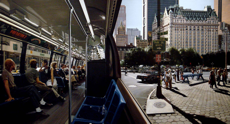
Richard Estes, The Plaza, 1991, oil on canvas, 36x66 inches
Indeed they were. I left the small naked woman lying in the middle of the gallery, as if waiting for a massage, as I went slowly around the room. I'd seen some of these paintings, or some very much like them, in airbrush books and magazines my whole life. Not all of these artists use airbrush, but then not all of them are true Photorealists, as Richard Estes used to be. I'm not sure he is any more; his more recent painting in this show struck me as more simply traditional landscape painting. I suppose it's possible landscape painting caught up with the Photorealists. I'm not sure.
In any case, I doubt you're likely to find a greater concentration of pure technique anywhere on the planet. These are the works most likely to make regular people off the street say "Wow" and "How'd they do that?" They're also some of the few art works which honestly need that ubiquitous "PLEASE DON'T TOUCH THE ART" sign because, damn, some of them you really want to feel. I still get a little charge out of work like this -- I spent nearly 20 years trying to live up to it -- but in the end it's just not as great as I thought it was. Still pretty neat, though.
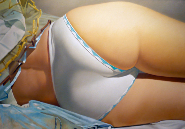
John Kacere, C. Smith, 1972, oil on canvas, 56.5x80.5 inches
Standouts for me were John Salt, who paints hazy images of old junked cars; Ben Schonzeit, who had a large Photorealist airbrushed painting of a pile of apples with a lovely rendering of photographic depth of field (a curious thing to replicate, since it's kind of a flaw of optics, not really something we asked for); and John Kacere, who I found notable mainly because his painting was enormous and entirely of one woman's derriere. I consider myself something of an expert on the female backside, having painted a number of them myself over the past few years, so I looked up John when I got home and found that his oeuvre seems to consist almost entirely of giant paintings of women's asses. In his online bio he states, "Woman is the source of all life, the source of regeneration. My work praises that aspect of womanhood." Speaking as one guy who paints naked women I can tell you this: John Kacere is full of shit. I suppose he's approximately right, that woman is the source of all life, although it's more accurate to say exactly half of all creatures which reproduce sexually, since man is required for half the process, too. Regardless, once you hit a word like "woman" as a stand-in for all women in an artist's statement, you know you're in trouble. John should just come clean and say, "I paint women's asses because I like them. I'm an ass man. Now take off your pants."
Speaking of asses, there was me, carefully prowling around the edges of the gallery lest I go too quickly to the nude woman lying in the middle of the room. But eventually I had to go and take a look.
I imagine not all sculptors, down through the ages, have sought to capture the human figure exactly. But many have. Certainly those old Italian guys working in the finest marble were trying their damnedest to make translucent white stone look like human skin. With a lot of tricks and an application of immense skill, training, and talent, they did a great job. But not perfect, never perfect.
Well, technology and techniques have improved over the years, and now it's possible to make an exact life cast of a living human without too much trouble. I've even played with it myself. It's easy to do. Less easy is to take that life cast and have it made in bronze; and much more difficult than that still is to apply paint to that bronze until you have as close to an exact replica of a living person as anyone's ever seen.
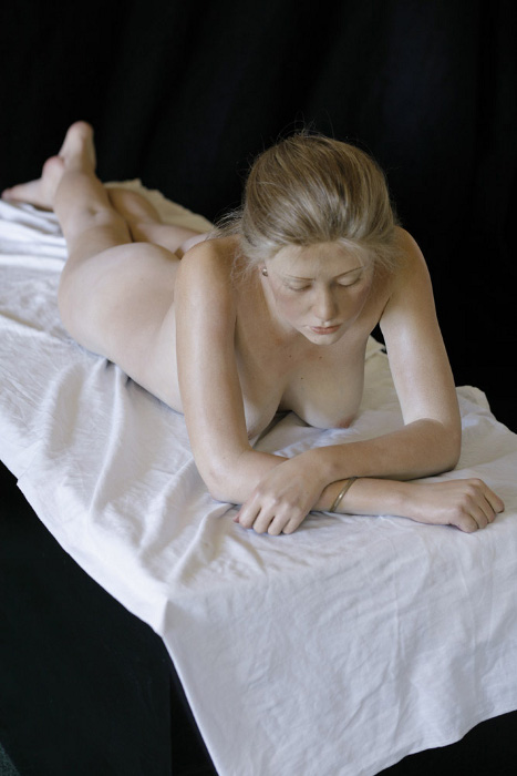
John DeAndrea, Amber Reclining, 2006, painted bronze with mixed media, life-size
And this is what John DeAndrea has done. I was actually afraid to stare, afraid to get too close, because Amber looked like she might get up and slap me. The texture of her skin, the little goosebumps, every freckle and beauty mark, small folds of her toes, every little detail was there, flawless and lifelike. No Uncanny Valley here, either.
The sculpture is not absolutely perfect: Her hair isn't quite right, although I think it looked better in the gallery than in the photos, where it looks like plastic mannequin hair. And there are places where John's paints couldn't reach. In the tightest crevices, as between her folded arms, you can just see where the paint runs out and the bronze peeks through. And finally I can't be sure -- although I knelt down to look at her face -- that part of why she didn't enter the Uncanny Valley is because she was facing away and down.
Altogether John DeAndrea's sculptures are a fantastic achievement. I'm not sure they're great art, exactly, in that they don't have that feeling I associate with the very best art, that sort of elation that comes with seeing something truly sublime; but great art or not, they're certainly a triumph of technical skill. In fact that could be said of everything in the gallery, but John's sculptures are that one step higher. They're truly amazing.
Okay, enough serendipity. Why was I really in SoHo? Why, to stop by Campton Gallery to see
(until January)
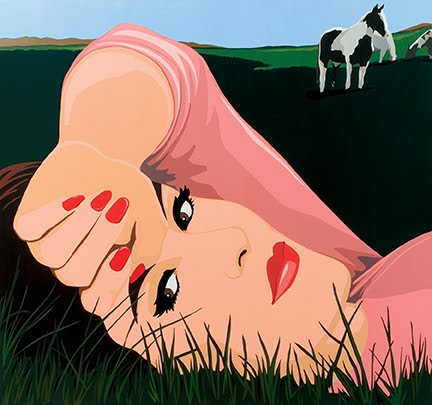
James Wolanin, Summer Meadow, 2009, acrylic & resin on panel, 48x48 inches
I won't be fully critical here, not because I don't want to be, but because it's just not possible. Jim's a friend -- well, there I go again. Friend's not quite the right word, since it's not like we exchange birthday gifts or borrow each other's underwear or anything. But Jim was one of the first artists I met when I started my blog and he was one of the first to join me on a slog through Chelsea, and it was partly on his recommendation that I ended up at the School of Visual Arts in 2007, so I think of him as a friend even though I haven't seen him or his work in a couple of years. The upshot is, whatever we are, I don't have the proper critical distance from his work, and even if I decided to bear down and really criticize it constructively, I'd probably do it privately. Because I do have boundaries. Not many and somewhat rickety, but boundaries nonetheless.
The first thing I saw as I arrived at the gallery is Jim's name in big letters at eye level along with one of his big new paintings right there in the front window. It's absolutely great to see someone I know getting that kind of exposure. Jim deserves it.
Inside I noticed something new about Jim's latest paintings: They're really shiny. Look in the media list -- see where it says "acrylic resin"? I wasn't sure how he used it but now I know: He's been covering his paintings with Envirotex Lite. I played with that stuff a bit myself and I was really impressed by his handling of it: To cover a surface as large as these paintings without a lot of flaws -- dust and hairs and things getting stuck -- and bubbles -- although there were a few tiny ones -- and to get the sides covered too, it's quite an accomplishment. Of course the thick resin coating really saturates the colors of the paints, and Jim's acrylics are always very bright anyway, so the finished effect just screams POP!
Which is what these are, Pop Art. They're mostly of groovy men and women in hairstyles and clothing placing them somewhere in the early 1960s. Some are in cars, some are in front of planes, some are at the pool. There's always a sense of being on some kind of movie poster or travel brochure vacation -- martinis! Palm trees! The whole set is like a spread from an early issue of Playboy or maybe Vanity Fair. The image here, Summer Meadow, is one of the few exceptions. (The horse in the background makes me hope the nice lady checked the grass before she laid down.)
Jim's style hasn't changed a lot but I thought I picked up some small differences. He's working larger now. Also I think his forms are getting more stencily. He's always cut stencils or taped off areas (I forget his exact method) but it looks to me as if some of the edges are straighter and some of the corners sharper. Two paintings in the show are identical except for the color scheme, which makes me think he's reusing stencils. This also opens up questions about editions: Are these edging closer to serigraphs now?
Although I said I wasn't going to get too critical I will add a little: I'm still unsure of Jim's subject matter. I can't quite feel his connection to it. Back when he was at SVA his work was moving in a more personal direction which I thought was really good, but something seems to have short-circuited that, as if he touched some live wire and took a couple of steps back again. It could be, I guess, that he went down one of those fruitless avenues artists sometimes take while they're exploring in the studio. It looked like a good place to me, but maybe not to him, and he is, after all, his own artist. The resin surface, while aesthetically neat, adds a little more distance too, I think. The whole package sort of unsettles me.
But that's really a minor caveat. I like the work, I really do. And when I wrote to Jim after seeing the show he gave me some good news and some bad news: The bad news is, I missed almost half the paintings in the show; the good news is, that's because they sold and were shipped to their new owners already. Which is excellent to hear, although I wonder why the gallery didn't at least let the paintings stay for the rest of the show. The place doesn't do opening parties, either, so perhaps it's a...gasp...commercial gallery? Well, if it pays Jim's bills and keeps him painting, I for one don't care.
Jim is certainly doing better than the sidewalk artists. Over in Chelsea, or on the Lower East Side or midtown, for that matter, you don't get people setting up on the sidewalk hawking their wares. In Chelsea it's because there's relatively little foot traffic, at least of the shopping kind; in midtown it's because the galleries up there will call the police if you're within a hundred yards of their door. But SoHo has been burnished over the past few decades into the general public's idea of the New York Art Scene, so it's expected that starving artists will lug their life's work downtown and attempt to pass it off on unwary passersby. Most of it is street art, graffiti on canvas kind of thing, and mostly forgettable. But one guy I passed was selling drawings of comic book superheroes he'd clearly traced from my personal hero John Byrne. It's something most people might not have noticed but it made me mad. I thought of challenging the guy to draw Wolverine in front of me without a Byrne to copy. But then I decided to leave him alone. It is, after all, Christmas.
And I had to get to Chelsea. As it happened almost everything I wanted to see was on 25th Street so naturally I started with my favorite gallery, McKenzie Fine Art, and my favorite dealer, Valerie McKenzie, who was showing
(until December 19, 2009 -- you missed another one)
Laura Watt, 50402, 2004, oil on canvas, 36x34 inches
Valerie seems to love the kind of artist who covers the surface with a repeated pattern, often in some kind of spiral or spinning column. Maybe she has an inner ear problem or something. Or maybe I just happen to show up when she's showing that kind of work. Whatever it is, I often find myself feeling a little dizzy in her gallery.
Laura's show is a prime example of both the pleasures and the pitfalls of this kind of painting. Most of her work here consists of medium-sized canvases on which she's taken a motif and repeated it, twisting, folding, and otherwise transforming the shape as she goes. In some she then lays on another motif, possibly similar to the first, and runs that across the surface, again transforming it. Her transformations are very mathematical, sort of plane deformations, the kind of thing I used to have a name for back when I was studying mathematics but which escapes me now. In contrast to the specificity of her transformations, her paint handling is somewhat loose, not too precise. In a way I found myself wishing she was tighter, but then that might drain the work of all spontaneity and life.
The range of paintings she's done using this approach perfectly illustrates the pros and cons of abstract painting: When it works -- when she's chosen good colors and composed the deformations well -- it's really good; but when it doesn't work the painting completely collapses. She's working with small-sized pieces -- in Cubist terms -- and putting them together into an all-over composition, and when the colors contrast just so, and the two or more overlapping patterns work together in their shallow Cubist space, the effect is quite good (see Mandala Crossed #1). When she chooses the wrong color combination, or somehow doesn't get the patterns to match up in a pleasing way, there's just nothing there at all. The whole painting simply fails (see Indra).
Of course there's probably no way to know in advance what will work and what won't, which is why it's a hit and miss process. When it works it works, though, and that's important. She also does the same kind of thing in gouache and I found those much more successful than the oils. I'm not sure why; it could be that the lack of saturated colors brings the composition and shapes out better. Remember that Braque and Picasso kept their hues very close together when inventing Cubism, and there's a reason for that. It could also be the even less precise edges of the gouache helped wake the whole thing up. I'm not sure but I liked them.
Best of all, though, is the signature piece, 50402 (shown here). This time Laura's taken what might be Chuck Close's little filled rectangles and deformed them across the surface, giving us a kind of 3D wireframe of some abstract object, or something reminiscent of Dalí's figures fading in and out of existence. This is an older work and not, I guess, the kind of thing she's doing these days, but it struck me as more satisfying than the newer paintings.
I said good-bye to Valerie and went downstairs and across the street since my next stops were even-numbered buildings. Since I was there I ducked into Lennon, Weinberg where I saw
(until January 9, 2010)

Denyse Thomasos, Lollipop Nation, 2009, acrylic on canvas, 40x54 inches
I don't know who chooses the art in this gallery, whether it's Weinberg or Lennon or some other person, but I feel schizoid about their choices. I always seem to be drawn into the gallery but I never really like the art. Neither do I dislike it. It's almost always sort of distressingly uninteresting.
Denyse Tomasos is no exception. Her work is in a quasi-Cubist style with angular forms and flat colors which are slightly off-register from each other. It reminds me of that late 1950s to early 1960s illustration style which has no name I'm aware of but which really needs one. It's kind of Saul Bass meets Hanna-Barbera's Pink Panther cartoon backgrounds. All the paintings in this show look as if Denyse applied that approach to waterfront scenes filled with dock buildings and sailboats tied up at wooden quays. It's almost but not quite the kind of painting one would put in an ornate wooden frame and hang in a living room decorated in Better Homes & Garden circa 1975.
The only good thing about a small gallery filled with mediocre art is you can go through and around it quickly and right back outside to your next destination, which in my case happened to be 532 Gallery Thomas Jaeckel. The door to the building is opaque and when I stepped through it I made a little squeak because I faced what looked like the longest staircase of all time. In fact it isn't, but it's a weird old building where the architect decided, for reasons I cannot imagine, to run the stairs straight up without turning at landings all in one run to the third floor. Any fat man faced with that many stairs would've made the same noise I did. Thankfully the gallery is only on the second floor. Thus I was only slightly out of breath when I saw
(until December 24, 2009)
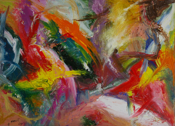
Hendrik Smit, Untitled, 2009, acrylic on board, 41x56 inches
The same way that Laura Watt's work shows what can go wrong with abstract painting, Hendrik Smit shows what can go wrong with Abstract Expressionist painting. Unlike her, however, his work never shows what can go right.
The gallery verbiage bills Hendrik "as one of the last true inhabitants in the world of action painting," a mouthful which says, basically, that he's not paying attention to the final results so much as how he gets there -- and it shows. Each one of the paintings here is a portrait of an artist vigorously applying any and all acrylic colors in whatever way he feels without regard for composition, coherence, quality or purpose. Each one might as well be an entirely random agglomeration of sticky, gummy plasticized pigment. Each one looks essentially the same as the last and not one of them has any discernable depth or structure. This is Abstract Expressionism at its worst: Cut free from any connection to solid painting, let loose from any boundaries at all, and clearly the result of someone completely misunderstanding how abstraction works. I get the impression that Hendrik looks at paintings by artists like Jackson Pollock, Jack Tworkov and Joan Mitchell and thinks, "Oh, they just slapped paint all over the place." You'd have to be pretty insensitive to think that way, but judging by his results, that's what he takes from them.
Back down the scary stairs and next door at PaceWildenstein I went in to see
(until December 24, 2009)
A few years ago if you'd asked me what I thought about David Hockney, I'd have said I thought he was a pretty poor painter. I'd remember those old pool paintings and so forth, and although I didn't have the term for it, I'd probably have said he's a forerunner of the Feeble Painting movement. Only during a period where people were saying painting is dead could a guy like Hockney get traction.
Then I read his book, Secret Knowledge: Rediscovering the Lost Techniques of the Old Masters. Not only did I find his thesis credible and interesting -- I won't go into it here -- I got the feeling from his writing that I get from certain authors, the feeling that I'm actually becoming friends with them, speaking with them personally. After reading his book, then, I felt like David was an acquaintance of mine, and I found myself looking forward to seeing his work in person again some day so I could see it with new eyes.
A funny thing about the show at Pace is I had walked halfway into it before realizing I'd already seen the show before. I had, in fact, walked through it back in October. I hadn't written it up then because it got caught in the backwash from that dreadful show but, more importantly, when I was looking up shows to add to my itinerary this time, I'd put David's show on the list without even remembering I'd been to it. That in itself says something about the work on view -- that less than two months later I'd have no memory of it at all.
So what this show confirmed for me is that I like David Hockney much better as a writer than a painter. As a writer I feel he's my friend but as an artist I feel he's a doddering old uncle we're all humoring for some reason. Maybe we're hoping he'll leave us something in his will.
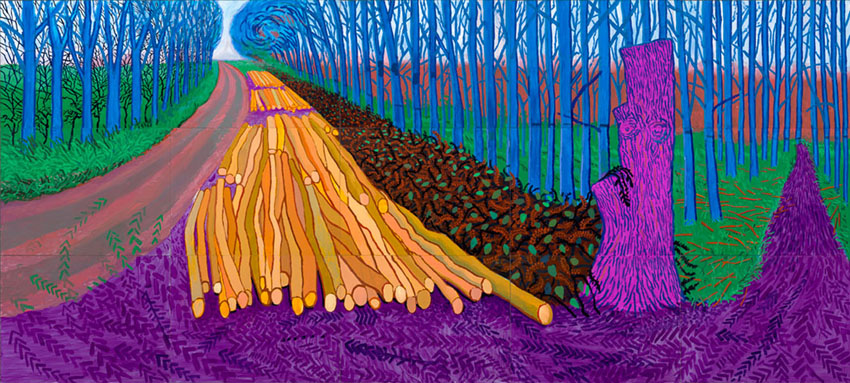
David Hockney, Winter Timber, oil on 15 canvases, 108x240 inches
The paintings in this show range from the merely big to the absolutely huge, some around twenty feet wide. Yes, that's right, twenty feet. They are brightly colored, nearly fluorescent, with large sinuous forms, like enormous Day-Glo sausages, snaking over the surface, balanced by huge blocky areas of primary greens and light blues. They're ostensibly landscapes -- according to the gallery verbiage some of them plein air -- but in no way realistic. In fact Ted Geisel might have had views like this if he ever dropped acid while suffering from a head cold.
There are some positive things to be said about David's work here. It's courageous. He clearly has no fear of using pigments usually found in grade school tempera sets. In fact his work reminds me of the paintings kids bring home from school. They have that complete abandon, that total immersion in the painter's world without considering what anyone else might like. It's commendable to see anyone attacking a canvas with that kind of energy.
Sadly, while David doesn't need to consider what anyone else might think, he does need to look at his own work with a more critical eye. He's got the color sense of a demented Fauve and the paint handling of a palsied Guston and he really needs to figure out what he's doing. I appreciate his desire, expressed in the Secret Knowledge book, to get away from what he calls optics in art -- the use of photographic techniques -- and to paint what he actually sees and feels. The gallery verbiage quotes Lawrence Weschler as writing, "...it was as if, after over twenty years of myriad wanderings, he'd found a figurative (non-abstract) way clean past the monocular optical vise." I think this is a laudable goal and it's one I'd been pursuing unknowingly before, and consciously since, reading David's book. But how this anti-optics approach -- the approach of using one's own eyes rather than photos, lenses, and received wisdom on "how things look" -- leads to purple paths meandering around blue trees and waving baguette-like tentacles on primary-green bushes is beyond me. To say nothing of the creeping mauve shadows and clouds roiling with pinky-russet tendrils. If this is how things really appear to David, perhaps he needs a run through an MRI machine.
Ultimately what's wrong with the paintings is, while they seem plenty wild and outrageous when you're looking at them, they turn out to be forgettable. I certainly forgot them. For all their size and color and craziness, they simply don't hang together as art, and slide right out of mind.
Outside once more I crossed 25th Street and found myself in front of Cheim & Read. What the heck, I thought, and went inside where I saw
(until January 2, 2010)
and got a fantastically stiff, fantastically large (6 3/4 by 9 1/4 inches) show postcard which thankfully contains no image of Lynda's crappy sculptures on it whatsoever. The back is entirely blank, in fact, and I think I might make a nice drawing on it.
A few doors down I made it to Dillon Gallery which has a very interesting show comparing and contrasting the work of two very different artists,
(until December 24, 2009)
Georges Rouault, Payasage africain (aux trios barques), 1920, oil, gouache on canvas, 16x18.4 inches
Makoto Fujimara, Soliloquies-Morning, 2009, mineral pigment on portrait linen, 60x48 inches
I was attracted to this show because a year ago Franklin had gone to a Rouault exhibition and made some drawings of his own, which I'd seen and liked. The twist to this show is that it juxtaposes Rouault's work with a series of paintings responding to it in some fashion. I'm not exactly sure how it was supposed to work, whether each painting by Makoto Fujimara is a direct response to a particular work by Rouault or not, but in the end I'm not sure it's that important. What is interesting is seeing the two side by side -- Georges' early to mid-20th century expressionism up next to Makoto's contemporary color field work. They're opposites in many ways, but each very good in their own ways: Georges' paint is laid on thickly, often caked on in so many layers that the surface must be almost an inch from the canvas backing; while Makoto's paint barely stains the canvas. Georges' colors are subdued, dull; Makoto's are sharp, vibrant. Neither of their works conjure up an illusion of space. Georges makes one or two stabs at perspective, but really never gets deeper than the picture plane. And Makoto is a true color field painter of the old school with no depth at all. Some of his paintings have layered gold leaf on top of the staining, but even so they stay very shallow.
One thing they do have in common is that both painters communicate emotion. Georges is all passionate intensity while Makoto feels more introspective, contemplative; it's almost the stereotype of the reserved Japanese versus the fiery Frenchman. Both are good painters on their own, but together the contrast improves them both.
After leaving that show I headed downtown a few blocks. On the way I stopped at Leo Koenig for one reason only. It sometimes occurs to me that I often review an artist and never see their work again. I don't follow along with too many. They get their one shot, and even if I like them, I don't seem to see them again. And sometimes I think that's a sign of my unprofessionalism. If I were serious about being an art critic, I think, I'd return to artists and evaluate their work anew.
Which is why I ended up seeing
(until December 23, 2009)
So now I can say this: Nicole Eisenman still sucks.
Whew. Now, at long last, we come to one of the reasons I left the house in the first place. I'd made a list of things to see, as I said earlier, but there were really only two shows that got me out specifically on this date. One was the SVA MFA Open Studios and the other was at Jonathan LeVine Gallery.
Over on the left-hand side of my page (as I write this in late 2009) there's a list of links. If you've paid any attention to it at all you've probably wondered what the heck I'm thinking with those. To be honest, I'm not thinking about them much at all. Most people seem to think their Web pages are places where they can publicize all the things they like, from artists to musicians, from cute cat photos to gossip rags, from friends to people they're hoping will one day notice them. Personally I don't give a crap. I don't want to know what you like, what music you listen to, what food you cook. Your tastes are probably pretty terrible anyhow. And on my own page, I'm mainly interested in being an end point, not a place for you to browse past on your way to somewhere else. So I don't really care about making and updating lists of links for you to visit when you've realized you don't want to read my writing any more.
However I do have some links there. They're to people I thought were interesting at some point, who I thought could maybe use a link, or maybe they're friends I felt obliged to link to. I don't really add to the list unless something very interesting comes up.
You'll note that one of those links is to Audrey Kawasaki. And you might wonder why. I wonder myself sometimes. Stephanie has called her art kitsch, and she might be right. There are times when I have trouble detecting kitsch. What I do know is that Audrey's work struck me as interesting at some point and I've kept up with her site ever since. Part of it is probably that Audrey is a woman making paintings of naked women. I have to admit to a weakness for that -- I wouldn't be surprised if a lot of guys have that weakness. Olivia De Berardinis has done pretty well for herself, for example. Part of it is the whole waify topless chick thing -- I'll admit to some prurience here -- and part of it is the whole fairy Goth thing, which I find perplexingly attractive at times. I'm actually not sure how the whole thing comes together for me; I think I'm also interested in how popular Audrey's work seems to be and the basic fact that I could probably do what she does. There are elements to her work that I've always been partial to -- the strong outlines and standard figures go back to my comic book days.
However all that fits together, I wanted to see her show, and so I eventually got to the LeVine Gallery and saw, for the first time in person, the work of
(until January 9, 2010)
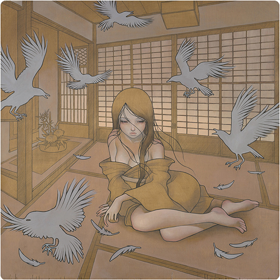
Audrey Kawasaki, Kazamachi (Waiting), 2009, oil and graphite on wood, 76.2x76.2 cm
Her work is very consistent: She draws in pencil over raw wood (I'm not sure if she seals it in some way first), then paints over that in thin translucent glazes. Her figures are usually slim and nearly vaporous, usually gamines, sometimes feminine young men. Flowers, birds, smoke, clouds, leaves, and other items swirl or float around. Sometimes the motif is very decorative, evoking Art Nouveau (especially, of course, Alphonse Mucha); sometimes the overall feeling reminds me of 1960s or 1970s home decor painting.
This show makes it clear that Audrey has mastered her medium. The most original thing about it is probably using the wood as her ground and midtone; shadows are pencil hatching, and highlights are smoky layers of paint. Still, as modern as these seem -- they're so very Juxtapoz (she's been featured in the magazine more than once) -- at bottom they're extremely traditional. If instead of wood she used panels stained with streaked burnt umber, she'd be painting in dead center Old Master style: Let the shadows be transparent and the highlights opaque, paint from dark to light, use outlines where necessary to delineate form. Obviously there are superficial details borrowed from manga, comic books in general, and pin-ups.
As always when an artist repeats a theme over and over I have to wonder if they've found something with which they can express themselves or just something that is easy and will sell. I think in Audrey's case it's a little of both. I feel she's sincere in her art but also she's gotten these figures down pat; there's no sense of exploration, of danger. Each girl has basically the same languid expression regardless of whether she's surrounded by chrysanthemums or crows, whether she's floating nude underwater or hugging a friend.
For me, though, the ethereal hazy weightlessness of all her paintings outweighs my questions; I like her technique aside from her subjects and if they get a little repetitive all in a row, well, that's no big problem. They're certainly not great art but I still can't tell for sure if they're kitsch.
Finally, timing it perfectly, I left Audrey's show and walked over to the School of Visual Arts to see the MFA Open Studios. I'd been invited over by the wonderful Cathleen Cueto who is scheduled to receive her MFA in May.
Once again I'm going to have to be an uncritical person, this time even more than with Jim, because I totally love Cathleen. We were at SVA together for the Summer Residency in 2007. So there's simply no way I can be remotely critical of her work. It'd probably be improper of me, in fact.
I will say that nothing she's done has been as excellently excellent as the first thing I ever saw her do, which was before I even knew her. Her current installation seems warmer and deeper than her previous ones, maybe because there's some finished wood in this one. I like her working space, though, because it has little bits and pieces from all her previous installations, including paint chips, which she still uses as handwritten business cards.
Her current installation involves a few pieces of furniture, some cookies (made, sadly, of sawdust), a couple of dried bugs in jars suspended by string, a hand-drawn sampler with some lines about spider and flies, a box with a collection of seashells, and a baby photo matted in cardboard. It's Cathleen's idea, she said, of what a spider's parlor might be like, including elements of motherhood, protection, children, and, naturally, dead bugs.
Cathleen has now collected dead bugs for at least two of her pieces and it's a bit weird. Girls aren't supposed to collect dead bugs. Or live ones. Or bugs of any kind. Also, while I was there, a woman walking through the installation caught one of the bug jars directly in her eye.
Cathleen's dad showed up with a bottle of some kind of fizzy wine which he handed out in cups. I ended up with one although I'd said I don't drink, but with the cup there I felt that I should, so I did. It went directly to my head and the room began to gently spin. Mr. Cueto claimed it had less alcohol than champagne but it knocked me for a loop.
While there I went through the BFA studios downstairs and the rest of the MFA studios. What I found was that the BFA students are all really, really young and beautiful with young beautiful friends all having a party, particularly the one guy dressed as a very skinny Santa with a woman dressed as a hoochie elf. They appeared to be setting up to film a Christmas-themed porno, although I doubt that was the intention.
A very few artists stood out. There was Kate David Caldwell who had this huge charcoal, seemingly abstract drawing but which, judging by her site, might be photographically based; Kevin Stahl, whose work I cannot remember at all but I took his card so I must have liked it a bit (and the work on his page at SVA doesn't ring a bell); and Felipe Garcia, whose work I don't remember and can't really find online. There's this one page with some of his stuff on it. No bells ringing there, either. But I took his card, too, so I must've liked him. With luck I'll see these people again some day.
Seeing all the BFA candidates in one place caused me to formulate a theory on What's Wrong with the Art World Today which I may share with you sometime. But as the wine made its way through my system I realized I'd been out a long time and was getting tired. I'd been at SVA for an hour and was running out of steam. So I took my leave and went home.


