Super Thursday, as Ed Winkleman jokingly called it, turned out to be a huge disappointment. Fair warning before I continue: I am clinically depressed. You may freely roll your eyes at that statement. Just in case you care, though, I've written up a short screed on What Depression Means to Me, so if you feel like you're up for it, go read that. If not, just take away this: I was cranky as all hell on Thursday and maybe that colors the following comments, opinions, and general unpleasantry. It doesn't help that few things deepen my bad moods as much as standing around in a noisy room which is too warm and crowded with people who are too hip for me. And that pretty much defines Super Thursday.
I've been going to Chelsea galleries regularly now for the last nine months or so and as busy and insane as it had ever gotten, I have never seen it like it was Super Thursday, September 7, 2006. Whether this was especially crazy compared to past openings of the New York City art world, I do not know. It wasn't Herald Square around Christmas -- which is pretty much my high setting for crowded New York stupidity, since I've never come in for New Year's Eve -- but it was, nevertheless, nuts.
You'd think, then, that the galleries of Chelsea would be putting out their absolute best of the season. Well, I can imagine a few possibilities here: First, galleries are actually saving their best for later in the season when the hordes of art gawkers will have died down, leaving room for those more serious; second, galleries really do think this is their best, and this is going to be the worst year for art on record; third, I chose all the bad shows and missed all the really good ones; or, finally, I have no taste whatsoever and everything I saw was incredible, but I'm such a philistine I can't tell.
We're going to set aside the fourth possibility as being beyond discussion.
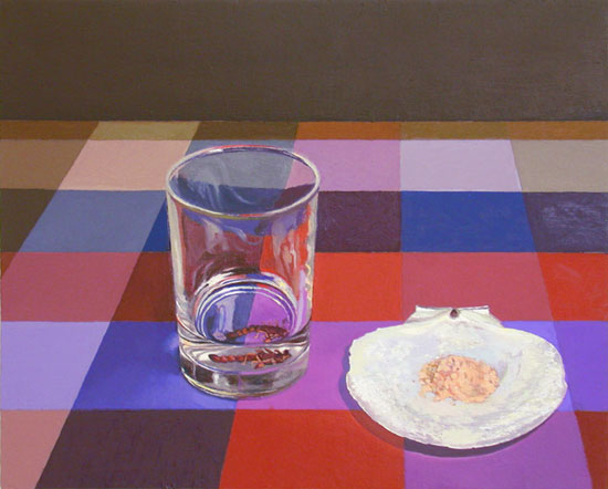 My evening began with parking on West 27th Street outside of my favorite gallery and walking down to 18th and Tenth to start in Bellwether Gallery with Everest Hall's show Axis Mundi. I mentioned on my Plan Ahead sub-blog that I wanted to see Everest's work because the signature painting of the show had a bumblebee in it, and another one of his paintings had a glass in it, and in subject and style I'd been meaning to paint a painting showing a bee trapped in an overturned glass, sitting on a wooden desk, which would have fit precisely in Everest's exhibit. I am now glad I never bothered to paint that painting, both because Everest has, in essence, painted it already, and also because I now see how shallow it would have been. Everest's paintings are competent. They have a good realism to them. They look good. They'd make excellent decorations on someone's wall and are much nicer than most of what you see in hotel hallways.
Um. I don't want to damn Everest with faint praise like that, but there you go.
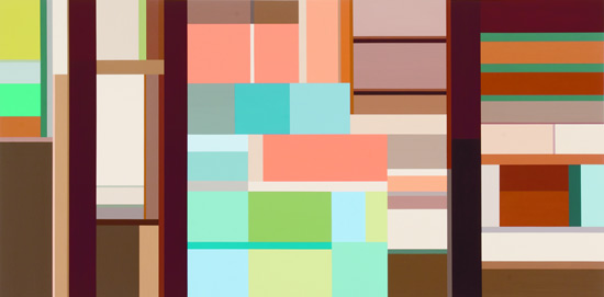 Karen Dow was also showing. I immediately thought that here was what Piet Mondrian would paint if someone had switched his palette, possibly with a "Miami Vice" coloring set. These are the kind of paintings which mystify me: Clearly there's no way anyone could possibly make it through an MFA program -- at Yale, no less -- without knowing the work of painters like Mondrian, and yet here they are, not really doing anything much more than was already done. Now, do I believe that Mondrian exhausted every possibility in this kind of rectilinear abstract painting? No. I believe, as something of an article of faith, that no artist can possibly answer all the questions their work asks. Do I believe that Karen is answering new questions left by Mondrian? No, I do not. I even spent some time calling up what I could remember of mathematics and proportions, trying to see, is this the Golden Ratio here? Is she exploring geometric concepts? Granted that I don't have all this at my fingertips all the time; still, I didn't see it.
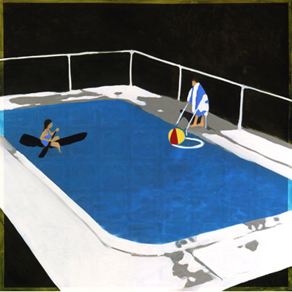 The next disappointment was Isca Greenfield-Sanders at Goff + Rosenthal. Isca's paintings actually look much, much better online than they do in person. In person they're made of overlapping squares of some material, maybe photos, which have been painted over. They look almost precisely like overexposed, unfocused, tinted photos. Photos of nothing much interesting. The title of this one says it all: Swimming Pool with Ball. Never mind the people in the painting. They're props. The inanimate objects are the subject of the painting. And who cares about a pool? Each painting is like an image from a glossy brochure for disaffected vacationers. Maybe that's supposed to mean something, but all I took it to mean was, "I am Isca Greenfield-Sanders, and I will be successful no matter what you think."
 Next up was Nicole Maynard at the Bowery Gallery. I must admit to some naivete here. I can't tell one type of gallery from another. I haven't been involved in gallery-hopping long enough to know much of anything regarding the reputations of any galleries. I know there are vanity galleries; I know there are co-operative galleries; and then there are regular galleries. I don't who is who, exactly, and I don't always do research before I visit a gallery. If I like the work I see online, I go. If someone recommends a show or invites me, I may go.
The Bowery Gallery is apparently a co-operative gallery. That's better than a vanity gallery but I still have some reservations about it. Still, Nicole invited me via e-mail. Not personally, but my address was on her list somehow, so, you know, I figured I'd try to go.
I can't say I was disappointed because I wasn't really expecting anything in particular from Nicole. Her paintings online didn't look great, but I don't like judging entirely by reproductions. I tried to keep an open mind.
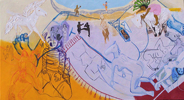
Nicole Maynard's paintings look like someone ate Picasso, Matisse, and Gauguin, and failed to fully digest them. I'm not a huge fan of any of those artists when they were in their paint-like-unto-a-child phases -- I'm not sure Gauguin had any other phase -- so I may not be the right person to look at this kind of thing. But honestly Nicole even had a painting she should have titled "My Guernica." Minotaurs are having sex with horse-headed ladies. Topless native beauties are standing amid fruit. And so on. All painted with technique to make a Fauvist stammer. I just don't understand why we're rehashing this stuff. It's not necessary or interesting.
I was so disconsolate after that show and having to thread my way through the masses of people in the vicinity (23rd Street was especially irritating) I actually forgot to stop to see Mary Henderson at Lyons Wier • Ortt. I therefore ended up at Lucas Schoormans seeing Maki Tamura.
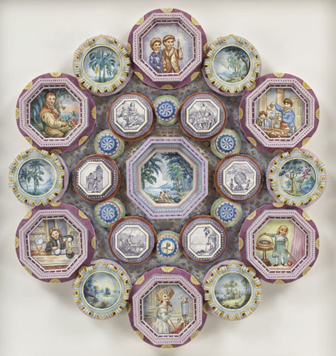 Once again I found myself confused by craft. Much like when I saw Julie Allen, I simply could not wrap my brain around this work. Maki Tamura's works are crowds of carefully folded paper, glued together and painted, with tiny, detailed scenes or creatures or decorative elements. Each thing -- is it a painting, a sculpture, a drawing (it's on paper, after all)? -- each thing is like a strange Victorian curio cabinet, filled with knick-knacks from some overseas cruise. The attention to detail and the craft involved in building these things is clear. And yet I have no opinion on them. They're just there. They connect with nothing in my experience. I think I just totally lack the background to appreciate Maki's work as anything other than saying, yes, it is here. It's not funny, or kitschy, or sick, or nostalgic, or cute; it's not neat, fun, bold, exciting, ugly, stupid, or worthless. It is what it is.
 I'm glad writing that's over. It's so hard to write about something I simply have no opinion on. It's much easier to get to work like Wendy White's show at Sixtyseven, which was quite simply bad. No, I don't know why I went to see it. I must've been out of my mind when I planned my trip. The paintings on the wall look exactly like the paintings do online, only larger. Which is to say, muddy, slapdash, uninteresting, and uninspired. I'm amazed that anyone can get oil paints -- which are, after all, beautiful in and of themselves -- to look this unattractive. I think Wendy might actually be angry at the pigments.
After that I went downstairs, where I found Jade Townsend's "site-specific installation" at Priska C. Jushka. Perhaps I'm wrong about the meaning of the words "site-specific installation" which appear on the show's promotional literature. My definition of this term is art which is built in a particular place involving the artist's response to that particular place. In other words, it's art which cannot simply be taken apart and rebuilt somewhere else. Something that could be moved would qualify as an installation, but not a site-specific installation.
However, there's nothing I could discern to mark this installation as site-specific. The construct didn't seem to have any relation at all to its surroundings, other than being obviously hard to remove. I don't have photos of the installation because I didn't take any and the ones on the gallery Website don't really tell you much. Here's what I saw as I came into the main room of the gallery: The room has been mostly filled with an old cinderblock wall. There's a hole in the wall big enough to step through, and inside there's a small room with white furniture in it. As you walk around the outside of the installation, you find the other three sides of the area are fenced off with chainlink topped with razorwire. Inside is a small yard of slowly drying grass. Around the other side are some barrels filled with junk, including a small hand axe painted solid black with the word "unlearn" written on it.
At this point you've come back to the hole in the wall in the front. Stepping inside you find some furniture painted white, some knick-knacks painted black, some glow-in-the-dark stuff in bottles, and a view out a small window which is supposed to be a convincing forced-perspective view of a small yard but which is, in fact, so poorly constructed that it looks like a cheap model.
I'll say this: The cinderblock wall was convincing in a stagey kind of way. I can imagine, if I were in an audience, I'd have believed that cinderblock wall had been weathering for years. Put Jesse L. Martin in front of it singing about rubbers and I'd have bought it. I wouldn't have liked it, but I'd have bought it.
And now I must confess: I've always been fascinated by razorwire. Growing up in and around some less than stellar neighborhoods, I'm familiar with seeing razorwire, but I'd never gotten very close to it. I had the kind of childhood where I'd see razorwire, but not the kind where I'd actually touch it. I've always wondered exactly how sharp it is. So there I was, right up next to the razorwire in Jade's work of art. And I touched it. Yes, he broke me -- I touched a work of art in a gallery in Chelsea. Without even thinking about it. I touched the razorwire. It was not very sharp, but I can see how it'd slow you down if you were hopping a fence. Then I realized what I'd done and looked around sheepishly. No one noticed.
 In the hopes that my taking the stairs wouldn't be a complete waste, I dropped in on an opening which caught my eye: Mike Geary's Brainbow at PH Gallery. Mike's paintings are sufficiently weird to make me take a second look: He's got an entertaining sense of the cartoony and his subjects are generally weird. That said, they're just another entry in the long list of Juxtapoz-style paintings. Gee whiz, wacky cartoons in a darkly twisted world of ambivalence and scatology! Oh, baby, transcend my boundaries! I'll be taking a nap over here next to the Caravaggio.
Finally I wound my way back to the last two galleries on my list. The first I'll be calling Ed Winkleman's gallery from now on, because if I just call it Winkleman, or even Winkleman Plus Ultra, I'll feel funny, like I've gone back in time to one of those old British boarding schools where everyone calls each other by their surname. "Tally ho, Winkleman, there's a jolly chap!" Next I'll be calling Ed "Winky" and slapping him on the back while we toss back brandy and smoke cigars. I do not think so.
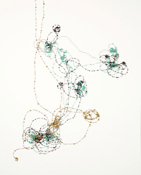 The second gallery was, naturally, Schroeder Romero, right next door to Ed's. Lisa and Mary Jo are showing Janice Caswell's Lay of the Land. Once again I find myself with nothing to say, really. Janice's works consist of lines drawn on paper and then stuck with pins and beads and things, with all sorts of colors and shapes and so on. I have no context for evaluating this. It doesn't look bad. It doesn't look good. It just is. About the only thing I can comment on is the lines themselves -- I consider myself pretty good with lines -- and I wish Janice's lines were more elegant. They seem a little scribbly; they're perfectly rendered lines, they're just meandering. Maybe if they were more confident -- still abstract, but confident -- I'd like them more. I don't know.
I'm starting to feel I have this enormous blind spot when it comes to women working with what are traditionally craft media. Sewing, pins, folded paper. I just don't get it. At the moment I'm willing to assume it's my fault. I'll let you know if I change my mind.
 And then there was Ed's gallery. I'm pained to write this. I like Ed, and he's been very nice to me, and I respect him, even if we don't always agree. I want Ed to succeed. I wish him all the happiness in the world.
But the current show at his gallery, Jennifer Dalton's Would You Rather Be a Loser or a Pig?, struck me as fairly lame. Not too long ago Ed started a long discussion on his blog regarding gender inequity in the art world. Of course this is the raison d'être for blogs like Edna's, this disparity between the obvious fifty-fifty split between the men and women of the world and how many of them get to be professional artists. There's a long, convoluted, disastrous discussion we could have on this topic, but setting that aside for now, let's ask: How do we address this perception? That is, how should we, as artists and gallerists, deal with, and treat in our work, the idea that women are not treated as well as men in the art world? Well, that's what Ed asked, and I think Jennifer's show is part of his answer to that, or anyway part of his trying to find some kind of answer to it.
And I would argue it's a terrible answer. Jennifer's show is didactic and simplistic, not to mention just not very interesting. She even has a PowerPoint slide presentation showing graphs and charts to explain how, for example, having children can hurt your art career, but only if you're female. Okay, the slides weren't made with PowerPoint -- I think she drew them by hand -- but they're just as exciting as any boardroom presentation or college lecture. Another piece of the installation is a few forlorn-seeming pieces of construction paper hanging from the ceiling telling us about how many MFAs are granted to women compared to how many openings there were for women artists in Chelsea last year. Or something like that.
The most interesting thing in the show -- really, the only part of the show that actually is a show -- is a huge display cabinet of little figures of art world people, like they're collectibles. It's called The Collector-ibles. Get it? Get it? Yeah, we get it. Too bad the figurines aren't nearly as well made as those you can find in any Games Workshop store. In fact I suspect the Warhammer geeks would laugh you out of the convention if you showed up with figurines as crude as these. "But that's not the point!" you cry. Maybe not. Maybe I'm being purposely dense. I can't tell.
The other mildly interesting fillip is a pair of bins filled with little plastic bracelets you can take. A sign exhorts you to choose: Do you want to be a LOSER or a PIG? I chose LOSER because I'm realistic, although I suppose I'm a pig in some sense, too. The bracelet barely made it around my wrist, which shows, I guess, that while it's bad to discriminate against women, it's okay to discriminate against fat people.
I'm kidding. The bracelets are made by a company, not by Jennifer herself, and I don't think she meant to make them so they wouldn't fit anyone with a BMI over 42.5. But then I doubt very much that all the gallerists in Chelsea got together to secretly swear only to show fifteen percent women artists.
I imagine there were some other parts to the show, too, but I'd gotten pretty annoyed and tired by then. I really only can tell you about The Collector-ibles because the details are on the Web. When I was there I skimmed past them pretty quickly. I might go back, but only if I'm in the mood to be lectured and hectored. I could just as easily stay home and have my wife yell at me for not doing the dishes.
So that was Super Thursday. Well, it certainly was Thursday, anyway. I was so cranky I didn't say hello when I saw a guy who looked like Jeff Moore. I was so cranky I didn't say hello to Sloth. I was so cranky, in fact, that I didn't speak to anyone, except very briefly. Truly, I am Cranky Man.

