May 2006 Archives

Double Take

| No Comments

People have written to me telling me that one thing they get from my blog is the feeling of being in Chelsea going from gallery to gallery. I think that's great.

Today I'm going to give you the feeling of living in the New York City metropolitan area.

Due to parental type things I left my house at 6:30. Now, there are three basic ways to drive into Manhattan from New Jersey. For the moment we'll set aside the obvious question "What are you doing driving into Manhattan?" If you are dumb enough to want to drive from New Jersey into Manhattan, you've got three choices. The George Washington Bridge takes you far, far uptown. 179th Street, actually; Chelsea starts down around 29th Street. 150 blocks is a fairly long way (Google guesses it's about 9 miles; my mother always said 14 blocks is a mile, so that sounds about right). If you need to get closer to midtown you can take the Lincoln Tunnel which gets you in at about 34th Street. Finally, there's the Holland Tunnel, which lets out near Canal Street, about 30 blocks south of the Lincoln Tunnel; thanks to New York's amusing geography, this is not actually 4th Street.

I live just about straight across from the George Washington Bridge. For fun sometimes I like to drive over to the New Jersey side at night and walk across. Some days I drive over the bridge to get to Manhattan, but if I'm going to Chelsea I have to cover those 150 blocks somewhere, and sometimes there's traffic on the Manhattan side. Meanwhile the trip down to the Lincoln Tunnel, on the Jersey side, is pretty uneventful.

No matter what you do, though, unless you're driving at three in the morning, you're going to sit in some amount of traffic. The question is -- the thing that makes the drive so entertaining -- how much traffic, and can you avoid the worst of it? Knowing this, every New York radio station which has a traffic report, and most do, ends the report with the bridge and tunnel numbers. What's the delay getting into and out of New York at each?

Thus it was that I was listening to the radio as I pulled up to the unmoving wall of cars leading, eventually, to the Lincoln Tunnel. The radio announced that getting in to New York at the Lincoln was an hour, but the Holland was only twenty minutes. Just before the wall of cars is the exit to turn off and head down to the Holland, so I whipped over to the right and shot down towards what I assumed would be the faster route.

What the traffic report did not tell me was the reason the Holland Tunnel was nearly traffic-free. There were no cars at the tunnel because everyone was sitting in traffic a mile or so outside of the tunnel where construction had dropped the road down to one lane. The approach to the Holland Tunnel, too, is one of those beauties of civil engineering: A walled-in covered highway with no exits. Once you're there, you're trapped. I have no idea how long that stretch of road is, but I've sat on it for many an hour, including now an additional hour or so after Thursday night.

When I finally I reached Manhattan and was working my way through the maze of streets to get uptown I looked forlonly at my list of openings. I had five shows I wanted to make it to that night alone, to say nothing of the other eight shows I'd been hoping to see if I had time and the galleries were open. Gallery openings traditionally run from 6 to 8 pm and here it was 7:55. I therefore reduced my list to two: I'd try to see the Clayton Brothers at Bellwether and Double Take at Schroeder Romero.

At almost exactly 8:00 I slowly drove by Bellwether. There was no parking within two blocks. That solves that dilemma. I drove up to Schroeder Romero.

I didn't read any of the materials along with this show so I'm not sure what the theme behind it is; I'm guessing since the name is "Double Take" and it's all photographs that the theme is as simple as "pictures of weird stuff." Actually, thinking on it, I'm going to say the theme is photos which turn out, on close inspection, to be different from what you thought they were.

I'm not usually a big fan of photography as art. I'm ambivalent about it. Intellectually I have to, for consistency's sake, say that photography is as capable as any other medium of supporting true art. Practically, though, I think photography is very, very difficult. I also think, when I'm feeling cynical, that most photographers are failed painters. In fact when I was working for Robert Farber I said as much to him; I was somewhat abashed when I found out later from an article that he did actually start out as a painter.

I think the real appeal of photography, the thing that makes it interesting to me, is the fact that a photograph records an actual moment in time. A photo says: This person stood in this spot in this way at this distance from this piece of film at this precise moment. I have a cache of home movies on 8mm and 16mm film my grandfather took in the 1940s, '50s, and '60s, and watching them the whole idea of photography hits home for me: This strip of film was moving through a camera while my grandmother was standing in front of it over forty years ago.

Of course filmmakers and photographers have been subverting this idea one way or another for almost the entire history of photography. Today's digital technology only makes it less applicable. But to me, ultimately, it's still the thing that makes photos worth looking at. Even staged photos depict an actual event, namely the staging of the photos.

And, really, I like photos. I respect photographers and their craft. I've known a number of photographers and I've done some time in darkrooms myself. In the end, I'm not sure that photography is art, but I do like it.

Simen Johan, Untitled #90, 2000, digital c-print, 44x44 inches 
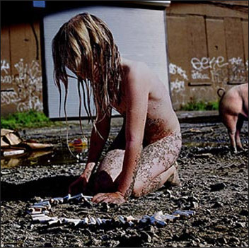
So "Double Take" is a collection of photos which, when you look closer, turn out to be something different than you were expecting. But the most striking photo in the gallery, Untitled #90 by Simen Johan, doesn't seem to fit this description as well as the others. It's certainly strange, and slightly disturbing, but it doesn't turn out to be something of an illusion the way the other photos in this show are. Like many interesting photos, it almost demands that you tell a story about it. But I don't think the story, in this case, is a true one. A dirty, naked child lines up cigarette butts in what looks like a run-down industrial neighborhood; off in the background we can just make out a pig leaving the frame. This could almost be one of those "look at the squalid living conditions in the Third World" photos we see so much of, except it isn't. Is it?

Carlos and Jason Sanchez, Pink Bathroom, 2001, digital c-print, 40x49 inches 
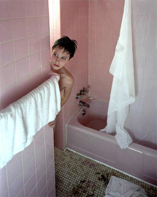
Another interesting photo asking for a story is Pink Bathroom by Carlos and Jason Sanchez. A young person -- boy? girl? -- looks apprehensively from around the corner of the bathroom. At first the scene seems relatively normal. Then you notice, down in the bottom of the photo, the floor of the bathroom, which is dirty, with a rumpled towel, and some broken shower rings from the torn curtain. What's going on?

Of course there are no answers. These photos are intriguing precisely because you want to be given an answer and there isn't one. You have to invent your own story for them.

The other photos in the show are more firmly doubletakes but not as engaging. Wendy Small has a large beautifully red photogram of what look like alien plants or sea anemones but which turn out to be French ticklers (she smirkingly calls them Freedom ticklers on her site). Caroline McCarthy has a photo of what looks like a fruit still life but the fruit is all sculpted out of wet toilet paper. Alison Jackson is even more heavy-handed: She has a George W. Bush lookalike using Michael Moore and Osama bin Laden photos for target practice; she has an Elton John lookalike getting an enema. If the social commentary were any deeper, I'd need a shovel. You can see the rest on the Schroeder Romero Website, but I wasn't excited by it.

While you're at the gallery, though, you might wander into the side room and see some other good stuff they've got there. Janice Caswell has a neat construction of pins and beads strung together by an ink latticework drawn on paper; Laurie Hogin has a funky, eye-poppingly colored painting of a hairy monkey-like critter sitting on a skull; Jaq Chartier has a few pieces reminiscent of DNA lab results from his series Sun Test.

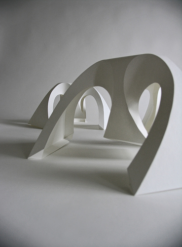
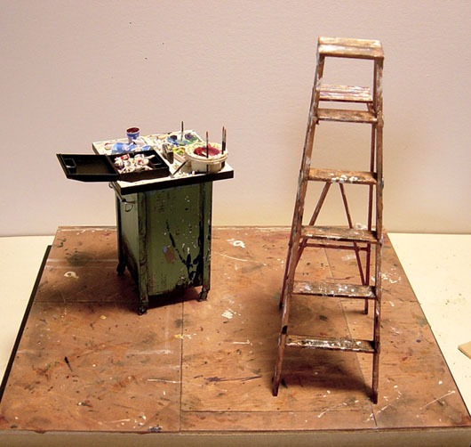
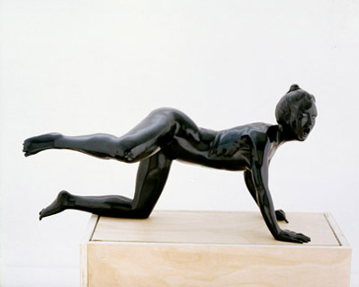
All in all, the show is worth the trip, especially if you can, like I did, stop in Plus Ultra next door and see Joe Fig's amazing sculptures again. The two galleries have a good thing going: With their openings staggered, it's like they each get two openings for their shows. I like being able to see a show after the opening -- the second time really lets me get a feel for the work. I'm even a little closer to thinking of Joe's objects as art after getting another viewing.

Well, now I've got a list of shows I wanted to see that's as long as my arm. Alyssa Monks at DFN, Valentina DuBasky at Cheryl Pelavin, Jennifer Coates at Feigen, Stanley Goldstein at George Billis, Toshio Iezumi at Chappell, Anne Thompson at Hudson Franklin, Nicole Eisenman at Leo Koenig, Bodo Korsig at Cynthia Broan, Dawn Mellor at Team, Stephen Wright at Henoch, the Clayton Brothers at Bellwether. I'm going to have to take a day this week and do another gallery slog.

Richard Sweeney

| 5 Comments

Richard Sweeney, Fractal Form II, 2006, folded paper I don't want this to become one of those blogs that just throws out links all the time, but I did find this one link over at Woospace which I had to comment on, so here it is.

Richard Sweeney's folded paper work is exactly the kind of thing which makes it even clearer to me why people like Tara Donovan annoy me. Galleries could be showing work by artists who really kill themselves making unique and beautiful objects instead of showcasing artists who stack cups. Richard's work -- at least judging by the photographs -- is elegant, obsessive, graceful, amazing -- I'm out of superlatives. This is truly art. Someone give him a show already!

Probable Working Sequence

| No Comments

I didn't get anywhere this week, but I have been painting. So while you wait for me to write up my reviews after this coming Thursday, go read Probable Working Sequence. I've updated with the latest going on in my studio.

Mark Kostabi

| 20 Comments

Let me start by noting that Mark Kostabi's opening doesn't get its own entry here, all by itself, because Mark Kostabi is so great. It's not that I love Mark so dearly that I had to set aside one entire evening for just his show, where ordinarily I'd see four or five shows in one night. Not at all. It's that Mark's show is way uptown at Adam Baumgold on the Upper East Side, 79th Street, and there was just no way I was going to make it to any other openings what with Chelsea being 50 blocks south and half a city west.

In fact I had originally planned to try to see some other shows. I didn't realize the show was up on 79th; last I saw Mark, he was showing at Stux in Chelsea, so I assumed Baumgold was in Chelsea also. I dutifully checked over the Douglas Kelley Show list and didn't see anything that really interested me, so I wrote to an unnamed art writer and sometime curator. I figured he'd mock me for going to Kostabi but he might have an idea of where something decent was showing elsewhere. Turns out I was wrong: He admitted he was going to be at Mark's opening and that he'd been a contestant on Mark's Name That Painting TV show.

Thus it was that I was greeted by him outside the door of the gallery and didn't actually make it inside to see the paintings for another hour or so, fully half an hour after the opening was supposed to be over. He sure can talk. He can expound endlessly on almost any topic. I'd say he covered about 80 percent of the conversation, I handled 15 percent, and other people standing around filled in the rest. This unnamed writer introduced me to another artist, Jonathan Ehrenberg; a real estate agent who was standing nearby introduced herself to us. Lisa Kraner was there because she'd tried to help Mark find an apartment and he'd invited her to his opening. I know these names, not because I have a perfect memory, but because the writer insisted on getting a business card from Lisa. "You should always have the number of a good doctor," he opined, "and a good real estate agent."

Conversation ranged widely, as it will. Of course we talked about Manhattan real estate and the writer's living arrangements; we talked about Mark's game show, where art world luminaries (all invited by Mark) vie to invent titles for existing paintings and he hands out cash to the winners; we discussed how drunk other visitors were, and how duplicitous some people are, and whether Jerry Saltz cribs ideas for his articles from other writers. At one point I mentioned my mostly-joking current pet peeve, namely beautiful young female artists getting shows. I'm really just jealous because these hot young chicks are almost my exact opposite, since I'm a fat ugly balding middle-aged man.

"Really what you should do, what's always worked historically, if you look at it, what you should do is turn your perceived weaknesses into affectations," the writer suggested.

"How does that work? Am I supposed to go bald faster?"

"If you look -- Shelley, he was very unattractive..."

"Who?"

"Shelley."

"Shelley. The poet?"

"Yes. The poet. He was very unattractive, really. And Samuel Johnson, he was, like, really tall and had a bulbous nose and these boils all over his face..."

"Aren't we going back a ways?"

"Doesn't matter. You turn your weaknesses into affectations."

"I think I'm too open and honest for that."

"You can be open and honest and have affectations."

Which I think means I'm supposed to revel in being fat. Maybe I should wear half-shirts. I did wear my fetus t-shirt, almost still warm from the iron, since I was double dirty dog dared by Jason Laning (otherwise known as Art Soldier). When Mark came out for air and I stopped him to say hello, he was struck by my design; he said it was like a painting he'd done with the help of Enzo Cucchi in Rome, where he painted himself, in a baby stroller, a bag of cash in one hand and paintbrush in the other, pregnant with -- get ready for it -- another Kostabi, also with a bag of cash in one hand and paintbrush in the other. Someone is pushing the stroller, you can't tell who; the unnamed writer says he thinks it's Enzo Cucchi. And who impregnated this baby Kostabi? Why, Mark himself.

Eventually I did get in to see the paintings. Luckily Mark is the kind of guy who'd keep his show open late to let as many people as possible see his work (some of the more upscale galleries in Chelsea start kicking people out before closing, and some just turn off the lights at eight to get people out; as the writer said, they have dinner reservations). Inside I met Douglas Kelley who, with very little prompting, proceeded to discuss Mark's early years. Apparently Douglas has known Mark for a long time. Douglas says watching Mark grow has been like watching Mr. Spock develop a sense of humor: It's not quite human yet, but it's better than it used to be.

Mark Kostabi, There's No Place Like Home, 2005, oil on canvas, 59 1/8x30 1/2 inches Mark Kostabi, Suicide By Modernism, 2005, oil on canvas, 23 5/8x19 3/4 inches 
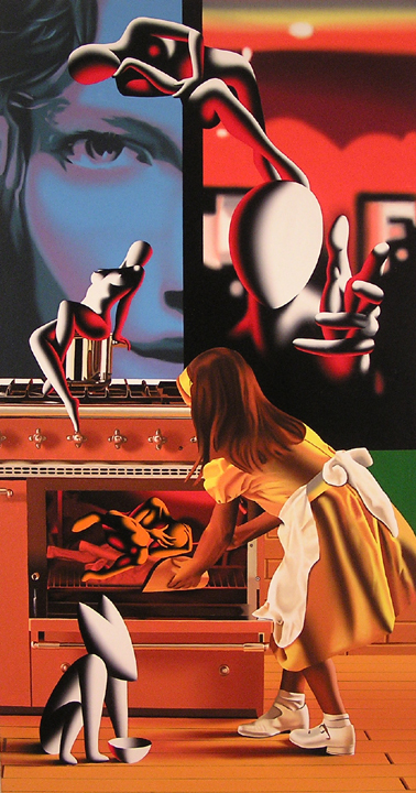
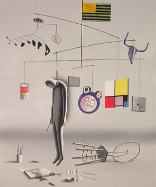
Douglas and I both agreed that our favorite painting in the show is "There's No Place Like Home." Mark said that most people seemed to like "Suicide By Modernism." My guess is that's because people like paintings which quote other paintings; it makes them feel smart to recognize them. And to me the most telling painting in the show is the tiny "Chain of Desire." Mark explained it to us after adjusting the painting below it so it was hanging straight. (I don't think I've ever seen anyone touch an artwork at a show before, and even though I knew it's Mark's show and Mark's painting, I still found it unnerving.)

Mark Kostabi, Chain of Desire, 2005, oil on canvas, 23 5/8x19 3/4 inches "Here I am, directing this assistant." Mark traced the cables running from the laptop to the back of the painter. "And I've got all this cash here. And he's chained to this penny. See that? I've got the cash, he's chained to a penny. And yet here we both are... in this little black and white painting."

It's hard to know what to say about Mark's paintings. He's so open about having assistants do most of the work -- Douglas says it's scary to visit his studio and see twenty people there painting away -- it's difficult to form an opinion without worrying you're going to feel cheated or hoodwinked. Liking a Kostabi leaves me feeling a little used. Like that unnamed writer guesting on Mark's game show, grubbing for cash handouts from the master, knowing you're the butt of some joke, trying to pretend you're in on it, suspecting you're not, deciding to take the money and run; it's the kind of conflict you can never feel totally good about. And Mark himself is so sincere, so warm, so friendly -- he's a huckster, yes, he couldn't help but make sure Douglas knew that earlier, yes, just a short time before he got there, the gallery was packed, it was a great turnout, great visitors -- he's a huckster but he's a genuine huckster, or seems to be....

It's the kind of tongue-tied nonsense which reads well on paper but which, when you're tangled up in it, is still uncomfortable. Is Mark sincere? Or is he faking being sincere? Is he honest, or is his honesty an affectation? Douglas and I both agreed that we'd like to think that the assistants are all for show and Mark actually paints all his paintings himself in secret.

And Douglas knows better, because he remembers Mark's system from when he had Kostabi World. He described how Mark had a British woman who was in charge of developing his paintings. She'd have drawings made, always on 8.5 by 11 paper because that was cheapest; the drawings were projected onto large paper at the final size of the painting; the paper was then pounced, which meant that the painting could be reproduced at any time, as long as they saved the pattern; and the drawing was filled in with paint. Mark would show up at the end to add some fine details, maybe, or just sign his name.

There's no reason to think his method has changed significantly whatever our hopes might be. Which leaves me back where I started: It's hard to know what to say about Mark's paintings. I can say that they are a Photorealist's most orgiastic dream of perfect flatness. I can say the paint is blended so flawlessly and edged so precisely it looks like it was airbrushed. I can say the paintings communicate alienation, distance, and loneliness. I can say that when there's color it's beautiful and bright and it contrasts wonderfully with the monochrome figures.

What the heck. I can say I like them. I don't know who did them, I don't know what they all mean. I know the titles are in some sense arbitrary (Mark likes to mention who made up the winning title as he's discussing a given painting). I know the subjects are the result of some committee meeting. Let's look at the paintings as what they are; let's separate the signal from the noise. Simply as objects, I like Mark Kostabi's paintings.

In the long run I suppose that's all that matters. When I think of painting -- either looking at someone else's paintings or creating my own -- I don't think in terms of months or years, but centuries. Because to me one of the best things about paintings is summed up by Robert Gamblin when he writes, "The earliest oil paintings ever made still exist after 550 years. Through the centuries, those artists still communicate their personal vision, undistorted by any editing or commentary." And that's just traditional oil painting: There are cave paintings going back over 40,000 years. When you think in those terms, questions of which individual painted what, and how; and questions of subject matter and taste; and questions of schools and categorizations; all those questions fade in importance. In the end, all of it will be forgotten: My conversation with the unnamed writer, the name of that real estate agent, how much someone paid for a Kostabi original, what Jerry Saltz thinks, the titles of the paintings, the exact dates they were painted, all of it will vanish. In the long run, if anything at all survives, it will be the paintings themselves. So why concern yourself with anything else?

During my last trip into Chelsea, I met up with an unnamed writer and sometime curator -- natty in jeans and jacket with, of course, folded handkerchief in the pocket -- amidst some mediocre paintings. I asked him what he thought of them and he sort of shrugged; then he admitted that he doesn't usually like "narrative," "illustrative," "literary" art. He observed it was like reading a Wagner opera versus hearing it: He much prefers to have a pure aesthetic experience. Much of the art he sees, he said, is like reading Wagner, being told what he should feel rather than simply having the feeling.

I told him I understood what he was talking about. I understand the idea of the purely aesthetic experience. After all, I'm the guy with a Stendhal quote taped to his easel. Stendhal, you might know, is the 19th century writer with a syndrome named after him: He wrote about nearly losing his mind while viewing the paintings of the Old Masters in Florence. He was overwhelmed by his response to the beauty around him; he was, in fact, overcome by a purely aesthetic experience. When I wrote about art being the promise of transcendence, this is something of what I was writing about.

I'm afraid, though, that that unnamed writer would not like my own art very much. I think it's all fairly illustrative. In fact, I have to wonder about this idea of narrative art. Is all figurative art necessarily narrative? What about landscapes? Is there any art which is not abstract which is not also illustrative? Is abstract art the only style capable of transmitting a purely aesthetic experience without engaging some other part of the viewer's mind?

In modern times I think we're in trouble when it comes to overcoming our audience with an aesthetic experience. Two hundred years ago -- even a hundred years ago, really -- your average person simply didn't see a lot in the way of beauty or color. Imagine for a moment growing up in a town where the only standard of physical beauty was based on the most beautiful people you had personally met. These days we form our ideals based on magazines and movies and TV; imagine not having those for comparison. La Gioconda became the icon it is today because it was the most masterful, realistic rendering of a human being ever painted. Today we see far better renderings every day in the newspaper or on the Web: They're called photos.

It must have been much easier in those days to enflame someone based on an image. Those Old Masters must have been truly staggering. These days we're all inundated with colors, forms and images far beyond the daily experience of humans at any time in the past. The purely aesthetic isn't as powerful as it used to be; our senses have been dulled by repetition of strong signals. So where a Vermeer or a Titian could literally drive his audience to distraction, today an artist is lucky to get someone to say, "That's nice." I really think giving someone that pure aesthetic experience -- causing them to suffer from Stendhal's Syndrome -- is much more difficult these days.

But I think it might be interesting to ask exactly which quote from Stendhal I've got taped to my easel. Here it is: "Beauty is the promise of happiness."

To me this brings us to a place in art after you get past pure aesthetics. After a work of art has either moved you or not moved you, you can still -- hopefully -- engage your intellect. Maybe a painting grabs you, shakes you, makes you weep, whatever. Maybe it doesn't. Especially if it doesn't, now you can think about the painting. It can work on a level apart from pure aesthetics. It can be considered as a concept, an idea, a communication, a manipulation of symbols.

At this point, you can think about narrative. Maybe it's an interesting story. Maybe there's no narrative and it's an exploration of color theory, like Josef Albers. Maybe the painting is about forms or the unusual juxtaposition of cultural archetypes. Maybe it's beautiful, and in that beauty you see the promise of happiness. It could be ugly, and in that you see the horror of life.

Is one type of appreciation better than another? Is a painting which doesn't induce Stendhal's Syndrome a lesser painting? I'm pretty sure you know my answer to this question. Hell yes, it's a lesser painting. But that doesn't mean we should dismiss it outright -- even a lesser painting can still have things to say. As much as we might like, not all of us can be Wagner. Some of us can only hope to be Chopin. Some of us are stuck being Metallica.

I'm not sure what the unnamed writer would think of this. I didn't say all of this, or even hint at it, while we were talking. It takes me a little time to get my thoughts in line, sometimes, and a gallery opening (with music) is hardly a place for in-depth conversation. As we parted, the writer gestured towards me: He made little typing motions with his hands. I guess that means he's reading, and maybe he'll comment. Maybe not.

Just remember: Beauty is the promise of happiness, but it's a promise not always kept.

I love the displays at the Museum of Natural History. They're really great. Very Victorian. I love the craft involved in stuffing the animals (or making them from scratch) and making fake trees and rocks, and I love the trompe l'oeil paintings of the more distant surroundings. I love how dim and musty the museum is, with all its little nooks and crannies, and even love speculating on what it must be like to design and create the displays or about who gets in behind the glass to dust.

One thing that never comes up regarding these displays, though, is this question: Are they art? Of course they're not art. No one is saying they are. They're not objects to be appreciated; you can, if you want, but the displays are meant to be taken for the things themselves. It's not a sculpture or an installation of a mountain lion on a ledge; it is a mountain lion on a ledge.

Joe Fig, Fred Tomaselli, 2006, Mixed Media, 11x11x9.5 inches So when we look at the work of Joe Fig currently on display at Plus Ultra Gallery, what are we to think? I wrote in Ed Winkleman's blog saying I'd need to see them to determine what, if anything, made them art; Ed responded by quoting Peter Schjeldahl: "What makes these exercises art? Well, what else might they reasonably be? They perform tasks that no one assigned. They involve real work that is really gratuitous. In a world of tightly knit job descriptions, that's distinction enough."

I'm sorry, Ed, but my definition of art is narrower than that. By Schjeldahl's definition art is anything which is difficult to do but serves no purpose; if that's the case, a lot of things are art, including watching Lost, swimming the butterfly stroke, and marriage.

What Joe's work consists of is meticulously -- one might say insanely -- detailed recreations of the studios (or parts thereof) of professional artists. They're done at standard dollhouse scale; Joe confided to me that he does even, on occasion, resort to using actual dollhouse products in his work. I guessed as much, having some experience of my own with dollhouses. For commercial products, like Poland Spring water bottles, he scans in actual product labels, prints them to scale, and glues them to the little versions he makes. Most of the stuff on view -- extension cords, cardboard boxes, tubes of paint, buckets, trash cans, blank canvases and so forth -- Joe makes himself.

I say this is insane -- in the best way, of course (Ed likes to say "We love our obsessives around here") -- but Joe seemed to find it odd when I said as much to him. He doesn't think it's insane at all to recreate, say, Fred Tomaselli's art cart and ladder at 1/12th scale, along with every drip, scuff, and scrape on the floor. He thinks, I guess, that normal people send letters to artists asking for interviews and some alone time with their work area, make drawings and measurements, take photos, go home and rebuild it one miniature object at a time.

That it's insane, or obsessive, or anyway not normal, average, or quotidian is not the same as saying that it's art. Is it? Are they? It's seeing these sculptures in a gallery which forces us to ask the question. If these were part of an exhibit at MoMA, it would be easy to know what to think of them: Not art, but about art. If they were in the Museum of Natural History, there'd be no hesitation. Not art. And I've seen similar obsessive miniature making at the Games Workshop store in Palisades Center Mall; the Warhammer tabletop gaming folks are absolutely apeshit about their figures and engines of war. Again, we can state easily: Not art; craft. But here Joe's sculptures are in an art gallery, which means we're supposed to think of them as art, and that demands some consideration.

I found myself thinking about Joe's sculptures on two distinct levels. First, certainly, Joe Fig's work is an astonishing act of craft. I will not dispute how much skilled work is involved in their creation. Joe is very talented in this regard. I'm certain that, with the right focal length and depth of field and correct positioning, you could photograph these sculptures such that they'd be indistinguishable from photos of real, full-sized places and things. I find this impressive and I don't impress easily in this regard. Joe's sculptures are truly extraordinary.

The second level is one of curiosity about how these artists work. I'm always interested in seeing how other artists do what they do. I now know, for example, that Chuck Close uses Gamblin paints. I use the same paints as Chuck Close! I now know that Eric Fischl and April Gornik have possibly the most fantastic studio space of all time. I didn't know these things before; now I do. I learned about them from Joe's sculptures.

Which at last answers my question for me. I learned something from the works, but I didn't feel anything. Are Joe Fig's sculptures art? I'm afraid I don't think they are. They are about art, they are of art. They convey information beautifully and elegantly. They are a welcome and wonderful addition to the world of art, useful and educational objects which act as excellent records of how some well-known artists of our time work. (Imagine if we had Joe Fig around to miniaturize Jan Vermeer's studio!) They are about art and artists, they are of art, they belong in an art museum. But they're not art.

Which is okay. Joe's sculptures may not be art, but they are really, really great. And the fact that they -- and their location in a gallery-- have me thinking and asking questions, that's a bonus. Which makes Joe's show better than most right there.

Enough solving the philosophical problems of the art world! Moving on to objects which ask fewer questions -- which may be more boring, but at least are easier to write about -- let's walk a little across town and stop in at Ceres Gallery to see Christine Mottau's latest paintings. Note that there's no link with her name; I couldn't find anything from her online and went to see her opening because... I'm not sure why. I just like knowing things. I consider knowing things to be a value in and of itself. And I couldn't find out what Christine's paintings looked like online, so the only way to know was to go.

[Christine Mottau] It turns out Christine Mottau is something of an Abstract Expressionist. She paints fairly large. I'm going to guess about five feet high. On this Christine brushes her colors into shapes with vague intimations of natural forms; ultimately, I think, the forms suggested say more about the viewer than the viewed (I tended to see hips, breasts, flowers and trees -- no surprise there, given my predilections). Her pigments are muddy and strokes tentative at best. I'm not sure, on the evidence of these paintings, that Christine knows what she's doing any more than we do. I picture her in a trance while she paints. I don't consider this a flattering impression. The actual images reminded me very strongly of the cover illustrations of some of the old Dungeons & Dragons modules -- and not the good ones by Trampier or Erol Otus. The later ones.

Meanwhile down at Lyons Wier, Michael Lyons Wier has joined with a new partner, Anna Ortt, to form Lyons Wier • Ortt (I love a gallery name with a wacky special character in it). Anna is probably the impetus behind the current display of the work of Miki Lee, a sort of Op Art painter. (I've been seeing a lot of both Photorealism and Op Art in Chelsea for some reason.)

Miki Lee, Untitled #5, 2006, oil on canvas, 58x60 inches 
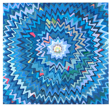
Miki's paintings didn't knock me for a loop the way some Op Art does; their effect is more subtle, like an optical illusion. A very subtle optical illusion which only moves a little bit, out of the corner of your eye. Her work is about contrasting color and clashing, curvy lines. It's all executed so carefully, though, that what reads at first as overwhelming movement quickly shows itself to be very stolid. The varying contrasts of Miki's tones read almost like a Munsell scale. Looking more closely, you can see a texture to her paint, tiny brushstrokes at times working with and then at times against the curves of the composition. This works with the gloss of the paint to lend each painting a shimmery quality in addition to the shivery feeling of the colors and shapes arguing.

But at no point did I feel like there was anything else below or above this level: There's no passion or obsessive behavior here. (Passion and obsessive/compulsive tics being states which are usually taken as opposites but which can, in painting, be combined.) The main emotion I feel looking at Miki Lee's paintings is that there's no powerful emotion here. She paints these because she likes to. That's fine. I like looking at them. But, ultimately, not that much.

Next door to Lyons Wier • Ortt McKenzie Fine Art is showing Julie Allen, another artist I was seeing with no preconceptions due to the dearth of online information. In this case, though, I wasn't going for the knowing, I was going because I like Valerie McKenzie. She was so touched by my review of James Lecce's show she printed out a stack of copies of it and put it by the door of the gallery. Which I think is great. Alas, I don't think she's going to be printing out my review of Julie's show.

Julie Allen, Hamburger, 2005, silk, embroidery thread, liquid vinyl, 1.5x5x4.5 inches 
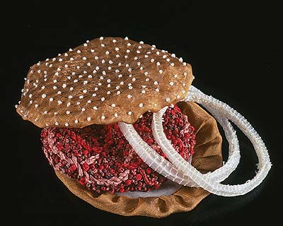
I believe that any work of art can be placed into one of three categories. After my many years of art experience, I have carefully worked out precise and descriptive terms for each of these three categories, and they are as follows: Wow!, Yuck!, and Huh?. Julie Allen's work is firmly in the last of these. I can't even formulate a decent opinion on her work because I really just have no idea what or how to think about it. This show consists almost entirely of articles of food replicated in sewn fabric. That's right: Julie has created a hamburger on a bun -- with onions! -- out of sewn and embroidered fabrics. Also a banana split, some cakes, little green peppers, mushrooms, salmon steaks, bacon, cherries, oranges, and who knows what all else.

This is art from Venus. As an Earthling I can't even wrap my mind around it. What can it mean? Usually I'm able to at least fake some art world verbiage to explain in some fashion, however brain-damaged, why someone would want to create and display any given artwork. Not this. I don't mean to say it's bad or wrong or shouldn't have been done; not at all. It seems kind of nice. It's just... I have absolutely no frame of reference for this at all. It is what it is.

Hans Benda, Uchigeisha/la femme maison, 2006, oil on wood, 15.7x14.5 inches On the same floor as those two galleries I found M.Y. Art Prospects which is showing Hans Benda's "Prussian Pink Spice." I'd meant to see this show, so I'm glad the gallery happened to be open. Hans' paintings are on the small side and they often involve naked women. He also pays quite a bit of attention to the rooms and decorations behind the women. I found myself kind of wanting him to be better; I got the feeling that he stopped these paintings a little too soon, like he decided, okay, that's good enough. His works seem to stop somewhere short of full rendering. I'm not sure they'd be better if he worked on them more, but I just sort of wished he had. I get the feeling Hans is not as invested in these works -- in these women -- as he could be. Both the paintings and the women seem sloppy, disposable.

Dannielle Tegeder, Smooth Shatter, installation view, 2006 I also wandered into Priska C. Juschka Fine Art to find Dannielle Tegeder's "Smooth Shatter." Dannielle's show consists of some paintings and some sculptures, some hanging and some leaning, at various points around the room. I can't say the whole grouping did much for me; I passed through without anything touching me, which is sort of not what you'd expect from a theme like shattering glass. It was less like going through real glass and more like going through movie glass. Real glass will cut you to the bone, but movie glass just leaves harmless stuff all over the place.

Thordis Adalsteinsdottir, installation view, 2006 Finally escaping the clutches of 511 West 25th I crossed the street to Stux Gallery to see Thordis Adalsteinsdottir's show. Thordis's works are uncluttered acrylics in a style best described as childlike. Maybe childish. There's an element of ancient Eqyptian art here, as well as some comic book, cartoon flavor; everything's mildly disturbing in the way of art which appropriates more naive styles. Thordis herself is clearly not naive: You don't title a show full of alienation and despair "A cheerful reminder of our lives and loves" by accident. Overall I think the paintings are kind of boring, flat, and repetitive. They don't speak to me. They don't say "Here's a great painter!" or "Here's a painter who has deep feelings!" or much of anything else. They just sort of sit there looking self-indulgent, like a teenager's angsty diary pages.

Iva Gueorguieva, The Fact of Blossoming, 2006, acrylic on canvas, 28x28 inches By way of contrast, Stux is showing Iva Gueorguieva in the back of the main exhibition. I didn't like her paintings a lot more than Thordis', but Iva's have the advantage of being really violent and energetic. These paintings are made of quick slashes of color and crazed squiggly lines. Forms almost appear but then vanish back into the general chaos. I'd say Iva's work looks a lot like Gerald Scarfe with Parkinson's on LSD.

Paul Waldman, Blaze, 2003, oil over gesso on canvas, 48x72 inches My last stop was at Lennon, Weinberg where I saw what I shall forevermore refer to as the Chicks with Dicks Show. Paul Waldman's exhibition starts off mild enough: It's titled "New Paintings and Sculptures" -- how innocuous! The first couple of paintings are mirrored pairs of what look like distressed wallpaper designs; way down in the bottom corners you can see a flowerpot, or maybe a naked woman, repeated in a slightly different pose on the second canvas. As you go from work to work, though, things very rapidly degenerate; very soon you have naked women riding other naked women and they both have penises. Maybe. Could be a strap-on, I guess. Then come a couple which are clearly not strap-ons; then, at the back of the gallery, you find a number of sculptures of, yes, chicks with dicks. Colorful, protean, masturbating, and just plain strange amalgams of man and woman, each standing about a foot tall. Then, as you circulate back to the front of the gallery, you spot the final sculpture: Low down near the ground, dark and shiny, one last penis-enhanced woman -- or is it a breast-enhanced man? -- on all fours, lifting one leg. But wait for it: Every so often, the sculpture actually urinates.

Paul Waldman, Surprise Guest, 2004, painted clay, 17x8x4 inches 
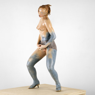
Now this is a cool show. What's better than chicks with dicks? Also, this show attracted probably the best-dressed visitors of any show I've seen. One woman turned everyone's head; if she'd been wearing less, it probably would have been less indecent. I heard one guy say to another that she was the model for the fountain. If so, I suspect Paul took some liberties with the genitalia. But you never really do know, do you?

Paul Waldman, Heaven, 2004, patinaed bronze, 14x10x27 inches Paul's paintings are pretty excellent. I wish the reproductions online were in higher resolutions; you really can't see how detailed his little figures are, or how well executed. Paul nicely merges abstract patterns with his figuration. I'm not sure this breaks new ground -- I seem to be seeing a number of painters using a sort of figure-against-flat-background thing -- but it's done well enough to evince a chuckle or two, and it's even a little surprising. His sculptures are well-made, but a little heavy-handed for my taste. Still, a urinating fountain -- while not the most original idea of all time -- is always entertaining.

A few more of those, and the Museum of Natural History would be all set.

Pages

OpenID accepted here Learn more about OpenID
Powered by Movable Type 5.2.7