March 2006 Archives

To get an idea about how I feel about Saturday's opening at Fuse Gallery NYC, take this word: WOW. Highlight it with your mouse and copy it. Then open your favorite text editor and paste it 100 times. That's how I feel about the opening: WOW.

I found out about it entirely by accident. As I wrote in the Plan Ahead section, I was over at Cory Marc's looking at the Seattle Erotic Festival Website. Cory got in; I did not. So I was bitterly tearing apart all the lousy art on display when Cory asked me if I knew John John Jesse's work. John (John John?) got into the Seattle show, too, but I don't feel bad about it because his work totally rules, which I found out when I visited his Website. Who knows what moves festival juries? They pick excellent work like John John Jesse and François Dubeau, and then they pick total crap like this guy. What's with this guy, seriously? Could he suck any harder? I'm not even going to use his name in case he's got a Google alert, that's how bad he is.

John John Jesse has a bunch of links off to other artists, one of whom is Madeline von Foerster. His link is broken but I'm persistent when I want to be and I found her current site. Her paintings looked excellent online and, oh happy day, she posted that she would be opening at Fuse in just a few days. She'd be sharing with Melissa Murray, whose work also looked good, so I put Fuse on my calendar for Saturday in the hopes that I'd be able to make it.

I did make it and I'm glad I did. I don't know if I picked up a contact high from the miasma in Fuse -- smelled like incense, but who knows? -- or if maybe it was the six cups of bad coffee I'd had earlier -- I don't usually drink coffee -- but I'm still excited today. This one little opening over on the Lower East Side has more energy and technique than every show I've seen in Chelsea so far combined (if you set Inka Essenhigh aside, anyway).

Melissa Murray, Juice, 2005, oil on canvas 
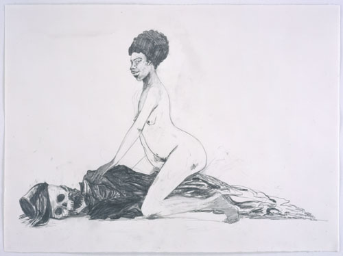
The Fuse gallery space sits behind your standard New York City bar. New York architecture being the random thing it is, two doors lead into the same back room. I took the one on the left (always go left) and found myself in a small hallway which forms an L with the main gallery room. Melissa Murray's work was hung here and then on the left half of the larger space. I first found a series of self-portrait photographs of Melissa, opposite the show's signature piece, "Compassion." Next to the photos a number of small pencil drawings pinned to the wall made up one piece. A swarm of wasps invaded Melissa's orifices in this one. I was happy to see vulva -- who doesn't like vulvae? -- until I saw a wasp making its way inside.

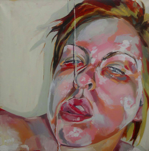
The photographs and pencil drawings are slightly different from Melissa's other works here, which are all of the artist in masochistic or otherwise tortured poses. She paints big and bold and bright, but what she's painting is unpleasant and mildly disturbing. In conversation she told me she's exploring the masochism of creating one's self-image -- at least that's what I understood. From the paintings you'd expect Melissa to be unattractive, fat, debased; I've known people who fit her paintings. But Melissa herself turns out to be adorable, sweet, and anything but obese. I told her she was very brave to portray herself as she does, wrapped in duct tape or with a pear shoved into her mouth and held with packing tape. Even when she's just having something sticky poured on her face, she looks depraved. The photos she takes -- which she uses as references for her paintings -- are unsparingly unflattering. And sticky: Not just the subjects (oozing fluids, adhesives, runny mascara) but also the paint itself, which she clearly throws on with abandon using broad brushes.

I hope I haven't given you the idea that I don't like Melissa's paintings; I do. They're very good. But they're not nice. Which is fine -- art doesn't have to be nice. Still, I can't help but think Melissa would be even better if she'd channel some of her true personality and attractiveness into her paintings. What she has is excellent; what she could have, I think, is even better. Whether she adds some pleasantry in or not, as she matures she's going to be worth watching.

Madeline von Foerster, Essentia Exaltata, 2005, oil and egg tempera on panel, 12x9 inches Meanwhile on the other side of the room Madeline von Foerster's paintings await. The very first thing I said to Madeline, after spending some time absorbing her paintings, was, "I am in love." That's it right there. That's what happened: I fell in love. On the way home from New York I heard "Light My Fire," of course by the Doors, on the radio and I realized right then: Madeline's paintings are the visual equivalent of the Doors' music, where harpsichord and funky backbeats blend, where the Dionysian of Jim Morrison's train wreck meets Robby Krieger's Apollonian precision and the two agree to a truce so they can rock your ass off. Sorry to get all freshman-year-lit-thesis here, but that's what these paintings did to me. They grab your head and heart and don't let either go.

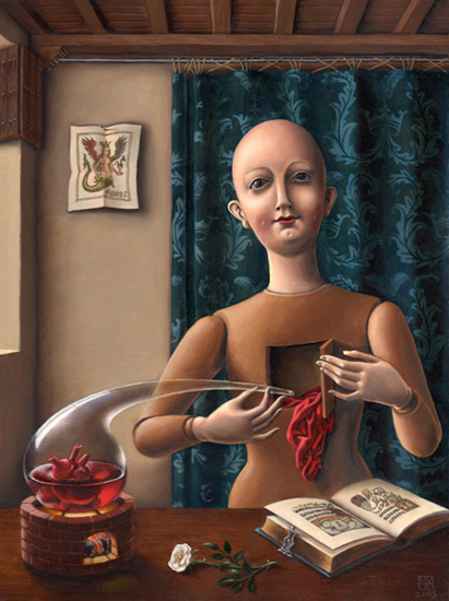
Madeline's style is -- I don't want to say old-fashioned. Her paintings hark back to before the Renaissance, with elements of symbolism and the still life; small landscapes; and the posed, preserved quality of Byzantine religious icons. The best way I can describe it is to talk about other painters: Have you ever seen Dali's "The Persistence of Memory" in person, and stood so close to it your nose was almost touching it -- I really mean so close the security guard edges closer in case you suddenly start licking it or something -- and have you looked at the tiny blips of paint, the nearly microscopic lines and dots, and wondered how the hell he painted like that? Madeline's paintings have the same magnetism. The hermetic quality of Bosch, the paint handling of Dali, the smooth, luminous surface of... darn, I know I've seen it somewhere. Giotto? Van Eyck? Botticelli? It's the egg tempera -- she paints in egg tempera and oils now, although her earlier works are straight oils.

Madeline's subjects are based in the language of alchemy, magick, and the Tarot. On her Website she calls herself an illustrator, which only makes me respect her more; too many people decide to call themselves artists when the title is really one others should bestow upon you. So her paintings have been commissioned in some cases, with specific purposes in mind. That makes them no less beautiful but it does make reading them a bit of a challenge. Even when she paints something as simple as a baboon holding its baby, I found myself peering intently at it looking for the subtext (beyond that supplied by the bulldozers off in the distance behind the apes). Madeline's world is populated with sphinxes and moths and sumptuous drapery, dryads who sculpt themselves out of trees, carved acorns, and night skies. The phrase "wealth of detail" comes to mind, but it also falls short. I think she puts her paintings together molecule by molecule.

And Madeline herself is beautiful. I know I'm not supposed to care what the artist looks like -- and if her art sucked, I wouldn't care at all -- but, I'm sorry, I respond to beauty, whether it's in a painting, a tree, a line of charcoal, or a person. And Madeline is as beautiful as her paintings, a perfect example of an artist whose creations flow from who she is. We spoke a bit before she had to mingle again, about how she wants to open in Chelsea sometime, and how she paints (there's a lot of layering). She made me feel like an old friend. Call it salesmanship -- if I'd had the disposable income (instead of scraping to afford the tunnel toll) I would've walked out with one of her paintings -- but to me, both the artist and her works look nothing but sincere.

I drove out of New York that night feeling higher than I have in weeks. Eager to paint, draw, anything. Maybe I had too much coffee. Maybe there was something funny in the air at Fuse. Maybe I'd just had a good day. But I like to think it was the art that did it.

Two feet from the canvas, the glint on Rembrandt's potato nose becomes a blob of white paint and the puckers in Titian's sleeve turn into flat slaps of umber on a blue ground. We turn these marks back into velvet and sweaty skin by making the right guesses. The painters force us to.

Jan van Eyck's extraordinary achievement rests on the fact that he did the opposite. In his paintings, he extended detailed information about things far past the ordinary limits of scrutiny; his eye acted "both as a telescope and as a microscope", and it left us with too much, not the suggestive too little of other realist art.

-- From Robert Hughes, introduction to "The Complete Paintings of the Van Eycks" via
Mark Harden's Artchive

I went down to Newark on Thursday night to find a whole different world. I've mostly stayed with the Chelsea scene, and the Chelsea scene is about money. Not all of the artists who show there are established and successful, but the galleries themselves are financed with a lot of money: Chelsea may be inexpensive for Manhattan but it's still astronomically expensive. Actually I don't think there's a bad (and therefore affordable) neighborhood left on Manhattan Island; if there is, it's way way way uptown. By contrast, Newark is pretty much one big bad neighborhood. Newark is one of those cities which the government is always throwing money at in an effort to "revitalize" it, but so far it's valiantly resisted all such attempts. So visiting Red Saw Gallery is like stepping into a time warp and seeing what the Village looked like when the Abstract Expressionists were working there, or maybe like dropping in on the Cubists at the beginning of the 20th century. At Red Saw a small group of artists have cobbled together gallery/party/studio/living space and are living the stereotypical artist's life of material poverty and, one hopes, creative wealth.

As per standard operating Newark procedure, I had to break about seventeen traffic laws -- turning left when I wasn't supposed to, going the wrong way down a one way street, driving on the trolley tracks -- to find Red Saw and park. Upstairs I found Jeanne Brasile sitting in on a meeting of the Red Saw principals. Jeanne wanted me to talk to Asha Ganpat, but in the meantime we wandered off together to talk without disturbing the meeting. We were shortly joined by Seth Goodwin, who -- probably because he liked Jeanne -- brought us back to his studio to show us what he's working on, and then to his bedroom, which -- in keeping with the poverty theme -- actually has no windows, although it does have a connection to the Internet.

Seth Goodwin, Tooth Turner 1, 2005 
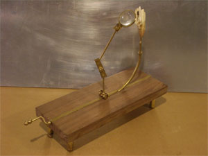
Seth is a sculptor, I guess you'd say: He assembles these contraptions out of metal tubing and animal teeth and wooden boxes and magnifying lenses and cranks and other odds and ends, creating what look like things out of a Victorian dream filtered through a whimsical Clive Barker. If you can imagine such a thing.

One of his projects, called Curious Tokens, I liked very much. He made these little objects and placed them in a few different places around the city. Then he went back every so often to see if he could find out what happened to them. The story of one piece was fantastic: He placed it in an alcove above a shop, and the woman who runs the shop thought it was some witchcraft or Santería working and wigged out and had a ritual to remove it, ending with putting it into a garbage can outside and pushing it down the street with a broom.

I like this. You might not think I would: Ordinarily my focus is on the end result. Show me a work of art and I'll tell you if I like it or not. I'm not interested in process, or what the artist intended, or context, or how many rich bozos paid how much for it. The proof, to me, is in the final object, never mind what went into making it. That's usually how I feel. But sometimes I'll turn it around, and Seth's project is one of those times. I love it when art surprises people, when it turns up some unexpected place, when it causes a reaction not constrained by being labeled as "art." Outside a gallery, outside a studio, dropped off somewhere without any attribution -- that's the way art can really hit people. Sometimes it just knocks them off balance a little, and maybe sometimes they go nuts and think someone is hexing them, but in the end at least it's shaken something up.

When we made it back to the gallery the meeting had ended but Asha was now talking with this artist who had brought in a piece for an upcoming show on the theme of toys. The woman had made some blocks in standard kindergarten shapes but had made them out of lead, so you have to handle them with gloves. I'm not exactly sure what that's supposed to be about, but Asha cooed appreciatively over the blocks, eventually joined by Jeanne. I hung back as the conversation wounds its way around to being about men and what terrible people they are.

Douglas Czuszak, NYC Metro 
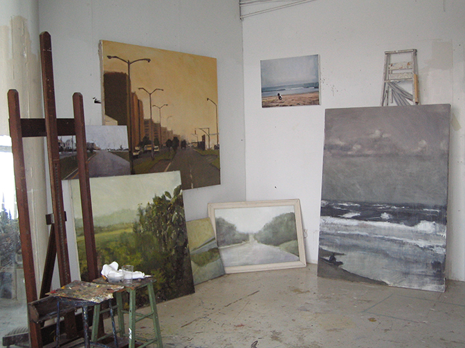
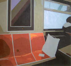
I spent my time looking over the gallery's current show, "Interiors" by Douglas Czuszak. Douglas' paintings remind me of Brian Alfred's, although they lack some of his precision. They're slightly more emotional. Still, Douglas' work has a certain coldness to it, a distance. They're supposedly of memories but don't have the warmth or ambiguity I'd expect from a memory; there's no sentimentality and, to me, little sentiment. These paintings are spare, sparse, and a bit empty.

Eventually I got my chance to talk to Asha and show her the drawings and painting I'd brought. Meeting Asha gives me a sense of how small the art world is -- particularly the northeast New Jersey art world -- since Jeanne wanted me to meet her; and Asha's Website has a link on it to Cory Marc's Website, which I designed; and Asha and Cory know each other, also.

After talking to Asha, the next reason Jeanne had me come to Newark was to stop by 27 Mix to see the paintings there. Alexandra Pacula, a friend of Jeanne's, was showing four large works. After seeing my painting of the George Washington Bridge Jeanne thought I'd like Alex's paintings, and she was right. Alex's work looks like she starts with digital photographs taken with a slow shutter speed. Dark areas are lit by smears of colorful light; people are blurry shapes. There's an element of The Night Cafe, with man-made illumination being the main subject. Alex's paintings vibrate with energy, like the shaky hands of a late-night photographer. The only flaw is Alex doesn't have a Website or many images online: To give you an idea, I found this image, but it's not what she has up now. [Alexandra Pacula]

It is, of course, too early to tell if Red Saw is where we'll find the next Jackson Pollock or Mark Rothko, or if it's just some self-indulgent exercise in bohemia for would-be hipsters. I tend to think that the New York art world is all about the subways: Brooklyn was the next big thing -- Dumbo and Williamsburg -- but the money is following the art, as so often happens, and it's getting too expensive for up-and-coming artists to live and work there, probably, and so the artists are going to have to move farther out. New Jersey spots like Newark and Paterson are actually closer to midtown Manhattan than the hinterlands of Queens and Long Island, but I suspect the gaze of the art world will keep moving that way simply because even the distant reaches of Brooklyn and Queens are still connected by the subway system -- and New Jersey public transportation sucks ice cubes through a crazy straw. But I guess we'll see, won't we?

I didn't get my driver's license until I was 21 years old. Growing up and living in New York City, I just never needed to drive. I took trains and buses -- almost never taxis -- everywhere I needed to go. For a few years after I got my license, too, I still didn't drive much, except down to Philadelphia with my wife to visit her family.

Since then, though, I've become Mr. Bridge-and-Tunnel. When I make my trips into Chelsea, I drive in. Parking in Chelsea, at least, is very easy, unlike everywhere else in Manhattan. The drawback is that sometimes the traffic is insane and I end up spending most of my time sitting in my car. Of course, the bus would have to sit in the same traffic.

Last night was one of those nights with a lot of traffic. And I'd gotten out late, too, so I found myself performing triage on my openings list so I could make the shows I really wanted to in the time I had left. So I didn't make it to Jack Shainman to look at and mock mercilessly Hank Willis Thomas' show, nor did I get to Bryce Wolkowitz to see what Ben Rubin had cooked up.

Lynn Jadamec, studio view I did make it to Lyons Wier Gallery to see Lynn Jadamec's opening. I had seen James Rieck's show and spoken to Michael Lyons Wier about James' work and art in general and I was eager to see what else Michael was interested in. Lynn's a bit different for Michael: He mostly likes photorealism, and Lynn is more of an impressionist.

I'm admittedly more into photorealism myself, but Lynn's paintings captivated me. The paintings on view are choppy -- at times it looks like she paints with a palette knife. There's very little detail. Her colors are very naturalistic. Altogether she has a great sense of space; what she leaves out is as important to the painting as what she leaves in. Somehow the texture of the paint itself substitutes for the texture of the objects she's painting, whether it's buildings, benches, or the ocean. This exhibit is taken from paintings Lynn's made of Rockaway, where apparently she surfs. Anyone who surfs off of New York has clearly come to terms with adversity. The paintings say nothing of this; instead they seem quiet. I was reminded of the time I spent living in Wildwood, New Jersey, and I could smell the sea salt. Lynn evokes something of an Edward Hopper-like loneliness, but I'd say it's more of an aloneness than Hopper's -- more the positive feeling of spending some time by yourself than the negative feeling of being isolated.

Lyons Wier is a small gallery. I didn't need to ask anyone which attendee was the artist. Lynn was clearly the tall, slim, very pretty young woman chatting with visitors near the door. I was annoyed at first -- I haven't met an ugly artist yet and it's starting to get me down -- but as soon as I introduced myself Lynn turned out to be so incredibly nice I had to stop being annoyed. I needed to ask her how she achieved this certain color, which you can see on the painting in the studio photo I include here. I've tried to get that streetlight yellow sky over and over with no real success, and she's just about got it in the painting with the streetlights marching off into the distance. Under the lights in the gallery her painted sky positively glows. Lynn told me she couldn't quite remember which pigments she used -- of course -- but that it was important to start out with a good oil-based titanium ground and use very pure pigments with very clean brushes. She actually went into a mini-lecture on oil paints and mixing colors, saying that each pigment is like a diamond in that it refracts light as it passes through it, and mixing too many different pigments crowds them together and the light can't pass through. I liked her way of describing paint mixing. I hope to find time to talk to her more in the future, because a gallery opening is not a good place for long discussions.

James Lecce, Voyager, 2006, acrylic polymer on panel, 45x36 inches Just about right next door on the same floor as Lyons Wier is McKenzie Fine Art which was showing James Lecce's poured paintings. A Google search on James' name turns up, first, an article titled "Paintings That Paint Themselves," but it turns out to be badly named, at least where James is concerned. I asked him if he was tired of explaining how he makes them and he told me he wasn't at all, and went on to describe his process for what must be the thousandth time.

James has been painting in this style for about eight years now. He does indeed pour the acrylic polymer liquid onto a panel, but then he takes an active hand in moving it around. He uses all sorts of things from squeegees to turkey basters to get everything where he likes it, and after so many years of doing this, he's got a pretty good idea of how to achieve what he wants this way. After the first layer dries he'll pour down another layer and manipulate that, and so on. His paintings can have six layers, sometimes more, sometimes less. And each layer has areas of translucence through which the underlayers show.

The result is a series of paintings which I just loved. I can imagine someone arguing that they're merely decorative -- "decorative" being a pejorative in art circles -- and that they're repetitive. To which I say: Nonsense. They're simply beautiful. Kurt Vonnegut once wrote that Abstract Expressionist paintings are about nothing but themselves and I'd class James' work with them: They are about nothing but themselves, and they are beautiful, and that's more than enough. As smooth as an enameled refrigerator door, as whorled as a fingerprint, with the majesty of Hubble telescope photos of distant nebulae and the curious interactions of fractal geometry, I could look at these all day. When I was younger I had a specimen of polished leopard jasper and it was one of my great treasures because every time I looked at it I saw new patterns. James Lecce's paintings have that quality.

But I was running out of time and I had at least one more opening I wanted to see. So I bade good-bye to James' paintings and rushed out, only to find myself drawn to the crowd across street at Lennon, Weinberg. Stephen Westfall was showing his latest paintings and I took a look around.

Stephen Westfall, Señor Stack, 2004, alkyd/oil on canvas, 36x36 inches My immediate impression was that here was a painter who'd looked at Piet Mondrian too long. And not actual Modrians, but reproductions of Mondrians, because, as anyone who's looked at the actual paintings can tell you, a real Mondrian has a lot of texture. This texture can't be reproduced photographically, so you might think Mondrian paints very flat, but in fact many times you can see his brushwork, and passages which reproduce as all one shade of white turn out to be many different shades, and so on. Meanwhile Stephen's paintings are as flat as flat can be, as if they were painted with a roller, which maybe they were. Now, I love going through paint chip displays at the hardware store -- and I'm not even kidding here -- but I'm not sure they're art. Stephen claims (in the interview I link to above) that he spent a lot of time in front of actual real live Mondrians, but I'm not sure he took away what he should have from that experience. 20th century art can seem, in some ways, like a gradual process of removal: Remove the subject, remove the story, remove the brushstrokes. There's a point, though, where I think you've removed whatever made painting interesting, and I think Stephen Westfall is past that point.

Having gone through that show I was really hustling to make it around the corner to the next opening on my list, Glen Hansen at the Fischbach Gallery, except when I got there the elevator wasn't accepting 8th floor button pushings, so I ended up on the 6th floor in the Edward Thorp Gallery viewing Judith Linhares' latest paintings.

Judith Linhares, Wild Nights, 2005, oil on canvas, 51x78 inches I can't say I was overwhelmed by Judith's work. I had looked her up when news of her opening hit the Douglas Kelley Show list since I look up almost everyone while planning my gallery trips. Her paintings didn't strike me as anything I wanted to see all that badly. I was right about that to some extent -- I didn't need to see her show.

But I was pleasantly surprised to find that I didn't dislike it, either. Judith's style is very blunt and basic -- to give you an idea, she has two gouaches showing which are almost indistinguishable from her oils, and if you can paint in gouache the same way you paint in oils, well, let's say you're not working too hard. Nevertheless I found myself won over by her bright colors and enthusiastic brushstrokes. Her paintings are fun. A little strange, filled as they are with naked girls, pots, pails, and bunny rabbits, but fun anyway. Even a painting with a potentially gloomy title like "Fools for Love" -- can't you just see broken, weeping figures in a lonely landscape? -- even a title like that is given to a painting of happy-looking nudes climbing a tree. Maybe there's some dark symbolism I'm missing here (I tend to be naive like that) but on its face, it's a bouncy work.

On the way out I found myself waiting for the elevator with a tiny young woman who was so drunk she was spilling wine all over herself and the floor. An older man, who was wearin' the green a day early, shouted to her, "Gulp it down!" To which she replied, "I'm so glad I was invited here. The artist is my professor!" On the elevator, the man asked rhetorically, "And what class is that, Groupies 101?"

And speaking of the Irish, on the sidewalk on my way to my car I found the work of one Ellis Gallagher, who had chalked the outline of the shadow of a streetlight on the sidewalk. I know it was Ellis because he signed his name, along with ©2007, and I wrote it down for future reference. Turns out Ellis is old news: The New York Times already ran a story on him. Regardless, I was charmed by his shadow, and I smiled, which is not something that happens often to me in Chelsea.

So I go through the trouble of having a Plan Ahead section where I can note where I'm going to be, then I don't show up for the planned event and end up going out without a plan. I'm sure the three people who read this are astonished and upset, but, hey, that's life in the big city. As it was, I should've stayed home last night.

I was looking forward to the first show on my list, The Seventh Side of the Die at Alona Kagan. Last Saturday Jeanne Brasile had introduced me to a friend of hers who works at the gallery and one of the artists in the show gave us an invitation, so I figured I'd go. Anything to support someone I've actually met. Luckily I forgot his name, so I can't blame him for any of the really bad art on display.

I was expecting a pretty big show. It had a good sized clot of verbiage on the Douglas Kelley Show list which threw out a list of about a hundred artists. Granted that one of the major names was Duchamp, and I usually take that as a sign to run as fast and as far as I can; I like Duchamp, but honestly, he's opened the door for more crappy art than just about anyone I can name, Warhol included -- and Warhol was name-dropped by the show, too. Still, I expected the show to at least be big and varied.

In fact, the show is microscopic. I can remember less than fifteen pieces. And the quality level was poor. Really poor. There's some video I avoided; there's a horrendous assemblage of tinfoil and tempera which made me think my son's third grade book report diorama should be in a museum; there's some other stuff. Overall it's hugely disappointing. The show includes a couple of ancient artifacts from the early days of surrealism and dada, like a Hans Bellmer book; sadly, as has happened with all these old things, they now have to be encased in plexiglas instead of actually looked at. I'm sure the creators of these things would either be amused or horrified at their sanctification, but that's the art world, I guess.

The looseleaf binder which, in most galleries, would be a help to figuring out what the hell was going on, turned out to be stuffed solid with pages upon pages of material, a lot apparently downloaded from the Internet, in various languages, regarding maybe some of what was in the show, maybe some things by the representated artists, and maybe some things from Mars. I'm all for jokes and humor, and occasionally merely being weird for weird's sake, but you can't just beam down from the mothership and start blathering. A little context is helpful. A guy on the corner ranting that all the white people are moving to a base on the dark side of the moon is potentially entertaining; a guy ranting about the same subject in his own invented language is just some crazy person off his meds.

Colleen Asper, The Portrait of the Artist as President, 2005, oil on canvas, 4.5x3.5 feet 
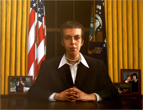
There were a few interesting bits. Colleen Asper's "The Portrait of the Artist as President" was really stunning in terms of technique; a real old-school photorealist, she managed to efface all of her brushstrokes and leave a smooth, luminous surface. (Reproductions never do justice to oils, but this one is especially egregious; trust me, at full size, in person, it looks a lot better.) Timothy Hull, Somewhere Between Real and Remembered, 2006, graphite on paper, 9.5x7.5 inches 
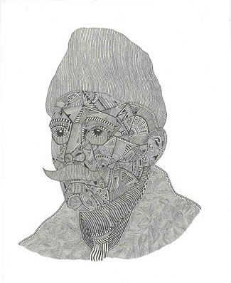
Timothy Hull's tiny drawing "Somewhere Between Real and Remembered" was neat, a little pencil portrait of Proust filled with little patterns and hatching and so forth. I have a weakness for drawings by obsessives; my father used to doodle like that, and I have a ton of similar doodles myself, so I tend to feel happy just seeing other people with the same penchant. I'm never sure they qualify as "art" and not, you know, doodles, but I like to see them anyway.

Jill Magid, Head, 2005, forensic reconstruction, sculpture 
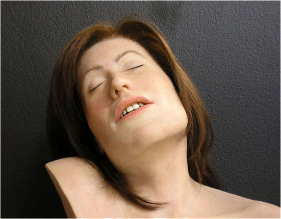
Finally there was Jill Magid. This sculpture of her head was entrancing, in a way, because -- the photo doesn't quite communicate this -- it actually looked alive, like it might wake up and move around. It doesn't look like a real head by a long shot, which is what made it strange; the proportions are off and it's clearly constructed. But it still has that creepy quality you get from the Real Dolls, that it might, in fact, be alive and just waiting for the right moment to move. In the looseleaf notebook there were a lot of pages devoted to Jill; if they weren't almost totally unreadable they might have been interesting. Apparently she works with or around or near actual forensic pathologists and uses what she sees and learns in her art. And maybe she puts together faux crime scenes; I couldn't figure out what was going on. Still, that sounds more in the spirit of surrealism than most of, well, anything I've heard in a while.

So now I've said it was a small show and then I praised almost half the pieces in the show, which makes you wonder why I'd be so disappointed. The show really just left a lot dangling. I wouldn't have even known half of what was going on without checking the Web before getting there. The other pieces -- which I will not discuss -- were so terrible. And the show was just so damned small. It may seem like a great idea to inflate something to get people to come by, but if you inflate it too much, you run the risk of becoming exactly what Seventh Side of the Die became: A hugely lame show which left such a bad taste in my mouth, I don't think I'll trust this gallery for a good show for a long time.

From there I went down a couple of blocks to West 27th to see Andrei Roiter at Dinter Fine Art. Which opening had been cancelled. Well, their Website was so totally half-assed I expected it wouldn't work out. While on 27th I stopped in to see if CoSM was open, but the elevator seemed to be deceased, so I didn't even give it a shot. I did pass by Sundaram Tagore Gallery, which was preparing for an opening which looks really good. They're on my list now.

One block south I dropped in on Marco Neri's "Mars Black" at Lucas Schoormans. Readers may have gotten the idea that I don't like abstract art, but that's not true. I have high expectations of all kinds of art, and a lot of people incapable of meeting those expectations seem to choose abstraction as their metier. Abstract art can be good. Marco Neri's abstractions are, in fact, good. He's pared down his palette to just a few colors; as the title of the show might imply, mars black -- that flat, featureless black -- is the main color here. Marco then uses some white, which tends to get swallowed up by the black, so his brushstrokes are reduced to shades of gray depending on the thickness of the paint. Other colors occur occasionally; red and blue for a flag, olive green. Marco is working in tempera for this show, too, so all of these paintings are so matte they eat some of the light around them.

Marco Neri, Cityscape (Paesaggio di Città, 2005, tempera on canvas, 55 1/8x70 7/8 inches His scumbling of white definitely shows the hand of the painter at work. I can easily see any of these as being the kind of painting you could hang on your wall and stop to look at every so often, noting new details and nuances each time.

Lucas Schoormans Gallery is in a building which has a real live elevator operator. 35 years I've lived in and around New York and I don't think I've ever been on an old-fashioned manually operated elevator. I thought they were all extinct by now. And if that wasn't thrill enough, I rode the elevator back down with Jesse L. Martin. I wouldn't mention it except it was the highlight of my trip. I'm a big Law & Order fan.

Since I was already on 26th Street I decided to head over to a show Jeanne recommended. At 601 West 26th the gallery is just about in New Jersey it's so far over, and Krampf/Pei Gallery itself is 14 floors up and half the building away from the elevator. I think I walked about a mile before I even got to John Avelluto's show, titled "Playstation."

Now Krampf/Pei is so cool they could even hire this ridiculously pretty girl to stand at the sign-in book just to tell people "This is for the mailing list" and get hit on by pathetic young men. They could hire a guy to sit in the corner of the room and dispiritedly pluck out on guitar the musical equivalent of the nearby art, which is to say unfocused, pointless, and only glancingly related to any known art form. They could put out a bowl of minipretzels. That's how cool Krampf/Pei is.

And as near as I can figure that's what the crowd was there for, to appear to be cool. I didn't think they were there for the artwork, which they looked at even less than your usual opening night crowd. Which was just as well. John's art consisted of videogame-style images -- all hand drawn pixels and primary colors -- juxtaposed with what could charitably be called references to past artists, like Jackson Pollock and Francis Bacon. There was some graffiti-style stuff, too. And in an attempt to appear interactive and groovy, one painting was essentially a blank videogame background (it reminded me of the Atari 2600 Superman game) on which viewers could stick and re-stick some of John's graffiti-style AT-AT Walkers and rockets and stuff. The original blank painting was probably the best thing in the show before anything was stuck to it. After it had been "artified" or whatever, all I could think of was what an archival nightmare it had become.

[John Avelluto] Speaking of archival nightmares, a number of the paintings in this show appear to be layered epoxy. This gives a nice, candy-like surface -- the epoxy drips off the sides of the paintings as it dries, leaving a wacky edge when you check behind them -- and the paint between the layers makes for an interesting dimensional effect. But I have it from my favorite curator Jeanne that epoxy has a nasty habit of yellowing and cracking as it ages. And in fact one piece, a plug-in with a lightbulb behind it (and which was unlit), is already yellowing.

[John Avelluto] Curatorial concerns aside, I was unimpressed by the work in this show. 1980s videogames don't strike me as very interesting, especially not when used for heavy-handed, obvious political messages. Ooh, racial profiling is like a videogame, wow, man. Bong-inspired paintings don't do much for me, either: Super Mario's head floating above a Pollock-like background with slices of real pepperoni layered in the epoxy doesn't seem all that wildly imaginative to me, just a little pointless and wacky.

The show seemed great after the Seventh Side of the Die, but I don't think I'll be rushing out to any more John Avelluto openings.

[Inka Essenhigh] You may have seen Inka Essenhigh's paintings before. You may have seen images of her paintings on the Web. But you have not seen what she has now.

Inka Essenhigh has painted a masterpiece.

This measly little image here cannot even hint at how great this painting is in person. I've done a fair bit of gallery-hopping and I've yet to see anything I would say truly belongs in a museum (although I've seen stuff in museums I'm not sure belonged there). Inka's work deserves to be on the same walls as any 20th century artist.

Inka started out painting in a very flat style. In her early works the whole painting surface almost looks enameled. She then populates this with obsessively outlined amorphous shapes which resemble real-world objects but which refuse to actually become whatever you think they are. On closer inspection, there is no closer inspection: Everything dissolves into lines and planes of color.

Over the past few years her work has grown. When I last saw a painting from her, a couple of years ago at one of the big shows on the piers, Inka had added depth and lighting to her work and a much more confident use of paint. It was also much easier to figure out what was actually going on in the painting: "Oh, it's a man packing a suitcase." I didn't think this was a bad thing, but overall the work seemed a little tentative.

Not any more. What Inka has up at 303 Gallery right now is perfectly poised and very powerful. This painting I've reproduced here is absolutely fantastic. I'd say it was about five feet square, so it was impressive just in size alone. The paint is no longer flat; she's allowed herself some brushwork here. I'm not sure if she changed media from her earlier paintings or not, but now she's clearly using oils. The depth she achieves is astonishing given how abstract some of the objects are. And there's clearly something recognizable going on, although there's still room for interpretation.

When she heard I was going to see Inka Essenhigh, my friend Jeanne Brasile -- who's starting as a curator at Seton Hall next week -- asked to come along. She was not disappointed; we were both blown away by this exhibition.

It's a small show. I remember four or five paintings. I got the impression, too, that Inka had rushed out the last painting, which looked less polished and somehow slightly unfinished compared to the others. That, plus a few really large, really blank walls, made me think the gallery had been expecting more. Not that it mattered to me: Any show with just one of the paintings on display here would've been a very good show.

I was lucky enough to grab Inka for a moment to talk to her. I followed right after a young girl, maybe twelve years old, who got Inka talking very graciously about her nearest painting and also had her sign a postcard. I've never seen an artist asked for an autograph before. It was sweet. I mentioned to Inka that none of the paintings were titled or signed and she told me it was all part of the minimalist aesthetic. Beyond that there wasn't much to say other than to heap praise on her, and she's kind of small and I didn't want to bury her, so I let her go back to shaking hands all around.

Jeanne and I couldn't find any postcards ourselves -- I guess we arrived after the big postcard run -- so we hustled out into the freezing Chelsea night and on to our next destination, which was to the Mary Boone Gallery and Brian Alfred's opening there.

Brian Alfred, The Saddest Day of My Youth, 2005, acrylic on canvas, 85x102 inches Mary Boone's gallery is so cavernous it dwarfs all but the most massive installations. Brian had painted large to fill the space but even so, both the paintings and the number of visitors seemed small and sparse in comparison. This meant I was able to get a really good, long look at his paintings, though, which isn't common at openings; and I could talk to the artist for a good long while.

Brian's paintings are extremely flat, like some kind of triumphant return of the 1970s. It was clear looking at them that he'd spent a lot of time cutting friskets and masks, taping off areas of the canvas, before even putting down paint. They're so carefully planned even the edges of the canvas were masked. I always like to see such insanity in an artist; I gave up airbrush because I couldn't take all of the careful masking involved. So I admire anyone who sticks with it.

Brian, Jeanne and I spoke specifically about the painting I've reproduced here, "The Saddest Day of My Youth." I didn't pick up on it immediately -- and the paintings were hung untitled -- but it's an image from the Challenger disaster. His parents, Brian said, had the Kennedy assassination. Younger people had September 11th. But he had the explosion of the Challenger, which he witnessed in a school assembly in junior high where they'd gathered to watch the launch on TV. I remember the Challenger well, but at least it wasn't a surprise by the time I saw the news footage. Brian and his classmates got to see it as it happened. We agreed that September 11th was more horrific, of course, but Brian pointed out that the Challenger was destruction of a different kind. When you think of space exploration you think of adventure, excitement -- you don't think of disasters, or anyway you didn't when you were a kid, at least until 1986.

Brian also explained something of how he works. He starts out working on his paintings on computer, adjusting shapes and colors, and when he gets it right he works from that to create the large painting. I could see his friskets overlapped in places, and in one particular spot I could see he'd painted over an area which had been masked off, and he told me that's intentional: He could make everything fit together perfectly, but he'd rather leave the evidence that an actual person painted this. He also leaves himself room to change his mind as he paints, which is surprising since his paintings are so carefully worked out before he starts.

After admiring Brian's paintings -- and the early Essenhigh in the gallery's back room, which provided good insight into how she's progressed as an artist -- and finding nothing interesting in my printout from the Douglas Kelley Show list, we went back to West 22nd to catch an opening we'd heard about from another gallery hopper at Sikkema Jenkins & Co..

Marc Handelman, Raptus, 2006, oil on canvas, 90x76 inches Kara Walker, That Thing, 2005, pencil on paper, 22x30 inches 
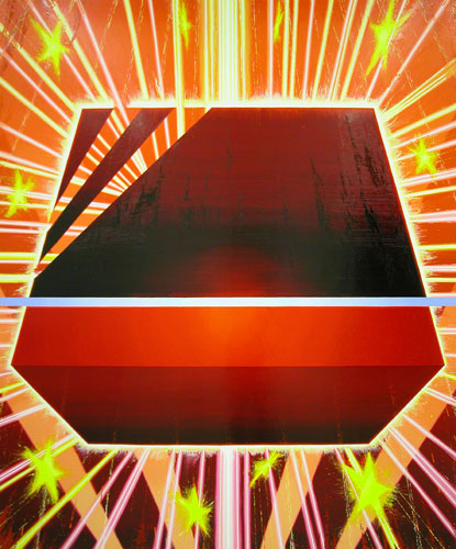
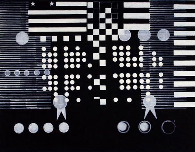
Sikkema Jenkins had two openings, one for a group show, "Turn the Beat Around," and one for Kara Walker. The group show had some pretty lousy art -- I found the young girl from Inka's opening staring quizzically at what appeared to be a poorly made prosthetic leg standing in the middle of the room -- and two good paintings, one of which I found an image for and put here. Marc Handelman's "Raptus" was kind of neat. Very energetic and big, kind of wacky. Most of what was on the walls otherwise, and also on the floor, was pure dreck. I didn't even try to find out who did what or why.

In the next room, Kara Walker had some pencil drawings and a video, all uniformly awful. Jeanne protested that the works were supposed to upset me, but I don't think they upset me in the right way; I was just irritated at the crappy draughtmanship and pretension of it all. When the gallery decided it was time to kick the capacity crowd -- including Village Voice art critic Jerry Saltz -- when it was time to kick us out, they lowered the lights, which was really only an improvement. By the time Jeanne and I made it to the front door they'd even turned off the plug-in wall hanging art type thing that was the first piece we saw in the show, and I felt that was probably good for everyone.

Pages

OpenID accepted here Learn more about OpenID
Powered by Movable Type 5.2.7