The plan was simple.
- Bid good-bye to my lovely wife and happy children.
- Go to my studio in Brooklyn.
- Be awesome.
- Tear myself away from my latest work of sublime genius and take the G train to Williamsburg to arrive fashionably late for the opening at Ch'i Contemporary Fine Art.
- Return home to my lovely wife and happy children.
Things began going wrong at the very first step. I did not have a lovely wife and happy children that day. That day I had an evil harpy and her monstrous minions. I quickly realized I had to leave immediately lest we make the evening news. What I didn't expect was that I was in danger of making the news all on my own. It became clear after I stormed off for the bus that the trouble wasn't my harpy wife or her evil spawn; the trouble was I was in the foulest mood imaginable.
The nastiness continued at the studio where I found myself unable to set paint to panel without being overwhelmed with disgust. Forget sublime genius. Forget, even, acceptable mediocrity. Instead think, good lord, man, please drop yourself in a deep trench. When I couldn't take it any more, I left for Williamsburg where I arrived two hours early for the opening.
I was in no condition for Williamsburg. I grumped around feeling old, fat and incapable of enjoying myself. All I wanted to do was slap everyone I saw, all those passersby, so smooth and hip and clean, with their groovy glasses and their tattoos and their tiny dogs. Tapas bars. Pabst Blue Ribbon. "Distressed" t-shirts. Sandals. How I hate you all, I thought, as I gnashed my teeth, hunched and sneering like a Stan Lee supervillain.
It occurred to me that a normal human -- given a beautiful day, a few bucks in their pocket, and a couple of hours to kill -- a normal human could've gone into a bar or cafe or restaurant or something, had a drink and maybe a meal, soaked in the sunshine, gazed out on the fine afternoon; given all that, a normal human could've had a lovely time. Thinking this made me even grumpier. So rather than assuage my hunger by stopping in at one of those tapas bars, instead of quenching my thirst with a cold PBR at one of those sidewalk tables, I paced back and forth through two square blocks, getting angrier and hungrier the whole time, only occasionally stopping in a gallery.
I'd like you to keep this nightmare vision in mind while reading my reviews today. If I seem less than enthusiastic about everything, well, it was mostly me.
I began my peregrinations by getting lost on my way from the Metropolitan Avenue train station to Like the Spice where Reuben Negrón's show, Dirty Dirty Love, had been extended until July 12, 2009.
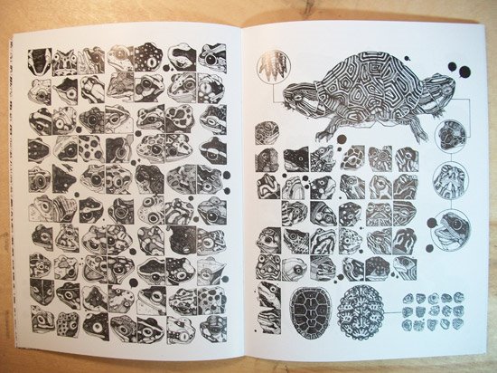
Reuben Negron, Dirty Dirty Love: Becky and Neomi, 2006-2007, watercolor on paper, 52x32 inches
Reuben's show consists of meticulous watercolors of people engaged in sexual activity. Some of the paintings are impressively large; a few are smaller. If you look closely you can see he starts with a detailed pencil sketch, probably from a projected photo. Two of the pieces in the show are just the sketches. He uses his lovely, feathery graphite lines as the framework from which the watercolors hang. Although he's tight with his paints, close inspection shows the absolute tightest areas are, in fact, pencil drawings. So really the media on these should read, at least, "mixed", if not the more detailed "pencil and watercolor". Even so, Reuben's work here is technically very, very impressive: His control of his media is fantastic, his color reproduction excellent, his composition well-balanced. His pencil work all by itself is pretty marvelous.
That said -- and adding that I, of course, am always fond of naked people -- I have to admit I'm really tired of photo-based work. The gallery verbiage -- I guess it's written by Marisa Sage -- says "Photorealism is usually associated with cold, clinical cityscapes.... The watercolors of Reuben Negrón partake of the deep photo-visual honesty and technical mastery of the photorealists but are also imbued with a deep humanist emotional intelligence." I can see how she might want to distance Reuben's work from the "cold, clinical" Photorealists, but she's stretching it: Reuben's as chilly as any of them. His attention to detail is astonishing from a technical standpoint but in terms of content places his subjects at a distance; he may be working from his own photos (I doubt they're all his own, actually) of people he was in the room with, but really these feel more like images taken from some surveillance camera on the Internet. They have that air of menace often found in self-consciously arty portrayals of sexuality: They're permeated by dominance, submission, voyeurism, and just plain creepiness, as if allowing any hint of fun, happiness, or garden-variety prurience would deflate the whole exercise.
It's a shame, too, because some actual dirty, dirty love would really have livened things up.
I left Like the Spice and began my meandering around the few blocks of Williamsburg. My mental map of Brooklyn and its neighborhoods is hazy and indistinct; what I learned was that Williamsburg is actually pretty small. I paced around most of the area fairly quickly, leaving plenty of time to do it again. Although Williamsburg is often placed as a competitor of (or maybe a minor league for) Chelsea, in scale the two aren't even close: the freely available Brooklyn Art Guide lists maybe 20 galleries in Williamburg versus Chelsea's over 300.
Thus I had a lot of time to skulk and steam, because after leaving Like the Spice I arrived at Ch'i to find them still putting the finishing touches on the show. I picked up the latest WAGMAG and began to wander.
Lauriston Avery, GLZ44, 2009, flashe on canvas, 85x70 inches
I eventually found Lauriston Avery at the Hogar Collection. I haven't seen anyone working in flashe in a while, and I guess there's a good reason for that, because it's kind of flat and dead. It seemed to me Lauriston really wanted these paintings to pop, but the flashe keeps them down, the result being about as exciting as day-old soda left out on the counter. The tiny, tiny venue that is Hogar doesn't help; these need room to breathe. Executed in a better, peppier medium -- almost anything would do, but I'd recommend oils, of course -- and placed in a bigger space, and Lauriston's work might ascend to the lofty heights of mediocre abstraction. Instead they're just sort of there.
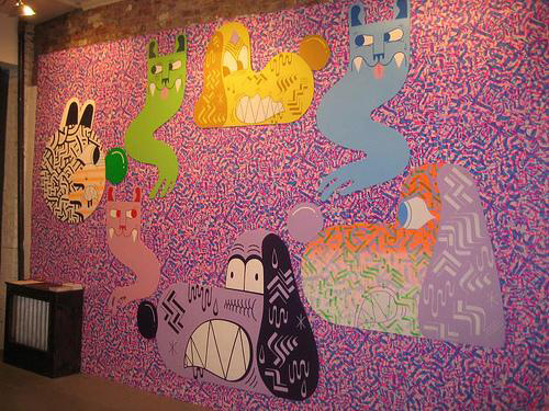
Isaac Lin, The NeverEnding Story IV (installation view), 2009
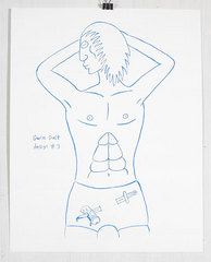
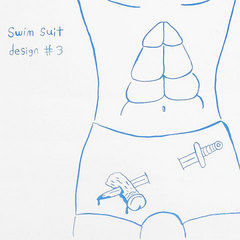
Andrew Jeffrey Wright, Swimsuit #3, 2009, silkscreen print, edition of 40, 11x14 inches
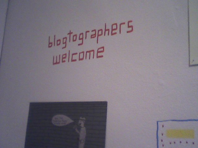
At the other end of the spectrum I found The NeverEnding Story IV at Cinders Gallery (until July 26, 2009 -- you missed it). Philadelphia artists Isaac Lin and Andrew Jeffrey Wright went batshit all over the walls of Cinders in that semi-graffiti graphic style, with bold lines, bright colors, lots of words, and poor draftsmanship. Ordinarily this kind of thing only annoys me -- it's so easy and pointless -- but this time, I was charmed. Something about the childlike way every available space is covered; and although I almost always object to words in art (it's visual art, dummy -- if I wanted to read, I'd pick up a book) these were amusing and whimsical. Including something I just had to take a picture of with my mobile phone: Even though I'm in no way a blogtographer, I felt I had to oblige.
Andrew Jeffrey Wright, The NeverEnding Story IV (installation view), 2009
Further wanderings took me past the first and only graffito I've seen based on the lyrics of a Rush song. This is worth becoming a blogtographer.
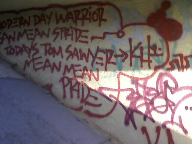
Williamsburg graffito, 2009
At long last, after a few more passes, I found Ch'i ready for me to enter. It's a lovely space for a lovely afternoon: It wasn't too hot out and the big front windows let in the late-day sunshine to flood the gallery's large space. This brought the near-monochrome works on the walls into sharp contrast. A couple of them caught my eye immediately as I entered, but before I could explore the art I was wrapped up in conversation with Assistant Director Jenny Cuasapaz. I told her I was there to see Melissa Murray's work, since I'd reviewed her a few years back. This brought over Kevin Bourgeois, one of the show's artists and also a curator in his own right. He told me how he'd directed shows with Melissa's work and how the two of them had shown before. He pointed out his work on the walls when I asked.
When Kevin excused himself the gallery director herself, Tracy Causey-Jeffery, introduced herself to me and we chatted a while. She toured me through the works in the show, which she'd titled Uprooted (until August 24, 2009 -- you missed it, too). Three of the artists had shown together and are related artistically: Kevin, Melissa, and Abby Hertz. They trade studio visits, I think I heard, and talk art together.
That seemed pretty clear from looking at the work. Certainly those three had the best, most accomplished drawings in the show. And there are stylistic similarities.
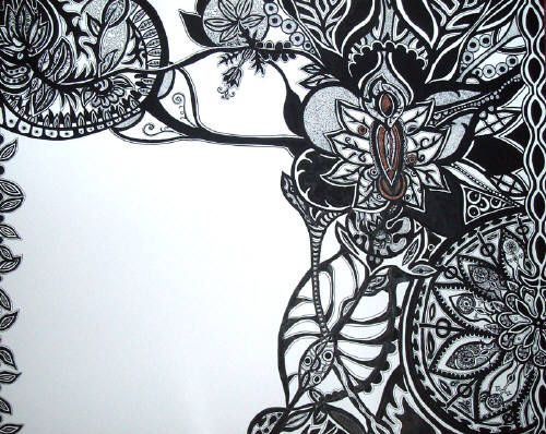
Abby Hertz, Creep, 2009, ink on paper, 32x40 inches
The drawings which I noticed first were Abby's. She describes her work on her MySpace page as "vaginal art" but I didn't see that immediately; what I noticed were strong lines, intricate patterns, and a connection to floral fabric patterns like paisley. Sure, typing it all out like that makes the vaginal connection obvious, but it really didn't occur to me.
I found Abby's large-scale inks striking and interesting. I liked her patterning but also her use of negative space. She could easily have filled the paper but instead allowed the positive and negative to fall into a balance. I did sort of wish her draftsmanship were a bit better: I like this kind of patterning when it's more precise, less wabi sabi. Instead they have a clearly handmade quality, which is fine, but not my preference.
Kevin Bourgeois, Process of Elimination (To C.G.), 2009, graphite and mixed media, 40x60 inches
Kevin's work, meanwhile, defies categorization as just drawing. It doesn't jump off the wall the way Abby's work did for me, but I found it more engaging once getting close enough. The drawings are a little gimmicky -- they're sort of aggressively mixed media in a way that seems unnecessary to me, like the one that uses arrays of pills lined up, shadowbox style, behind the drawing. And yet I found myself enjoying them anyway, mostly, I think, because Kevin's pencil work is so subtle and lovely. It doesn't come through in the JPEGs, which blithely translate all smooth shadings pretty much the same, but his delicate, smooth way with graphite is simply lovely. I felt the overt sociopolitical elements were as unnecessary as the mixed media, but again the execution of the works overcame my reservations. They're just too well composed, too well drawn, to keep from captivating me.
Melissa Murray, A Letter, 2009, graphite on paper, 40x43 inches
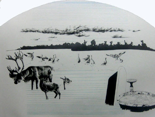
Surprisingly, of the three Melissa's work was the least coherent. Her drawing is technically excellent, and the works in this show look like she spent plenty of time and effort on them; but they didn't quite come together for me. She's definitely gone in a different direction from when I last saw her work. I'm glad she's left behind the self-denigrating work -- as well-painted as they were, her self-depiction as someone ugly and depraved was worrisome -- but I wish she'd replaced it with something I could get a handle on. In these drawings, meticulously detailed animals share the stage -- and it does look like a stage -- with schematically rendered detritus of humanity, like old stores and collapsing buildings. Passages of these appear intentionally unfinished, with outlines sketched in; they butt up against finely and completely drawn features like dogs and clouds. In a way they resemble collections of clip art jumbled together, sort of collages with uncertain meanings. I get that Melissa is looking to juxtapose the beauty of the natural world with man's despoilation of same; this is a hackneyed theme unredeemable, in my eyes, through admittedly solid technique.
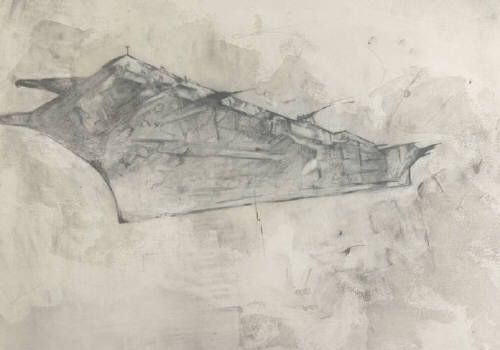
Sasha Blanton, Disengaged #2, 2008, pencil, wax, 28x36 inches
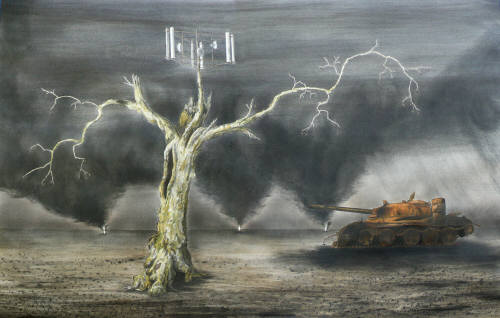
Eric Johnston, A People's Power Plant, 2006, watercolour on paper, 30x23 inches
Joseph Smolinski, Sycamore, 2008, ink, watercolor and graphite on paper, 26x40 inches
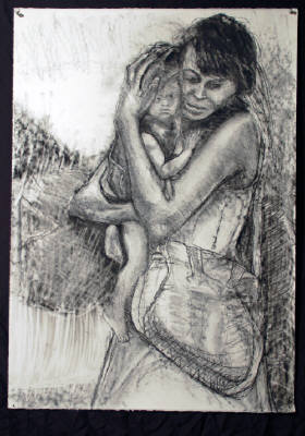
Homer Yost, Fourth Year Homeless in the Lower Ninth Ward, 2009, charcoal on paper, 22x40 inches
The other artists in the show don't work up to the same level as those first three. Sasha Blanton's ghostly aircraft carriers are interestingly rendered in a technical sense -- I wonder how he did them -- but beyond that blend into the background. Eric Johnston's drawings are jumbled architectural renderings of uninteresting mongrel buildings with no aesthetic effect. They're too cool and distant, lacking heft and any connection to the viewer. Joseph Smolinski's drawings are cute enough evocations of plants growing antennae, but don't rise above twee ephemera. And Homer Yost's sketches of homeless men, women and children, clearly intended as heartbreaking portraits of people in dire circumstances, struck me as simply incompetent and poorly drawn. I've reproduced the least bad of them here; the others were weaker than cocktail napkin scribbles.
I never did see Melissa Murray in person, as I'd hoped to. I guess she didn't get to the opening until later, and with the mood I was in I didn't want to hang around. I was only going to get crabbier and nastier. Best to crawl home and into bed as soon as possible.