January 2010 Archives

Even More Recent Stupidities

| 21 Comments

DUNCE

DUH

Things have been quiet. Too quiet. Maybe it's because they know I'm watching, just waiting for the moment when they write something inane, moronic or just plain stupid, waiting for that moment to pounce! And put them on my blog.

But probably not. More likely it's just been quiet. Very little going on in Dumbbell Land lately, I guess. Still, I noticed a couple of things.

She's not even trying any more, is she? Clearly, when one jabbers out gobbledygook like this, one has given up even making perfunctory stabs at coherence. Like "the deprofessionalization of art as a form of professionalization" -- yes, he nodded, that makes perfect sense. And "the idea that unlike earlier times in which only the upper class had time to produce art and text for millions who have no time to view them, now millions of people are creating work for a select few who have no time to view it" -- now incomprehensible in any human language!

I can only hope Paddy hopelessly failed to understand or grasp anything said by Mr. Groys, but considering the talk was of interest to both her and Tom Moody, I honestly don't have the stomach to attempt to read much more.

Keeping Paddy's attempt at writing justified, alas, is the Village Voice, which has listed her blog with 17 other "obsessive, cantankerous, and unstoppable Gotham blogs worth going ape over". Since the Voice has devolved to basically nothing but cheap newsprint for putting under your overbred apartment-sized idiot dog and online softcore porn with a side of limp art criticism, I suppose it shouldn't be shocking when they can't tell their ass from a badly-written blog, but it's still dispiriting. But the list of ridiculous superlatives is 33% correct: So far Art Fag City and the rest have been unstoppable.

Also, Paddy gave this great quote, which is particularly brilliant when juxtaposed with the preceding item in my list: "What I've been trying to do here is make things clear for people who don't spend every living moment in the art world, and give them a set of tools with which to look at contemporary art and engage with it." Uh huh.

Everyone wants to get on the clearfication of complicatinated artstuff for the masseslikepeople wagon of bandness: Joining the cacophony is Leah Triplett who writes, "Perhaps due to its focus on new media art, Younger Than Jesus, was almost completely devoid in painting of quality. By quality, I mean that which stand the test of time because of their enduring reverberation in one’s mind -- if they are made from ephemeral materials or not."

Perhaps, due to its, overuse of commas, this sentence, fails to get its verbs and nouns, to match up. Children raised by wolves have an easier time putting together working statements than that. What, pray tell, is a "comically chilling small-scale oil [painting]?" Is "comically chilling" like "hilariously deadly" or "politely flatulent"?

Perhaps all art writing on the Web has been outsourced to some indigenous Amazon rainforest tribe whose only contact with English is a promo t-shirt for the I Can Has Cheezburger book.

But no, that's just me making up likely-sounding excuses for them. Fact is, they're just bad writers.

And finally, proof that when the art world gets it right, it still gets it wrong: Michael Landy's latest work of art is a giant, transparent bin in which to throw away works of art. There are a number of problems with this piece, towit:

  • Artists are being asked to submit works of art. We shouldn't ask artists, we should just throw out their crap.
  • The artists being asked are certainly worthy of being binned -- Hirst, Emin, and a few other disasters. Sadly, they've been asked to contribute work they consider failed -- a tall order. How does one tell a failed Emin from a successful one? How unwashed the sheets are?
  • The bin -- with a volume of 600 cubic meters -- is transparent. This is huge mistake, since clearly no one in their right mind wants to see any of this crap again.
  • Lastly, the bin cannot be put into itself.

Perhaps it's too much to ask for, but maybe Damien's next work can be vitrines containing the bodies of the Young British Artists, himself included.

January 7, 2010: Julian Jackson

| 1 Comment

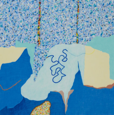
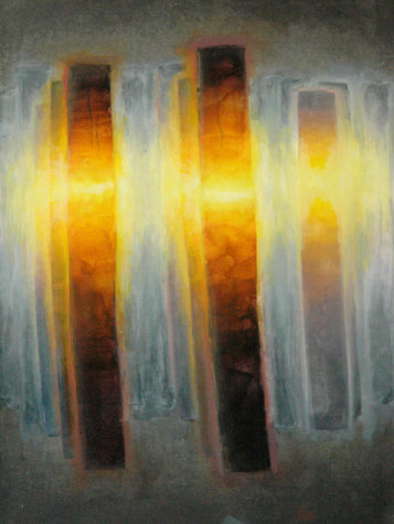
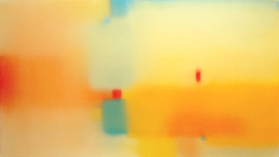
Julian Jackson, Mirage, 2009, oil on wood, 24x42 inches

Julian Jackson, Mirage, 2009, oil on wood, 24x42 inches

After squeezing my way past the adoring throng at Danese's building -- which had completely filled the lobby such that I had to push my way out -- I made for 20th Street and Kathryn Markel to see the last show in my evening's plan, Will o' the Wisp by Julian Jackson. I'm not sure now how I caught on to his work, but I saw it somewhere -- probably in one of the regular e-mail messages the gallery sends out. It looked good and I'd been hoping to see it, so when I heard Julian was having an opening, I put it on my list. Even so I almost skipped it; I wasn't sure I wanted to walk the extra four blocks down and three back on my way home. I'm glad I went for it.

Julian's work is something like what you'd get from Hans Hofmann if he forgot his glasses at home, or from Josef Albers on a squinty day. Gauzy overlapping rectangles hang in hazy space in each of his paintings. Some consist of colors very close in hue, others vary more widely. The paintings are perfectly flat, nearly showing no evidence of brushwork, and slightly matte. Julian's colors are mostly strongly saturated. The hazy edges are effected by a lot of blending back and forth and each painting has something of a direction imparted by these strokes; they don't quite come across as brushy but there's a very subtle hairiness to them.

Not one of the works in this show qualifies as a stunner, but altogether they're meditative, quiet. Mellow. They cast a soothing aura out into the room. Each one invites calm inspection.

I like the paintings more when Julian expands his palette. Some of them are nearly monochrome -- they could fit in a couple of other group shows I saw that night -- but I think he's better when he's more adventurous. Mirage, shown here, has some contrast with the cool blues and warm yellows. It doesn't fade entirely away when you're not concentrating on it. The more narrowly defined palettes are in danger of vanishing into the background unless you focus on them.

I think the dealer managed to find the exact right number of paintings to show: Too many more would be repetitive; too many fewer wouldn't have the same impact. Julian's work is shown in the best possible light here and it looks very good.

Leaving the building the elevator opened on a lower floor where another opening party was going on in Denise Bibro Fine Art. I don't know how welcome I am there any more but since the elevator had stopped I thought I'd take a look around. It turned out I was barely able to get off and once off I couldn't move much and couldn't see any of the art. That's a crowded opening! After trying to wiggle my way through a bit I gave up and spent the next ten minutes trying to get back to the elevator and out. So I'm sorry I didn't see anything there.

See all the reviews from this date or go to the previous review from this date.

On to Danese and their really huge Works on Paper show (until February 6, 2010). One way to make sure your gallery is packed for the opening party is to cram as many artists as you can in the same show. You might, for example, herd 40-odd artists onto the gallery walls, and even stick some more in the little project room off the way. When all the artists' friends, family members, and hangers-on arrive, they'll clog the elevators so badly the line will run out of the microscopic lobby and into the street.

Which is what happened at Danese Thursday night. Not that I really mean to pick on the gallery too much, because the show is really, really good. Anything with 40 artists in it has a shot of having at least of couple of things I might like, but this time I didn't see more than a couple of clunkers and most of the work is excellent.

There's no way I can go through everything on display, especially since the gallery neglected to list all of the work in the main show on the postcard. And never mind the project room, which wasn't listed, either. I didn't bring a pen with me so the best I could do was work my way over to the gallery desk to borrow one to make quick marks next to the artists I liked best. I highly recommend seeing the show for yourself. (If you can't see it you can run through the Website, which I'm pretty sure lists all the works and artists, including the ones missing from the postcard.)

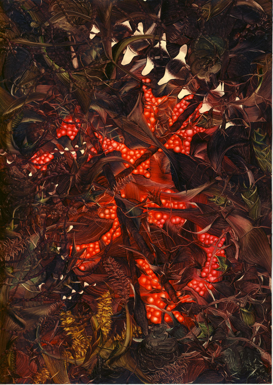
Andy Harper, Untitled, 2009, oil on paper

Andy Harper, Untitled, 2009, oil on paper

The first thing that caught my eye was Andy Harper's small oil painting on paper. I don't think this was on regular paper, but rather some glossy-coated kind, or maybe even that Yupo stuff. Maybe Andy just gessoed the paper very smooth. I say this because he's taken advantage of the apparent detail you can get just by brushing oil paints on a non-absorbent ground -- the wealth of striations, wibbles, wobbles, and shades of opacity that magically appear from smearing oil around. Looking closely you can see the kind of overgrown garden he's painted here is really an abstraction built up of different brush pressures and twists and turns of the strokes. It's like Bob Ross on steroids. Or maybe LSD. Personally I love the physical qualities of paint and I love to see them played with in this way, so not only did I find the painting striking from a distance -- its contrast of tones and hues makes it explode from the wall -- but also worth looking at up close.

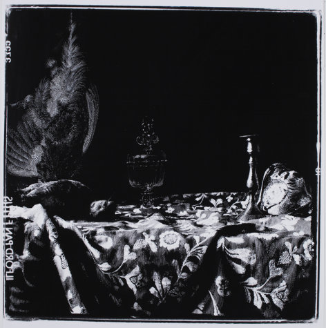
Sebastiaan Bremer, Game Piece with Glass and Shell, 2009, inks on gelatin silver print, 19 3/4x19 3/4 inches

Sebastiaan Bremer, Game Piece with Glass and Shell, 2009, inks on gelatin silver print, 19 3/4x19 3/4 inches

Just to the left of Andy's painting is Sebastiaan Bremer's Game Piece with Glass and Shell. At first glance it looks like a photogram but the media list says it's inks on a print, so I'm guessing we can say Sebastiaan drew on a photo. Something like that. It's a pretty little still life with the velvety blacks really looking nice.

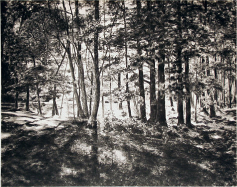
April Gornik, Forest Light, 2009, charcoal on paper, 24x30 inches

April Gornik, Forest Light, 2009, charcoal on paper, 24x30 inches

After that I worked my way clockwise around the room. I'm not sure of the exact order except that April Gornik's Forest Light was near the end of my looping trip, and a what a lovely, lyrical way to end the show for me. Her work is a large, subtle, radiant charcoal of sunlight through a stand of trees; despite its simple, everyday subject, the drawing itself is transcendent. Somehow April gets the bare paper to glow between the shadows of the trunks. I am rarely a fan of landscapes or plain nature -- I like a human figure in the vicinity, usually -- but when it's done this well, I can't help but love it.

Sid Garrison, May 15, 2009, 2009, colored pencil on paper, 28x28 inches

Sid Garrison, May 15, 2009, 2009, colored pencil on paper, 28x28 inches

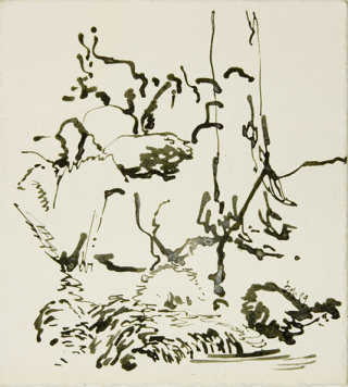
Robert Lobe, Mossy Brook 2, 2009, ink on paper, 11x10 inches

Robert Lobe, Mossy Brook 2, 2009, ink on paper, 11x10 inches

Gerard Mosse, Untitled #1, 2009, oil and graphite on vellum, 23 5/8x17 5/8 inches

Gerard Mosse, Untitled #1, 2009, oil and graphite on vellum, 23 5/8x17 5/8 inches

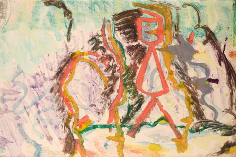
Larry Poons, Untitled, c.1992, monotype, 15x22 1/4 inches

Larry Poons, Untitled, c.1992, monotype, 15x22 1/4 inches

Nothing else in my walk around the very crowded gallery struck me the way April's or Andy's did, but there are many fine pieces. Sid Garrison has a pretty blue drawing in colored pencil, where he's worked over the pigments to a waxy sheen, almost like encaustics. Robert Lobe has a nice little ink, abstractish but with the sense of something representative underneath -- it sort of looks as if he painted in only the darkest shades of a scene, but I can't quite make out the full image from the parts. It's neat, though. (He seems to have done a series of New Jersey Meadowlands drawings, which I mention since I live right next door to them.) Gerard Mosse's painting -- even though it's on vellum and therefore maybe technically a drawing -- has a luminescence which is quite striking, and some of the same oil-on-a-smooth-surface effect as Andy's painting. And Larry Poons is represented by a decent, small monotype in the project room. It's not spectacular, but it's good.

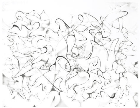
Valerie Giles, Untitled, 2008, graphite, colored pencil and gouache on tinted paper, 7 3/4x9 3/4 inches

Valerie Giles, Untitled, 2008, graphite, colored pencil and gouache on tinted paper, 7 3/4x9 3/4 inches

I'm also partial to Valerie Giles' good-sized drawing. Her swoops and lines, with their calligraphic changes of thickness, and the grace and power of her drawing remind me of...well, of me. Her strong, solid lines are layered over a lighter level of shaded curves and the whole thing almost, but not quite, coheres into something recognizable. Instead it just vibrates there in its jazzy way.

As I wrote above, there's nothing really bad in this show. There were a few pieces I didn't care for, that didn't push my buttons, but overall the quality on display is very high. For a collection of this many artists that's impressive, especially in Chelsea. I'm almost surprised anyone could get together 40 contemporary artists without there being a pile of construction debris or a video with slowed down sound or something. There's hope for us yet.

See all the reviews from this date, go to the previous review from this date, or go to the next review from this date.

January 7, 2010: Alessio Delfino

| No Comments

Alessio Delfino, Metamorphoseis, 2009

Alessio Delfino, Metamorphoseis, 2009

Meanwhile across the hall from McKenzie Fine Art is Kips Gallery. I've seen a couple of things there that were okay but I didn't write them up for one reason or another. Mostly I go in because they're directly across the way from Valerie's gallery and if I'm there I might as well. This time, too, I saw that the show involved nudity, so I figured I could stop in.

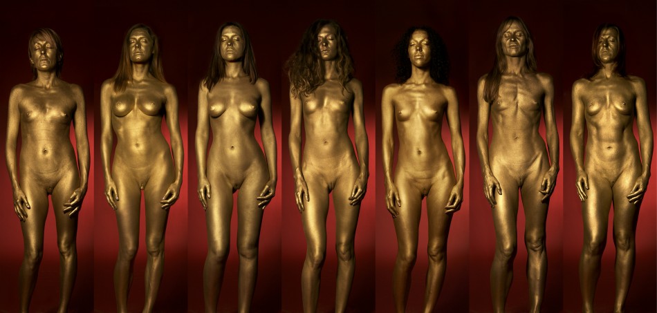
The show is Alessio Delfino's Metamorphoseis. The gallery verbiage on this is not to be believed -- it's almost a conceptual piece in itself, some kind of dada satire: "The grandeur of Alessio Delfino’s Metamorphoseis -- a synthesis of photography and video in the purest sense -- comes from a perspective on fashion fused with an acute awareness of both fine art and history.... Metamorphoseis is a work of art that deserves serious attention, not only on the level of being a spectacle (which, in a sense, it is), but also on two other irreconcilable issues, namely connoisseurship and representation."

Wowie zowie, sounds just incredible, don't it? The purest synthesis of photography and video? Connoisseurship? Representation? Bow down before my works, ye mighty, and despair!

Or not. What it actually turns out to be is, as usual, an excuse for a photographer to get women out of their clothes. Which is fine as long as one is honest about the enterprise. Alessio talked a number of women into getting naked, being painted gold, and standing in the same pose. Then he took their photos and printed them out all the same size -- nearly life size -- and put them all in a row on the wall. On the other wall he's got a video of the women, also all in a row, all morphing into one another via the very cutting edge of 1991 video technology.

The excitement in the gallery is palpable. Oh, wait, no, I meant boredom. Someone had burned about a metric buttload of incense in the room, too, I guess in an attempt to induce a boudoir atmosphere or something. Plan failed.

Let's quote the verbiage (by Robert C. Morgan) again: "Delfino has done the research. In selecting his 'models,' he decided not to go for professionals but to choose everyday ordinary people. In making his selection, he would converse with each woman in order to understand her character." Funny how, although he supposedly chose ordinary women, all of them ended up being approximately the same size, shape, and ethnicity -- the same approximate size, shape, and ethnicity of anyone on the cover of Vogue or W (or Maxim, for that matter). Why is it whenever a photographer starts going on about the beauty of Woman and the cultural importance of femininity, they always seem to end up with the same kind of models the fashion industry pushes as sex objects?

More verbiage: "He would then try and compare the women with one of the Athenian goddesses. He aspiration [oh god, sic] was less concerned with expressing erotic qualities than in emphasizing the concept of natural beauty over the mediated notion of instantaneous glamour." Natural beauty, right. Which explains why none of the women have body hair and at least two of them have obvious breast implants. Also, apparently Athenian goddesses over 35 need not apply.

The show, in case my tone hasn't made it clear, is a complete waste of time, and that's even though it only takes about eight seconds to take in the whole thing. Investing that eight seconds in almost any other activity -- including staring off into space in the empty hallway -- would be wiser.

See all the reviews from this date, go to the previous review from this date, or go to the next review from this date.

James Lecce, Meltaway, 2008, acrylic polymer emulsion on panel, 42x24 inches

James Lecce, Meltaway, 2008, acrylic polymer emulsion on panel, 42x24 inches

After working my way through Piri's suggestions it was time for my own. I started where I often start, at McKenzie Fine Art, where Valerie McKenzie had put together the group show Mostly Monochrome (until February 6, 2010). Unlike Winter White, this show involves more than one color, but only one color per artwork. Approximately.

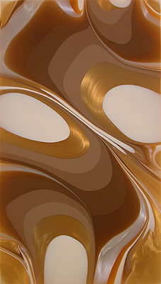
It's not the strongest group show Valerie's put together. There are some good pieces here, but some I'd just as soon skip. On the good side there's James Lecce, whose show in 2006 I really liked. I also saw his next show, last year I think it was, and I liked that also, but I guess I forgot to write it up. His piece in this show, Meltaway, may be one of the ones from his last show. He's been using metallic paints, glittery stuff which doesn't reproduce too exactly, but which looks great. I still love his swirls of color and the way they flow across the surface. The varying tones blend optically while never blending physically. And you can't see it in the JPEG but there's a wealth of striations in each seemingly homogeneous layer which give the whole painting a vibrancy only enhanced by the shimmering metal flake. As far as I'm concerned, James can keep doing these forever.

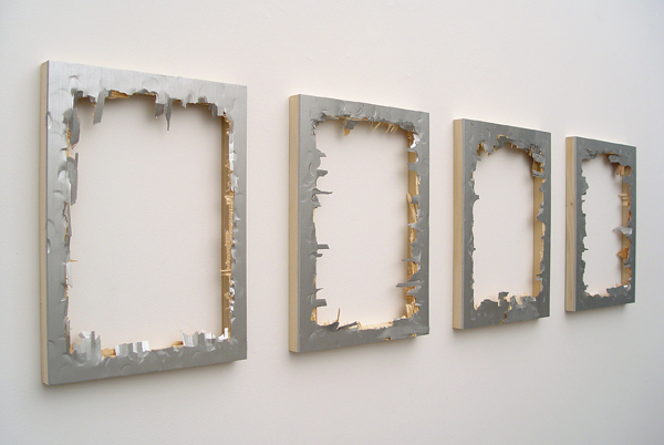
Matthew Deleget, They Don't Love You, Like I Love You, 2009, silver monochromes, iridescent silver acrylic paint on 4 panels, hit with a hammer, 16x60 inches

Matthew Deleget, They Don't Love You, Like I Love You, 2009, silver monochromes, iridescent silver acrylic paint on 4 panels, hit with a hammer, 16x60 inches

On the bad side, on the wall facing James' painting, is Matthew Deleget's They Don't Love You, Like I Love You, which includes "hit with a hammer" in its list of media (to say nothing of the extraneous comma in the title). That pretty much sums it up: Four wooden panels, painted silver, and smashed with a hammer until barely more than the cradles are left. If he'd gone ahead and finished off those we'd all be happier. Everybody say yeah yeah yeah!

Bill Thompson, KK2, 2007, acrylic and urethane on polyurethane block, 11 1/4x9x4 inches

Bill Thompson, KK2, 2007, acrylic and urethane on polyurethane block, 11 1/4x9x4 inches

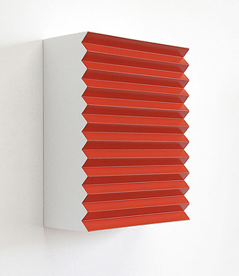
Aside from James, I rather liked Bill Thompson's two pieces, KK2 and KK3. They struck me as kind of Donald Judd-like, although far more playful than Judd would ever be. Which is to say very slightly whimsical. There's not a lot to them but that's part of their charm. I'm taken in by their simplicity and smoothness, how solid they seem to be hanging there on the wall.

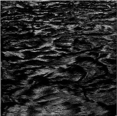
Karen Gunderson, Churning Sea, A Moment Later, 2009, oil on board, 24x24 inches

Karen Gunderson, Churning Sea, A Moment Later, 2009, oil on board, 24x24 inches

I also found myself peering into Karen Gunderson's Churning Sea, A Moment Later. The JPEG here doesn't even come close to reproducing this accurately -- I have a feeling Valerie's photographer (who I've sometimes seen at work in the gallery) had a conniption over this one. The painting is entirely black, the waves being made up of brushstrokes. You can only see them as the light bounces off in different directions. The photo makes it look as if the painting contains shades of gray, which it does not. Is it a bit gimmicky? Yes it is. Does it work? Yes it does.

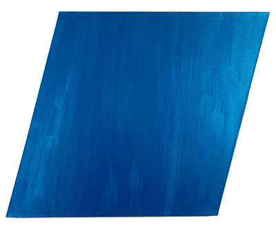
Li Trincere, Montauk 1, 2007-8, acrylic on canvas, 36x36 inches

Li Trincere, Montauk 1, 2007-8, acrylic on canvas, 36x36 inches

Honorable Mention for Painting Like Ken Noland goes to Li Trincere for Montauk 1, a shaped canvas, albeit not as aggressively shaped as Noland's, painted with metal flake also, giving it a nice flip-flop character I'm sure Noland also experimented with. The color Li chose for this one is lovely and jewel-like and the rhombus canvas sets it off nicely.

Everything else in the show is better than the "hit with hammer" one but not up to what I've mentioned here. On balance, worth a visit, as usual.

See all the reviews from this date, go to the previous review from this date, or go to the next review from this date.

Piri's final recommendation to me was a group show of new work at Tria Gallery titled Winter White (until January 21, 2010). I hustled up to 25th Street and made it in before Carol Suchman, one of the gallery principals, could close up shop.

I have to admit that the show's genesis puts me on my guard: The gallery verbiage says "Tria challenged eight artists to come up with their own interpretation of the expression 'winter white.'" The artificiality of this bothers me for some reason. On the other hand, sometimes constraints, even artificial ones, can coax better work out of an artist. I don't know any of the artists in the show so I can't say, but I did like the work.

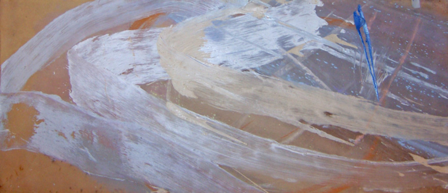
Francine Tint, dream life of angels, 2009, acrylic on canvas, 30x78 inches

Francine Tint, dream life of angels, 2009, acrylic on canvas, 30x78 inches

If I absolutely had to choose the best in the show, I might go with Francine Tint's painting. It's a beautiful and subdued Abstract Expressionist piece, all nearly monochrome and warm beige except for a splashy stab of blue. It's mutely eloquent, the way good Abstract Expressionism can be, without being overwhelming. The tight range of values holds the whole thing together and the width is just enough to encompass your field of view and hold you there. It's equal parts restraint and abandon -- close hues slapped on wildly -- and it works.

Another candidate for best would be Serena Bocchino's painting. Alas, I have no image to share with you since the gallery has so far been unable to get a good photo of it. It is, after all, white. You can see from Serena's site the kind of work she does -- a sort of constricted Jackson Pollock drip, more calligraphic, less wild. Her other work looks to me as if it might be in danger of being too twee, but working white on white cuts her back in a good way. Not only is her paint more tightly wound than Pollock's, it's shinier, too, lying on the surface like a piece of polished plastic.

Carol gave me one of Serena's digital cards, a credit card-sized thing with a flip-out USB plug. At home I got to plug it in and watch a short video, music by Pat Metheny, which is basically a slideshow of Serena's work, although the introduction is a clip of her painting, canvas out on the floor, dripping away like old Jack. Only barefoot. This seems to me like a great way to promote artwork. It's extremely groovy.

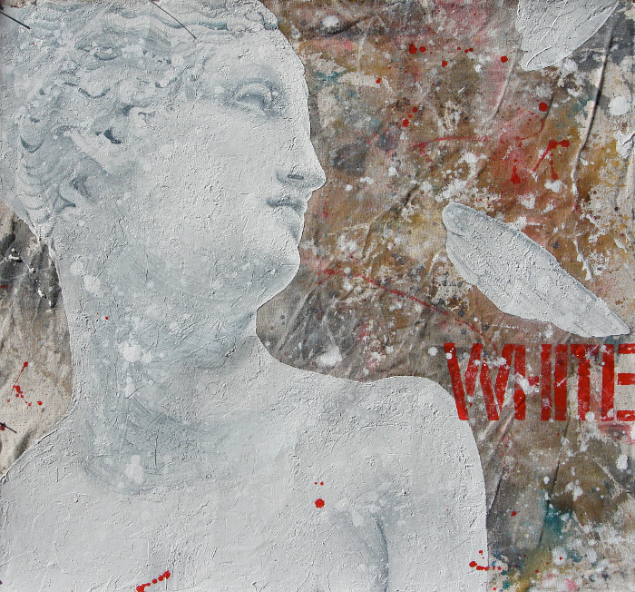
Michela Martello, White, 2009, mixed media on canvas, 27x29 inches

Michela Martello, White, 2009, mixed media on canvas, 27x29 inches

Close on the heels of those two I'd put Michela Martello. I liked her White, shown here, despite its use of a word. I'm not a big fan of words in paintings. That "WHITE" isn't white at all is kind of funny, though, like one of those perception tests you can take online. The surface of this painting is nicely chunky, very lively, contrasting with the stillness of the subject and the chilliness of the color scheme.

Andrew Millner, Winter White, 2009, inkjet print, 47x73 inches

Andrew Millner, Winter White, 2009, inkjet print, 47x73 inches

The rest of the work in the show is good, also. The only exception for me is the inkjet print submitted by Andrew Millner. Apparently what Andrew does is work out these digital compositions and then print them. The result looks decidedly computer generated, like fractal-based wireframe landscapes in the early 1990s. About the only thing going for it, in fact, is that it fits in perfectly with the latest trend in art as reported by Joanne Mattera, which is trees.

See all the reviews from this date, go to the previous review from this date, or go to the next review from this date.

Helen Frankenthaler, High Spirits, 1988, acrylic on canvas, 65 3/4x98 3/8 inches

Helen Frankenthaler, High Spirits, 1988, acrylic on canvas, 65 3/4x98 3/8 inches

Having exhausted myself amidst the crenellations and battlements of uptown I headed downtown to Chelsea to catch Piri's other two recommendations before the galleries closed and the openings opened. I went as directly as possible to Ameringer McEnery Yohe (and isn't that a crowd) to see Helen Frankenthaler (until January 23, 2010). It does seem a little odd for me to pay this much attention to established older artists, but at least it gives you, my wonderful readers, a chance to see what I think about a wider range of work.

I'm no expert on color field painters so I'm not really familiar with Helen Frankenthaler's work. In the conversational circles I travel it's impossible not to know who she is -- she's one of the few women you hear about from the days of High Modernism -- but her work doesn't get pulled out of storage as often as, say, Jasper Johns or Jackson Pollock. In fact I'm not sure if I've ever seen one of her paintings. Maybe if they had one up at MoMA once. Her breakthrough hit, Mountains and Sea, is frequently cited as the painting that launched a thousand paintings -- the story is Morris Louis and Ken Noland formulated their color field work after seeing it in New York -- but I don't think I've ever seen it in person.

The show at Ameringer is of work thirty years past that breakthrough moment -- all from the 1980s -- and it still finds Helen doing much the same thing: Staining rectangular canvas with her acrylics. It seems to be enough, although in these paintings she also blobs on thicker passages, contrasting nicely with the thin washes.

As with the Noland show I'd just seen, I didn't feel that any of these were great works of art, but again, compared to work like Richter's, they're masterpieces of probing intelligence. None of these paintings feels unstudied, hurried, or thoughtless. Each one expresses a great deal of decision-making, from the color choices to the compositions. All of Helen's considerable experience with picture-making is evident in each painting.

That said, nothing here looks really necessary, either. Especially not the rather unfortunate three-piece bronze screen, which looks as if it went through a garbage compactor before being left out in the rain for twenty years. A couple of smaller studies on paper don't help. This is probably a lesser showing from the artist.

Still, a lesser show from Helen Frankenthaler beats the best a lot of contemporary artists can muster.

See all the reviews from this date, go to the previous review from this date, or see the next review from this date.

January 7, 2010: Ken Noland

| 9 Comments

I'm going to try something a little different with the shows I saw last Thursday: I'm going to break them out into separate entries. The last slog I wrote up ran very long and having all the shows together like that seemed a bit too much. What I'm going to do is write up separate entries and have them connected by a tag and also add in links to the next entry in the night. We'll see how it goes.

Kenneth Noland, Rutilant, 1982, acrylic on canvas, 74.2x25.2 inches

Kenneth Noland, Rutilant, 1982, acrylic on canvas, 74.2x25.2 inches

I started bright and early in the late afternoon. The late afternoon isn't bright and early, of course, but it is when you're talking about gallery openings, which traditionally start at six o'clock. The trick is, if you want to see shows that have already opened and also attend some openings, you have to go in early enough before the galleries close -- traditionally at six o'clock -- while planning your trip to end in Chelsea when the openings have started. Because you don't want to have to find something to do in Chelsea while you wait for the openings to start. Aside from art galleries and the 24-hour taxicab car wash there's not much to do.

The wonderful Piri Halasz had recommended I see Ken Noland's show at Leslie Feely uptown (until January 15, 2010). Ken's been mentioned a lot lately since he just passed away after a career in art spanning five decades, which is a lot to talk about. His work at Leslie Feely is from a very narrow slice of that -- 1981 and '82 -- but it coincidentally happened to be up, so it was worth going to.

I walked along East 68th Street from the subway station at Lexington musing over the buildings lining the sidewalks. I don't know much about architecture but I'd say most of them date from the early 20th century, great big piles of gray stone for the captains of industry of the day, all huge curving windows and cast iron, polished brass and terracotta decoration. Most of them have been converted into one-floor apartments or offices, but a few seem as if they might still be single dwellings for the wealthy of today. As I walked, lost in thought about these lovely old houses, wondering who lives in them now and what the block looked like when they were new, I came upon one of those quintessential New York discontinuities, a modernist steel-framed glass curtain wall. It knocked me out of my reverie, which was good, because I'd arrived at the gallery.

Upstairs I found the gallery somewhat cramped -- the ceilings felt low to me -- and a little more dimly lit than I'd like. One of Ken's shaped paintings greets you as soon as you step from the elevator; the rest are arranged around the two main spaces of the gallery. There are twelve on the show's Website. I thought there might be more in the show itself but maybe not. I didn't count them.

All of the work in this show is from Ken's period of shaped canvases. Of course he's better known for his targets -- concentric rings of color centered on the canvas -- but he spent many years going in other directions, most of them concentrating on color relationships and minimizing everything else. These paintings are all what I'd call extremely shaped: He's bent the canvas around many sharp angles, both obtuse and acute, resulting in a series of tall, narrow paintings with anywhere from six to eight edges. Each one appears to balance on a point, like a shard of stone in a megalith. Narrow stripes follow two or more of the edges on a field of solid color.

My feeling is that the paintings are too constricted. I think Ken was trying to channel his sense of color through a bottleneck. In some cases the canvas is even shaped into a narrow isthmus. Instead of the color giving the impression that it's flowing across the surface to fetch up against the stripes on the sides, it feels like the stripes are lying on top of a small band. The colors have no room to breathe and thus have no real relation to one another; they don't seem to be in the same space. Ken is known for his color sense but in these paintings I think it got overwhelmed by the support.

For me, the actual shape of the canvases became the focal point. The shapes are so forced and unnatural, and so tightly bound visually, that they squeeze out any interest in the painting as an abstraction. I found myself more interested in the flaws of the presentation, something I feel certain Ken didn't want. Linen canvas always comes with these little knots in parts of the weave where the thread, for whatever reason, is thicker than elsewhere. These knots stand out in great relief from the otherwise flawlessly flat color. Also, some of the shapes are so torturous for the canvas -- when you stretch fabric around such tight angles you're attempting to force a flat shape on something that simply can't lie that flat -- waves were left in the surface. I'm sure these annoyed the hell out of the artist and he did his best to eliminate them -- I can imagine him pulling harder and harder on those canvas pliers -- but I ended up fixating on them instead of the color.

I also felt that the color combinations were dated to the 1980s. It may be because, as Piri suggested in her 1969 article on Noland, graphic designers pick up on color combinations from fine artists. Or it may be Ken was infected by Reagan and Huey Lewis. Whatever the case -- and it may be unfair of me to think this -- the colors in this show remind me strongly of the '80s, and while I liked them well enough when I was living through them, looking back I see them as a period of great cultural shallowness. These paintings fit in a little too well.

Which is not to say they're actively bad. Piri recommended this show to me, not just because Ken's name is going around in obituaries, but also, I think, because she's hoping for more positive-sounding reviews from me. She wants me to turn people on to art that's worth seeing, as opposed to, for example, Gerhard Richter.

Comparing Richter's most recent show to Noland's is actually worthwhile. I didn't find anything in Ken's show that really excited me, nothing I thought was truly great; but at no point did I feel I was looking at the products of an assembly line. The difference between Noland and Richter is visually clear: Ken's is the result of restless intelligence and exploration, while Richter's is just another widget off the conveyor belt. As similar as the shaped canvases are to one another, they don't give the impression of an artist running through a series of pre-ordained steps. The decisions of the painter are all there on the canvas. Next to the work of someone like Richter, these are masterpieces.

On their own, however, they show what can happen when this kind of chilly abstraction isn't quite right. With nothing to hang on to beyond the fields of color and the relationships between them, when they don't come together, the result is somewhat tepid. The life has been squeezed out of them in the shaping of the support.

See all the reviews from this date or go to the next review from this date.

More Recent Stupidities

| 23 Comments

DUNCE

DUH

I went to a number of openings and some shows Thursday night and I'll be writing the reviews up shortly. In the meantime, however, there have been a couple of recent stupidities that bear mentioning.

Jerry Saltz, a writer I admire who has always been nice to me when we've met, who even visited my studio when I was at the School of Visual Arts Summer Residency and said nice things about my work, nevertheless does say dumb things from time to time. He hasn't always been this bad, though -- I think something at New York magazine is getting into his head or something. I post this, then, with genuine fondness and care.

When you hear the name Orozco perhaps you, like me, immediately think of Mexican socialist murals. Unfortunately Orozco is a fairly common Mexican surname and you're thinking of José Clemente Orozco. But chances are, these days, the Orozco being mentioned is Gabriel Orozco, who is one of those artists who basically throws half-digested junk around a room and calls it art. What's he known for? Removing the middle third of a car and putting the remaining pieces back together. I'd be impressed if he could make the result operational, but no -- he's not an engineer or a mechanic, he's just a bozo with a saw. Another masterpiece: Nailing four yogurt container lids to the walls of an otherwise empty gallery.

All of which is stupid enough. But the real dumb part is Jerry's hilariously overbaked praise for this halfwit: Yogurt Caps is "one of the most vexing artworks of the past two decades. Somehow Yogurt Caps transforms the gallery into something both more and less visible. The space becomes about emptiness and fullness, caring and not caring, the drained and the charged, passivity, portals, pissing people off, location, dislocation, irony, sincerity."

Holy shit! All that from four yogurt caps? What happened when Jerry saw Tara Donovan's stacked cups, did his testicles explode? Yogurt Caps may very well be one of the most vexing artworks of the past two decades -- hell, I'll go with centuries -- if you happen to be the kind of person who's vexed by pretentious assholes giving the finger to thousands of years of visual artists who actually put some work into it.

But Jerry's real low point comes a few sentences earlier when he emits this burst of flatulence: "An empty shoe box just sits there, like Duchamp’s urinal but more casual -- still confounding viewers, transcending itself restlessly." Transcending itself? It's a fucking shoe box, Jerry.

Perhaps my stupidity round-ups should have categories. One might be "Artists Who Make Other Artists Ashamed To Be Called Artists". Today's nominee: Man Bartlett and his so-called art performance piece 24h Best non-Buy. Note that the piece is also a Twitter feed, showing that Man is one hip, edgy artist right out there on the bleeding edge of participatory performance. You know, him and eight zillion other people. Anyway. The piece consists of Man Bartlett, visionary, shopping for 24 hours in a Best Buy. But here's the catch: He never buys anything! Fucking brilliant.

Hrag, of course, loves it. Because, really, nothing says ART like an unshaven dweeb in a fur hat aimlessly wandering around a place of business. He should've worn a sign: "Warning: This is what happens when someone with no discernible talent decides to be an artist."

It's not so much that I don't consider performance art to be a real art form. I mean, I don't, but that's beside the point. It just seems to me if you're going to waste your time on something like this, at least attempt to make it interesting. Alain Robert's provocations are equally silly and pointless, but at least they're exciting and a wonderful exhibition of skill. Guys like Alain are great to have around. They keep the world turning a little off-kilter.

But guys like Man Bartlett? Give him a blue shirt and a name tag and let him work for a living.

America at the Roadside

| 33 Comments

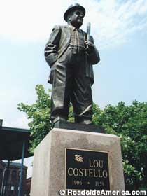
Lou Costello memorial statue in Paterson, NJ

This blog is ostensibly about fine art and I try to keep it on that topic as much as possible. But I do make occasional forays into other areas, as all three dedicated readers have certainly observed, and I intend to do so again now.

When it comes to fine art, to art that proposes to place itself with the greats of the past -- Rousseau, Van Gogh, Leonardo and Titian -- I'm very hard to please. So were they. That's part of how they got there, by demanding the very best of themselves and the art they looked at.

But when it comes to other things, less pretentious things, I'm not so hard to please at all. In fact I'm like a kid. And one thing I simply enjoy is weird stuff. You know what I mean: The kind of thing where somebody decides to collect garden gnomes and display them all in their front yard. Or some bored automotive welder sculpts a robot-like man out of exhaust pipes.

It seems to me to be a peculiarly American trait to have a vision and see it implemented, whether that vision is intermittent wiper blade motors or wiry towers of scrap rebar. I have a soft spot in my heart for those endeavors, the little invention that could or the crazy structure. I love the idea of people who just forge ahead with whatever's in their head whether it makes sense or not.

It may be because of Mr. Trombino. He lived down the street from me when I was growing up in Staten Island, New York. I found out years later that he was a retired shop teacher; he'd retired before I was born. I met him when using his yard as a path from an empty lot to my best friend's house. My friend's house, like most of the houses in the neighborhood, was set close to the sidewalk with a small front yard and a large back yard. But Mr. Trombino and his wife lived in the old carriage house that served the estate which was eventually broken up and sold into lots. So his house was a small set of rooms attached to an enormous barn set all the way at the back of the property. Mrs. Trombino was in charge of gardening beds of flowers in the yard and Mr. Trombino spent his days coming up with things he wanted to make and making them.

When I first met him his line was in fish mobiles. He'd make these large fanciful wooden fish, maybe three feet long, maybe ten, or anywhere in between, out of wood. He'd paint them or varnish them or whatever looked good at the time, find the point at which he wanted to balance them, and hang them from the trees in his vast front yard. As they decayed in the weather he'd take them down.

He was always restlessly working on something. When I'd come by to visit he'd show me what he was doing and some days he'd have something in a box by the door for me. He gave me my first book of Arthur C. Clarke short stories and my first book of Robert Heinlein short stories. He gave me a tetrahedral puzzle. Once he handed me a transistor taped to a card, and he explained to me what it did.

Over the years I'd stop by and see what he was doing every so often. The last time I spoke to him he had built a skeletal framework, painted it pink, and hung various things from it, including a bowling ball. I remember saying it must've been tough to drill a hole in a bowling ball but he said it wasn't, you just needed to go slow.

He died a few years ago. My parents finally moved out of the neighborhood, so I don't know if Mrs. Trombino is still there. The Trombinos are the kind of neighborhood treasure that passes unremarked, remembered only by those who knew them. There won't be a monument to Mr. Trombino; his works haven't been preserved; I wish I could go back and pay more attention this time, but that's life.

So I have a soft spot in my heart for people across this great land of ours who see something lacking in the world around them and go ahead to create it. The World's Largest Ball of Twine. Mount Rushmore. Muffler Men (and men made of mufflers).

I would never demean these people by calling them artists. That would be an insult to their intentions. They don't desire fame or money, power or influence. All they want is to do what they want to do. They are what makes this country great.

And now you too can find them, and many other things besides, thanks to the fine folks at Roadside America. Yes, we've reached the shameless plug section of the article. But I'm plugging shamelessly for the app developer, Joe D'Andrea, because he's really a great guy and a good friend, and his app is bound to be excellent. (Also you should check out Joe's band Broadside Electric, whose site is the best use of Dover Clip Art since Saul Chernick.)

Joe developed Roadside America for iPhone, an app which allows you to easily look for interesting, offbeat attractions near your location. I'll never use it because I never travel anywhere, but I can see how it'd be useful. Hop in your RV and wander the highways and byways of these United States and never grow bored. I mean, the Oasis Bordello Museum in Idaho? The Broken Angel House in Brooklyn? A 33-foot Virgin Mary in Ohio? All there!

You won't find Mr. Trombino on that app, but you can find his spiritual successors. Tell them you love them.

Pages

OpenID accepted here Learn more about OpenID
Powered by Movable Type 5.2.7