Cold weather pounced on New York City last week, making it good weather for walking but notso hotso for being indoors; or rather too hotso, since all the buildings have the heat cranked up to about 95 degrees. Joe Rosato claims it's just everyone's way of saying "Screw you!" to Nature -- if Nature's going to make it that cold out, then I'm going to make it really goddamn hot inside!
That's okay, though, because last Thursday you were better off wandering aimlessly outside looking for a coffee than you were entering Chelsea galleries and looking around. It was a staggeringly lame night for the opening shows.
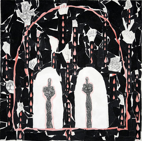
I don't remember what order I staggered in so I'm going to go in no particular order, although I'll save the best for last. My gallery postcard pile has Trenton Doyle Hancock on top, so I'll talk about his show, titled Fear, at James Cohan.
I fear it was very bad.
Get it?
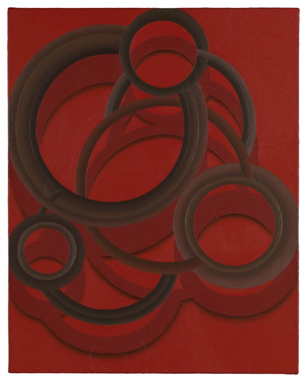
Trenton Doyle Hancock, A Tippy Head Run, 2008, acrylic and mixed media on canvas, 60x60 inches
No, seriously, it wasn't really totally completely awful, it was just lame, in the entirely accurate sense of the word: This is a show barely limping around, dragging one misshapen leg behind it, collapsing in exhaustion every so often, and reaching weakly for the crutch across the room. It's feeble, a mish-mash of graffiti and 1930s animation and cartooning tropes, like warmed-over late period Philip Guston, combined with a pathetically limp color scheme and a total lack of draftsmanship. It goes nowhere, does nothing, and looks like crap. The only halfway decent thing about the show is Trenton's painted all the gallery walls with black-on-white raindrop shapes, giving the rooms a neat atmosphere. It probably would've been better, however, to have left all the paintings in a dumpster somewhere and the walls blank white. Titanium dioxide, all by itself, is more interesting than this show.
Next in my pile is Collector's Eye at Gana Art, which took over the space from some museum-type organization thing that never showed anything I wanted to look at. New owners, same result: Two floors of junk. Whatever collector's eye is the basis for this show is blind -- but wealthy. The show consists of one floor of dusty old relics from Cindy Sherman, Roy Lichtenstein, Frank Stella, Damien Hirst, Tom Wesselmann, Anthony Caro, Cy Twombly, and a few others. Upstairs is given over to some Korean or Korean-American artists who won some kind of contest or other. I think. The gallery Website is in Korean and all I know how to say in Korean is "Please don't eat me."
Whether or not you like the slew of well-known artists, these particular works are most likely the ones you don't like. Anthony Caro gets high marks from people whose opinions I respect, but the tiny (I almost tripped over it) Caro bronze here is forgettable. I couldn't even find the Cindy Sherman piece, unless it was the utterly pointless black and white photo. Lichtenstein's a hack and Wesselmann, well, I have liked his work before, even prints, but this one is beyond me. Miró is represented by a lumpy rock exhibiting none of his usual airiness. You might accidentally overlook Stella's work, and a Stella you can overlook is a rare thing indeed. I didn't see Hirst's work in the show, I don't think, which is a blessing, since if they managed to find a bad Miró, can you imagine what a bad Hirst would look like? Probably like the climactic scene in "Raiders of the Lost Ark."
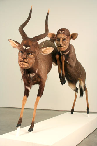
So, having narrowly missed having our faces melted off, let's see what's next in my pile. I have here Kate Clark's Perfect Strangers at Claire Oliver.
Kate Clark, The Map is Not the Territory, mixed media sculpture (organic & synthetic materials), 59 x 90 x 30 inches
Kate Clark should get together with Hyungkoo Lee. I think they'd make a fine pair of obsessives: He could build skeletons and she could wrap skin around them and maybe, just maybe, they'd leave the rest of us out of it. The main difference between them, though, is I think Hyungkoo wants us to laugh, or at least chuckle, while Kate, I imagine, wants us to be disturbed.
I expected, in fact, to be disturbed by her work. But somehow it failed to disturb me or, really, interest me all that much. The most interesting thing about her sculptures is wondering how they're made. I think what she does is take a taxidermy specimen and take apart the animal's head. Then she rebuilds the skin of the head into a human-like head. The final result is a very realistic-looking animal with a very realistic-looking human face. The faces she builds are excellently made and nearly look alive, especially with the ceramic (or plastic, I guess) eyes.
That sounds disturbing. But I found the result curiously tame. I suppose part of it is simply mass: There are very few sculptures on display. Maybe because they're hard to do and take a long time. Also, well lit in a bright gallery, maybe the figures lose some essential mystery. Maybe the gallerist at Claire Oliver should take a cue from Hyungkoo's gallery, Arario, where his works were set up in dark rooms with black walls like a real museum exhibit. Not that I thought those were great works of art or anything -- imagine that cartoon characters are real creatures, and that archaeologists and naturalists could dig up their skeletons and display them -- but the show was a triumph of exhibit design.
Whatever the reason, I was impressed by the craft of Kate's work, but not by the actual work itself.
Speaking of unimpressive work, I also stopped in the huge, fancy, well-appointed opening at Marlborough Chelsea. I usually avoid the place because they're usually showing massive Tom Otterness bronzes. I see enough of his nasty work at the 14th Street subway station as the A train doors open and close on my way to my studio. All those Rodins and a Calder destroyed in the World Trade Center but these stupid little Otternesses we still have to look at.
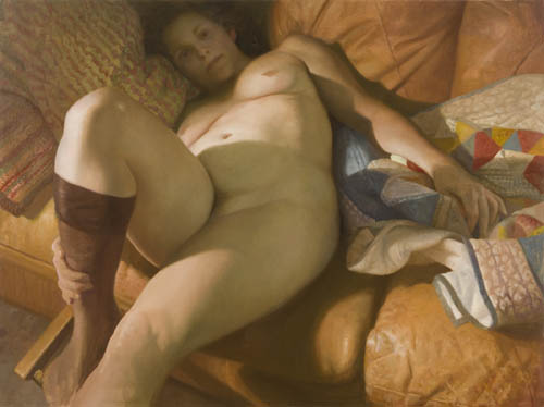
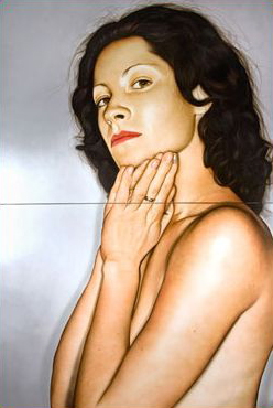
I didn't wander into an Otterness opening, though. Instead it was Vincent Desiderio. You'd think I'd like his work, since it's somewhere on the line between academic realism and Impressionism -- a sort of latter-day Manet kind of style. Vincent likes nudes; one whole wall of the gallery is taken up in a long painting of a dozen or so naked people sleeping. This large work is provocatively titled "Sleeping." He also has up a couple of big nudes, and they're nice and chubby, the way I like them.
Vincent Desiderio, Nude I, 2008, oil on linen, 49.5x67 inches
And yet I wasn't taken with the work. None of it. It's technically very accomplished, and with none of the approbation that usually implies; nothing feels especially cold or distant, stiff or mannered. Everything's nicely loose and comfortable and...um...you know, I don't know. None of it grabbed me at all. I have no idea why. Maybe I was just cranky. Maybe it's his diffuse atmosphere, like all his paintings are showing through Captain Kirk's Love Interest Soft Focus Lens. Maybe it's his academic titles -- Nude I, Lily in a Round Chair. Maybe it's the gallery. Maybe it's me. I don't know.
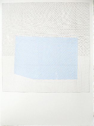
And now the best for last, although the best in this case is certainly faint praise. I stopped in to see Sara Eichner and her latest show at Sears-Peyton, Plane Equlibrium. I gave Sara a rave review two years ago. (How much of a rave I didn't remember until I saw my review printed out and displayed in a binder in the gallery.) I'm deeply sorry to say that this show was not as good as the last one.
Sara did tell me that she had some trouble settling on a new direction in her work, which is at least partly why it's been two years since her last show. I'd hate to quash her motivation at this point, but I have to be honest. Sara told me she likes the idea of showing her process, leaving it visible, as she did in these latest works; I think it detracts greatly from them.
Sara Eichner, overlapping planes-blue bricks, 2008, pencil and gouache on paper framed, 30x22 inches
It's hard to see what she's done in this image because it's too small and digitally noisy but basically she's left the scaffolding up: It seems she starts her paintings by drawing in a grid in perspective which she then uses to guide her pattern's placement, whether it's bricks or tiles or wallpaper or whatever. That's how she's always worked, but now she doesn't cover the entire surface, or erase the pencil, so the guide lines are all still visible. Now, I take it as an article of faith that a work of art isn't necessarily bad just because you can see some of how it was made. But for Sara's work it seems to take away from the sense of her building a space for the viewer to be drawn into. Rather than feeling as if I'm looking into some infinite volume, I feel as if I'm looking at an architectural rendering. And not a terribly exciting one at that.
Sara's also reduced her palette. Some of her regular colors are still in evidence, but only the quieter ones; and, more importantly, she's stopped putting two sharp colors up against each other. Where her hues vary, they're the slightest of shades apart, almost identical -- as you can see here in the JPEG, the colors are the same as far as a digital camera is concerned. The vibrancy has drained from her pigments.
Also gone is the sense of inside/outside. The last show was split between bricks and tiles from the outside walls and wallpaper from the inside; this show is almost entirely outside walls, except for a couple of wallpapers, at least one of which looks like a holdover from 2006.
Eric Fischl wrote to me after my review of his show saying he knows how hard it is to not like an artist's work and then have to change your mind about it. That's hard, but it's not nearly as hard as the opposite, where you find an artist you admire misses the mark. That's really difficult, both to see and to write about.
So I'm reluctant to criticize the show this way. Also because, looking over the work -- if I could diagnose someone from their paintings -- I'd say Sara has become depressed. And I'd hate to depress her even more. I hope, instead, that she takes my thoughts however she needs to so her art gets even better than it was; whether that means ignoring me, calling me names, or taking my words to heart isn't important. What's important is that she makes great art. Sara clearly has it in her.
Greetings from your friendly neighborhood idiot. In our last installment I mentioned how I ran into Mark Kostabi and he invited me to be in the audience for his TV show. When I'd gotten home, I'd asked my wife what I was doing tomorrow. She informed me that tomorrow was Halloween. Except I thought tomorrow was Saturday, and Halloween was on Friday.
"Today's Thursday," she said.
Uh oh. Now I couldn't remember if Mark had told me to come in on Friday or Saturday. I thought he'd said "tomorrow" but I couldn't be sure he hadn't said "Saturday" and I'd translated that to "tomorrow" because I thought "tomorrow" and "Saturday" were the same because....
I called Friday morning to check and no one answered, so I figured, okay, the TV show tapes on Saturday. I therefore stood in front of Kostabi World Saturday morning, slightly out of breath because I was hurrying to get there before noon when the taping was supposed to start. I knew I was in trouble because I'd found Kostabi World without getting lost even though I didn't bring the address with me. When one thing goes right in my world, that's a sign that something I don't know about is going wrong.
Mark answered the studio doorbell via the little speaker. I told him I was there for the TV show.
"What TV show?"
It turned out that of course when Mark had said "tomorrow" back on Thursday, he'd meant "Friday," not "Saturday," because he's a normal person. Mark was on his way out so he came down and somehow failed to mock me, but he did suggest I call him before the next taping, which will be some time in mid-November.
Now that I think about it, I probably should've written that date down.
Well, when God closes a door, he opens a window. Sometimes the window is thirty storeys up, but it's a window just the same. This time the window opened onto an impromtpu gallery slog -- I had time to wander around and see what was showing. Mark suggested Eric Fischl, whose show was just opening at Mary Boone. I didn't honestly know which way Mary Boone's gallery was -- despite having been in it more than once -- but when I left Mark slipping into a secret coded door down the block from Kostabi World I accidentally found myself near it anyway.
But first something on my side of the street caught my eye, and I found myself in Ramis Barquet looking at
Victor Rodriguez, Giant White, 2008, acrylic on canvas, diptych, total 120x78 inches
Victor Rodriguez's Crazy Diamond
where I paused for a moment in total shock. I couldn't believe what I was seeing. It simply wasn't possible that anyone was still showing this kind of work. I wondered for a moment if I'd been transported to the 1980s or into some back issue of Airbrush Action magazine. Because I was standing in front of honest to goodness no holds barred one hundred percent authentic large-scale airbrush photorealism. Really.
No, really!
One of my most treasured books, endlessly studied, pored over, examined, the book which was my personal Torah for almost twenty years, is The Airbrush Book by Seng-Gye Tombs-Curtis. The reproductions in it span the gamut of airbrush work from technical drawings through fine art, from the first airbrush portrait by an unknown artist through t-shirts worn by the Tubes. The book is full of abstruse details of photoretouching and frisket cutting, detailed schematics for the most popular models of airbrush, and cleaning instructions; and a whole middle section is devoted to examples of some of the most fantastic airbrush work ever done. I aspired to be ranked among these greats, to use my airbrush to conquer the worlds of illustration, fine art, t-shirts, album covers, and posters. I was going to be on the wall in every dorm room in the world.
And I gave up all of it for good in 1998 when I discovered oil paints.
And here it all was, resurrected, in front of me.
And it's not all it was cracked up to be.
It's not Victor Rodriguez's fault, that's for sure. For what he's doing, he's absolutely fantastic. If Photorealism is your thing, Victor is the best. His color sense is dead on, exactly to the life. His hand is assured. The result is hugely realer than reality, in your face, and it can carry you along like a great action movie. Victor evokes textures without overworking the surface; you won't mistake his work for photos and they're not microscopic examinations of his subjects, but the feel of everything is there. Skin, clothing, jewelry, fingernail polish, what have you. Glossy parted lips, minuscule eyelashes, collar seams, all of it. Guys like James Rieck should just hang it up: Victor's got the field covered.
But it's not all it's cracked up to be. I moved on to oil paints long before my feelings changed -- I honestly gave up airbrush because I realized I was never going to be that good at it and oil paints were just a lot easier to deal with (there's only so many times you can fling an airbrush across the room -- it always comes up short because of the air hose and it's very unsatisfying) -- I moved on to oil paints before my feelings changed, but my feelings have changed. Over the past couple of years, seeing a lot of art and making a lot of art, I've turned around on what art does, on what it can do. I've seen a lot of illustrations in person and I've learned that there is a definite difference between fine art and illustration. You can't get that difference from reproductions, from a story in a magazine, but it's so obviously there when you look at the originals it's shocking. And that difference has changed my feelings towards this kind of work: I'm no longer excited by it the way I used to be. It's good, it's technically proficient, it's nice enough to hang on your wall, I guess, but...but it's not all it's cracked up to be.
I'm still impressed by it, though. It's fun to see, and for me kind of nostalgic. And it does my heart good to know that the airbrush, which has mostly gone the way of slide rules, vinyl records, and 35mm still film in the wake of the digital revolution, hasn't completely died out.
I should, at this point, say something about Denis Peterson. Denis is also an airbrush artist and he's also working realistically, so it might seem I should compare his work with Victor's. But in fact the two are very different artists. Denis' work is photographic: It's possible to mistake his work for digital photos printed out on canvas. But Victor's work could never be confused with a photo. Denis is aiming for more than the reality of photography, while Victor is a true Photorealist, in that his work is only exactly as real as photography, while not actually looking like a photo. The distinction is maybe difficult to explain but it's clear in the work itself. Victor's paintings are definitely the work of a human hand but have the cold sheen of something mechanically reproduced, while Denis' work appears mechanical but somehow contains all the warmth of humanity.
My spirits thus lifted I crossed the street to Mary Boone's to see
Eric Fischl
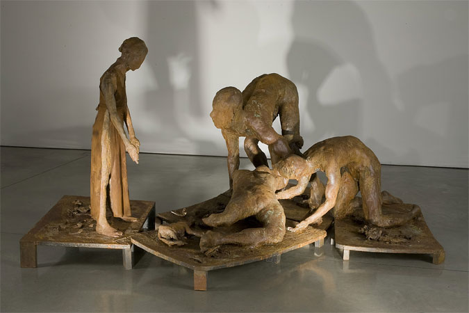
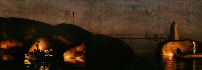
I was expecting paintings. There were no paintings in the show. Instead, the cavernous space was occupied by a few groupings of figures and some lights directed on them. If you described the sculptures to me, or if I saw photos, I don't think I would've thought much of them. They're very unfinished, entirely lacking polish in all senses of the word. Each figure is only roughly human and entirely lacking in detail -- fingers are merged, faces are only hinted, genitals are ambiguous. The figures are arranged on haphazard, crooked slabs of the same metal from which they're made, and all of it is rusty, crusted, rough.
Eric Fischl, Ten Breaths: Damage, 2007, resin, patina, and cloth, 57x93x124 inches
Yet something more powerful came through as I walked around the space. Watching the way the light played over the figures they became sad, sympathetic people. One grouping shows a woman splayed out on the ground being lifted or cradled by a couple of figures. A small child watches. One of the woman's legs trails off below the knee into a twisted wreck of corroded metal. Somehow I was moved almost to tears by a wave of pathos that swept over me. Tenderness, sorrow, pain, pity, loss -- they all radiate outward from the work.
The other groupings are less powerful but still filled with a roil of emotion. I was surprised by my feelings. I'd never associated the name of the artist with anything meaningful, but here it was. The feelings aren't embedded in the stories of the sculptures: There's no obvious narrative to them. There's so little about them that's clear and definable, I couldn't say to myself, here's a man running away from his impending death, or here's a group of people dancing in a harvest festival, or here's a soldier nursing a fallen comrade, or anything like that. In fact intellectually anything I came up with was almost immediately contradicted by something in the sculptures themselves. And yet the feelings are still there.
When I talked about the difference between art and illustration above, this is what I meant.
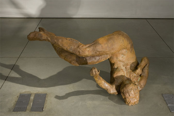
Eric Fischl, Ten Breaths: Tumbling Woman, 2007, resin, 48x48x44 inches
In the back office you can see Tumbling Woman. It's pretty obvious why viewers felt so strongly about this sculpture as a statement about September 11th: It gives off so much more feeling than can be explained by a figure of a woman rolling around on the floor. Eric Fischl may have intended it as just a study of a body in motion -- I recall reading somewhere it was originally sculpted before September 11th, 2001, and repurposed afterward -- but somehow he imbued it with something deeper and stronger, something his viewers long to connect to some more powerful current in their own lives, in our shared life. We can't say what it is or precisely how it got there, but it exists as undeniably as the material from which the figure is made. And that's the mystery of art.
If you wanted a clear contrast between art that is simply meaningful and art that intends to be meaningful but isn't, you couldn't ask for a better demonstration than the one I got by walking out of Mary Boone and into Charles Cowles next door to see
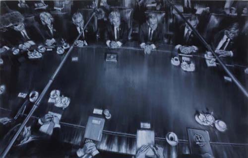
Xiaoze Xie, November 5, 2004, NYT (Bush Cabinet 2nd Term), 2008, oil on linen, 70x110.5 inches
I get it: I can see how the dealer sitting in his office going over Excel spreadsheets and examining his bottom line might be thinking, "Everyone else seems to be selling Chinese painters these days, so what I really need to do is dig up anyone with an unpronounceable name with a lot of Xs and Zs and Shs who can slap paint on canvas and get them on my walls..." And find his eyes straying over to his Gmail inbox to see one of his minions has unearthed this Asian guy -- a surefire winner! And I can see how the painter sitting in his studio with his Starbucks and the latest New York Times, staring at a blank canvas and wondering what to do, might be thinking, "I must somehow reflect the important events of my time in a way that communcates the workings of power and politics in this most chaotic of eras. I must discover a way to speak truth to power while drawing inspiration from the fabric of our daily lives..." And find his eyes drifting over to the newspaper as a little Guernica lightbulb goes off over his head and he decides to copy news photos relating to the War in Iraq. A surefire winner!
So I get how these two flows, swollen as they are by all the tiny minds trying to think big thoughts, dumb dealers who think they're smart and dopey painters who think they're deep, might come together into a show such as this. I get it, but I don't really understand it, because the paintings are just so obviously lame. They're so obviously and slavishly copied from photos, and executed in such a boring style, all brushy and out of focus with little Sargent highlights on the noses and knuckles, with Rumsfeld and Powell and Bush and soldiers in desert camo and so forth swimming out of the watery gloom and then floating off again -- I just don't see how even the stupidest of dealers, even the densest of painters, couldn't see how shallow, how worthless, how completely unnecessary this show is. A show of the original photos, a photojournalism retrospective, would be infinitely better, if only because the photos at least depict and record something; these copies, these depictions-once-removed, add nothing, but subtract everything, like context, significance, sequence and consequence. Watching an artist think about politics is like watching a dog trying to get peanut butter off the roof of its mouth.
Enough with the blue chips! I decided to head uptown to my old friends, Ed Winkleman and Lisa Schroeder and Sara Jo Romero. Ed's gallery had a bunch of people in it for some reason -- maybe a tour group had gotten lost -- so I started in Schroeder Romero where I saw...
A Sign of the Impending Apocalypse
...which is Schroeder Romero showing something I actually liked. Or anyway didn't think was completely wacky. Well, that's not entirely true. I thought it was very wacky, but entertaining.
Ahem. I didn't give credit where it's due. I walked into...
Andy Diaz Hope and Laurel Roth's Future Darwinist
Andy Diaz Hope and Laurel Roth, Future Darwinist, 2008
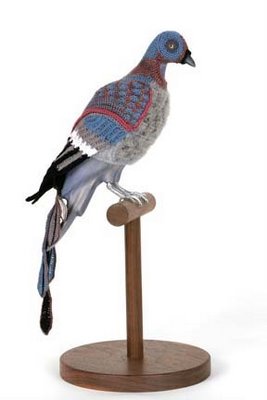
Andy and Laurel -- was it really only the two of them? -- managed to put together a rollicking show. The objects on display -- no, scratch that. The objects aren't exactly on display, they're sort of all over the room, almost but not quite as if you wandered into a storeroom somewhere. Imagine a very neat, roomy storeroom with some really strange things here and there. A number of things are on white crates with stenciling on them. Other things ranged about: Carved clear plastic animal skulls; pigeon mannequins displaying knitted outfits for birds; photo montages using pills as pixels; and a big multicolored tapestry depicting -- well, depicting a whole bunch of stuff, like a mirror of the room.
Take those knitted bird outfits: Lisa had to point out to me that they're costumes of extinct birds for city pigeons to wear. So if a pigeon is tired of being harrassed, I guess, it can dress up as a dodo (or, seen here, as a passenger pigeon) and get some respect.
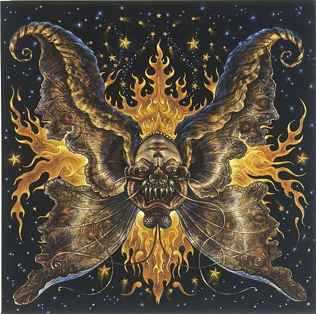
And that tapestry! Well, I like tapestries. I have one in my bedroom of a unicorn from the Franklin Mint. Really. I like the way the colors aren't blended but stepped, like old computer graphics were. And this tapestry of Andy and Laurel's is a curious mixture of old and new crafts: Lisa told me they sent an image off to a place in Europe that "prints" a digital image as a tapestry. What was on this tapestry? A very surreal scene involving bees, trees, a caduceus, sheep (presumably cloned) and a three-headed dog.
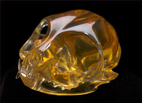
Laurel Roth, Lap of Luxury (Persian), 2007, carved industrial resin, walnut, Swarovski crystal, aluminum, 2.5x3.25x4 inches
The most impressive objects in the room, however, are Laurel's animal skulls. Most are clear plastic, but there was at least one made of wood, proving that she didn't have these molded -- no, they're carved, but so carefully and delicately, and polished so well, you wouldn't know it. Back in high school I took one of the only art classes I ever had and there was this guy who'd bring in a skull from his collection -- raccoon, squirrel, cat, dog, whatever -- and work on perfect little pointillist ink drawings of them from different angles. I thought he was insane -- not because he collected skulls (although, looking back, I guess that is a bit weird), but because of the time and patience it took to make a drawing of a skull out of tiny dots. If that was crazy, then Laurel is clearly well beyond crazy and into some other mental condition, because I can only imagine how much effort goes into her sculptures.
Less interesting are Andy's pill photomontages. Apparently there's some kind of reaction involved to our medicincal culture, or America's need to take drugs, or something. The work is visually inert and only interested me for as long as it took me to realize -- aha, Andy cuts a photo up into small slivers and slides each one into a clear pill, then arranges the pills in order to recreate the photo. Okey doke.
But that's okay, because overall the show's fun. And fun is good.
Not so good was what was going on next door. When I made my way back to Ed's gallery I found the tour group or whatever had left so I had the exhibit to myself, said exhibit being...
Jimbo Blachly and Lytle Shaw's The Genretron
Or maybe those names are hokum, too, because the whole thing purports to be a find from 19th century Holland, something to do with the Chadwick Family, which may or may not be fictional, and which....
But you know what? I really don't care. The thing in the middle of the room was hard to crawl into and once I did, it wasn't worth it, unless you like dioramas a dull second grader would be ashamed to hand in to their teacher. Stand outside a group home on heavy trash day and you're likely to see material more artfully arranged.
Judging by this and the hallway show -- which consisted of purposely unreadable postmodernist jargon wall text next to stickers reading "Item temporarily removed" over and over -- Ed's looking to become the Henny Youngman of art dealers. Why anyone would want to become the Henny Youngman of art dealers is beyond me, but, hey, whatever skins your banana.
From there I decided to go back downtown a couple of blocks to my favorite street in Chelsea, 25th. I started at Dillon Gallery which was showing...
Per Fronth, Bridge/Teenage Lux (archipelago), mixed media/oil on canvas, 184x65 inches
It's a rare thing to see paintings which appear to be disintegrating before your very eyes, but Per Fronth has managed to create just that. I'm not sure what he thinks he's doing, but what it looks like he's done is recreate all the bad parts of J.M.W. Turner without too much of the good parts. Stand back from one of Per's paintings and you might like the subtle luminosity of his paint, or the compositions he achieves with sweeping passages of pigments. Move just a little closer, however, and you'll see the paint, which has been thinned to the point of watercolor and laid on in a very thin glaze, slowly oozing down the surface, alligatoring and crackling as it goes. The whole painting is actually working its way south at different rates; I expect if the works were left in one spot for a year, you'd come back to find a puddle of gray grease and a clean canvas.
A painting like the one I've pictured here, Bridge/Teenage Lux (archipelago), perfectly illustrates what's going on in all the works in this show: First you've got a heroically-sized panel (a little over 15 feet wide) with a fantastically overwrought -- one might say pretentious -- title; then you've got the canvas positively slathered with paint; you can see the several areas across the top where the paint is falling off; and you've got some lovely illumination effects. That's what made me think of Turner -- beautiful light, collapsing structure. Not really the best combination.
Upstairs in the same building is PPOW Gallery wherein I saw one of the last days of...
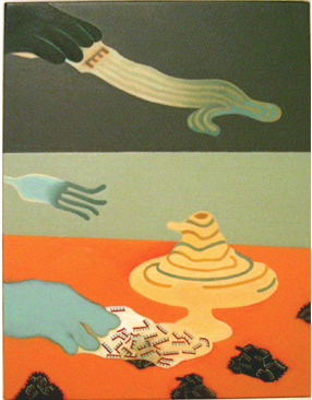
Thomas Woodruff, Venus: The Object of Affection/The Demon of Lust, 2007-2008, acrylic on black silk velvet with motor, 40x40 inches
Thomas Woodruff's Solar System (The Turning Heads)
Thomas' show is helplessly, hopelessly gimmicky, and yet I fell for it.
I've mentioned many times on this blog that I'm a sucker for certain things. I say these things up front so you understand that I'm a person, just like you, and I come to art with my own biases, prejudices, and insanities, the same way anyone does. Add one more to the list: I have a thing for color on black backgrounds. I don't know why, but I'm automatically drawn to colored pencil on black paper; something about the way the colors are deepened, made richer, maybe, or something about the way the forms seem to hover over the background. I can't say what it is, but it's there.
Which means I'm a sucker for black velvet paintings. Yes: The very height of cheese, the very depth of kitsch, the sine qua non of junk garage sale art, the painting on black velvet; yes, that paragon of perfidy; I like it. I like it.
So I was primed to like Thomas' show, since one of his gimmicks -- as if one isn't enough! -- is that a number of these paintings are acrylic on black silk velvet. This lends his colors a brightness and a sharpness that really makes them pop. Then there's gimmick number two, which is that each painting can be viewed in two directions, like one of those optical illusions where the old woman turns into a young woman. So Thomas has each painting mounted on a motor which slowly spins it as you watch.
While I appreciate the idea, in practice it didn't work so well; some of the painting's motors had stopped with the painting in a weird orientation; and the ones that hadn't stopped were kind of hard to really grasp as they went around. It was good to be able to view the two different images, as it were, without having to twist your head around, but in a way, it still took away from the viewing.
That said, the viewing was still more entertaining than most plain old paintings. The works are fun, frothy, full of odd little details, like Hindu religious paintings, with demons lurking, butterflies perching, fireworks popping, baby rabbits turning into baby ducks, galaxies swirling, and so on. No one would mistake this for a sober endeavor and yet underneath there's a current of something very serious, as if these paintings tap into a deep river of myth. It's not overwhelming, that feeling -- the velvet and the spinning and the gaiety of the paint itself keep it muted. But I felt it anyway, a darkness -- like the velvet of the paintings themselves.
Thomas also has a number of pastels on display, big sunbursts of bright, light color. These are a little less successful than the velvet paintings, but they have the benefit of being a lot less gimmicky. They're more focused, more serious, and slightly creepy.
Whew. You'd think I'd be done, but no. I don't go in to Chelsea during the day much, so I was determined to stop at all my favorite places. Topping the list was my last stop: 511 West 25th Street. Mainly it's my favorite because it's got Valerie McKenzie in it, but there are a bunch of galleries in there and any one of them can have good stuff in it. For her part, Valerie was showing...
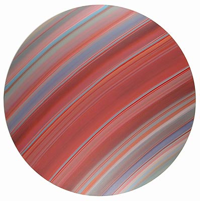
Chris Gallagher, Tondo 16-08, 2008, oil on canvas, 48 inches diameter
Chris Gallagher
I had to start by asking if Chris was a he or a she -- he -- and if he's a Christopher or a Christian -- Christopher. Good choice. Chris is another one of the obsessive-compulsives that have been taking over Chelsea lately. His works consist of carefully painted colored bands running entirely across the canvas. The colors modulate from band to band following some whim of the artist, I suppose, although there's a sense of some kind of harmony, some plan being followed. Altogether the paintings remind me of nothing so much as close-up photos of the rings of Saturn, some of which, being false-color, are about as artistic as paintings themselves.
I like Chris' color sense and I appreciate the minimalist, quiet effect of his paintings. I'm not sure seeing a lot of them at once is the best way to view them. I'm also not sure how well they'd hold up over time; it's hard to say after just one visit. I certainly like them more than any Barnett Newman I've seen, or Ken Noland, just to name two artists known for stripes. But I found myself wondering more how they were done technically than how much I liked them.
Upstairs from McKenzie Fine Art I found Luise Ross Gallery, a small place I don't think I ever been, which was showing
Frank Rivera, Bent Fork Attack, 2008, oil on wood, 13.5x10.5 inches
Frank Rivera
This is a lovely little group of paintings right here. Frank's work is a little like what you'd get if you crossed Keith Haring with Giorgio de Chirico or maybe Jean Arp. They have a pretty, tightly controlled, even anal-retentive surface, with tones painstakingly modeled and edges neatly delineated. The overall color scheme reminds me of the 1950s looking back on the 1930s, a sort of Soviet poster art meets Parker Brothers design department kind of thing. It's subdued and somehow calming, making the surrealism of the works a little less obvious. Frank repeats motifs from one painting to another giving the impression that there's some kind of private code at work; but, as usual, it's a code I'm not all that interested in exploring. In this case, however, the work itself is visually interesting enough to stand on its own without explicating its conceptual underpinnings -- if there even are any, and not just the symptoms of an obsessive continually reworking his visual tropes. It's that obsessive quality, I think, that keeps these paintings firmly outside of whimsy; if they were any looser, any more casual, they'd be simply loopy. But Frank keeps such strong control over them that they never quite float away and instead feel slightly unsettling, like a too-intense child.
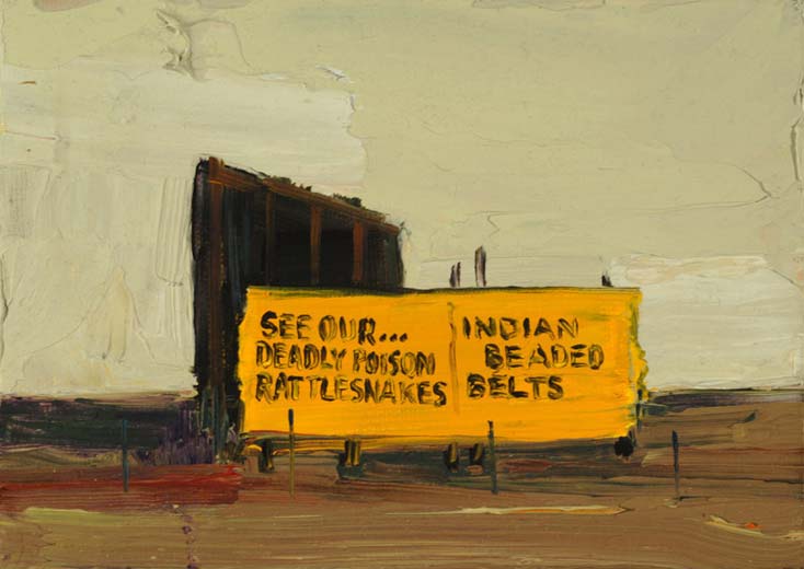
Finally, on my way out, I strolled into George Billis to find...
Patrick McFarlin, Poison Rattlesnakes and Indian Belts, 2007, oil on canvas, 5x7 inches
The first thing I thought of when I saw Patrick's work, very small paintings arranged in a nearly overwhelming array, was Tracy Helgeson's work. Because they share subjects -- landscapes -- and to some extent style -- brushy surfaces with few details. What Patrick has that Tracy doesn't is color and lots of it, and impasto, and lots of that. His impasto is even more pronounced because when the painting's only 5 by 7 inches, a brushstroke looks pretty huge. When it's a tiny landscape, then the sky's only two or three swipes of the palette knife high. Still, it's amazing how much he manages to do with so little; although I think Tracy's work is significantly better, Patrick's work is nevertheless quite good.
Patrick writes on the gallery site, "Took me fifty years to realize my strong suit is color. I’ve been wasting art materials longer than that. Something worth keeping comes around often enough to keep me behind the paint brush." I'm not sure that I agree color's Patrick's strong suit: While his color is good, he has just as much grasp of form, composition, and that thing we have no word for which allows him to define an object with as few details as possible. It's easy to multiply details and effects until you can't help but recognize the subject of a painting; it takes a real artist to pare away all that and find the essence of the subject and then communicate it.
And that was your friendly neighborhood idiot's day out, in case you wondered what he does while you're away at work.
Spur of the moment I decided to see what was happening Thursday night. And I saw that Tomma Abts was having an opening at David Zwirner and I thought, what the hey, that looks interesting. So out I went.
For once I wasn't disappointed. Tomma was worth the trip. The only thing slightly dispiriting was she hadn't filled the gallery the way Chris Ofili did for his last show there; I was expecting to see a thousand or so of Tomma's paintings and instead got a small handful. In fact, even for the couple of rooms of Zwirner's sprawling labyrinth she took up, most of the walls were empty: Some walls had no work on them, some had only one, and a couple had two. At first I got the feeling that she'd expected -- or been ordered -- to have a lot more work, but then I found that the paintings really needed that room to breathe a bit. (Most of the other rooms in the gallery are given over to large photographs of stuff so staggeringly uninteresting I didn't even stroll through most of it.)
Tomma Abts, Isko, 2008, oil and acrylic on canvas, 48x38 cm
Back to Tomma. For this show -- possibly for her whole career, I'm not sure -- Tomma limited herself to a single canvas size, 48 by 38 centimetres (she's German, living in Britain), in portrait mode. Her forms are starkly geometric; one of the first things I noticed about her is that she's a taper. Judging by the evidence in her work, she changes the layout as she goes, submerging earlier layers under new, heavy, opaque layers. The texture of the canvas only rarely shows through, and in the one painting where she does use that, it makes the forms appear to be floating in space. In fact all her forms seem intended to float, as if she were attempting a basic two-dimensional version of those cross-eyed 3D posters that were all the rage a few years back. Then there are touches of genuine 3D, as when a thick ridge of paint -- where it beads up against the tape edge -- gets buried under a new layer of paint not quite thick enough to hide it, or in subtle textures of brushstrokes. Not even brushstrokes -- more like the hint of the strokes that laid the paint down.
Tomma's sense of color keeps these from wandering off into the land of Op Art. There's certainly an element of Op to these, with trompe l'oeil shadows, occasional shadings, and spinning, twisting stripes which almost become dizzying. But Tomma keeps everything firmly in hand with a finely tuned sense of subdued color: No garish blasts of red or yellow here, merely warm variations of muted blue-greens, brick reds, greenish yellows, ochrey greys. Every so often she tosses in a brief shot of pure cadmium orange or saturated ultramarine, but her underuse of such powerful pigments allows them to retain their surprise value and intensity.
Tomma Abts, Schwero, 2005, oil and acrylic on canvas, 48x38 cm
She clearly plans her work, but it's just as clear from the paintings themselves that she revises them as she's working. You can only barely see it in the reproduction here, but in Schwero she definitely painted the circle grouping to the right of where it is now -- you can see the shape of the previous one under the red background.
Her work is not the most deeply felt of all time and it might not blow you away. But in its small scale and lack of bombast it's seductive. I recommend you step back about ten feet to take them in; I find they work much better at a distance than up close -- give them some room to expand in your vision.
I liked Tomma's paintings enough to want to talk to her, which can be hard thing to do at these large openings, but I really thought it was worth it. I asked one of the gallerinas to point Tomma out to me, but she couldn't; she told me the artist was wearing a tan trenchcoat. When I went looking for that I found no one in the gallery was wearing any kind of trenchcoat, much less a tan one. No luck. Turns out she was there after all, but since I didn't know what she looks like, I didn't talk to her.
That was all I'd gone in to see and with that done I had no particular plan, so I worked my way up Tenth Avenue, checking down the streets to see if there were any likely looking crowds. That's how you find openings in Chelsea: There's always a crowd on the street outside, smoking, trying to let people out or in, drinking (when the cops aren't busting people), giving double-cheek kisses and asking about other openings. I didn't see anything inviting so I ambled towards 25th Street just to see what was happening on my favorite block. That's when I happened across Mark Kostabi peering in the door of Jim Kempner Fine Art trying to see who-knows-what in the shrouded darkness of the closed gallery. I called out to him and he started like I'd caught him playing with himself, then pleasantly waited for me to re-introduce myself and explain where we'd met before. He seemed to recognize me eventually and we made some small talk, then he invited me to be in the audience for the next taping of his TV show Title This. Hopefully I'll make it.
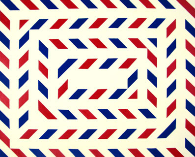
Stephen Westfall, Tunnel Vision, 2006, oil and alkyd on canvas, 24x30 inches
The first crowd on 25th was by Lennon, Weinberg where Stephen Westfall was showing. I'd seen Stephen's work there before and was completely uninterested in it, but here I was in front of it anyway, so I went in. I breezed around the show finding that he hadn't gone far: Another obsessive taper with a lot less color sense than Tomma Abts and far less interesting compositions. Although, really, I don't think Stephen uses tape; his edges look freehand. But for no good reason. He might as well use tape or, heck, print his patterns out on an inkjet. Take an image like Tunnel Vision -- why not call it International Air Mail and have done with it?
As if to prove that his work is easy and pointless, Stephen even painted the back wall of the gallery, using tape and latex paint this time. The result was indistinguishable from his work on canvas and about as exciting as a set for a variety TV show in 1976.
And now, dear reader, I must admit to something. I did something completely calculated. I saw, as I came in to the gallery, good old Jerry Saltz talking to a small group of people. I wanted to say hello to him but his conversation, and the ring of people he was part of, didn't invite interruption. So instead of just easing on by and going home, I went across the street, meandered through 511 West 25th for a bit, then came back to a show I was already bored by the first time just to see if Jerry's conversation was over. Lucky for me it wound down just as I came back in and I was able to accost him. I re-introduced myself and asked if he remembered me from SVA a couple of years ago.
"I did but now I think I'm forgetting."
"You said I was a visionary," I began, but as it was coming out, he turned to a woman he'd been talking to and said to her, "Chris is an excellent painter," or something to that effect.
We talked a bit more and then he gave us the peace sign and left. Now, I have no idea if he remembered my work correctly. I'm sure he was sincere, but I imagine he might have mixed me up with someone else, some better painter. Or some painter he thinks is better. Or whatever. But still, this made me happy. No so much because he's the Great Jerry Saltz or anything, but because I like him and respect him personally, and I appreciate his opinions.
Having thus made use of Stephen Westfall and Lennon, Weinberg for my own nefarious purposes, I slunk back out into the night and home.

