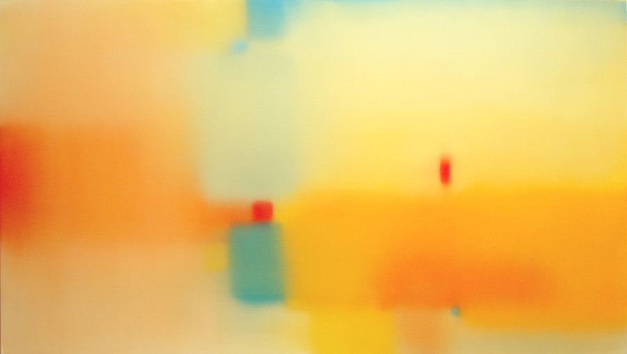
Julian Jackson, Mirage, 2009, oil on wood, 24x42 inches
After squeezing my way past the adoring throng at Danese's building -- which had completely filled the lobby such that I had to push my way out -- I made for 20th Street and Kathryn Markel to see the last show in my evening's plan, Will o' the Wisp by Julian Jackson. I'm not sure now how I caught on to his work, but I saw it somewhere -- probably in one of the regular e-mail messages the gallery sends out. It looked good and I'd been hoping to see it, so when I heard Julian was having an opening, I put it on my list. Even so I almost skipped it; I wasn't sure I wanted to walk the extra four blocks down and three back on my way home. I'm glad I went for it.
Julian's work is something like what you'd get from Hans Hofmann if he forgot his glasses at home, or from Josef Albers on a squinty day. Gauzy overlapping rectangles hang in hazy space in each of his paintings. Some consist of colors very close in hue, others vary more widely. The paintings are perfectly flat, nearly showing no evidence of brushwork, and slightly matte. Julian's colors are mostly strongly saturated. The hazy edges are effected by a lot of blending back and forth and each painting has something of a direction imparted by these strokes; they don't quite come across as brushy but there's a very subtle hairiness to them.
Not one of the works in this show qualifies as a stunner, but altogether they're meditative, quiet. Mellow. They cast a soothing aura out into the room. Each one invites calm inspection.
I like the paintings more when Julian expands his palette. Some of them are nearly monochrome -- they could fit in a couple of other group shows I saw that night -- but I think he's better when he's more adventurous. Mirage, shown here, has some contrast with the cool blues and warm yellows. It doesn't fade entirely away when you're not concentrating on it. The more narrowly defined palettes are in danger of vanishing into the background unless you focus on them.
I think the dealer managed to find the exact right number of paintings to show: Too many more would be repetitive; too many fewer wouldn't have the same impact. Julian's work is shown in the best possible light here and it looks very good.
Leaving the building the elevator opened on a lower floor where another opening party was going on in Denise Bibro Fine Art. I don't know how welcome I am there any more but since the elevator had stopped I thought I'd take a look around. It turned out I was barely able to get off and once off I couldn't move much and couldn't see any of the art. That's a crowded opening! After trying to wiggle my way through a bit I gave up and spent the next ten minutes trying to get back to the elevator and out. So I'm sorry I didn't see anything there.

See all the reviews from this date or go to the previous review from this date.


Wow, very interesting blog and this piece in-particular. I like your assessment - Hans Hoffman if he forgot his glasses. The out-of-focusness is definitely interesting and holds your eye. It would be cool if the red squares were the only thing in focus, but it still is very cool.