On to Danese and their really huge Works on Paper show (until February 6, 2010). One way to make sure your gallery is packed for the opening party is to cram as many artists as you can in the same show. You might, for example, herd 40-odd artists onto the gallery walls, and even stick some more in the little project room off the way. When all the artists' friends, family members, and hangers-on arrive, they'll clog the elevators so badly the line will run out of the microscopic lobby and into the street.
Which is what happened at Danese Thursday night. Not that I really mean to pick on the gallery too much, because the show is really, really good. Anything with 40 artists in it has a shot of having at least of couple of things I might like, but this time I didn't see more than a couple of clunkers and most of the work is excellent.
There's no way I can go through everything on display, especially since the gallery neglected to list all of the work in the main show on the postcard. And never mind the project room, which wasn't listed, either. I didn't bring a pen with me so the best I could do was work my way over to the gallery desk to borrow one to make quick marks next to the artists I liked best. I highly recommend seeing the show for yourself. (If you can't see it you can run through the Website, which I'm pretty sure lists all the works and artists, including the ones missing from the postcard.)
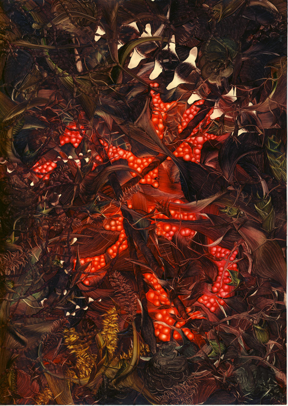
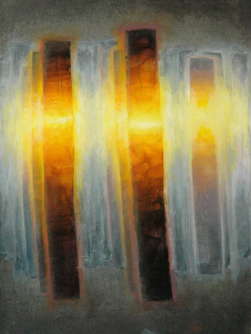
Andy Harper, Untitled, 2009, oil on paper
The first thing that caught my eye was Andy Harper's small oil painting on paper. I don't think this was on regular paper, but rather some glossy-coated kind, or maybe even that Yupo stuff. Maybe Andy just gessoed the paper very smooth. I say this because he's taken advantage of the apparent detail you can get just by brushing oil paints on a non-absorbent ground -- the wealth of striations, wibbles, wobbles, and shades of opacity that magically appear from smearing oil around. Looking closely you can see the kind of overgrown garden he's painted here is really an abstraction built up of different brush pressures and twists and turns of the strokes. It's like Bob Ross on steroids. Or maybe LSD. Personally I love the physical qualities of paint and I love to see them played with in this way, so not only did I find the painting striking from a distance -- its contrast of tones and hues makes it explode from the wall -- but also worth looking at up close.
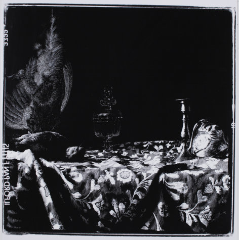
Sebastiaan Bremer, Game Piece with Glass and Shell, 2009, inks on gelatin silver print, 19 3/4x19 3/4 inches
Just to the left of Andy's painting is Sebastiaan Bremer's Game Piece with Glass and Shell. At first glance it looks like a photogram but the media list says it's inks on a print, so I'm guessing we can say Sebastiaan drew on a photo. Something like that. It's a pretty little still life with the velvety blacks really looking nice.
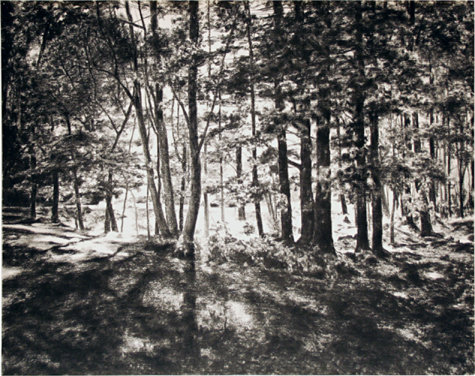
April Gornik, Forest Light, 2009, charcoal on paper, 24x30 inches
After that I worked my way clockwise around the room. I'm not sure of the exact order except that April Gornik's Forest Light was near the end of my looping trip, and a what a lovely, lyrical way to end the show for me. Her work is a large, subtle, radiant charcoal of sunlight through a stand of trees; despite its simple, everyday subject, the drawing itself is transcendent. Somehow April gets the bare paper to glow between the shadows of the trunks. I am rarely a fan of landscapes or plain nature -- I like a human figure in the vicinity, usually -- but when it's done this well, I can't help but love it.

Sid Garrison, May 15, 2009, 2009, colored pencil on paper, 28x28 inches
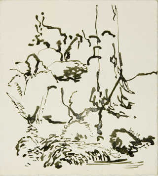
Robert Lobe, Mossy Brook 2, 2009, ink on paper, 11x10 inches
Gerard Mosse, Untitled #1, 2009, oil and graphite on vellum, 23 5/8x17 5/8 inches
Larry Poons, Untitled, c.1992, monotype, 15x22 1/4 inches
Nothing else in my walk around the very crowded gallery struck me the way April's or Andy's did, but there are many fine pieces. Sid Garrison has a pretty blue drawing in colored pencil, where he's worked over the pigments to a waxy sheen, almost like encaustics. Robert Lobe has a nice little ink, abstractish but with the sense of something representative underneath -- it sort of looks as if he painted in only the darkest shades of a scene, but I can't quite make out the full image from the parts. It's neat, though. (He seems to have done a series of New Jersey Meadowlands drawings, which I mention since I live right next door to them.) Gerard Mosse's painting -- even though it's on vellum and therefore maybe technically a drawing -- has a luminescence which is quite striking, and some of the same oil-on-a-smooth-surface effect as Andy's painting. And Larry Poons is represented by a decent, small monotype in the project room. It's not spectacular, but it's good.
Valerie Giles, Untitled, 2008, graphite, colored pencil and gouache on tinted paper, 7 3/4x9 3/4 inches
I'm also partial to Valerie Giles' good-sized drawing. Her swoops and lines, with their calligraphic changes of thickness, and the grace and power of her drawing remind me of...well, of me. Her strong, solid lines are layered over a lighter level of shaded curves and the whole thing almost, but not quite, coheres into something recognizable. Instead it just vibrates there in its jazzy way.
As I wrote above, there's nothing really bad in this show. There were a few pieces I didn't care for, that didn't push my buttons, but overall the quality on display is very high. For a collection of this many artists that's impressive, especially in Chelsea. I'm almost surprised anyone could get together 40 contemporary artists without there being a pile of construction debris or a video with slowed down sound or something. There's hope for us yet.

See all the reviews from this date, go to the previous review from this date, or go to the next review from this date.


Wow, Andy Harper's Untitled....fantastic piece of artwork. Would agree that you get more detail painting on a non-absorbent medium with oils.