Summer has arrived, although you wouldn't know it from the weather here in New York City. New York is beastly hot in the summer and frigid in the winter, but spring and fall are heavenly; of course, they last about two weeks each. Somehow this year, though, we've had springlike weather long after the miasma usually descends. This miasma, in theory, sends wealthy art collectors out of the city to their summer haunts, wherever they might be. I wouldn't know, since my family has always had to work for a living keeping the city running, and we don't get to escape the heat.
And anyway all of that was before widespread air conditioning. Now you barely need to go outside for any reason, and so the art season, which should be winding down for the summer, is in fact still going. I guess it's slowing a bit -- more group shows are on the schedule than usual -- but there's still plenty of new stuff every week.
Jim Wolanin is in the city this month, too, up from Bon Jovi Land, since he was granted a summer residency at the School of Visual Arts. I picked him up outside his studio -- I wasn't able to go up and see his current work owing to Manhattan's post-September 11th armed camp mentality -- and we went crosstown to see what was showing.
We started at McKenzie Fine Art's World without End, a group show on the theme of "iteration." Or infinity, or something. You know I never pay attention to gallery verbiage. Well, this is an interesting show with some very good work in it.
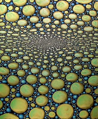 I immediately recognized one of the paintings but couldn't place the artist. I looked over the postcard and the name didn't jump out; on the way home I managed as much as Barbara Nagasomething, because I remembered trying to memorize her name by thinking of a sea snake. It wasn't until I was home that I saw her name on the card: Barbara Takenaga. I saw a number of her meticulous paintings at an opening a couple of years ago where she was showing with Amy Yoes. I really like Barbara's work: It's obsessive and interesting, abstract and yet somehow concrete. There's an area where I tend to really like art, balanced between realism and total abstraction, and Barbara has taken up residence there. I like her colors and the contrast she achieves between different tones. This particular work is more entrancing than usual, too, because -- although it's not clear from the reproduction -- the green ovals are pearlescent and shimmery.
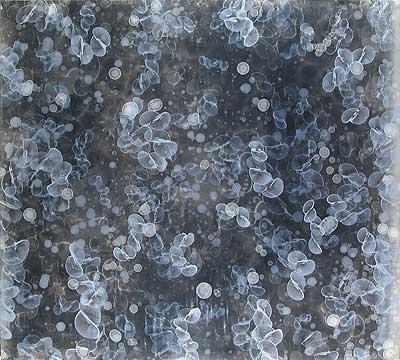 The only other artist I recognized was David Mann, and only because I've seen his paintings in the office at McKenzie every time I've been there. David is one painter who has, as near as I can tell, found what he likes to do and keeps doing it over and over: Little cell-like swirls. Every painting of his is pretty much the same except for color. Blue cells on a dark blue background, pink cells on a brown background, and so on. This one is light blue cells on a background which looks like a photo emulsion but is apparently built up from -- and I quote the painting's online listing here -- "oil, alkyd, acrylic and wax". David's paintings don't move me deeply but they are worth looking at.
 Sara Walker has a good painting on paper. I want to say it's nice without being insulting; it's nice, it's good, it's interesting. I don't want to damn it with faint praise. I'd like to see more by her.
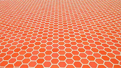 Another Sara, Sara Eichner, has a couple of very neat little paintings where a plane of hexagons marches off into the distance. Jim and I agreed that in large scale they'd be stunning; their small size weakens their impact, but they're still excellent explorations of perspective. They reproduce completely flat but what I appreciate about them most is their lack of perfect flatness; the paint has a faint but definite blobbiness at the start and end of brushstrokes, and the tiny differences in paint thickness throughout lend the paintings a life they might not otherwise have. I can imagine trying to do these larger would drive someone insane, but I have a feeling Sara can do it, and I'd like to see the results.
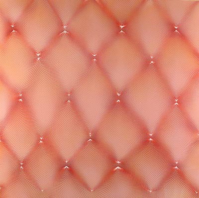 Michelle Hinebrook has a similar painting up; in this case, a dizzying web of pinkness undulates in and out of focus. This is one of those "How did she do that?" kind of paintings -- my guess is spray (airbrush or spraypaint) over folded netting. The layers of darker and lighter colors give this a depth impossible to reproduce here, and the spray pattern is likewise unreproduceably delicate.
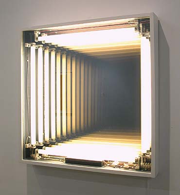 The rest of the show is less interesting but still good and solid. I enjoyed my walk around. The only total dud in the show, I'd say, is Ivan Navarro's Wall Hole, an old idea which looked much better hanging in Mr. Spock's quarters in the fourth Star Trek movie. Only its crudeness makes me think it was intended as something other than what it is; the fact that the light fixtures are so obvious makes me think it might have been intended as some kind of commentary on Spencer's Gifts cheesiness in our society, or something. But, really, I think it's just lame.
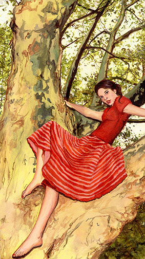 Next door, Lyons Wier-Ortt is showing Amanda Besl. I was surprised to see just how tiny Amanda's paintings are; I'd thought they'd be regular painting-sized paintings but they turned out to be really small, in some cases about the size of an index card. But in that little space Amanda packs a ton of detail and feeling. Her subjects are mostly women (the paintings appear photo-based). The women lounge in the crotches of trees, stand around, sit, sometimes in their underwear, sometimes with veils, in forests, in rooms. Amanda's technique is good but not flawless. There's a detachment in these images, like they were photos taken with a long zoom. The subjects often look directly at the viewer out of the painting, as if making some comment on the nature of viewing. But what, exactly, is unclear to me. Are they happy, are they sad, are they just friends of the artist? They're not quite cheesecake, not quite sexy, not quite asexual -- they're ambiguous. Or maybe they're just too subtle for me. Still, I liked them.
After that Jim and I headed up a block, where we found a huge crowd milling around outside. "Should we fight our way in?" I asked, and Jim assented, and in we went, immediately losing each other when I got caught standing next to Tatum O'Neal while someone took a photo of her. I love her in Rescue Me and in real life she looks exactly the same. I wonder if she's really batshit crazy, too.
When I was able to escape the photo session I found myself in the midst of Jack Pierson's "The name of this show is not GAY ART NOW." Perhaps it isn't, but I'll say this: I don't ordinarily feel exceptionally heterosexual. In most social situations I'm kind of borderline. But in Paul Kasmin Gallery, with that art, with those visitors, I felt like I was...I can't even think of a comparison. Who's the straightest man ever? I felt I was the straightest man ever.
Maybe I'm the most art illiterate person ever, also, since I couldn't place a lot of what was on view. Most of it was forgettable anyway, so I have to apologize to such art luminaries as Matthew Barney, Stephan Tashjian, Robert Indiana, and Elizabeth Peyton: I didn't recognize your work and I didn't care. There really was only one thing in the whole show I slowed down for and I know I've seen the artist before but I couldn't place it. Unfortunately the Paul Kasmin Gallery is so far beyond cool their Website isn't up to date on this show and they had no papers to take from the show itself, so I'm completely devoid of useful information. If I accidentally happen to go back I'll let you know.
I couldn't find Jim anywhere inside so I went outside and around the corner and called him on his cellphone. Now that's a well-attended opening.
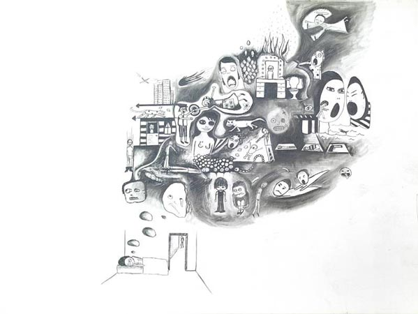 Around the corner at Mixed Greens we made it to see Christina Mazzalupo's drawings. If you've read one of my reviews of shows of drawings before, then you know I'm ambivalent about them: On the one hand I love drawing, but on the other, I still find myself thinking drawings belong in notebooks, not on gallery walls. Christina's work didn't make me change my mind, either. Jim pointed out that all her drawings in the show have the same basic composition, empty in the lower left corner, filled up in the upper right. Now, the show is titled Hey! Get Mental!, so maybe the drawings are all supposed to be dreams, and they all emanate from a dreamer in the lower left corner as a sort of choice of Christina's; but all the same it's a little monotonous.
The drawings themselves are kind of neat, filled with little details of young girls looking downcast and fantastic animals and religious symbols and, I don't know, UFOs and stuff. After a bit they all kind of blend together. And no wonder: Christina is bipolar, or obsessive-compulsive, or depressed, or all three at once, and I know this because -- in addition to her drawings -- she was giving away little booklets filled with her tiny handwriting telling me all about how crazy she is. It was kind of cute, actually, the sort of booklet we used to put together in college and randomly leave under people's windshield wipers in the parking lot, just a random collection of weirdness. It made me feel very close to Christina (we take a lot of the same medications) and kind of protective of her. It made me want to like her drawings a lot more.
In the end, though, I didn't like them that much. They're okay.
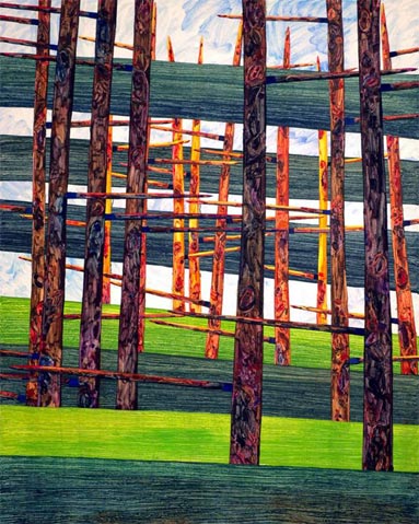 The other side of Mixed Greens is showing Howard Fonda, whose paintings I liked quite a bit. At first glance they look like abstracted stands of trees, but when you look at them a bit longer the illusion breaks down. I like the way Howard disrupts the figure/ground relationship by sometimes having a green stripe (which might be seen as grass behind a tree) or a blue stripe (sky) actually in front of one of the treelike things. Also, I really liked the way the texture of his paint stands in for the detail of the actual object; at first the impression is one of carefully painted nuances, but if you really look, you see his paint is all over the place, scratched back into, goobery, messy. In all, Howard's work is just confounding: As soon as you think you know what it is, it isn't that any more, and it turns into something else. And it does all that with energy and presence. It's actually a little exciting being in front of Howard's paintings.
While Jim and I were standing in front of Howard's work, Jerry Saltz came up and introduced himself to us. He wanted to tell me he liked my shirt. Jim had just attended a lecture given by Jerry at SVA as part of his residency so we talked about that for a bit. Of course art bloggers in general love to bash Jerry, or pick on him, but every time I've seen him he's struck me as an intelligent, decent person. There's this unnamed art writer and sometime curator who says that's Jerry's thing, populism, man of the people; I don't know if he means that in a bad way, but I don't take it as such. Jerry really seems to be what he seems to be. I certainly wouldn't mind being Jerry Saltz when I grow up.
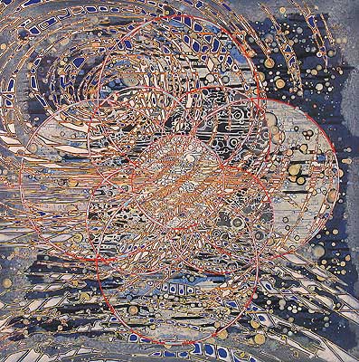
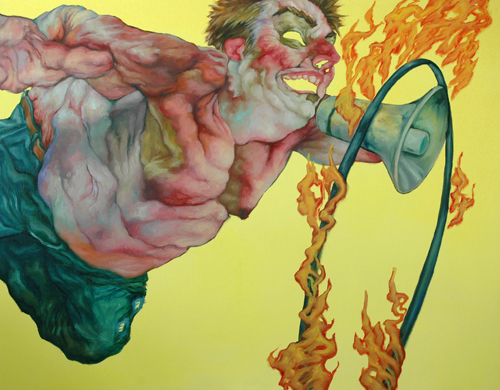 Jim and I eventually moved on to our next and last stop, Chad Marshall at Priska C. Juschka Fine Art. Chad turned out to be perfect for inclusion in an online discussion over at Jason Laning's art soldier: Jason actually liked Dawn Mellor's show, which I of course despised. And I wrote there that there's a difference between a painting which evokes revulsion and one which causes it. Dawn Mellor's works cause revulsion by being themselves revolting and awful; but Chad Marshall's paintings evoke revulsion by being about revolting characters, while being themselves beautiful. In their way. I totally fell in love with Chad's paint handling: It's confident, bold, forward, sweeping, amazing. In the image I've got here, look at the jowls: There's pure, straight blue in there (Jim corrected me at the opening. "Cerulean," he said). No human has that much blue in their skin tone. But hot damn if Chad doesn't pull it off.
That said, I didn't for an instant actually like viewing his paintings. They're unpleasant things. Chad likes to show the background color through his figures' orifices, giving everyone the appearance of a rubber mask or suit. Everyone is corpulent and bloated with an air of perversion and sickness. Grotesqueries abound, frolicking and cavorting like happy demons. There's an element of Egon Schiele but taken to another level of disgust for the human form. As usual for me, I'm not sure why -- maybe I'm not supposed to ask. Whatever is going on, it's disturbing.
So I like the technique but not the subject matter. Too bad, really. For me or for Chad? You decide.
I dropped Jim off at Penn Station on my way uptown so he could return to Bon Jovi Land (apparently the "residency" part of "summer residency" is nominal). I'm hoping to get to visit his studio before he's kicked out at the end of June. Here's to hoping.


i enjoyed looking at the art on your blog although I must confess Michelle Hinebrooks pink diamonds made my stomac feel queezyi really liked Chad Marshallthis painting makes one look at one's conscience I think it represents what we all have a bit of, but try to overcome
I was most interested in the McKensie fine art group show. I hate when I don't have enough time to really pay attention. I keep coming back picking my way through. I recognized an affinity from 1998's paintings. Damn summer vacation means I have to have fun with my daughter. Why paint? the pools open!