The invitations have been coming on strong lately for some reason. The summer is supposed to be the art world's off season, but suddenly everyone's found my e-mail address; maybe it's because of all the group shows, which means more artists, which means more people trying to get obscure bloggers to write about them. I've tried to keep up with the invitations but I missed a couple of shows, alas. Then again, one of them was from a photographer, and he said he liked my blog, which leads me to believe he's never read it, because anyone who's read my blog knows how I feel about photography. On the other hand, his photos were of naked women, so maybe he does read my blog.
Not only are there invitations coming in but I'm also finding shows to go to. This time, I picked Elisabeth Condon because she commented on Stephanie's blog and her work looked interesting online. Her paintings are part of a group show, Into the Woods, at the Arsenal in Central Park. Elisabeth didn't publicize her show or ask anyone to go; I just followed along from her comment to find her site, was intrigued, and decided to go.
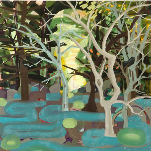
Elisabeth Condon, Woods, 2007, oil and acrylic on linen, 24x24 inches
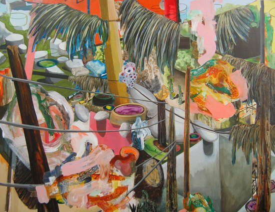
Kurt Lightner, Settle, 2007, acrylic, collage on panel, 55.5x72 inches
The best work in the show, however, belongs to Kim Krans. I couldn't find a Website for her or any images online of the works in this show, which is a shame, because it's really excellent. If I just list her materials here, you might be horrified -- ink, gouache, spray paint, glitter, fur and glue on paper -- but she puts all of it together beautifully. In fact these three small works are mostly gouache on black paper, where the paint contrasting with the ground is meant to evoke the bark of a tree stump. The other ingredients are just, we might say, supporting players. Each piece is small, maybe 11 by 14 inches, maybe 14 by 18 -- I'm not a great judge of size -- but lyrical in its abstraction from reality. Each one isn't so much abstract, actually, as distilled; the essence of tree stump, with all the years of treeness, and all the sense of decay and renewal wrapped up in that. While all the other pieces in the show seemed to be there because they incidentally involved trees -- the show is called Into the Woods, after all -- only Kim's pieces really address the idea of trees, the importance of trees, and the impermanence of those seemingly most permanent of plants.
I wanted to talk to Elisabeth, to let her know I'd come to her show, and to Kim, to whisper that I liked her paintings best, but none of the women handing out drinks could tell me who was who, or even where the bathroom was. I didn't feel up to introducing myself to random people, so instead I left, and in honor of Central Park and the trees, took the long walk along 59th Street back to the bus station.


I liked the Condon and the Lightner - Condon stylising the ground alot - as you point out - confidently - then it strikes me she doesn't quite know how realistic she wants the trees to be - more realistic than ground or background - but still sort of related, so the drawing looks awkward and tentative for the detail struggling with a broad handling. Maybe want to rethink choice of brush or paint consistency at some point.But it's nice to see landscapes again - maybe summer makes people more appreciative. The Lightner looks more conventional to me, but yeah probably more consistent, more assured over all.Was the Krans also landscape?
Did you see the paintings or just the JPEGs? Because the JPEGs of Elisabeth's paintings look better than the paintings themselves. The crudeness of the draftsmanship isn't as evident.Kim's paintings weren't landscapes except loosely. They were really closer to still lifes. Each tree stump -- I think all three were tree stumps, if memory serves -- sort of stood or floated on its own in a space created by a spray-painted atmospheric background.I really wish there were JPEGs of those somewhere. They're hard to describe.
Both thrilled and staggered at this post.Shocked at how the work is perceived here! So dismissive! Draftsmanship, skill, facility: these are not ends in themselves. I'm seeking the sensation of place from my inner core: not an externalized language; oh, sure, snippets but the whole thing, no. Place is the contingency. These paintings come from Brooklyn and Saratoga Springs: places that make me reach for the oil, in tandem with acrylic, to create a world of sensation more than form.Ming Fay and I have a two-person show near the Arsenal at 16 E 77th through 7/11.This is the first time someone said a jpeg of my work looks better than the work itself. I simply cannot disagree more, though I do have a great photographer.Well, CR, many thanks for coming to the opening. The Arsenal has a wonderful tradition of opening up the roof and it is a lovely experience of the park, at tree level. Had we met it would have been nice to chat there.Best wishes,Elisabeth Condon
Meant to say, Ming Fay and I have a show at Heller, and in that show there are the more recent Seuss Dynasty paintings.-EC
I didn't want to be dismissive but there wasn't much I could say; only four paintings and none of them a centerpiece, really. Draftsmanship isn't an end in itself, surely -- although done well it has its own pleasures for me -- but its lack was one way I could describe the lack I felt in these particular paintings. There are plenty of cases where poor draftsmanship isn't a handicap -- I always seem to come back to Henri Rousseau on this point -- but not here.
Well-thank you for your consideration. Too bad you felt a lack. I don't experience that and have never spoken to someone who has so at least this is new. I wish I could sense, get a grip on where you're coming from--but no.
My weighing in here is based entirely on the experience of seeing jpegs of Condon's work. I think her paintings look great and I would love to see them live. Brilliant colors, richly imaginative. It looks like Condon studies the organic world and has honed her imagination by studying it closely. Her work appears to be a wonderful blend of reality and unreality. When I first encountered her work online several months ago I was really impressed.
The show's up all summer, until September 4, so you've got plenty of time to see the works in person. Let me know and we can go together, maybe with a Chelsea slog, too.
I'm only going on JPEGS Chris, and after looking at EC's site, that big looping back and forth line seems like a favorite - is clearly where distinctions in line, color or more content must start.With all due respect EC, did not mean to sound dismissive about any of the work. I would hardly bother commenting if I didn't think the work was worth the effort. Just callin' 'em like I see 'em!
I deeply appreciate the consideration of my work from all parties. It means everything to have my work viewed and thought about! So thank you, Chris, everyone. The honesty is good, I can learn from it, although cannot agree the work is better in reproduction. The clumsiness? That's a part of it. Some say my hand is elegant, others not. If anyone heads uptown next week do see my work at Lesley Heller (M-F 11-6) - next week is the last week of the show, in which I have ten works. There's a video that features the show on http://www.lesleyheller.comBTW Kim Krans is represented by D'Amelio Terras in NY and Wendy Cooper in Chicago.
I saw that Kim has work at D'Amelio Terras, which gallery I have a soft spot for since they represent John Morris. I thought it was very funny that virtually nothing at the Blogger Show he arranged sold, but he managed to sell his own work to D'Amelio Terras while he was in town. Sometimes I think humans only get by on accidents.
I own one of Condon'a paintings, Raggedy Vista. I purchased it on the basis of a jpeg, so I feel I can speak to the different experience of the image on a screen and in physical space.When I first received the painting, I experienced the overpainting as a sort of intrusion on the space of the work. I had the thought that it pulled my eye more than I wanted it to. Now, having lived with the painting for several months, I have an entirely different experience of it. The overpainting neither competes with nor distracts from the fabulous flowing colors and shapes underneath. What I see now are layers of space and relationship far more complex and nuanced than that of underpainting and overpainting. In close physical proximity with the work on a daily basis (it hangs over my desk), the painting seems to shimmer and shift. The overall composition, the dominant red and blue splashes, seem to move back and forward in space, revealing, concealing, distorting, and making sense of other elements of the work. The painting I fell in love with as a jpeg was beautiful. The painting I own is an experience, sometimes beautiful, sometimes haunting, sometimes even threatening.To reduce Condon's vocabulary to under- and over-painting and to the use of pours versus line is a natural response on first encounter. But with time and intimacy, her vocabulary reveals itself to be infinitely more nuanced.
I have noticed that I sometimes feel differently when I get to see art a second and third time. My opening-night drive-bys aren't always the last word. I may end up seeing Elisabeth's work again, maybe at Lesley Heller, and if I feel things have changed, I'll certainly write again.
I like the video concept on the Heller Gallery Website. It's a nice idea.Elisabeth, you use a brush pen also. I've got a Kuretake. I love it.
Whoops. That link was supposed to go here.
Just bought one, having seen the linked blog entry before and at that time bookmarking the pen on Blick. So far been using student calligraphy brush pens from Taiwan, which are cheap, great but dry relatively quickly. So looking forward to the charms of the Kuratake.
The Pentel Pocket Brush Pen is cheaper than the Kuretake and I love it. I got one a few months ago. I bought one from the company I linked to below and they were dependable. The brush is shorter than the one on the Kuretake but I prefer that.Pentel Pocket Brush Pen
pocket brush pens?!?! This exchange took a bit of a nose dive. reviews are so impersonal, it's always awkward when the artist gets involved.
It is incredible that more and more art is sold on the basis of jpgs. I wrote a piece about the Berlin artscene in Art & Antiques and most of the high end galleries told me that 75% (or so) of their sales were made on the basis of e mailed jpgs. Very few collectors actually visit the galleries and make purchases. Just a thought.Best,Matthew Rose / Paris, Francehttp://www.youtube.com/user/mistahcoughdrop
whether it's purchased from jpegs or in the gallery, I suspect a whole lot more than just experiencing the physical object is involved with purchasing "high end" art.though I have very little to base this on.
You may be right about that. But it's my conviction that there shouldn't be anything more than experiencing the physical object to purchasing any kind of art, high end or otherwise.Sadly, I'm not emperor of the universe.
agreed
I guess if you're just buying them as investments you might buy direct from a website. For that matter, you might skip the jpeg and just go by name and dimensions or price.But at which point, we're not really talking about art anymore. So as artists we might as well just shrug and go back to looking hard and terying to explain what we see.
I remember when this blog used to boast it carried no ads.
I'm not really thrilled with ads but I am poor. The Google ads are, perhaps predictably, not making much, and may not stay much longer.I wish we, as a culture, could figure out a better way of redistributing income and supporting things like TV and blogs and magazines than advertising, which is pernicious and inefficient. But right now this seems to be what we're stuck with.
I can't really blame you Cry Walt, I 'allowed' ads on my blog when I started - and they rapildly over-ran my page (thanks to my blog host at the time - Orble). There were quarter page full-color ones after a few months. Never saw a cent, never trusted Orble's hit counts or its extremely dubious successful 'blog' sites - which were really just huge retail/commerce sites for clothing/music/video.But that's how they ripped/rip off Google - by pumping up their aggregate or net hit stats with bogus non-blogs contributing their hits.... Finally the whole thing just looked so UG I moved over to Blogspot and decided I'd rather have a clean, good-looking site that I maintained just for fun, rather than a grubby one than really didn't contribute anything for all the ads.And even though I am unemployed.You'll notice also the ads stay, even if 'your stats' don't warrant payment for them... Ever since, I've been extremely suspicious of all these 'free' hit counters available on the web as well. I ran different ones at different times just to sample consistency and was amazed/appalled at the variation - my stats could range between around 400 hits a day and just over 100 depending on 'counter' brand.Yeah the web! - forget about the dot com thing though, it's all a dot con thing.