Spur of the moment I decided to see what was happening Thursday night. And I saw that Tomma Abts was having an opening at David Zwirner and I thought, what the hey, that looks interesting. So out I went.
For once I wasn't disappointed. Tomma was worth the trip. The only thing slightly dispiriting was she hadn't filled the gallery the way Chris Ofili did for his last show there; I was expecting to see a thousand or so of Tomma's paintings and instead got a small handful. In fact, even for the couple of rooms of Zwirner's sprawling labyrinth she took up, most of the walls were empty: Some walls had no work on them, some had only one, and a couple had two. At first I got the feeling that she'd expected -- or been ordered -- to have a lot more work, but then I found that the paintings really needed that room to breathe a bit. (Most of the other rooms in the gallery are given over to large photographs of stuff so staggeringly uninteresting I didn't even stroll through most of it.)
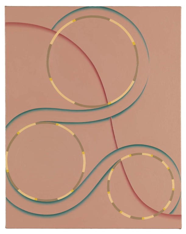
Tomma Abts, Isko, 2008, oil and acrylic on canvas, 48x38 cm
Tomma's sense of color keeps these from wandering off into the land of Op Art. There's certainly an element of Op to these, with trompe l'oeil shadows, occasional shadings, and spinning, twisting stripes which almost become dizzying. But Tomma keeps everything firmly in hand with a finely tuned sense of subdued color: No garish blasts of red or yellow here, merely warm variations of muted blue-greens, brick reds, greenish yellows, ochrey greys. Every so often she tosses in a brief shot of pure cadmium orange or saturated ultramarine, but her underuse of such powerful pigments allows them to retain their surprise value and intensity.
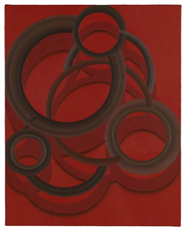
Tomma Abts, Schwero, 2005, oil and acrylic on canvas, 48x38 cm
Her work is not the most deeply felt of all time and it might not blow you away. But in its small scale and lack of bombast it's seductive. I recommend you step back about ten feet to take them in; I find they work much better at a distance than up close -- give them some room to expand in your vision.
I liked Tomma's paintings enough to want to talk to her, which can be hard thing to do at these large openings, but I really thought it was worth it. I asked one of the gallerinas to point Tomma out to me, but she couldn't; she told me the artist was wearing a tan trenchcoat. When I went looking for that I found no one in the gallery was wearing any kind of trenchcoat, much less a tan one. No luck. Turns out she was there after all, but since I didn't know what she looks like, I didn't talk to her.
That was all I'd gone in to see and with that done I had no particular plan, so I worked my way up Tenth Avenue, checking down the streets to see if there were any likely looking crowds. That's how you find openings in Chelsea: There's always a crowd on the street outside, smoking, trying to let people out or in, drinking (when the cops aren't busting people), giving double-cheek kisses and asking about other openings. I didn't see anything inviting so I ambled towards 25th Street just to see what was happening on my favorite block. That's when I happened across Mark Kostabi peering in the door of Jim Kempner Fine Art trying to see who-knows-what in the shrouded darkness of the closed gallery. I called out to him and he started like I'd caught him playing with himself, then pleasantly waited for me to re-introduce myself and explain where we'd met before. He seemed to recognize me eventually and we made some small talk, then he invited me to be in the audience for the next taping of his TV show Title This. Hopefully I'll make it.
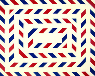
Stephen Westfall, Tunnel Vision, 2006, oil and alkyd on canvas, 24x30 inches
As if to prove that his work is easy and pointless, Stephen even painted the back wall of the gallery, using tape and latex paint this time. The result was indistinguishable from his work on canvas and about as exciting as a set for a variety TV show in 1976.
And now, dear reader, I must admit to something. I did something completely calculated. I saw, as I came in to the gallery, good old Jerry Saltz talking to a small group of people. I wanted to say hello to him but his conversation, and the ring of people he was part of, didn't invite interruption. So instead of just easing on by and going home, I went across the street, meandered through 511 West 25th for a bit, then came back to a show I was already bored by the first time just to see if Jerry's conversation was over. Lucky for me it wound down just as I came back in and I was able to accost him. I re-introduced myself and asked if he remembered me from SVA a couple of years ago.
"I did but now I think I'm forgetting."
"You said I was a visionary," I began, but as it was coming out, he turned to a woman he'd been talking to and said to her, "Chris is an excellent painter," or something to that effect.
We talked a bit more and then he gave us the peace sign and left. Now, I have no idea if he remembered my work correctly. I'm sure he was sincere, but I imagine he might have mixed me up with someone else, some better painter. Or some painter he thinks is better. Or whatever. But still, this made me happy. No so much because he's the Great Jerry Saltz or anything, but because I like him and respect him personally, and I appreciate his opinions.
Having thus made use of Stephen Westfall and Lennon, Weinberg for my own nefarious purposes, I slunk back out into the night and home.


I agree with you about Westfall. I thought he'd moved on to other (better) things - but I notice Tunnel Vision is dated 2006 - still at least it was reasonably modest in scale.Abts I just can't get into. If Westfall looks like old TV set-design, then Abts looks like graphics for Scientific American. Isko actually reminded me of the opening credits to ART 21. Either way it all seems a bit lame, impasto or no impasto.
Westfall's 2008 work looks exactly the same as his 2006 work, which is exactly like, well, everything he's ever done. I'd think his work was being turned out by a computer, but no programmer would be so unimaginative.Abts' work isn't, like, blow you away incredible or anything. It's good. Not exciting. Not groundbreaking. Quietly good. Better than the JPEGs for sure.
Abts's work looks like it should be hung in Motels. Westfall is where it is at - humorous, intellectual and at ease with the history of abstraction.
I detected no humor -- or anything else -- in Westfall's work.