I have here a small pile of things I've been meaning to write about, including a bunch of good stuff I saw at the Bridge Art Fair. Somehow I've been putting off getting to all of it, though, so in the interests of moving myself along, I've decided to write up just a short review of two shows I saw which I didn't like. That way I can get right to the things I did like. (Skip the negativity if you want by scrolling down to Julie Evans.)
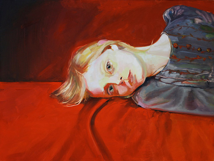
Juliana Romano, Keep the Dark Out of Your Mind, 2008, oil on panel, 18x24 inches
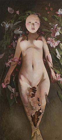
Wei Dong, Altar, 2008, oil and acrylic on canvas, 66x29.8 inches
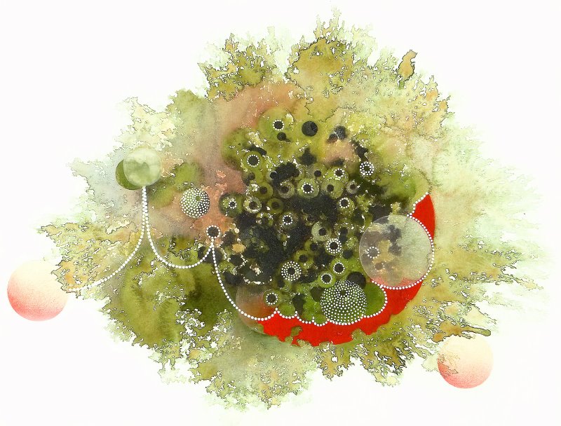
Julie Evans, Lesson from a Guinea Hen #3, 2008, mixed water based media and color pencil on paper, 22x30 inches
What Julie has managed here is nothing short of wonderful. She perfectly balances abstract, loose, random acts of watercolor, subject to the lovely whims of paint bleeding across wet paper, with very precise strokes and dots of gouache and pencil arranged in careful geometric patterns. The result is a series of paintings of enchanting beauty which appear to be unfolding before your eyes as you observe them. Julie's use of color is extraordinary, too, with bright yellows against crisp whites, olive greens butting up next to blacks, pinks and purples dancing throughout. If all of that weren't enough, she has the sense to keep her compositions hanging in negative space, exquisitely aware of the emptiness around them.
It's clear that Julie has been absorbing and borrowing from Indian textile patterns; she owes a debt to her sources, especially for her colors. In places she even quotes directly, using traditional lotus forms among others. But she comes by this influence honestly; according to the gallery staff and her own biography, she's spent time living in India.
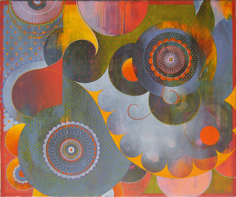
Julie Evans, Paharihaze, 2007, acrylic, gouache and pencil on paper on wood, 15x18 inches
It's clear from seeing her past paintings that Julie's progressing, evolving, and gaining confidence; her most recent work, in the show proper, is clearly built on her earlier work, and better, too, although less expansive in color and in filling her ground. In a way you can watch over the years as she steadies herself, stabilizes what she wants to do, and then begins to pare down, distill, and concentrate the essence of what she's doing. Her earlier work is less assured but more controlled; she's broken free of obsessively constraining her paint and the results are fantastic.
You have about ten days. Get to it.


Leave a comment