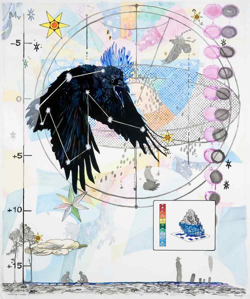
Christopher Reiger, Without Maps or Manifest, 2009, watercolor, gouache, sumi ink and marker on Arches paper, 34.5x29.75 inches
I went in to Chelsea last Thursday specifically to see Christopher Reiger's latest show, Some Species of Song, at Denise Bibro's Platform (until November 7, 2009). I just want to say up front, before I get into the show itself, that I consider Chris a friend. Well, not a friend, really. But more than an acquaintance. I actually can't think of the right word for what he is to me. We've never met, but we've exchanged friendly e-mail messages and commented on each other's blogs. I don't read him every day but he's on my list to check every so often. Obviously I'm on his mailing list. And we showed together in the Blogger Show although, actually, our works were never in the same gallery. Anyway. My point is, I like Chris and probably can't be unbiased about his work. Then again, if I didn't like his work, I probably wouldn't be friendly with him; I don't make a habit out of sending e-mail to artists whose work horrifies me.
Chris' show is, as always, worth seeing. With this batch of work he seems to have toned it down a bit; the last paintings of his I saw he'd thrown in the kitchen sink and some of the attached plumbing, but here he's cut back a bit and left some white space. In some cases he's left quite a bit of space around his subjects, and I like the extra room.
Christopher Reiger, Living, Moving, in the Space Between, 2009, watercolor, gouache, and marker on Arches paper, 17.75x17.5 inches
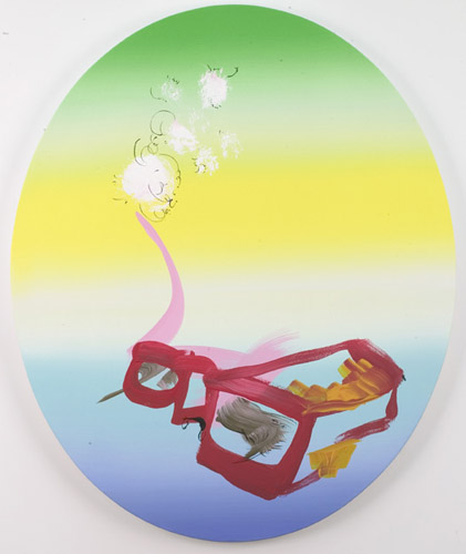
Chris bases his work on a firm foundation of nature. I know from his blog that he feels a strong connection to wild animals and spaces, and he brings that into his work by using animals as the centerpieces of his crazed compositions. I found myself thinking of Dalí as I went through the show, not so much because his work resembles Dalí's -- it's nowhere near as slick (whose is?) -- but because of the way Chris, like Salvador, repeats motifs across each work, or across multiple works; and also because of the obsession with scientific symbols and diagrams which the two painters share. A bird -- a crow perhaps -- mapped with a constellation I can't identify -- I was never very good at constellations -- is the main subject in one painting, then shows up reversed in the background of another. Penrose tilings make more than one appearance. Bird silhouettes abound. Some items are numbered with those lovely handwritten numerals found in 19th century scientific illustrations.
Another artist I thought of is James Joyce: Chris' set of symbols is hermetic and vast and beyond my ability to decipher; I imagine someone could spend a career unraveling his parallels, assonances, harmonies, and relations. Is he connecting frogs and tadpoles to spermatazoa or is that literally a cutaway diagram of a tadpole? I don't know for sure, but there's definitely plenty to think about.
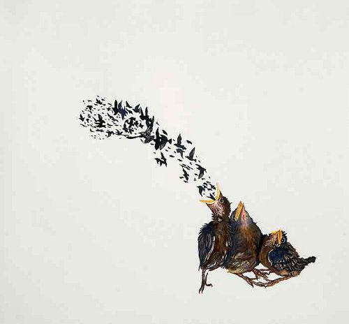
Christopher Reiger, Further Murmuration, 2008, watercolor, gouache, pen and sumi ink on Arches paper, 15x16 inches
The work doesn't get too hung up on the conceptual, intellectual side anyway. I'm not sure everything I see is strictly intended by Chris. I may be inventing my own complexity on top of his. Stepping back to the purely visual his work is lovely if somewhat cluttered. He's reduced the clutter from the work I saw last year but he's still trying to get across a lot of information. And it seems like he likes to throw every color he's got at every painting; again, he's cut back, but not quite as much as I might like. His very best work in this show is much more minimalist: I really liked Further Murmuration, which is nearly monochrome, mostly negative space, and positively beautiful in its tiny clockwork miniature perfection. His sensitivity in handling the watercolors here is nothing short of sublime. I've held a baby bird in my hand and this painting feels the same.
I should probably add that, in keeping with the nature theme and Chris' involvement with ecology and conservation and so forth -- he only eats meat if he's hunted and killed the critter himself -- some percentage of the price of each work he sells goes to the Wildlands Network. You can read more about his charitable sales model on his site.
After seeing Chris' show I went next door into Denise Bibro proper to see Gone to the Dogs. About this the less said the better. Really, anything I write about it is a bad idea. I can't quite write nothing, although that's what I want to do. Imagine a show that makes you long for Coolidge's A Friend in Need, take it down a notch or two, and you've got it.
Thus suitably stunned I staggered out into the lovely night air. I had nowhere else in mind; I was in Chelsea just for Chris. So I began to meander as my head cleared and soon I found myself in Jack Shainman's space on West 20th looking over Tim Bavington's Up in Suze's Room (through October 10, 2009). This is not the kind of show to clear an addled brain.
Tim appears to me to be the bastard child of Frank Stella and Stephen Westfall, with perhaps some Op Art DNA thrown in. Maybe not so much Stella since his canvases aren't shaped. But stripes always make me think of old Frank.
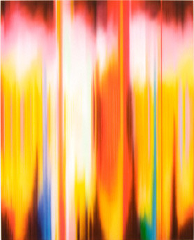
Tim Bavington, Up in Suze's Room, 2009, synthetic polymer on canvas, 120x96 inches
I suppose Tim's standout difference is that his lines aren't painted between taped-off areas. They're sprayed. This gives the edges a softness with a sideways overspray texture I kind of like. It reminds me of my airbrushing days. I'm not sure how Tim keeps his lines so straight -- I can think of a few possibilities, including an incredibly steady hand, but I can't figure it out by just looking at his paintings.
Tim's colors are all over the place; I can't divine a pattern for his choices. They kind of remind me of digital color pickers from programs like Photoshop. If you read his titles and some of his verbiage you find he's inspired by music and rock songs and so forth, but I went through the show entirely on visuals. Based on those alone I have no idea where his palette comes from; having read some I'm still not sure, but I can imagine there's some kind of system.
Most of these are just standard eye-bending fare, but in a few Tim breaks out of the stripes and starts allowing blurs, smears, and flares into his carefully ordered compositions. The signature image, Up in Suze's Room (apparently named after a Paul Weller song, whoever he is), is a fine example of Tim's letting loose. Amidst all the somewhat sterile stripes it really comes alive. With its large scale and concentrated color it stands with some of the better Color Field work I've seen.
Stéphane Calais, Les lunettes de Christoph Jacquet dit Toffe, 2009, acrylic on canvas, 25.75x21.25
From there I swung through ZieherSmith just because the door was open. Big mistake on my part because I got a look at Stéphane Calais' absolutely dreadful Flowers for America (through November 7, 2009). The conceit behind this show seems to be that Stéphane has sent a lovely bunch of plants and paintings to our shores. Or something. What he's really done is set up a bunch of truly dopey plastic vegetation-like fronds with macrame hangers and basketballs all around the room while ugly, uninspired, incompetent art gazes wanly from the walls. "It's better to be incomprehensible" Stéphane says in the gallery verbiage; he's silent on being indigestible.
Uncertain of where to go next I walked uptown to the usually dependable West 25th Street. There I found a large crowd massed outside Cheim & Read. I can't remember the last time they showed anything I wanted to see but tonight I bumped into James Kalm chatting with people in the crowd. I joined in and he introduced me to some people, then looked down at the contents of his hand with some surprise.
"Looks like I've stolen one of their price sheets," he said, and sure enough he was holding one of those plastic folders containing the list of works in the show and the prices almost no one actually pays. You're not supposed to remove those from the gallery, you're supposed to, at most, carry one around with you inside as you go from work to work while shaking your head in disgust or, possibly, approval. Of course Cheim & Read, being an awesomely hugely successful blue chip gallery, can most likely afford to have a few of those 55-cent folders wander off.
"Do I want to go inside?" I asked James.
He handed me the folder. "Yes, you want to return this for me."
So I gamely went in. Unfortunately the gallery staff had chosen the front desk to double as the bar from which free drinks were issuing, and the desk is right up near the front entrance, causing a big rugby-style scrum to form. It took a few minutes for me to work my way through and then I was free to squeeze around the rest of the gallery.
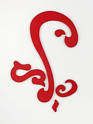
Jack Pierson, FLOURISH 2009, 2009, plastic, 77x55x1 inches
Much to my chagrin I found the show belonged to Jack Pierson (through November 14, 2009). Jack's been throwing together letters from "found" signage -- I assume he gets them on eBay or something, from stores closing down -- into new forms for some years now. It's a concept that's so unutterably lame Barney's stole it for its window displays; and if a department store can appropriate your style almost exactly for use as window dressing, that's a sure sign you suck. I went around once to confirm -- yes, he does indeed suck -- and then exited.
Outside again I saw that James was now talking to David Gibson. Considering the last review I gave to one of David's shows I decided I was better off sneaking away, so I scuttled down the street to Dillon Gallery where I saw Norihiko Saito's show (until November 7, 2009).
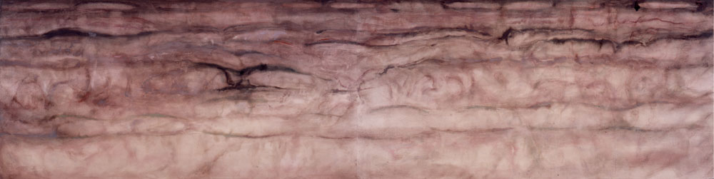
Norihiko Saito, Field in Autumn Shower, mineral pigment on paper, 35x142 inches
Norihiko -- I'm not sure which is his family name and in fact had to look up his gender -- paints paintings which are barely there. I got the sense that these are in the Japanese tradition of paper screen painting -- and in fact one of them was displayed as such -- but perhaps I'm too much of a barbarian to appreciate them. These looked to me like the backgrounds of screen paintings I've seen, as if Norihiko sort of forgot to add some bamboo in the foreground, or maybe a bird, or a geisha, or something. Anything. Instead there's just this large -- in some cases, vast -- amorphous undulating atmosphere of nearly nothing. These could be faux marble finishes, or maybe the foundation for a Natural History Museum display of Pleistocene cave painting recreations.
After that I walked over to 511 West 25th just to see if anything was happening at my favorite building; I found there that both George Billis and Robert Steele had vacated their ground floor fishbowl-like spaces (later I saw from their Websites that they just moved upstairs) and a Tesla Motors store had moved in. It's not really a Tesla dealership since they don't have a selection of cars for sale, but they do have one you can look at and plenty of shiny brochures and salespeople with bright white teeth and so forth. The car itself is lovely, low-slung, and in fact probably not something I could fold myself into, but I think we can all get behind an electric vehicle that's cool, and the Tesla certainly is that, so long as you're shorter than I am and a good deal thinner.


"It's better to be incomprehensible." I'd say something, but why bother? I mean, this is so lame it's like, duh.
If he'd finished his thought, "It's better to be incomprehensible than completely terrible," I'd agree. As it is he managed to be both.
You know, Chris, considering that we're talking about NYC, Chelsea even, the fact that so much, uh, underwhelming work (to put it mildly) can get gallery exposure is extremely telling, and what it tells is pretty damning. Of course that's irrelevant to the system, as long as the stuff sells well enough, but is there really that much stupid money around?
This Calais guy reminds me of another French guy, a glass artist (more like designer, since I doubt he actually made any of the stuff himself) who was probably sort of "hot" for, oh, 6 months, and may now be totally off the radar. Anyway, a few years back, he had a solo show at the MOCA in Miami, which would have been pretty funny if it had been meant as a satire or joke (but of course it wasn't). It was just a bunch of big, gaudy, jumbled up glass doo-dads that really belonged in some fancy department store's display windows, not a supposedly serious and legitimate art museum. At best, it was a show for little kids. I figured the museum people either didn't have a clue or didn't care, probably the latter. Let's just say that show did not encourage future visits.
I ranted at great length in a post a few months back about how, actually, none of the crap needs to sell. Many galleries are supported through external sources -- day jobs, trust funds, wealthy spouses, and so on. How much no one, of course, knows. In theory any business could work the same way -- movie theaters, cheese shops, liquor stores, whatever -- but few other businesses have the cultural cachet to make it worthwhile. So, more than most other businesses, galleries aren't capitalist enterprises at all. They don't need to sell a single object to stay afloat.
The number of galleries closing with the economic downturn probably has less to do with any falling off in art sales and more to do with falling off of external income sources, like overtime in day jobs or somewhat less wealthy spouses.
wow. Those pieces are absolutely incredible. I love the colors! Les lunettes de Christoph Jacquet dit Toffe makes me smile :)
Thanks for the awesome post.
P.s.- love your blogging style, even when it gets opinionated!
"It's a concept that's so unutterably lame Barney's stole it for its window displays" - what was lamer is that he made a stink about it. I recently saw that Elmgreen and Dragset put an iron ball and chain around a giacometti - something that qualifies as an art joke - a "one liner" as my professors would say - though I've come to realize that you can say anything about anything. But in this case it has been done - and in my opinion, done better - both because the context and execution were "edgier" - in front of the Seattle Art museum to a Jonathan Borofsky "Hammering Man" - by an artist who unfortunately committed suicide due in part to mental illness. I'm not one to celebrate "the crazy artist" but I would like to see more craziness - something that is lacking in your friend's work - though it is nice - I too enjoy knot theory, mathematica, penrose diagrams, nature, patterns and on and on - I find this a more authentic than art jokes. But a bit calculated to be serious"fine art" (illustrative is the only word I know for this - but I like illustration). Clouds of birds I've seen as well....
The spray paint thing has been soooooo done as has the "i paint songs" so while again, I applaud the impulse, no kudos for the thought part of the equation. Kandinskiesque sound-color synesthesia is like theory 101.
I've been working with KULER - adobe's proprietary color palette generator/designer - and I can attest that it is easy to come up with a pleasing array of colors without having a clue as to who Albers is, what the difference between a tone and a tint is, as well as a shade, saturation, value, hue, or any other jargon you might care to use.
Doesn't spray paint come factory mixed? I think a lot of those dudes in the day used silkscreens instead of tape. Prove me wrong.
I dont blame them.
I agree, Zip, that it was deeply lame of Pierson to complain about the "theft" of his "style". Given that his "style" amounts to dumpster diving, that someone else did some diving of their own hardly merits comment. Perhaps if Jack were more original, this kind of thing wouldn't happen to him. Fuckwit.
As far as art jokes, hey, I love them. I'm a big fan of guerrilla surrealism and pulling pranks on the stuffy and uptight, and few people are as puffed up with self-importance as artists and dealers. So I'm all for deflating them. But to call such jokes art is too much. That's what went wrong with Duchamp, I think.
As far as Chris' work goes, yeah, I see what you're saying. A little more craziness might not be a bad thing for it. I have no idea how he'd get it in there, though. I feel the same lack in my own work and I really have no clue how to inject it. Simply waving your arms more and being sloppier isn't going to do it. Then you end up like the jerk I mocked over here. I think maybe some of it comes with craft: At a certain point enough of the basic work comes easily enough that more emotion gets into it. But I'm not sure. Craft can also overwhelm spontaneity, of course.
Regarding Tim's work, I don't really care what his thoughts are and I really don't give a crap about theory. I only care about the results. The results are pleasing enough, but not really great. I liked them but not a whole lot.
Is it possible the Op Artists used silkscreens? Sure. Tape's easier in some ways, though. I'm not sure it'd be possible, really, to tell the difference from the final result. I don't blame them either. Whatever works for getting the effect you want.