I'm going to try something a little different with the shows I saw last Thursday: I'm going to break them out into separate entries. The last slog I wrote up ran very long and having all the shows together like that seemed a bit too much. What I'm going to do is write up separate entries and have them connected by a tag and also add in links to the next entry in the night. We'll see how it goes.
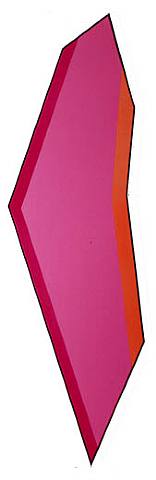
Kenneth Noland, Rutilant, 1982, acrylic on canvas, 74.2x25.2 inches
I started bright and early in the late afternoon. The late afternoon isn't bright and early, of course, but it is when you're talking about gallery openings, which traditionally start at six o'clock. The trick is, if you want to see shows that have already opened and also attend some openings, you have to go in early enough before the galleries close -- traditionally at six o'clock -- while planning your trip to end in Chelsea when the openings have started. Because you don't want to have to find something to do in Chelsea while you wait for the openings to start. Aside from art galleries and the 24-hour taxicab car wash there's not much to do.
The wonderful Piri Halasz had recommended I see Ken Noland's show at Leslie Feely uptown (until January 15, 2010). Ken's been mentioned a lot lately since he just passed away after a career in art spanning five decades, which is a lot to talk about. His work at Leslie Feely is from a very narrow slice of that -- 1981 and '82 -- but it coincidentally happened to be up, so it was worth going to.
I walked along East 68th Street from the subway station at Lexington musing over the buildings lining the sidewalks. I don't know much about architecture but I'd say most of them date from the early 20th century, great big piles of gray stone for the captains of industry of the day, all huge curving windows and cast iron, polished brass and terracotta decoration. Most of them have been converted into one-floor apartments or offices, but a few seem as if they might still be single dwellings for the wealthy of today. As I walked, lost in thought about these lovely old houses, wondering who lives in them now and what the block looked like when they were new, I came upon one of those quintessential New York discontinuities, a modernist steel-framed glass curtain wall. It knocked me out of my reverie, which was good, because I'd arrived at the gallery.
Upstairs I found the gallery somewhat cramped -- the ceilings felt low to me -- and a little more dimly lit than I'd like. One of Ken's shaped paintings greets you as soon as you step from the elevator; the rest are arranged around the two main spaces of the gallery. There are twelve on the show's Website. I thought there might be more in the show itself but maybe not. I didn't count them.
All of the work in this show is from Ken's period of shaped canvases. Of course he's better known for his targets -- concentric rings of color centered on the canvas -- but he spent many years going in other directions, most of them concentrating on color relationships and minimizing everything else. These paintings are all what I'd call extremely shaped: He's bent the canvas around many sharp angles, both obtuse and acute, resulting in a series of tall, narrow paintings with anywhere from six to eight edges. Each one appears to balance on a point, like a shard of stone in a megalith. Narrow stripes follow two or more of the edges on a field of solid color.
My feeling is that the paintings are too constricted. I think Ken was trying to channel his sense of color through a bottleneck. In some cases the canvas is even shaped into a narrow isthmus. Instead of the color giving the impression that it's flowing across the surface to fetch up against the stripes on the sides, it feels like the stripes are lying on top of a small band. The colors have no room to breathe and thus have no real relation to one another; they don't seem to be in the same space. Ken is known for his color sense but in these paintings I think it got overwhelmed by the support.
For me, the actual shape of the canvases became the focal point. The shapes are so forced and unnatural, and so tightly bound visually, that they squeeze out any interest in the painting as an abstraction. I found myself more interested in the flaws of the presentation, something I feel certain Ken didn't want. Linen canvas always comes with these little knots in parts of the weave where the thread, for whatever reason, is thicker than elsewhere. These knots stand out in great relief from the otherwise flawlessly flat color. Also, some of the shapes are so torturous for the canvas -- when you stretch fabric around such tight angles you're attempting to force a flat shape on something that simply can't lie that flat -- waves were left in the surface. I'm sure these annoyed the hell out of the artist and he did his best to eliminate them -- I can imagine him pulling harder and harder on those canvas pliers -- but I ended up fixating on them instead of the color.
I also felt that the color combinations were dated to the 1980s. It may be because, as Piri suggested in her 1969 article on Noland, graphic designers pick up on color combinations from fine artists. Or it may be Ken was infected by Reagan and Huey Lewis. Whatever the case -- and it may be unfair of me to think this -- the colors in this show remind me strongly of the '80s, and while I liked them well enough when I was living through them, looking back I see them as a period of great cultural shallowness. These paintings fit in a little too well.
Which is not to say they're actively bad. Piri recommended this show to me, not just because Ken's name is going around in obituaries, but also, I think, because she's hoping for more positive-sounding reviews from me. She wants me to turn people on to art that's worth seeing, as opposed to, for example, Gerhard Richter.
Comparing Richter's most recent show to Noland's is actually worthwhile. I didn't find anything in Ken's show that really excited me, nothing I thought was truly great; but at no point did I feel I was looking at the products of an assembly line. The difference between Noland and Richter is visually clear: Ken's is the result of restless intelligence and exploration, while Richter's is just another widget off the conveyor belt. As similar as the shaped canvases are to one another, they don't give the impression of an artist running through a series of pre-ordained steps. The decisions of the painter are all there on the canvas. Next to the work of someone like Richter, these are masterpieces.
On their own, however, they show what can happen when this kind of chilly abstraction isn't quite right. With nothing to hang on to beyond the fields of color and the relationships between them, when they don't come together, the result is somewhat tepid. The life has been squeezed out of them in the shaping of the support.

See all the reviews from this date or go to the next review from this date.


Your comments are very sensitive & well-thought out. With a show like this, I'm always just so glad to see above-average painting that I'm not as criticial as I should be. I don't think Noland would have been too happy with this review, but I think he would have respected it, and respect is really all a good critic can count upon if he/she calls the shots exactly as she/he sees them.
My experience is that older, more established artists take criticism very well, especially from newcomers like me. So he probably wouldn't have been upset or anything. And who knows what he thought of this stage of his career thirty years later? He covered a lot of miles after 1982.
I really wanted to like this show more, what with all the crap out there, but it just didn't click for me. "Better than Richter" is faint praise indeed.
It is, of course, perilous to judge from images at a gallery website, as opposed to the actual work in person, but this looks like clearly inferior Noland. I've always had problems with his shaped pieces, and these are especially problematic. The shapes feel strained, awkward, arbitrary or rigid, and their offputtingly harsh angularity and stiffness simply cannot be overcome by what's on the canvas--which, at least in some cases, compounds the problem. One has to try fairly hard to get at the "good Noland" in these works, and while the effort is not without reward, it also creates a degree of resentment. I fully expect these paintings would come off better live, but they seem a little too much like a technical-intellectual exercise which, while certainly respectable, feel a little too constrained or restricted.
I get thoughts which don't always make it into the final review -- I think of them, intend them for the review, and then in the process of writing they get left out and I forget them until something reminds me later. One of the things I meant to point out was how the stripes, usually at the edges of Noland's paintings, in these shapes conform to the edge of the canvas (sometimes following it around a curve) which makes them seem less like part of the painting surface and more like part of the painting support, like the stretcher bars and frame. The confusion doesn't help.
The shapes do feel strained -- not necessary and overly twisted. As if Noland purposely wanted them to be as not-square as possible for no reason beyond being not-square. And they're too narrow. The shapes might matter less, be less intrusive, if they were wider. The strain is evident, as I noted, especially where the canvas simply can't lie flat because it's been tortured too much.
They certainly look better live, but not actually good. They do feel like a technical exercise -- "How much can I deform a rectangle before it's a totally unacceptable shape?" Answer: This much.
It is clear, however, why this sort of work (including better Noland) would get nowhere fast with the vast bulk of the current would-be connoisseurs. It's not just that it's not representational, but that it has to be really looked at and visually engaged on its own so-called formal terms--as opposed to read, interpreted or gawked at for its ostensibly disturbing, transgressive, "relevant" or way-out qualities. There's no politics or trendy social issue, no hip irony or clever in-joke, no cutesy-pie whimsy, no ponderous "meaning" or flashy bombast, no overt provocation, no gee-whiz facture, no bells and whistles--just color, shape and placement. It's both too basic and too hermetic for those who don't really want to look, but rather talk, pose and project.
Oh, I don't know. Stephen Westfall has regular shows at Lennon, Weinberg. I've seen at least two in the last couple of years. I don't find his work all that worthwhile, but hell, he's showing. It's not all conceptual twaddle out there.
Chris, getting shown is one thing; being a serious player is another. Westfall, by the way, looks like a K-Mart or bargain-basement version of Noland. Completely prosaic, banal, canned-looking stuff.
I have not reviewed Westfall favorably yet. Lennon, Weinberg is one of the mid-range but solid galleries, I think. I mean, I'm not sure about anything, since I'm a known idiot, but I can pass along what I think I know, for what it's worth. Getting shown regularly at a gallery like Lennon, Weinberg is a good sign of being accepted and making good sales, although it's no Mary Boone or Gagosian.
You're probably right that no one coming along now, concentrating on color and very tight geometric forms, would most likely reach the heights Noland did arriving forty-odd years ago. But plenty of his style of work is still being shown. I don't know that we'll ever get back there again any more than anyone could create Spider-Man again -- the necessary naivete is simply gone -- but something along those lines may yet come around once more. Did you read my Danese review? There are still a lot of good artists out there.
What I meant was that the currently "major" people, both institutional types and collectors, would not be at all likely to pay attention to Westfall. I expect that yes, in big enough markets like NYC, there are bound to be galleries that show and sell his sort of work, as well as worse. All that's needed, for anything, is enough of a buying audience, hence Kinkade and Britto, for instance. But that's not the sort of gallery or audience I had in mind; I was talking about the "serious" crowd that currently calls the shots in the "serious" art world.