Piri's final recommendation to me was a group show of new work at Tria Gallery titled Winter White (until January 21, 2010). I hustled up to 25th Street and made it in before Carol Suchman, one of the gallery principals, could close up shop.
I have to admit that the show's genesis puts me on my guard: The gallery verbiage says "Tria challenged eight artists to come up with their own interpretation of the expression 'winter white.'" The artificiality of this bothers me for some reason. On the other hand, sometimes constraints, even artificial ones, can coax better work out of an artist. I don't know any of the artists in the show so I can't say, but I did like the work.
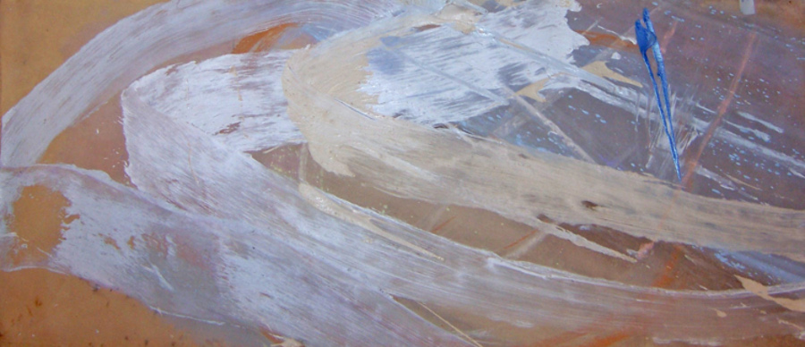
Francine Tint, dream life of angels, 2009, acrylic on canvas, 30x78 inches
If I absolutely had to choose the best in the show, I might go with Francine Tint's painting. It's a beautiful and subdued Abstract Expressionist piece, all nearly monochrome and warm beige except for a splashy stab of blue. It's mutely eloquent, the way good Abstract Expressionism can be, without being overwhelming. The tight range of values holds the whole thing together and the width is just enough to encompass your field of view and hold you there. It's equal parts restraint and abandon -- close hues slapped on wildly -- and it works.
Another candidate for best would be Serena Bocchino's painting. Alas, I have no image to share with you since the gallery has so far been unable to get a good photo of it. It is, after all, white. You can see from Serena's site the kind of work she does -- a sort of constricted Jackson Pollock drip, more calligraphic, less wild. Her other work looks to me as if it might be in danger of being too twee, but working white on white cuts her back in a good way. Not only is her paint more tightly wound than Pollock's, it's shinier, too, lying on the surface like a piece of polished plastic.
Carol gave me one of Serena's digital cards, a credit card-sized thing with a flip-out USB plug. At home I got to plug it in and watch a short video, music by Pat Metheny, which is basically a slideshow of Serena's work, although the introduction is a clip of her painting, canvas out on the floor, dripping away like old Jack. Only barefoot. This seems to me like a great way to promote artwork. It's extremely groovy.
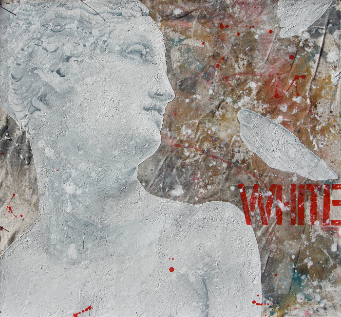
Michela Martello, White, 2009, mixed media on canvas, 27x29 inches
Close on the heels of those two I'd put Michela Martello. I liked her White, shown here, despite its use of a word. I'm not a big fan of words in paintings. That "WHITE" isn't white at all is kind of funny, though, like one of those perception tests you can take online. The surface of this painting is nicely chunky, very lively, contrasting with the stillness of the subject and the chilliness of the color scheme.
Andrew Millner, Winter White, 2009, inkjet print, 47x73 inches
The rest of the work in the show is good, also. The only exception for me is the inkjet print submitted by Andrew Millner. Apparently what Andrew does is work out these digital compositions and then print them. The result looks decidedly computer generated, like fractal-based wireframe landscapes in the early 1990s. About the only thing going for it, in fact, is that it fits in perfectly with the latest trend in art as reported by Joanne Mattera, which is trees.

See all the reviews from this date, go to the previous review from this date, or go to the next review from this date.


I think this is a brilliant theme for a show (literally and figuratively). The old adage "I play better tennis because there's a court" applies. I particularly love Martello's interpretation. (BTW the painting I last posted on my blog, though not in the same league, could almost fit this show.)
I am so glad you liked this show, and especially glad you liked the Tint. Some of our other evaluations differ, as you will see when you read my review (due to go online January 23), but hey, isn't that what makes horseracing?
As Robert Heinlein once wrote, "It has long been known that one horse can run faster than another -- but which one?"