I didn't get my driver's license until I was 21 years old. Growing up and living in New York City, I just never needed to drive. I took trains and buses -- almost never taxis -- everywhere I needed to go. For a few years after I got my license, too, I still didn't drive much, except down to Philadelphia with my wife to visit her family.
Since then, though, I've become Mr. Bridge-and-Tunnel. When I make my trips into Chelsea, I drive in. Parking in Chelsea, at least, is very easy, unlike everywhere else in Manhattan. The drawback is that sometimes the traffic is insane and I end up spending most of my time sitting in my car. Of course, the bus would have to sit in the same traffic.
Last night was one of those nights with a lot of traffic. And I'd gotten out late, too, so I found myself performing triage on my openings list so I could make the shows I really wanted to in the time I had left. So I didn't make it to Jack Shainman to look at and mock mercilessly Hank Willis Thomas' show, nor did I get to Bryce Wolkowitz to see what Ben Rubin had cooked up.
 I did make it to Lyons Wier Gallery to see Lynn Jadamec's opening. I had seen James Rieck's show and spoken to Michael Lyons Wier about James' work and art in general and I was eager to see what else Michael was interested in. Lynn's a bit different for Michael: He mostly likes photorealism, and Lynn is more of an impressionist.
I'm admittedly more into photorealism myself, but Lynn's paintings captivated me. The paintings on view are choppy -- at times it looks like she paints with a palette knife. There's very little detail. Her colors are very naturalistic. Altogether she has a great sense of space; what she leaves out is as important to the painting as what she leaves in. Somehow the texture of the paint itself substitutes for the texture of the objects she's painting, whether it's buildings, benches, or the ocean. This exhibit is taken from paintings Lynn's made of Rockaway, where apparently she surfs. Anyone who surfs off of New York has clearly come to terms with adversity. The paintings say nothing of this; instead they seem quiet. I was reminded of the time I spent living in Wildwood, New Jersey, and I could smell the sea salt. Lynn evokes something of an Edward Hopper-like loneliness, but I'd say it's more of an aloneness than Hopper's -- more the positive feeling of spending some time by yourself than the negative feeling of being isolated.
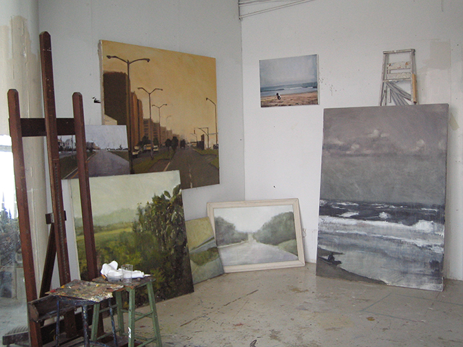
Lyons Wier is a small gallery. I didn't need to ask anyone which attendee was the artist. Lynn was clearly the tall, slim, very pretty young woman chatting with visitors near the door. I was annoyed at first -- I haven't met an ugly artist yet and it's starting to get me down -- but as soon as I introduced myself Lynn turned out to be so incredibly nice I had to stop being annoyed. I needed to ask her how she achieved this certain color, which you can see on the painting in the studio photo I include here. I've tried to get that streetlight yellow sky over and over with no real success, and she's just about got it in the painting with the streetlights marching off into the distance. Under the lights in the gallery her painted sky positively glows. Lynn told me she couldn't quite remember which pigments she used -- of course -- but that it was important to start out with a good oil-based titanium ground and use very pure pigments with very clean brushes. She actually went into a mini-lecture on oil paints and mixing colors, saying that each pigment is like a diamond in that it refracts light as it passes through it, and mixing too many different pigments crowds them together and the light can't pass through. I liked her way of describing paint mixing. I hope to find time to talk to her more in the future, because a gallery opening is not a good place for long discussions.
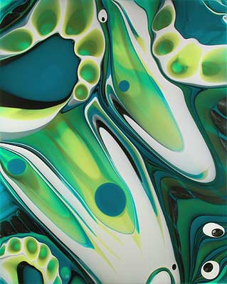 Just about right next door on the same floor as Lyons Wier is McKenzie Fine Art which was showing James Lecce's poured paintings. A Google search on James' name turns up, first, an article titled "Paintings That Paint Themselves," but it turns out to be badly named, at least where James is concerned. I asked him if he was tired of explaining how he makes them and he told me he wasn't at all, and went on to describe his process for what must be the thousandth time.
James has been painting in this style for about eight years now. He does indeed pour the acrylic polymer liquid onto a panel, but then he takes an active hand in moving it around. He uses all sorts of things from squeegees to turkey basters to get everything where he likes it, and after so many years of doing this, he's got a pretty good idea of how to achieve what he wants this way. After the first layer dries he'll pour down another layer and manipulate that, and so on. His paintings can have six layers, sometimes more, sometimes less. And each layer has areas of translucence through which the underlayers show.
The result is a series of paintings which I just loved. I can imagine someone arguing that they're merely decorative -- "decorative" being a pejorative in art circles -- and that they're repetitive. To which I say: Nonsense. They're simply beautiful. Kurt Vonnegut once wrote that Abstract Expressionist paintings are about nothing but themselves and I'd class James' work with them: They are about nothing but themselves, and they are beautiful, and that's more than enough. As smooth as an enameled refrigerator door, as whorled as a fingerprint, with the majesty of Hubble telescope photos of distant nebulae and the curious interactions of fractal geometry, I could look at these all day. When I was younger I had a specimen of polished leopard jasper and it was one of my great treasures because every time I looked at it I saw new patterns. James Lecce's paintings have that quality.
But I was running out of time and I had at least one more opening I wanted to see. So I bade good-bye to James' paintings and rushed out, only to find myself drawn to the crowd across street at Lennon, Weinberg. Stephen Westfall was showing his latest paintings and I took a look around.
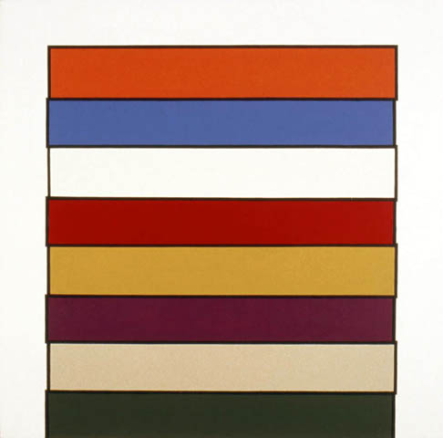 My immediate impression was that here was a painter who'd looked at Piet Mondrian too long. And not actual Modrians, but reproductions of Mondrians, because, as anyone who's looked at the actual paintings can tell you, a real Mondrian has a lot of texture. This texture can't be reproduced photographically, so you might think Mondrian paints very flat, but in fact many times you can see his brushwork, and passages which reproduce as all one shade of white turn out to be many different shades, and so on. Meanwhile Stephen's paintings are as flat as flat can be, as if they were painted with a roller, which maybe they were. Now, I love going through paint chip displays at the hardware store -- and I'm not even kidding here -- but I'm not sure they're art. Stephen claims (in the interview I link to above) that he spent a lot of time in front of actual real live Mondrians, but I'm not sure he took away what he should have from that experience. 20th century art can seem, in some ways, like a gradual process of removal: Remove the subject, remove the story, remove the brushstrokes. There's a point, though, where I think you've removed whatever made painting interesting, and I think Stephen Westfall is past that point.
Having gone through that show I was really hustling to make it around the corner to the next opening on my list, Glen Hansen at the Fischbach Gallery, except when I got there the elevator wasn't accepting 8th floor button pushings, so I ended up on the 6th floor in the Edward Thorp Gallery viewing Judith Linhares' latest paintings.
 I can't say I was overwhelmed by Judith's work. I had looked her up when news of her opening hit the Douglas Kelley Show list since I look up almost everyone while planning my gallery trips. Her paintings didn't strike me as anything I wanted to see all that badly. I was right about that to some extent -- I didn't need to see her show.
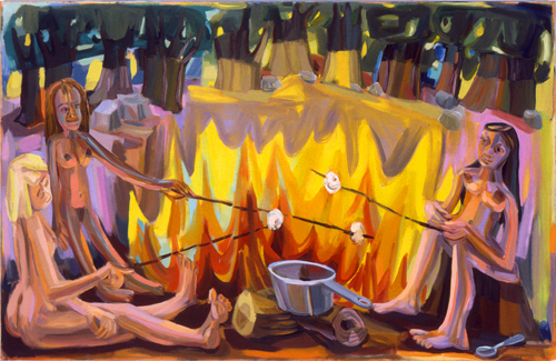
But I was pleasantly surprised to find that I didn't dislike it, either. Judith's style is very blunt and basic -- to give you an idea, she has two gouaches showing which are almost indistinguishable from her oils, and if you can paint in gouache the same way you paint in oils, well, let's say you're not working too hard. Nevertheless I found myself won over by her bright colors and enthusiastic brushstrokes. Her paintings are fun. A little strange, filled as they are with naked girls, pots, pails, and bunny rabbits, but fun anyway. Even a painting with a potentially gloomy title like "Fools for Love" -- can't you just see broken, weeping figures in a lonely landscape? -- even a title like that is given to a painting of happy-looking nudes climbing a tree. Maybe there's some dark symbolism I'm missing here (I tend to be naive like that) but on its face, it's a bouncy work.
On the way out I found myself waiting for the elevator with a tiny young woman who was so drunk she was spilling wine all over herself and the floor. An older man, who was wearin' the green a day early, shouted to her, "Gulp it down!" To which she replied, "I'm so glad I was invited here. The artist is my professor!" On the elevator, the man asked rhetorically, "And what class is that, Groupies 101?"
And speaking of the Irish, on the sidewalk on my way to my car I found the work of one Ellis Gallagher, who had chalked the outline of the shadow of a streetlight on the sidewalk. I know it was Ellis because he signed his name, along with ©2007, and I wrote it down for future reference. Turns out Ellis is old news: The New York Times already ran a story on him. Regardless, I was charmed by his shadow, and I smiled, which is not something that happens often to me in Chelsea.


Leave a comment