So I go through the trouble of having a Plan Ahead section where I can note where I'm going to be, then I don't show up for the planned event and end up going out without a plan. I'm sure the three people who read this are astonished and upset, but, hey, that's life in the big city. As it was, I should've stayed home last night.
I was looking forward to the first show on my list, The Seventh Side of the Die at Alona Kagan. Last Saturday Jeanne Brasile had introduced me to a friend of hers who works at the gallery and one of the artists in the show gave us an invitation, so I figured I'd go. Anything to support someone I've actually met. Luckily I forgot his name, so I can't blame him for any of the really bad art on display.
I was expecting a pretty big show. It had a good sized clot of verbiage on the Douglas Kelley Show list which threw out a list of about a hundred artists. Granted that one of the major names was Duchamp, and I usually take that as a sign to run as fast and as far as I can; I like Duchamp, but honestly, he's opened the door for more crappy art than just about anyone I can name, Warhol included -- and Warhol was name-dropped by the show, too. Still, I expected the show to at least be big and varied.
In fact, the show is microscopic. I can remember less than fifteen pieces. And the quality level was poor. Really poor. There's some video I avoided; there's a horrendous assemblage of tinfoil and tempera which made me think my son's third grade book report diorama should be in a museum; there's some other stuff. Overall it's hugely disappointing. The show includes a couple of ancient artifacts from the early days of surrealism and dada, like a Hans Bellmer book; sadly, as has happened with all these old things, they now have to be encased in plexiglas instead of actually looked at. I'm sure the creators of these things would either be amused or horrified at their sanctification, but that's the art world, I guess.
The looseleaf binder which, in most galleries, would be a help to figuring out what the hell was going on, turned out to be stuffed solid with pages upon pages of material, a lot apparently downloaded from the Internet, in various languages, regarding maybe some of what was in the show, maybe some things by the representated artists, and maybe some things from Mars. I'm all for jokes and humor, and occasionally merely being weird for weird's sake, but you can't just beam down from the mothership and start blathering. A little context is helpful. A guy on the corner ranting that all the white people are moving to a base on the dark side of the moon is potentially entertaining; a guy ranting about the same subject in his own invented language is just some crazy person off his meds.
 There were a few interesting bits. Colleen Asper's "The Portrait of the Artist as President" was really stunning in terms of technique; a real old-school photorealist, she managed to efface all of her brushstrokes and leave a smooth, luminous surface. (Reproductions never do justice to oils, but this one is especially egregious; trust me, at full size, in person, it looks a lot better.)
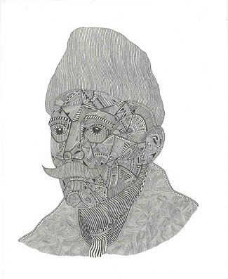 Timothy Hull's tiny drawing "Somewhere Between Real and Remembered" was neat, a little pencil portrait of Proust filled with little patterns and hatching and so forth. I have a weakness for drawings by obsessives; my father used to doodle like that, and I have a ton of similar doodles myself, so I tend to feel happy just seeing other people with the same penchant. I'm never sure they qualify as "art" and not, you know, doodles, but I like to see them anyway.
 Finally there was Jill Magid. This sculpture of her head was entrancing, in a way, because -- the photo doesn't quite communicate this -- it actually looked alive, like it might wake up and move around. It doesn't look like a real head by a long shot, which is what made it strange; the proportions are off and it's clearly constructed. But it still has that creepy quality you get from the Real Dolls, that it might, in fact, be alive and just waiting for the right moment to move. In the looseleaf notebook there were a lot of pages devoted to Jill; if they weren't almost totally unreadable they might have been interesting. Apparently she works with or around or near actual forensic pathologists and uses what she sees and learns in her art. And maybe she puts together faux crime scenes; I couldn't figure out what was going on. Still, that sounds more in the spirit of surrealism than most of, well, anything I've heard in a while.
So now I've said it was a small show and then I praised almost half the pieces in the show, which makes you wonder why I'd be so disappointed. The show really just left a lot dangling. I wouldn't have even known half of what was going on without checking the Web before getting there. The other pieces -- which I will not discuss -- were so terrible. And the show was just so damned small. It may seem like a great idea to inflate something to get people to come by, but if you inflate it too much, you run the risk of becoming exactly what Seventh Side of the Die became: A hugely lame show which left such a bad taste in my mouth, I don't think I'll trust this gallery for a good show for a long time.
From there I went down a couple of blocks to West 27th to see Andrei Roiter at Dinter Fine Art. Which opening had been cancelled. Well, their Website was so totally half-assed I expected it wouldn't work out. While on 27th I stopped in to see if CoSM was open, but the elevator seemed to be deceased, so I didn't even give it a shot. I did pass by Sundaram Tagore Gallery, which was preparing for an opening which looks really good. They're on my list now.
One block south I dropped in on Marco Neri's "Mars Black" at Lucas Schoormans. Readers may have gotten the idea that I don't like abstract art, but that's not true. I have high expectations of all kinds of art, and a lot of people incapable of meeting those expectations seem to choose abstraction as their metier. Abstract art can be good. Marco Neri's abstractions are, in fact, good. He's pared down his palette to just a few colors; as the title of the show might imply, mars black -- that flat, featureless black -- is the main color here. Marco then uses some white, which tends to get swallowed up by the black, so his brushstrokes are reduced to shades of gray depending on the thickness of the paint. Other colors occur occasionally; red and blue for a flag, olive green. Marco is working in tempera for this show, too, so all of these paintings are so matte they eat some of the light around them.
 His scumbling of white definitely shows the hand of the painter at work. I can easily see any of these as being the kind of painting you could hang on your wall and stop to look at every so often, noting new details and nuances each time.
Lucas Schoormans Gallery is in a building which has a real live elevator operator. 35 years I've lived in and around New York and I don't think I've ever been on an old-fashioned manually operated elevator. I thought they were all extinct by now. And if that wasn't thrill enough, I rode the elevator back down with Jesse L. Martin. I wouldn't mention it except it was the highlight of my trip. I'm a big Law & Order fan.
Since I was already on 26th Street I decided to head over to a show Jeanne recommended. At 601 West 26th the gallery is just about in New Jersey it's so far over, and Krampf/Pei Gallery itself is 14 floors up and half the building away from the elevator. I think I walked about a mile before I even got to John Avelluto's show, titled "Playstation."
Now Krampf/Pei is so cool they could even hire this ridiculously pretty girl to stand at the sign-in book just to tell people "This is for the mailing list" and get hit on by pathetic young men. They could hire a guy to sit in the corner of the room and dispiritedly pluck out on guitar the musical equivalent of the nearby art, which is to say unfocused, pointless, and only glancingly related to any known art form. They could put out a bowl of minipretzels. That's how cool Krampf/Pei is.
And as near as I can figure that's what the crowd was there for, to appear to be cool. I didn't think they were there for the artwork, which they looked at even less than your usual opening night crowd. Which was just as well. John's art consisted of videogame-style images -- all hand drawn pixels and primary colors -- juxtaposed with what could charitably be called references to past artists, like Jackson Pollock and Francis Bacon. There was some graffiti-style stuff, too. And in an attempt to appear interactive and groovy, one painting was essentially a blank videogame background (it reminded me of the Atari 2600 Superman game) on which viewers could stick and re-stick some of John's graffiti-style AT-AT Walkers and rockets and stuff. The original blank painting was probably the best thing in the show before anything was stuck to it. After it had been "artified" or whatever, all I could think of was what an archival nightmare it had become.
![[John Avelluto]](/blog/images/20060309/john_avelluto.jpg) Speaking of archival nightmares, a number of the paintings in this show appear to be layered epoxy. This gives a nice, candy-like surface -- the epoxy drips off the sides of the paintings as it dries, leaving a wacky edge when you check behind them -- and the paint between the layers makes for an interesting dimensional effect. But I have it from my favorite curator Jeanne that epoxy has a nasty habit of yellowing and cracking as it ages. And in fact one piece, a plug-in with a lightbulb behind it (and which was unlit), is already yellowing.
Speaking of archival nightmares, a number of the paintings in this show appear to be layered epoxy. This gives a nice, candy-like surface -- the epoxy drips off the sides of the paintings as it dries, leaving a wacky edge when you check behind them -- and the paint between the layers makes for an interesting dimensional effect. But I have it from my favorite curator Jeanne that epoxy has a nasty habit of yellowing and cracking as it ages. And in fact one piece, a plug-in with a lightbulb behind it (and which was unlit), is already yellowing.
![[John Avelluto]](/blog/images/20060309/john_avelluto.2.jpg) Curatorial concerns aside, I was unimpressed by the work in this show. 1980s videogames don't strike me as very interesting, especially not when used for heavy-handed, obvious political messages. Ooh, racial profiling is like a videogame, wow, man. Bong-inspired paintings don't do much for me, either: Super Mario's head floating above a Pollock-like background with slices of real pepperoni layered in the epoxy doesn't seem all that wildly imaginative to me, just a little pointless and wacky.
Curatorial concerns aside, I was unimpressed by the work in this show. 1980s videogames don't strike me as very interesting, especially not when used for heavy-handed, obvious political messages. Ooh, racial profiling is like a videogame, wow, man. Bong-inspired paintings don't do much for me, either: Super Mario's head floating above a Pollock-like background with slices of real pepperoni layered in the epoxy doesn't seem all that wildly imaginative to me, just a little pointless and wacky.
The show seemed great after the Seventh Side of the Die, but I don't think I'll be rushing out to any more John Avelluto openings.


Leave a comment