Greetings from your friendly neighborhood idiot. In our last installment I mentioned how I ran into Mark Kostabi and he invited me to be in the audience for his TV show. When I'd gotten home, I'd asked my wife what I was doing tomorrow. She informed me that tomorrow was Halloween. Except I thought tomorrow was Saturday, and Halloween was on Friday.
"Today's Thursday," she said.
Uh oh. Now I couldn't remember if Mark had told me to come in on Friday or Saturday. I thought he'd said "tomorrow" but I couldn't be sure he hadn't said "Saturday" and I'd translated that to "tomorrow" because I thought "tomorrow" and "Saturday" were the same because....
I called Friday morning to check and no one answered, so I figured, okay, the TV show tapes on Saturday. I therefore stood in front of Kostabi World Saturday morning, slightly out of breath because I was hurrying to get there before noon when the taping was supposed to start. I knew I was in trouble because I'd found Kostabi World without getting lost even though I didn't bring the address with me. When one thing goes right in my world, that's a sign that something I don't know about is going wrong.
Mark answered the studio doorbell via the little speaker. I told him I was there for the TV show.
"What TV show?"
It turned out that of course when Mark had said "tomorrow" back on Thursday, he'd meant "Friday," not "Saturday," because he's a normal person. Mark was on his way out so he came down and somehow failed to mock me, but he did suggest I call him before the next taping, which will be some time in mid-November.
Now that I think about it, I probably should've written that date down.
Well, when God closes a door, he opens a window. Sometimes the window is thirty storeys up, but it's a window just the same. This time the window opened onto an impromtpu gallery slog -- I had time to wander around and see what was showing. Mark suggested Eric Fischl, whose show was just opening at Mary Boone. I didn't honestly know which way Mary Boone's gallery was -- despite having been in it more than once -- but when I left Mark slipping into a secret coded door down the block from Kostabi World I accidentally found myself near it anyway.
But first something on my side of the street caught my eye, and I found myself in Ramis Barquet looking at
Victor Rodriguez, Giant White, 2008, acrylic on canvas, diptych, total 120x78 inches
where I paused for a moment in total shock. I couldn't believe what I was seeing. It simply wasn't possible that anyone was still showing this kind of work. I wondered for a moment if I'd been transported to the 1980s or into some back issue of Airbrush Action magazine. Because I was standing in front of honest to goodness no holds barred one hundred percent authentic large-scale airbrush photorealism. Really.
No, really!
One of my most treasured books, endlessly studied, pored over, examined, the book which was my personal Torah for almost twenty years, is The Airbrush Book by Seng-Gye Tombs-Curtis. The reproductions in it span the gamut of airbrush work from technical drawings through fine art, from the first airbrush portrait by an unknown artist through t-shirts worn by the Tubes. The book is full of abstruse details of photoretouching and frisket cutting, detailed schematics for the most popular models of airbrush, and cleaning instructions; and a whole middle section is devoted to examples of some of the most fantastic airbrush work ever done. I aspired to be ranked among these greats, to use my airbrush to conquer the worlds of illustration, fine art, t-shirts, album covers, and posters. I was going to be on the wall in every dorm room in the world.
And I gave up all of it for good in 1998 when I discovered oil paints.
And here it all was, resurrected, in front of me.
And it's not all it was cracked up to be.
It's not Victor Rodriguez's fault, that's for sure. For what he's doing, he's absolutely fantastic. If Photorealism is your thing, Victor is the best. His color sense is dead on, exactly to the life. His hand is assured. The result is hugely realer than reality, in your face, and it can carry you along like a great action movie. Victor evokes textures without overworking the surface; you won't mistake his work for photos and they're not microscopic examinations of his subjects, but the feel of everything is there. Skin, clothing, jewelry, fingernail polish, what have you. Glossy parted lips, minuscule eyelashes, collar seams, all of it. Guys like James Rieck should just hang it up: Victor's got the field covered.
But it's not all it's cracked up to be. I moved on to oil paints long before my feelings changed -- I honestly gave up airbrush because I realized I was never going to be that good at it and oil paints were just a lot easier to deal with (there's only so many times you can fling an airbrush across the room -- it always comes up short because of the air hose and it's very unsatisfying) -- I moved on to oil paints before my feelings changed, but my feelings have changed. Over the past couple of years, seeing a lot of art and making a lot of art, I've turned around on what art does, on what it can do. I've seen a lot of illustrations in person and I've learned that there is a definite difference between fine art and illustration. You can't get that difference from reproductions, from a story in a magazine, but it's so obviously there when you look at the originals it's shocking. And that difference has changed my feelings towards this kind of work: I'm no longer excited by it the way I used to be. It's good, it's technically proficient, it's nice enough to hang on your wall, I guess, but...but it's not all it's cracked up to be.
I'm still impressed by it, though. It's fun to see, and for me kind of nostalgic. And it does my heart good to know that the airbrush, which has mostly gone the way of slide rules, vinyl records, and 35mm still film in the wake of the digital revolution, hasn't completely died out.
I should, at this point, say something about Denis Peterson. Denis is also an airbrush artist and he's also working realistically, so it might seem I should compare his work with Victor's. But in fact the two are very different artists. Denis' work is photographic: It's possible to mistake his work for digital photos printed out on canvas. But Victor's work could never be confused with a photo. Denis is aiming for more than the reality of photography, while Victor is a true Photorealist, in that his work is only exactly as real as photography, while not actually looking like a photo. The distinction is maybe difficult to explain but it's clear in the work itself. Victor's paintings are definitely the work of a human hand but have the cold sheen of something mechanically reproduced, while Denis' work appears mechanical but somehow contains all the warmth of humanity.
My spirits thus lifted I crossed the street to Mary Boone's to see
Eric Fischl
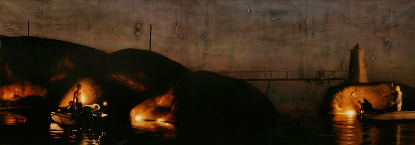
I was expecting paintings. There were no paintings in the show. Instead, the cavernous space was occupied by a few groupings of figures and some lights directed on them. If you described the sculptures to me, or if I saw photos, I don't think I would've thought much of them. They're very unfinished, entirely lacking polish in all senses of the word. Each figure is only roughly human and entirely lacking in detail -- fingers are merged, faces are only hinted, genitals are ambiguous. The figures are arranged on haphazard, crooked slabs of the same metal from which they're made, and all of it is rusty, crusted, rough.
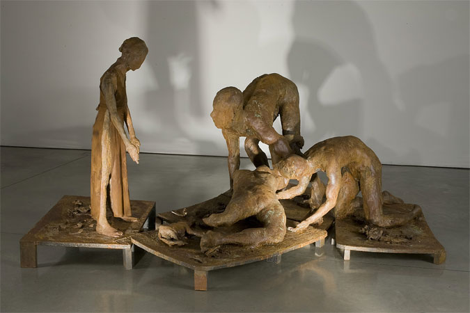
Eric Fischl, Ten Breaths: Damage, 2007, resin, patina, and cloth, 57x93x124 inches
The other groupings are less powerful but still filled with a roil of emotion. I was surprised by my feelings. I'd never associated the name of the artist with anything meaningful, but here it was. The feelings aren't embedded in the stories of the sculptures: There's no obvious narrative to them. There's so little about them that's clear and definable, I couldn't say to myself, here's a man running away from his impending death, or here's a group of people dancing in a harvest festival, or here's a soldier nursing a fallen comrade, or anything like that. In fact intellectually anything I came up with was almost immediately contradicted by something in the sculptures themselves. And yet the feelings are still there.
When I talked about the difference between art and illustration above, this is what I meant.
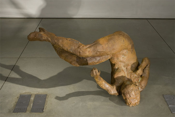
Eric Fischl, Ten Breaths: Tumbling Woman, 2007, resin, 48x48x44 inches
If you wanted a clear contrast between art that is simply meaningful and art that intends to be meaningful but isn't, you couldn't ask for a better demonstration than the one I got by walking out of Mary Boone and into Charles Cowles next door to see
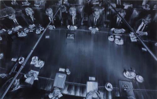
Xiaoze Xie, November 5, 2004, NYT (Bush Cabinet 2nd Term), 2008, oil on linen, 70x110.5 inches
I get it: I can see how the dealer sitting in his office going over Excel spreadsheets and examining his bottom line might be thinking, "Everyone else seems to be selling Chinese painters these days, so what I really need to do is dig up anyone with an unpronounceable name with a lot of Xs and Zs and Shs who can slap paint on canvas and get them on my walls..." And find his eyes straying over to his Gmail inbox to see one of his minions has unearthed this Asian guy -- a surefire winner! And I can see how the painter sitting in his studio with his Starbucks and the latest New York Times, staring at a blank canvas and wondering what to do, might be thinking, "I must somehow reflect the important events of my time in a way that communcates the workings of power and politics in this most chaotic of eras. I must discover a way to speak truth to power while drawing inspiration from the fabric of our daily lives..." And find his eyes drifting over to the newspaper as a little Guernica lightbulb goes off over his head and he decides to copy news photos relating to the War in Iraq. A surefire winner!
So I get how these two flows, swollen as they are by all the tiny minds trying to think big thoughts, dumb dealers who think they're smart and dopey painters who think they're deep, might come together into a show such as this. I get it, but I don't really understand it, because the paintings are just so obviously lame. They're so obviously and slavishly copied from photos, and executed in such a boring style, all brushy and out of focus with little Sargent highlights on the noses and knuckles, with Rumsfeld and Powell and Bush and soldiers in desert camo and so forth swimming out of the watery gloom and then floating off again -- I just don't see how even the stupidest of dealers, even the densest of painters, couldn't see how shallow, how worthless, how completely unnecessary this show is. A show of the original photos, a photojournalism retrospective, would be infinitely better, if only because the photos at least depict and record something; these copies, these depictions-once-removed, add nothing, but subtract everything, like context, significance, sequence and consequence. Watching an artist think about politics is like watching a dog trying to get peanut butter off the roof of its mouth.
Enough with the blue chips! I decided to head uptown to my old friends, Ed Winkleman and Lisa Schroeder and Sara Jo Romero. Ed's gallery had a bunch of people in it for some reason -- maybe a tour group had gotten lost -- so I started in Schroeder Romero where I saw...
A Sign of the Impending Apocalypse
...which is Schroeder Romero showing something I actually liked. Or anyway didn't think was completely wacky. Well, that's not entirely true. I thought it was very wacky, but entertaining.
Ahem. I didn't give credit where it's due. I walked into...
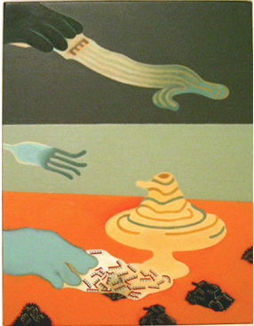
Andy Diaz Hope and Laurel Roth's Future Darwinist
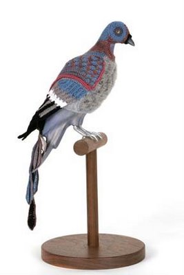
Andy Diaz Hope and Laurel Roth, Future Darwinist, 2008
Take those knitted bird outfits: Lisa had to point out to me that they're costumes of extinct birds for city pigeons to wear. So if a pigeon is tired of being harrassed, I guess, it can dress up as a dodo (or, seen here, as a passenger pigeon) and get some respect.
And that tapestry! Well, I like tapestries. I have one in my bedroom of a unicorn from the Franklin Mint. Really. I like the way the colors aren't blended but stepped, like old computer graphics were. And this tapestry of Andy and Laurel's is a curious mixture of old and new crafts: Lisa told me they sent an image off to a place in Europe that "prints" a digital image as a tapestry. What was on this tapestry? A very surreal scene involving bees, trees, a caduceus, sheep (presumably cloned) and a three-headed dog.
Laurel Roth, Lap of Luxury (Persian), 2007, carved industrial resin, walnut, Swarovski crystal, aluminum, 2.5x3.25x4 inches
Less interesting are Andy's pill photomontages. Apparently there's some kind of reaction involved to our medicincal culture, or America's need to take drugs, or something. The work is visually inert and only interested me for as long as it took me to realize -- aha, Andy cuts a photo up into small slivers and slides each one into a clear pill, then arranges the pills in order to recreate the photo. Okey doke.
But that's okay, because overall the show's fun. And fun is good.
Not so good was what was going on next door. When I made my way back to Ed's gallery I found the tour group or whatever had left so I had the exhibit to myself, said exhibit being...
Jimbo Blachly and Lytle Shaw's The Genretron
Or maybe those names are hokum, too, because the whole thing purports to be a find from 19th century Holland, something to do with the Chadwick Family, which may or may not be fictional, and which....
But you know what? I really don't care. The thing in the middle of the room was hard to crawl into and once I did, it wasn't worth it, unless you like dioramas a dull second grader would be ashamed to hand in to their teacher. Stand outside a group home on heavy trash day and you're likely to see material more artfully arranged.
Judging by this and the hallway show -- which consisted of purposely unreadable postmodernist jargon wall text next to stickers reading "Item temporarily removed" over and over -- Ed's looking to become the Henny Youngman of art dealers. Why anyone would want to become the Henny Youngman of art dealers is beyond me, but, hey, whatever skins your banana.
From there I decided to go back downtown a couple of blocks to my favorite street in Chelsea, 25th. I started at Dillon Gallery which was showing...
Per Fronth's Carbon Compositions
Per Fronth, Bridge/Teenage Lux (archipelago), mixed media/oil on canvas, 184x65 inches
A painting like the one I've pictured here, Bridge/Teenage Lux (archipelago), perfectly illustrates what's going on in all the works in this show: First you've got a heroically-sized panel (a little over 15 feet wide) with a fantastically overwrought -- one might say pretentious -- title; then you've got the canvas positively slathered with paint; you can see the several areas across the top where the paint is falling off; and you've got some lovely illumination effects. That's what made me think of Turner -- beautiful light, collapsing structure. Not really the best combination.
Upstairs in the same building is PPOW Gallery wherein I saw one of the last days of...
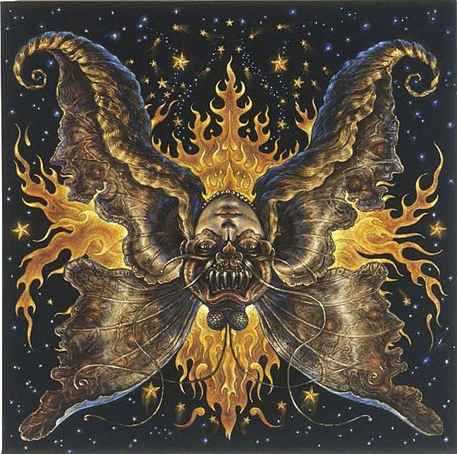
Thomas Woodruff, Venus: The Object of Affection/The Demon of Lust, 2007-2008, acrylic on black silk velvet with motor, 40x40 inches
Thomas' show is helplessly, hopelessly gimmicky, and yet I fell for it.
I've mentioned many times on this blog that I'm a sucker for certain things. I say these things up front so you understand that I'm a person, just like you, and I come to art with my own biases, prejudices, and insanities, the same way anyone does. Add one more to the list: I have a thing for color on black backgrounds. I don't know why, but I'm automatically drawn to colored pencil on black paper; something about the way the colors are deepened, made richer, maybe, or something about the way the forms seem to hover over the background. I can't say what it is, but it's there.
Which means I'm a sucker for black velvet paintings. Yes: The very height of cheese, the very depth of kitsch, the sine qua non of junk garage sale art, the painting on black velvet; yes, that paragon of perfidy; I like it. I like it.
So I was primed to like Thomas' show, since one of his gimmicks -- as if one isn't enough! -- is that a number of these paintings are acrylic on black silk velvet. This lends his colors a brightness and a sharpness that really makes them pop. Then there's gimmick number two, which is that each painting can be viewed in two directions, like one of those optical illusions where the old woman turns into a young woman. So Thomas has each painting mounted on a motor which slowly spins it as you watch.
While I appreciate the idea, in practice it didn't work so well; some of the painting's motors had stopped with the painting in a weird orientation; and the ones that hadn't stopped were kind of hard to really grasp as they went around. It was good to be able to view the two different images, as it were, without having to twist your head around, but in a way, it still took away from the viewing.
That said, the viewing was still more entertaining than most plain old paintings. The works are fun, frothy, full of odd little details, like Hindu religious paintings, with demons lurking, butterflies perching, fireworks popping, baby rabbits turning into baby ducks, galaxies swirling, and so on. No one would mistake this for a sober endeavor and yet underneath there's a current of something very serious, as if these paintings tap into a deep river of myth. It's not overwhelming, that feeling -- the velvet and the spinning and the gaiety of the paint itself keep it muted. But I felt it anyway, a darkness -- like the velvet of the paintings themselves.
Thomas also has a number of pastels on display, big sunbursts of bright, light color. These are a little less successful than the velvet paintings, but they have the benefit of being a lot less gimmicky. They're more focused, more serious, and slightly creepy.
Whew. You'd think I'd be done, but no. I don't go in to Chelsea during the day much, so I was determined to stop at all my favorite places. Topping the list was my last stop: 511 West 25th Street. Mainly it's my favorite because it's got Valerie McKenzie in it, but there are a bunch of galleries in there and any one of them can have good stuff in it. For her part, Valerie was showing...
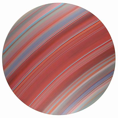
Chris Gallagher, Tondo 16-08, 2008, oil on canvas, 48 inches diameter
I had to start by asking if Chris was a he or a she -- he -- and if he's a Christopher or a Christian -- Christopher. Good choice. Chris is another one of the obsessive-compulsives that have been taking over Chelsea lately. His works consist of carefully painted colored bands running entirely across the canvas. The colors modulate from band to band following some whim of the artist, I suppose, although there's a sense of some kind of harmony, some plan being followed. Altogether the paintings remind me of nothing so much as close-up photos of the rings of Saturn, some of which, being false-color, are about as artistic as paintings themselves.
I like Chris' color sense and I appreciate the minimalist, quiet effect of his paintings. I'm not sure seeing a lot of them at once is the best way to view them. I'm also not sure how well they'd hold up over time; it's hard to say after just one visit. I certainly like them more than any Barnett Newman I've seen, or Ken Noland, just to name two artists known for stripes. But I found myself wondering more how they were done technically than how much I liked them.
Upstairs from McKenzie Fine Art I found Luise Ross Gallery, a small place I don't think I ever been, which was showing
Frank Rivera, Bent Fork Attack, 2008, oil on wood, 13.5x10.5 inches
Finally, on my way out, I strolled into George Billis to find...
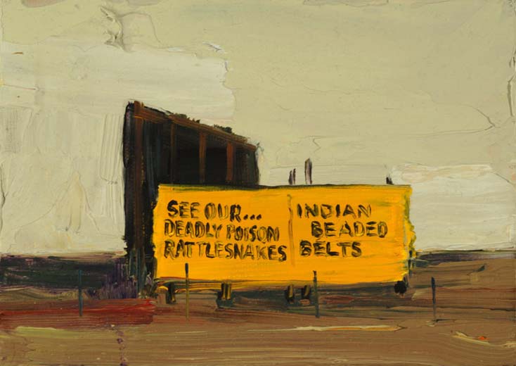
Patrick McFarlin, Poison Rattlesnakes and Indian Belts, 2007, oil on canvas, 5x7 inches
The first thing I thought of when I saw Patrick's work, very small paintings arranged in a nearly overwhelming array, was Tracy Helgeson's work. Because they share subjects -- landscapes -- and to some extent style -- brushy surfaces with few details. What Patrick has that Tracy doesn't is color and lots of it, and impasto, and lots of that. His impasto is even more pronounced because when the painting's only 5 by 7 inches, a brushstroke looks pretty huge. When it's a tiny landscape, then the sky's only two or three swipes of the palette knife high. Still, it's amazing how much he manages to do with so little; although I think Tracy's work is significantly better, Patrick's work is nevertheless quite good.
Patrick writes on the gallery site, "Took me fifty years to realize my strong suit is color. I’ve been wasting art materials longer than that. Something worth keeping comes around often enough to keep me behind the paint brush." I'm not sure that I agree color's Patrick's strong suit: While his color is good, he has just as much grasp of form, composition, and that thing we have no word for which allows him to define an object with as few details as possible. It's easy to multiply details and effects until you can't help but recognize the subject of a painting; it takes a real artist to pare away all that and find the essence of the subject and then communicate it.
And that was your friendly neighborhood idiot's day out, in case you wondered what he does while you're away at work.


That rotating JPEG is neat! (I've no idea how you put it into FLASH and tween it or whatever) - but it's a gimmick on a par with the kind of cheesy mysticism you are so susceptible to.I think probably the McFarlin appealed to me most.
I have to say Eric Fischl's work is really my favorite from this trip, and probably one of the better shows I've ever seen. McFarlin's work is good but I even considered not writing about it; I didn't get a huge kick out of it. Woodruff's work is light-hearted, mostly, and enjoyable on that level, like a good romantic comedy movie.I'm glad someone noticed the rotating animation. I made that myself. I don't know why the gallery didn't do it for Thomas in the first place, but I couldn't resist. It was pretty easy, but the one snag is you need to make some pre-rotated keyframes so the automatic tween routines get the direction of the rotation right. Otherwise instead of going around 355 degrees it just goes back 5 degrees.
Maybe I'm just a sucker for paintings that implore me to see their 'deadly poison rattlesnakes'.One thing about small paintings though, is that I have a lot more faith in the JPEGS. I'm sure you'll agree they do the impasto justice.
I think whatever it is that makes art worthwhile cannot be communicated by reproductions. Smaller works definitely allow JPEGs to show impasto better, though.It was tough for me to choose which McFarlin to illustrate here. Usually I don't like paintings with words in them -- if you use words, you're a writer, not an artist -- but I couldn't resist the poisonous snakes. McFarlin doesn't need me advertising for him, anyway, because he's good enough on his own.
j'aimerais recevoir vos informations.