Cold weather pounced on New York City last week, making it good weather for walking but notso hotso for being indoors; or rather too hotso, since all the buildings have the heat cranked up to about 95 degrees. Joe Rosato claims it's just everyone's way of saying "Screw you!" to Nature -- if Nature's going to make it that cold out, then I'm going to make it really goddamn hot inside!
That's okay, though, because last Thursday you were better off wandering aimlessly outside looking for a coffee than you were entering Chelsea galleries and looking around. It was a staggeringly lame night for the opening shows.
I don't remember what order I staggered in so I'm going to go in no particular order, although I'll save the best for last. My gallery postcard pile has Trenton Doyle Hancock on top, so I'll talk about his show, titled Fear, at James Cohan.
I fear it was very bad.
Get it?
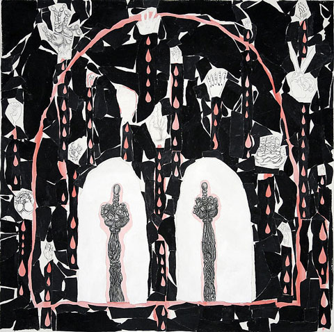
Trenton Doyle Hancock, A Tippy Head Run, 2008, acrylic and mixed media on canvas, 60x60 inches
Next in my pile is Collector's Eye at Gana Art, which took over the space from some museum-type organization thing that never showed anything I wanted to look at. New owners, same result: Two floors of junk. Whatever collector's eye is the basis for this show is blind -- but wealthy. The show consists of one floor of dusty old relics from Cindy Sherman, Roy Lichtenstein, Frank Stella, Damien Hirst, Tom Wesselmann, Anthony Caro, Cy Twombly, and a few others. Upstairs is given over to some Korean or Korean-American artists who won some kind of contest or other. I think. The gallery Website is in Korean and all I know how to say in Korean is "Please don't eat me."
Whether or not you like the slew of well-known artists, these particular works are most likely the ones you don't like. Anthony Caro gets high marks from people whose opinions I respect, but the tiny (I almost tripped over it) Caro bronze here is forgettable. I couldn't even find the Cindy Sherman piece, unless it was the utterly pointless black and white photo. Lichtenstein's a hack and Wesselmann, well, I have liked his work before, even prints, but this one is beyond me. Miró is represented by a lumpy rock exhibiting none of his usual airiness. You might accidentally overlook Stella's work, and a Stella you can overlook is a rare thing indeed. I didn't see Hirst's work in the show, I don't think, which is a blessing, since if they managed to find a bad Miró, can you imagine what a bad Hirst would look like? Probably like the climactic scene in "Raiders of the Lost Ark."
So, having narrowly missed having our faces melted off, let's see what's next in my pile. I have here Kate Clark's Perfect Strangers at Claire Oliver.
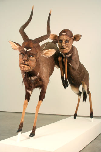
Kate Clark, The Map is Not the Territory, mixed media sculpture (organic & synthetic materials), 59 x 90 x 30 inches
I expected, in fact, to be disturbed by her work. But somehow it failed to disturb me or, really, interest me all that much. The most interesting thing about her sculptures is wondering how they're made. I think what she does is take a taxidermy specimen and take apart the animal's head. Then she rebuilds the skin of the head into a human-like head. The final result is a very realistic-looking animal with a very realistic-looking human face. The faces she builds are excellently made and nearly look alive, especially with the ceramic (or plastic, I guess) eyes.
That sounds disturbing. But I found the result curiously tame. I suppose part of it is simply mass: There are very few sculptures on display. Maybe because they're hard to do and take a long time. Also, well lit in a bright gallery, maybe the figures lose some essential mystery. Maybe the gallerist at Claire Oliver should take a cue from Hyungkoo's gallery, Arario, where his works were set up in dark rooms with black walls like a real museum exhibit. Not that I thought those were great works of art or anything -- imagine that cartoon characters are real creatures, and that archaeologists and naturalists could dig up their skeletons and display them -- but the show was a triumph of exhibit design.
Whatever the reason, I was impressed by the craft of Kate's work, but not by the actual work itself.
Speaking of unimpressive work, I also stopped in the huge, fancy, well-appointed opening at Marlborough Chelsea. I usually avoid the place because they're usually showing massive Tom Otterness bronzes. I see enough of his nasty work at the 14th Street subway station as the A train doors open and close on my way to my studio. All those Rodins and a Calder destroyed in the World Trade Center but these stupid little Otternesses we still have to look at.
I didn't wander into an Otterness opening, though. Instead it was Vincent Desiderio. You'd think I'd like his work, since it's somewhere on the line between academic realism and Impressionism -- a sort of latter-day Manet kind of style. Vincent likes nudes; one whole wall of the gallery is taken up in a long painting of a dozen or so naked people sleeping. This large work is provocatively titled "Sleeping." He also has up a couple of big nudes, and they're nice and chubby, the way I like them.
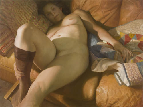
Vincent Desiderio, Nude I, 2008, oil on linen, 49.5x67 inches
And now the best for last, although the best in this case is certainly faint praise. I stopped in to see Sara Eichner and her latest show at Sears-Peyton, Plane Equlibrium. I gave Sara a rave review two years ago. (How much of a rave I didn't remember until I saw my review printed out and displayed in a binder in the gallery.) I'm deeply sorry to say that this show was not as good as the last one.
Sara did tell me that she had some trouble settling on a new direction in her work, which is at least partly why it's been two years since her last show. I'd hate to quash her motivation at this point, but I have to be honest. Sara told me she likes the idea of showing her process, leaving it visible, as she did in these latest works; I think it detracts greatly from them.
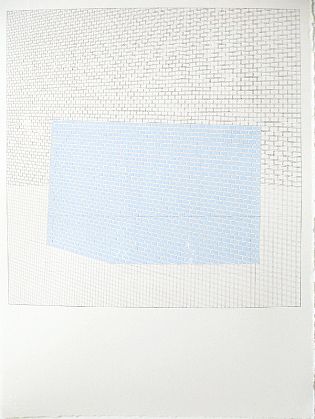
Sara Eichner, overlapping planes-blue bricks, 2008, pencil and gouache on paper framed, 30x22 inches
Sara's also reduced her palette. Some of her regular colors are still in evidence, but only the quieter ones; and, more importantly, she's stopped putting two sharp colors up against each other. Where her hues vary, they're the slightest of shades apart, almost identical -- as you can see here in the JPEG, the colors are the same as far as a digital camera is concerned. The vibrancy has drained from her pigments.
Also gone is the sense of inside/outside. The last show was split between bricks and tiles from the outside walls and wallpaper from the inside; this show is almost entirely outside walls, except for a couple of wallpapers, at least one of which looks like a holdover from 2006.
Eric Fischl wrote to me after my review of his show saying he knows how hard it is to not like an artist's work and then have to change your mind about it. That's hard, but it's not nearly as hard as the opposite, where you find an artist you admire misses the mark. That's really difficult, both to see and to write about.
So I'm reluctant to criticize the show this way. Also because, looking over the work -- if I could diagnose someone from their paintings -- I'd say Sara has become depressed. And I'd hate to depress her even more. I hope, instead, that she takes my thoughts however she needs to so her art gets even better than it was; whether that means ignoring me, calling me names, or taking my words to heart isn't important. What's important is that she makes great art. Sara clearly has it in her.


You're right about Desiderio. It's funny the way they just don't click. In repro they look sure fire, but in real life (I've only seen older ones) there's something a bit academic or dull about the technique. They're sort of killed with kindness or calculation. You want Vince to be just a little less safe and formal, to risk a bit more.
I don't even mind academic paintings. I've praised them before. They can be really impressive. But something about Desiderio's handling of it, I don't know. I really can't put my finger on what didn't work for me. I wish I could. Judging by the JPEGs I would expect to have loved the work, but in person they're just sort of lifeless. It's not that they're illustration, either. I just don't know what it is.
It's the drawing and how he handles flesh. He does not quite get there like Bouguereau does. He's still very good ,but I know what you mean about the distance.For my money Jacob Collins is the man for this kind of work.