The atmosphere's been awfully negative around here lately. Stephanie likes to warn me that it's okay to let loose with some negative thoughts now and then so long as I eventually get back to the positive, what she calls "the good stuff". And it's been noted by a few people in my vicinity -- most notably Piri -- that art critics aren't remembered for the bad artists they savaged but for the great artists they championed.
After the past couple of weeks on this blog, then, I was thinking that I really need a winner. I really need to find a show of art I truly love so I can get some positivity out there. But it's hard to call that up on order. It's just not possible to look over the shows on One Art World and say, yes! That one's a surefire quality show! It doesn't work that way. Of course the fairs were in town but I have a four year tradition of not going and I'm not planning on changing that any time soon.
Something I'd been thinking about anyway was making a list of the artists I'd want to show if I had my own gallery. I would never have my own gallery, but if in some imaginary parallel universe I were to have one, I was thinking of which artists I'd want to show. It occurred to me that I could do this virtually by putting together a blog post showcasing my favorite artists and explaining what they do that works for me.
One thing I'm not doing, however, is just listing artists I like. That would be a long list because there are lots of artists whose work I've seen that I simply like. There are museum-level artists, dead artists, artists whose work I've only seen in reproduction, and so on. Such a list would serve no real purpose.
I'm going to be more specific than that. What I'm going to do is make a list of artists who I not only would but conceivably could show in my fictitious gallery. These are living artists, still working, still creating. Granted that some of them -- most of them, probably -- are out of my league, or anyway the league of this imaginary gallery I'm running. It's not realistic. Some of these artists are people I consider friends; some I've exchanged e-mail with; some I've met; some are blue-chip artists. I own works by some of them; some I couldn't afford if I won the lottery.
Above any of that, these are artists whose work has done more than make me think, "Oh, I like that." These are artists whose work I've experienced in person, and their work has affected me. Each artist has created at least one work which moved me in some way while I was standing in front of it. The feeling is indescribable and inexplicable, something beyond words, something that cannot be fully understood, only known.
To me, that's what art's all about.
[Note: This has taken me longer to write up than I imagined it could. So I'm splitting it into two parts. This is part one. Part two will be following soon.]

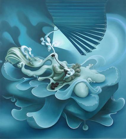
Inka Essenhigh, In Bed, 2005, oil on canvas, 68x62 inches
Inka Essenhigh
Inka Essenhigh's In Bed, painted in 2005, is an excellent example of why art needs to be experienced in person. Looking at a reproduction of this painting, computer-monitor sized, reduced, flattened, it looks like a pretty obvious take on insomnia, or nightmares, or anyway of someone being tortured while sleeping or trying to sleep. There are the window blinds, the bed wheels, some grinning critters twisting someone's guts. There are the sheets flapping and the sleeper writhing. It looks kind of literal, actually.
But in person it's another thing entirely. Standing in front of it you can only just get the painting between your outstretched arms, and then only if you're pretty tall. The painting completely dominates you and your field of view. And you're confronted immediately with a frenzy of activity, a swirl of moving lines, a sudden, shaking blast from the brass section. You might not notice -- I certainly didn't -- the literal elements of the work, which are actually small parts in relation to the structural elements. What takes over your vision isn't the strings marking those wild stripes as venetian blinds or the delicate curl of the sleeper's kidneys. What you see is a violent maelstrom of flapping calligraphy. Only if you stand in front of it for some time -- or walk away and come back to it, as I did -- do you start to focus on the individual, more recognizable, parts of the painting. Of course if you see the title of the work before standing in front of it you might catch on sooner. But if you're open to the pure visual experience of In Bed, it's like being washed away by a sudden cold ocean wave.
I haven't seen anything from Ms. Essenhigh in the past few years, not since I reviewed her 2006 show at 303 Gallery. Researching for this I discovered I only just missed her most recent show there and now I'm kicking myself. I haven't seen anything in the rest of her work to match the power of In Bed but a couple of them have come close; and I'd really like to see more reach this level.
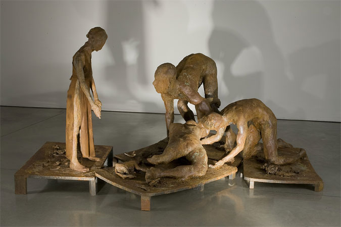
Eric Fischl, Ten Breaths: Damage, 2007, resin, patina, and cloth, 57x93x124 inches
Eric Fischl
It may not be entirely obvious that a painting needs to be seen in person but everyone can agree that sculpture needs to be experienced. Until you're actually walking around it, seeing how the light changes against the forms with your viewing angle, you're not seeing sculptural work at all. So I can't really expect you to look at photos of Eric Fischl's Ten Breaths series and get even an inkling of the feelings I felt when I saw them in Mary Boone's cavernous space.
That's a shame because the whole installation should be seen by anyone with a love for humanity. Each figure radiates tenderness, sorrow, pain, pity, and loss. Each one is infused with the fragility of being human, the essential brokenness of every person. Of course we can say Mr. Fischl communicates this through the surfaces of these sculptures: They're all corroded, lumpy, unfinished. Fingers melt together, legs trail off into nothing, anatomy is distorted, barely human. Individual features are indistinct. But that's just surface and it's superficial: Simple ugly half-forms aren't what makes these sculptures great. What makes them great is something ineffable Mr. Fischl infused into each one, a feeling of great empathy and love, a sadness for the weakness and suffering of each figure, and a palpable desire for transcendence.
I felt all that as I walked around the figures. The angel being blown out of Heaven, the frenzied dancers, the fleeing man, the tumbling woman just striking the floor, the Samaritan helping someone from where they've fallen, a small child standing helpless as another fallen person is attended to. It's easy to read all of this as a recasting, possibly an allegory, of September 11th, and that may be what Mr. Fischl was thinking and what he intended. But I believe great art transcends intentions, even the intentions of its creator; great art embodies more than anyone can possibly intend. That's what makes it great. And Ten Breaths is great art. I went in with no idea of its connections to anything -- no idea of the reception Tumbling Woman received when first displayed, no idea of Mr. Fischl's ideas behind the piece, no idea of what the gallery had to say. None of that is necessary because the sculptures tell you everything you need to know by being themselves.
I hope that one day Ten Breaths will be displayed permanently somewhere. It deserves to be experienced by many, many people.
-by-Tracy-Helgeson.jpg)
Tracy Helgeson, Horizon Lines (One), 2008, oil on panel, 4x4 inches
-by-Tracy-Helgeson.jpg)
Tracy Helgeson, Horizon Lines (Eight), 2008, oil on panel, 4x4 inches
Tracy Helgeson
I feel a need to defend the paintings of Tracy Helgeson and at the same time I feel a little bad about that. I personally try to say how I feel about an artist without making excuses or apologies. But Tracy herself would probably admit that she has a bit of a difficult time in the art world because of her subject matter and her success. Her paintings sell, and they're mostly landscapes, mostly of barns. The problem is that seeing her work in reproduction, and knowing what there is to know about it -- woman painter, living in rural upstate New York, doing gauzy paintings of rustic exteriors, sells well from non-New York City-based galleries -- one might be inclined to dismiss her and I think she's been dismissed many times over the years. It's too easy to say what she's doing is arts-and-crafts, not fine art, that it's kitsch (and not in that acceptable ironic way, either).
I feel bad about wanting to defend Tracy because her work needs no defense from me. All it needs is to be seen in person. When you have one in front of you all the words attached to the paintings drop away and you're left with the painting itself and all its wonderfulness. How Tracy gets so much into what is, really, a simple subject -- well, that's the mystery of art, isn't it? That's why people enjoy art, why they keep coming back to it. Because there's something there that can't be explained by biography or subject matter, something that can't be described by sales figures or encompassed by the address of your gallery.
These two tiny paintings are probably not what I'd choose to represent Tracy, and I doubt she'd choose them herself. I put them here because they're the ones I happen to own. You can see more of her work at her site. Again, I insist that looking at a Website isn't enough: If there's some way you can see Tracy's work in person, do so.
Tracy's paintings have a marvelous depth to them. Her darker underpaintings slip in and out of perception, hidden to varying degrees by her lighter, more realistic upper layers. She never reaches a level of full reality but instead maintains an almost dreamlike quality. The blue of a sky is never a solid cerulean but instead waxes and wanes across the painting, as the deep maroons and fulsome pinks of the underpainting peek through. Her vegetation is never a pure viridian as you'd find in an amateur landscape, but always tinted through with purples, blues, yellows. Her paintings always shade off at the edges with a hint of Rothko. And she usually finishes them with a varnish that saturates and unifies everything into one lovely jewellike whole.
I firmly believe that art isn't about its subject; in fact art isn't about anything. Art is how you feel when you stand in front of it. Tracy's paintings show us the truth of that.
J.T. Kirkland, Untitled, 2007, acrylic on canvas, 20x20 inches
J.T. Kirkland
Once again I'm representing an artist with a painting they'd probably not choose for themselves, and once again I have to plead that it's one I happen to own. In this case J.T. offered this painting free to a good home on his site and I was lucky enough to volunteer to adopt it before anyone else. He was giving it away because it's a direction he attempted but never followed up on, leaving him with a work nothing like anything else in his oeuvre. So using that painting here is a bit wrong of me, but I'm going to do it anyway, because, as I keep saying, the reproductions don't matter. What matters is the actual work. If you want a more representative idea of his work, go to his site, or, better yet, see it in person for yourself.
J.T.'s work is especially difficult to discuss because it's so minimalist it makes Donald Judd look positively extravagant. J.T. has pieces which consist entirely of a single piece of wood coated with slightly different textures of clear polyacrylic varnish. Yet in person his work doesn't seem minimalist, it feels rich. How this happens is, yes, the mystery of art.
The work which I've seen most is J.T.'s work with wood and holes, where he arranges pieces of various species of wood and drills holes into them in some pattern. It sounds cerebral, cold and distant, but in practice it's none of these things. J.T.'s sensitivity to his materials is such that in choosing them, arranging them, and arranging his holes, they all come together in a harmony greater than the parts. His work is subtle -- no one's going to faint from the sensuousness of it all -- but strong, like the insistent pull of a slowly flowing river. Or like the growing of a tree itself. Most artists, I think, have a love for their materials, a sense of their innate beauty, but few artists would allow their materials to stand so wholly on their own. Wood is itself beautiful, of course, but J.T. leaves us looking at the wood, his additions to and subtractions from it, and the whole combination as different levels of beauty.


What a great and refreshing post, Chris. Thank you for sharing. After all the art fairs, I got pretty negative myself. It was such a chaos that it was hard to appreciate anything, but still easy enough to see the bad.
But this is much more to the point of why people, or at least I, write an art blog. Good reminder.
Looking forward to part 2.
you have horrible taste Chris, but I applaud your magnanimous decent towards decency and positivity as the new aquarian age dawns upon us. Because, like the musical "Hair" we are approaching a new age of franchiseable art. Not all franchises are the same, however, unlike McDonalds. This is why $tarbucks is opening another chain - an indie chain, and sending their other brand to the dogs - namely McDonalds. Word is they are being trained to diss Starbucks - what the right grinds the left hand chews, right?
Inka is garden variety surrealism, the blended, near airbrushed look mimicking the best of the worst of Juxtapoze - and the sick thing is I think she actually thinks it is good and not "good bad" - so despite her obvious progress towards "skillz" she is receeding further and further into the horrizon line of kitch. Too bad. Even that columbia star machine baby woman painter I cant even remember her name thank fucking god the drugs DO work, has some soul.
Not Inka. She is just evil.
THe other stuff, meh, im too busy working on the bullshit contextual menu driven nightmare of my life to read your argument for the work - but if you feel storngly about it, I guess I might be interested in your "great and refreshing" movement towards spring-mind.
my bad, Starbuxks is going to Burger king, - their new stealth brand is 15th Avenue E Coffee and Tea - spread the word, the virus must be stopped.
Thank you, Stephanie! I was beginning to dread of what bludgeoning I might read next.
I read your introduction to the entertaining exercise of filling your imaginary gallery, Chris. But at the point where you list the artists which you have singled out for your gallery I stopped reading in order to scan the art without knowing your opinion. I must say that in general and so far I agree with zipthwung; you have terrible taste.
There was one artist, Tracy Helgeson, whose work impressed me enough to want to seek out her web site. But before I did I read your comments and I see you are struggling with some notions of provincial and sexual inferiority. I think you have two exquisite if diminutive paintings in your possession and there are others to be admired at the artist's web site. If Helgeson's work was being offered at Pace Wildenstein and you did not know what you know about her life and activity would you be so uneasy about giving the work a thumbs-up? If the subject matter was gas storage tanks rather than barns would they be more admirable? Your description of a "woman painter" that sells well upstate as your pause for thought is just too obviously wrong-minded for me to have to spell out why. Helgeson's work is about painting. It is very interesting and satisfying to view. Let's leave Helgeson's eschewing city life out of our assessment.
As you so rightly observe art is most accurately judged by how one feels when one stands in front of it and looks, as in a gallery. The particulars of the artist mean little in that assessment. Perhaps for the second half of your introduction to the artist's work included in your fantasy gallery you might consider treating us to the exhibition without commentary and leave the support for your choices to the hypothetical catalog.
As far as my taste goes, until and unless you've seen all of this art in person, you have no standing. I thought I made that clear in my post, but perhaps not, so let's try this again: You must see art in real life in order to judge it. You cannot judge art by reproductions. Are we clear now?
As for my comments on Tracy's work, she's a friend of mine. She even bought me dinner once. I have no struggle with provincial or sexual inferiority, but she does. I'm not uneasy about giving the work a positive review at all. I'm uneasy about the reception of that positive review. I'm concerned that her work might be dismissed out of hand by more ignorant, less enlightened people, and my review along with it. I'm not pulling this out of my ass, either -- I've experienced such reactions to her work.
You need to put some more effort into your reading comprehension, Kathleen. I'm not the wrong-minded one, I was expressing concerns about other wrong-minded people.
Incidentally, if I saw Tracy's work in PaceWildenstein I'd wonder what Twilight Zone episode I'd fallen into, because her work is far too good, and far too painterly, for them.
Fair enough, Chris. No one can criticize your choices until one has a note from Mother saying we've seen your chosen artists in person.
But as to your charming dismissal of my assessment regarding your view of the work of Tracy Helgeson, it seems to me that you surely are struggling with notions of provincial and sexual inferiority by worrying about what other "wrong-minded people" might think. By giving any consideration to those who would dismiss this work for all sorts of "wrong" reasons that have no relevance you are giving those notions a value. What is the point in your bringing up these factoids about Helgeson's life for all the wrong reasons at all, especially as a "gallery owner"? For the best business you would be emphasizing her lifestyle as a positive aspect of her artistic choices.
This is no way for a gallery owner to approach business (nor an art critic or art reviewer, or whatever you want to call yourself). Strength of conviction is called for in any role you choose. Qualifying your taste with a view to the ignorant is a waste of time and hardly serves your artists. It is those very ignorant people that you must ignore. They are not going to give your gallery any sales or credence.
That Tracy Helgeson must entertain and deal with such absurd notions of her work is very sad. But are you saying that at an opening she has to field questions from admirers about barns being hackneyed? No, I think it is only from critics who choose to make those observations that she must endure such stupidity. And here you are worried about the reception of your positive review; very sad indeed.
So yes, it is very apparent that you will never be a gallery owner. But, you do have your blog. I'm looking forward to see your other choices for your fantasy gallery.
PS - Pace Wildenstein sells original Rothkos, a comparison that you made to Helgeson's work.
I realized after saying you have to see the art that I've broken that commandment myself, so maybe I shouldn't be so quick about it. Mainly it's a knee-jerk reaction to Zip's criticism since I'm fairly sure he's completely bugfuck.
If you do get a note from Mother, though, feel free to pass it along.
My only response here is to feel you're overreacting. I'm not a gallery owner and I won't be opening one any time soon, so to say that I'm not acting like a good gallery owner -- well, yeah. I'm not. And when you talk about giving notions value just because I discuss them, I disagree entirely. One can mention and even discuss wholesale stupidity while knowing full well it's stupid. Talking about it doesn't give it any more weight. In fact I think dragging stupidity out into the light helps shrivel it up.
I personally wouldn't be surprised if Tracy hasn't had a supposed admirer or two try to talk her out of painting barns. Even at an opening.
Regarding Rothko at PaceWildenstein, I haven't heard of a Rothko being shown by them in at least the past four years. Their Website lists the last show of Rothkos at the gallery in 2004. Meanwhile, who have they shown lately? Ryman, Beuys, Hockney, Turrell, Katz. I think I saw Tara Donovan there in 2007. You might say Hockney and Katz are painterly but I'd say only approximately. Splitting hairs, I guess. I don't think of Pace as showing painters, and certainly not very good ones.
I approached this post as trying to introduce people to artists they haven't seen. So I expect them to have to judge from the reproductions here. I've made it clear I don't think that works, so my defense of the art is an attempt to account for anything a viewer might get wrong from looking only at JPEGs and Websites of the artists. It's a tough thing to do, especially when confronted by readers with their own set of axes to grind.